Chapter 1
I had a significant learning curve with Chapter 1. It took a bit to figure out the user interface on the desktop compared to the WebGIS that I grew accustomed to last semester. Some new terms arose as well as some old terms were rehashed. A feature class is a grouping of common features that are represented using the same symbols, points, lines, and shapes- making feature classes somewhat similar to a point of interest but in a broader sense. I believe that now I understand what a Raster dataset is- more so than before. Raster data is image data whereas vector data concerns points, lines, and polygons just like feature classes. In my early learnings of the desktop software, I kept managing to remove my map and the contents tab, but I found out that there is a way to reset the contents tab. Though, I had to leave without saving to get the map back at least once. A problem I encountered throughout chapter one alongside the other chapters was the use of terms that I was presumed to already know such as ribbons, groups, and bounding boxes. With that aside, I have acquired the ability to better navigate through maps and data via zooming in and out, zooming to full extent, and properly utilizing bookmarks. Additionally, I have gained experience using Structured Query Language to easily locate the names of specific features. Building upon the claims of the Mitchell reading, I was employing the GIS software to perform statistical analyses using sum, mean, standard deviation, etc. In all of the learning I have done thus far, the most engaging part was going through the symbology of the symbols for the various features. Though, I could not find any such “Dialogue Launch” or “Active Symbols” tab when manipulating the labels and symbols of features.
Chapter 2
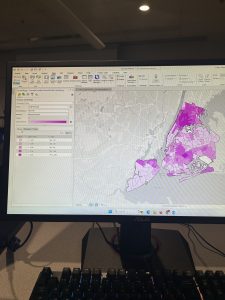
For Chapter 2, everything began smoothly with coloring the different areas. After that step, I had a lot of trouble finding the label class group on the ribbon for the next section of the tutorial, so I chose to move on. Otherwise, I did not have any trouble with using the popups. Then, once again, I was manipulating symbols- which I enjoy doing very much. When I moved on to making the Choropleth map, I encountered a lot of troubles that hindered my ability to perform everything properly. For some reason, I had an error come up every time I attempted to apply any settings under symbology, so I was virtually unable to complete the task. Moving past that, the next section went smoothly. I renamed the layer, changed the symbology, and that was all. Then, I had another issue with changing the symbology in the Female Headed Household feature. I was unable to change the method in the symbology to “manual interval.” Then, I had a lot of trouble locating the feature layer tab, but, as I acclimate to the system, I should eventually have less trouble navigating and location the different groups and layers. Following my pattern, the next section ran much more smoothly. I was working with symbology, and everything was great. Then, I encountered yet another roadblock. I could not locate anything labelled “beyond” or “current” in the visibility range group. There were only numbers where I found anything associated with visibility range, so I moved on.
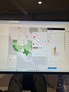
Chapter 3
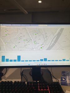
Chapter 3 was more geared towards my experience with WebGIS from last semester. By far, this chapter proceeded the most smoothly with no real issues inhibiting my ability to fully understand and complete the tutorials. For the first section, I transferred the maps to the sheet oriented for common viewership as well as creating the charts to understand and interpret the data of each map. After completing the sheet, I transferred the sheet and was reunited with my beloved WebGIS where I could set everything into precisely how it was meant to be. Then, I created the story map as I had many times before in 292. Next, I created the dashboard. I remember having trouble the last time I made a dashboard last semester, but this time went far better. With that said, when I made the table for the map, it ended up being on its own little separate section instead of being displayed with the map. I am unsure if that was intended, but it did not create any major discrepancies with showing all of the data in the finished product. At first, I thought the table I created disappeared into oblivion. Then, I found it in its own little area of the dashboard, so all was well.