Chapter 1:
In the first tutorial, I learned how to change base maps and add features to a map. This was an important first step because choosing the right basemap helps give context to the data. By the end, I felt more comfortable navigating the interface and working with maplayers. It then showed me how to explore the map more efficiently and adjust its features for better visibility. I got the hang of zooming, panning, and managing layers to highlight key data without making the map look too cluttered. One of the most useful things I learned was how to access and use the attribute table, it made it easier to find specific locations and filter information quickly. I got better at using the attribute table to pull out useful data. I practiced sorting and filtering to spot patterns, like areas with high population density. I also learned about customizing map symbols. I learned how to change colors, shapes, and labels to make the map easier to read. I also experimented with toggling labels and feature classes to reduce clutter.
Chapter 2:
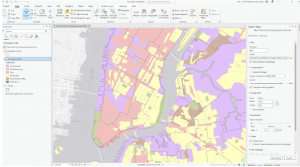
In this tutorial, I learned how to adjust symbology by customizing map features with different colors, shapes, and symbols, making it easier to distinguish between data layers. I also explored the labeling tab and practiced modifying pop-ups, allowing users to click on features to see important details like names and statistics. I worked with definition queries to filter and display only the data that met specific conditions, which helped refine the map’s appearance. I also experimented with different ways to classify and display data, such as using quantile and defined intervals. Additionally, I practiced importing symbology and adjusting it to compare datasets, like income levels versus population density. Other key skills I learned included creating a dot density map to visually represent data and controlling when labels appear based on zoom levels. This helped keep the map clean while still showing important details when needed.
Chapter 3:
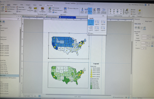
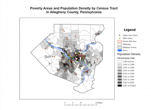
This tutorial was packed with valuable information and gave me a solid introduction to several key ArcGIS features. One of the most useful things I learned was how to compare two maps on the same sheet, which made it easier to analyze and contrast data. This was especially helpful for spotting patterns, like comparing population density with infrastructure distribution. There were a few challenges along the way, but overall, it was a great experience that helped me understand how different layers of information can be visually connected. I ran into an issue with inserting the legend in the map below and the program crashed multiple times. I was not able to work through some of the final steps, but I feel I know how to do them just from the reading. Overall, this unit gave me a much stronger grasp of ArcGIS. I feel more confident in managing, analyzing, and presenting geospatial data.