The preface is making me very excited to get started using GIS. There are so many potential applications for it, in both my field and in others. The start of chapter one explains the basic terminology for ArcGIS, which is especially useful as I did not know some of it beforehand. The most important part was explaining the difference between the gbs extension, which stands for a file geodatabase with feature classes and raster data, and an aprx extension, which contains a project, also known as the map or maps.
Chapter 1:
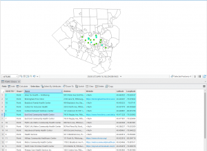
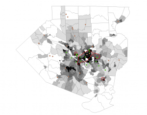
I got to the first turn section and tried to add the first base map, and the software froze. I rebooted the computer. It worked after this. The 1.1 tutorial was mostly focused on teaching me how to change basemaps and add features. I successfully completed this tutorial. The second tutorial focused on how to explore the map, and adjust the features of the map to see things more clearly. I also learned how to find the attribute table to find specific areas. In the third tutorial, I learned more about the attribute table, how to navigate it. For instance,I used the table to determine that object 204 had the largest population density. I also learned how to use the toolbox to get statistics. In the fourth tutorial, I learned how to adjust and change the symbols on the map. I also learned how to toggle labels and feature classes, and how to see a 3D version of the map, which was especially cool.
Chapter 2:
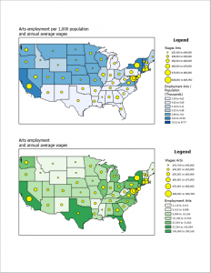
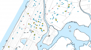
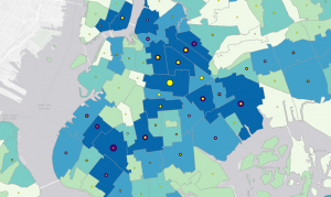
Tutorial one taught me more about adjusting symbology. The colors it had me choose for the map weren’t great, though. Not a lot of contrast. Tutorial two taught me more about the labelling tab, as well as how to change the information in the pop-up display. However, I couldn’t actually see any information in the pop-up beside the name of the neighborhood, even after I went back and triple checked that I did everything. Tutorial three taught me how to make definition queries, and let me practice adjusting symbology more. I attempted tutorial four, however, I could not adjust symbology due to an error, in which there was no data associated with the neighborhood, later renamed over age 60 receiving food stamps. I will try again later, when I can ask for advice. Tutorial five taught me how to display data in two different ways, quantile intervals and defined intervals. In tutorial six, I learned how to adjust and import symbology data, allowing for data comparisons. In tutorial seven, I learned how to create a dot map. In tutorial eight, I learned how to adjust labels, so that they can be seen only at certain levels of zoom. This is especially useful for keeping the map uncluttered.
Chapter 3:
Tutorial one was very big, but covered a lot of very interesting information. I enjoyed learning how to compare two maps on the same sheet. The create chart part did not work. The second tutorial taught me how to publish maps, and how to view published maps through ArcGIS. This is especially useful to know. Tutorial three is really useful for me, because one of my classes gives the option of making a story map for on the assignments, and now I know how! I’ll definitely be using this in the future. Finally, tutorial four taught me how to make a dashboard, which makes it easy to view information and share information with others. All in all, this unit has improved my understanding of arcGIS a lot.