Norman Week 3

Chapter four discusses mapping density and how to show the highest concentration of features. This is useful for interpreting, identifying, and analyzing patterns. There are different ways to map density. These include shading defined areas based on density or creating a density surface. This method can be decided based on analyzing the data you have. The density of points or lines is usually done using a density surface method while you can also map data that has already been defined by defined areas. You also need to look at whether you are mapping features or feature values. This is an important distinction for analyzing. As far as the two methods go, you should map density by area if you have data that is already summarized by area or you have lines/points that can be summarized by area. This will produced a shaded fill map or a dot density map. A good thing about this method is that it is fairly easy to do, but it does not pinpoint the actual centers of density so it is not terribly precise in some situations. You should use the second method, creating a density surface, if you have individual locations, points or lines. This will produce a shaded density surface or contour map. This gives a more precise view, but is also more complicated involving more data processing. The chapter also describes in detail how to achieve both of these methods. Another concept it covers is the search radius. The size of the search radius matters because if it is larger the patterns are more generalized while if it is smaller it shows local variation.

Chapter five covers mapping “what’s inside”. This is important because it allows you to monitor what’s occurring inside an area or to compare with other areas. There are different forms of data for this type of mapping. One is a single area. This can include things such as an administrative or natural boundaries, an area you draw manually, and the result of a model, etc. Another form of data is multiple areas. This can include contiguous such as zip codes, disjunct such as state parks, and nested such as floodplains. An important thing to look at is if the features are discrete or contiguous. Discrete features are unique and identifiable. They can be counted and quantified. Contiguous features are seamless geographic values. From the analysis, you need to discover if you need a list, count, or summary and if you need to see features that are inside or partially inside the area. The book lists three ways to find what’s inside. These include drawing areas and features, selecting the features inside the area, and overlaying the areas and features. Drawing areas is a good method to discover if features are inside or outside and its a fairly simple method, but is only visual. Selecting the features will give you a list or summary, so it is good to get information about a specific area, but does not tell you about things on the edge of a specific area. The overlaying method is good for both finding and displaying what is in different areas, but requires more data processing and is more complex.

Chapter six talks about finding what is nearby. This is important because it allows you to look not only at features inside an area, but also what is outside and nearby an area. This can help provide context to an analysis which can help identify patterns. The first step is to define what constitutes both near and far. You can do this in many ways such as distance and cost. The information you need from the analysis is if you need a count, list, or summary and how many distance or cost ranges are necessary. There are three ways that you can find what is nearby. The first way is straight line distance. This is useful for creating boundaries and selecting features at a set distance away. The second way is distance or cost over a network. This is useful for finding what is within a set distance or cost. The third way is cost over a surface. This is useful for calculating overland travel costs. Which one to choose depends on what you are trying to accomplish and what data you have.
Villanueva Henkle Week 3

Chapter 4: Mapping Density

The chapter starts off by explaining why it is important to map density in a map. The primary reason being to show patterns rather than showing locations of features. This is especially helpful when you have a large abundance of features on a map, and it is hard to discern the concentration of said features. There are a few ways to map density, so in order to find the way that fits your goals, you need to assess a few things. These would be whether you have dots and lines or summarized data. Dots and lines benefit from a density surface. Another thing to keep in mind is whether you are mapping features, or feature values. A map of the density of businesses could look completely different then a map of the density of employees. Areas with high amounts of businesses could only have one worker each, while areas with low amounts of businesses could have a high amount of employees. The two ways of mapping density are either by using  density surface, which is continuous, or by defined area, which is segmented/separated. It is also important to keep in mind the scale at which you are mapping. If you have a large map with hundreds of tiny dots, it can be overwhelming and hard to read. If you group/combine some dots, it can make your map more accessible. You could have a similar problem with density surfaces. If you make your cells too small, your gradient will become too smooth, and finding distinguishable areas will be impossible. On the other end of the spectrum, if your cell size is too big, you lose clarity and information in your gradient. It is also possible to combined the two methods, by rending density as a density surface, and then placing your map with boundaries, i.e. county lines, over that map to see a continuous gradient and how it is spread through each county.

Chapter 5: Finding What’s Inside

Shockingly, this chapter describes why you might need to find what features are inside an area in GIS. There are a multitude of reasons, including crime analytics (finding where crimes are located to identify hotspots), how many roads are in a county or a park, and assessing flood damage. Looking at your data, you may only need to find what is inside one area, such as one state, county, park, or zipcode, or multiple areas. The multiple areas could be adjacent or disjunct. The features you are looking for could also be either discrete or continuous, Which could be land parcels or soil types. GIS is also helpful for gathering different types of data. By overlaying continuous values over discrete land parcels, such as smoke plumes over a city, you could either get a list of parcels affected, the number of parcels within the smoke,  find out what each land parcel does, and more. There are three methods to “finding what’s inside”, those being, Drawing Areas and Features, Selecting the features inside the area, and Overlaying the areas and features. Drawing can help you easily find which discrete features are inside or outside an area. Selecting is good for grouping areas together and finding what is within a given distance of a feature. Overlaying features are good for seeing how much of a discrete feature is in a certain area, and what type of feature it may be.

Chapter 6: Finding What’s Nearby

Mapping what is nearby a feature can be helpful in many ways. Figuring out the time it would take to get from your house to the store, or monitoring logging near a river or property line. However, what is near to a feature could be defined in different ways. It could be a set distance, like mapping every tree of a certain species that is within a mile of a river. It could also be travel to or from a feature, like a fire truck driving to a fire.The units of measurement could also be different than just distance. Time, money and effort are also units of measurement when measuring what is nearby to a feature. It is also important to decide whether you want to factor in the curvature of the Earth when measuring distance or not. You can find what’s nearby in three ways: Straight line distance, Distance or cost over a network, and cost over a surface. I have already talked about the first two, so I will just describe cost over a surface. This approach is really only good for finding the cost of traveling long distances, as it uses a raster surface to show how much it costs to move away from a feature across the map. You can also use GIS to just select features within a distance. By inputting a distance from a source, it will highlight every feature within that distance, and give you either a list, count, or summary of those highlighted features without setting a boundary. Although, when doing this with multiple sources, you must label each feature for every source you place in order to know which is near which. GIS also has a street network built in, so you do not have to put in any data when measuring distances or costs over a network.

Godsey Week 3

Chapter 4: Mapping Density

Mapping density allows the user to see where the highest concentration of a feature is located and highlights patterns in areas of different sizes. There are two methods when mapping density: shading an area based on density value or creating a density surface. The method should be based on the data type; the GIS program uses a density surface to map features, and map data is usually already summarized by a defined area (counties, forest districts, etc.). Mapping density by defined area is commonly created using a dot map, which represents the density of individual locations summarized by defined areas (each dot represents a specific number of features and is not based on the features’ actual location). To calculate the density value for the area, the user can divide the total number of features/total value of features by the area. The density surface is created in GIS as a raster layer, with each cell in the layer getting a density value based on the number of features within the cell’s radius. Users should map by defined area if their data is already summarized by area or map by density surface if they want to see the concentration of point or line features. Density by defined area is calculated based on the areal extent of each polygon and is usually displayed as a shaded map. In a dot density map, the user maps each area based on a total count/amount and a specific value of how much each dot represents. Then, GIS divides the value of the polygon by the amount represented to figure out how many dots to draw in one area. A dot map represents density graphically, and the individual dots represent total numbers/values in each area rather than a calculated density value. GIS creates density surfaces as raster layers with a specific calculated density value for each cell in the layer, which is good for showing where/how point/line features are concentrated. 


Chapter 5: Finding What’s Inside

Users map the inside of an area to monitor and understand what is occurring inside a given parameter and compare it to several other places; this provides the user with an idea of what is happening and where to take action. There are three ways users can define their analysis to find what is inside a given parameter, including drawing an area boundary on top of the features, using an area boundary to select the features’ insides and list or summarize them, or combining the area boundary and features to create summary data. Finding what is inside a single area allows the user to monitor activity/summarize information about the area (e.g., an administrative/natural boundary such as a watershed). Finding what is inside several areas allows the user to compare the areas (e.g., a group of zip codes). The features inside a given parameter can be discrete, unique identifiable features, or continuous, seamless geographic phenomena. By drawing areas and features, the user can show an area/feature’s boundary and then see which falls inside/outside the boundary. When selecting the features inside the area, the user specifies the area and the layer containing the features, then GIS chooses a subset of the features inside the given area. When overlaying the areas/features, GIS combines the areas/features to create a new layer with the attributes of both or compares the two layers to calculate the summary statistics. When choosing the best method for the user’s data/results, they should follow the guidelines to select the most appropriate method. First, the user should draw the area/features if they have a single area and only need to see the features within that selected area. Select the features inside if you have a single area and make a list/summary of discrete features that are fully or partially inside. Overlay the areas and features if there are multiple areas with a summary of what’s inside each, there is a single area with a summary of discrete features, including the portion of features, or there is a single area with a summary of continuous values. 


Chapter 6: Finding What’s Nearby

User map change to gain insight into how features/factors behave to anticipe what future conditions may be like, decide on a course of action, or elevate the results of an action or policy. Users can demonstrate change in an area by showing the location/condition of features at numerous dates or calculating and mapping the difference in specific values for each feature between two/more dates. Geographic features can show change in two ways; either through change in location or change in character/magnitude. Mapping a change in location allows the user to see how features will behave in the future allowing them to predict where future movements may take place (e.g., mapping the patterns of hurricanes throughout the months). Discrete features can be tracked as they move through space over time, these can be individual features (an animal), linear features (a river), or an area feature (boundary lines). Events represent geographic phenomena that can be tracked and occur at different locations over time (movement of crimes in a given area over time). Mapping a change in character/magnitude shows how the same condition in a given location has changed over time (e.g., changes in categories of land cover in a watershed now vs 20 years ago). Discrete features can change in character/quantity of an attribute associated with them (e.g., changes in traffic volume over a 24-hour period). Data summarized by area are totals, percentages, or other quantities that are associated with features within a defined geographic area (e.g., population in each county for each year). Continuous categories demonstrate the type of features in a given area, represented by boundaries or as a surface. Continuous values are measurements that are monitores at fixed points and are always available, such as air pollution. The time pattern being used to measure can be mapped in three ways; as a trend (change between two dates/times), as a before and after (conditions before and following an event), or as a cycle (change over a recurring time period). Change can be mapped in three ways, through a time series (one map for each time/date showing the location or characteristics of the features over time), a tracking map (a single map showing the location of the features over time), or measuring change (the amount, percentage, or rate of change in a specific place). 

Pratt Week 3

Mitchell 4, 5, 6

Ch. 4

Mapping density is an invaluable technique for analyzing spatial patterns, allowing for a deeper understanding of how features are distributed across different areas. Depending on the type of data—whether lines, points, or defined areas—the approach to mapping density varies. If you have point data or lines, density can be mapped through graphical methods or density surfaces. For graphical methods, you might use dot density maps where each dot represents a certain number of features, visually demonstrating the distance between them. Density value maps, on the other hand, shade defined areas based on the number of features per unit area, offering a quick visual reference without pinpointing exact density centers. For more precise analysis, especially with point data or lines, density surfaces are useful. These surfaces assign density values to cells, and the patterns are displayed through shading or contours, which can highlight concentration areas more accurately but require more processing.

When mapping density for defined areas, consider factors such as cell size and search radius. Larger cells make for coarser maps with less detail, whereas smaller cells provide a smoother and more accurate map but require more intensive processing. The search radius affects pattern detail; smaller radii reveal more detailed patterns, while larger radii offer a more generalized view. Calculations can be simple, counting features within a cell radius, or weighted, giving more importance to features near the cell center. When transforming summarized data into a density surface, the center points of defined areas can be used to reflect the value assigned to each area, helping to highlight patterns with less emphasis on shapes.

Displaying a density surface involves choosing appropriate classification methods like natural breaks, quantiles, equal intervals, or standard deviations, which affect how patterns are visualized. Graduated colors or contours illustrate variations, with darker shades often representing higher values. It’s essential to find a balance in the number of classes to effectively show patterns without distorting the data. Interpreting these results requires understanding that the patterns observed may vary based on sample point distribution and the specific data layers used, as GIS calculations are tailored to each layer’s data.


Ch. 5

Mapping and analyzing what is inside a defined area involves several techniques to interpret spatial data effectively. The process starts with creating an area boundary, which allows you to identify and summarize the features within it. The method you choose depends on your data and the type of information you need, such as lists, counts, or summaries.

There are three primary approaches to finding what is inside an area:

  1. Drawing Areas and Features: This approach helps determine whether features are inside or outside a boundary.
  2. Selecting Features Inside the Area: Useful for obtaining a list or summary of features contained within the boundary.
  3. Overlaying Areas and Features: Effective for analyzing which features fall within which areas and summarizing data based on these areas.

When features partially intersect with the boundary, you need to decide whether to include the entire feature or just the portion inside the boundary. GIS can help by generating reports and statistical results based on your selected features. Overlaying multiple areas on a set of features allows for detailed summarization and comparison based on specific statistics.

The chapter highlights the importance of understanding what is inside a given boundary, which is crucial for applications like determining the impact of events within specific zones, such as assessing speeding violations in school zones. Choosing the right boundary—whether a service area, buffer, natural boundary, or manually drawn territory—affects how features are analyzed. Effective mapping involves creating a suitable boundary and using GIS tools to produce relevant reports and summaries based on the analysis of areas and features.

Ch. 6

The chapter focuses on using GIS to map what is nearby a feature, measuring within a specified distance or travel range. This involves understanding how to define “nearness” based on the information needed from the analysis. Travel range can be measured by time, distance, or cost, and the choice of measure depends on the analysis requirements and how you define proximity.

For small distances, the planar method is appropriate as it assumes a flat surface, while the geodesic method is used for larger distances to account for the Earth’s curvature. Your choice of method should also consider the desired end result, whether a list, summary, or count, and the number of distance or cost ranges needed.

To find what’s nearby, there are three primary methods:

  1. Straight-Line Distance: Defines an area of influence around a feature using a fixed distance to create a boundary or select features within that distance.
  2. Distance or Cost Over a Network: Measures travel based on a fixed infrastructure like roads, capturing the cost or distance of travel between points.
  3. Cost Over a Surface: Measures overland travel to calculate the area within a travel range based on varying travel costs.

The chapter explains that mapping what is nearby involves creating buffers or rings around a feature to visualize the distance or travel range. It also discusses creating multiple buffers to assess how the total amount changes with distance or using distinct bands to compare distance to other characteristics. To create effective maps, you may use various visualization techniques such as point-to-point distance, color-coding, or spider diagrams. The process starts with data gathering and separation before mapping, emphasizing the need to choose appropriate methods and visualizations based on the analysis goals.


Deal Week 3

Mitchell

Chapter 4 Mapping Density 

Map density shows you the concentration of features, rather than as individual points. This is helpful because sometimes with the naked eye it is hard to tell which areas of a map are most dense when it is shown as individual dots. When deciding how to create your density map you must know the features you are mapping, and the information you need from the map. Density maps are helpful when mapping density points or lines, census tracts, countries, forest districts and more. When creating your map you must decide whether you need to map the density of features or the density of feature values. There are two ways to create a density map 1. based on features summarized by a defined area or 2. by creating a density surface.  By Defined Area: This can be done graphically, using a dot map, or by calculating  a density value for each area. To calculate density value for each area you divide the total number of features, or the total value of features, by the area of a polygon. Use this method if you have data already summarized by area or you want to compare administrative or natural areas with defined boarders. By Density Surface: Usually created as a raster layer. Each cell in the layer gets a density value based on the number of features within a radius of the cell. This produces more detailed information but requires more effort. Use this method if you want to see the concentration of point or line features. If you have data summarized by areas but want to create a density map you can use the centroids of defined areas to create the density surface, based on the values assigned to each area. When creating a density map you can display the density using graduated colors or contours.

Chapter 5 Finding What’s Inside

Finding what’s inside is important to be able to compare different areas. To find what is inside create an area boundary, and list or summarize the features inside, or combine the area boundary and features to create summary data. To determine which method is best for you, you must look to the data you have and the information you need from the analysis for example if you need a list, count, or summary. You can find what’s inside a single area or several areas. You must decide how to handle features that do not fall precisely inside or outside of your created boundary. If you need a list or count of features, you should include features that are partially in the boundary, whereas if you need to know the amount of something inside the area you should only include the portion inside the area. There are three ways of finding what’s inside. 1.Drawing Areas and Features: Good for finding out whether features are inside or outside an area 2.Selecting the features inside the area: Good for getting a list or summary of features inside an area.  3.Overlaying the areas and features: good for finding out which features are inside which areas, and summarizing how many or how much by area. GIS can create a report for you of your results of the selected features. It can also create statistical results. For overlaying you can use the same kind of analysis you would do with geographic selection if you are overlaying a single area. If you are overlaying several areas on a set of features you can summarize the features by area. To compare areas based on a particular statistic you can create a chart from the table.

Chapter 6 Finding What’s Nearby 

You can use GIS to discover what’s occurring within a set distance of a feature, and what is within travel range. Travel range is measured by time, distance, or cost. To decide which measure would be best to use for you, consider what information you. need from the analysis and decide how you would like to measure “nearness”. You can define nearness by setting a distance you specify, or if travel is involved based on distance or travel cost. If you are measuring a small distance it is suitable to use the planar method which assumes the distance you are measuring is a flat plain. If you are measuring a large distance it is suitable to use the geodesic method, which will account for the curvature of the earth. To help you determine the best method for your analysis you should also consider what end result you need, whether that be a list, a summary, or a count. You must also decide how many distance or cost ranges you need. If you are going to do more than one range you can create inclusive rings or distinct bands. If you are trying to find how the total amount increases as the distance increases you should use inclusive bands. If you are looking to compare distance to other characteristics you should use distinct bands. There are three methods of finding what’s nearby 1. Straight-line distance: to define an area of influence around a feature and create a boundary or select features within the distance  2. Distance or cost over a network: to measure travel over a fixed infrastructure 3. Cost over a surface: to measure overland travel and calculate how much area is within travel range.

Plunkett Week 3

Chapter 4: 

  • This chapter goes into detail about why you should map density and how to map it. Density mapping is used specifically when looking for patterns rather than individual features. There are two ways of mapping density, by defined area and by density surface. Using a defined area allows you to create a dot map, which means each dot represents a specified number of features. The density surface is created in GIS as a raster layer, which means each cell in the layer gets a density value that varies depending on what you are measuring. The use of color is also brought in again, when a part of the map has a higher density typically the color becomes darker to signify the amount. As someone who is not the best at math, I think learning how to calculate the correct density sizes seems to be important. The steps to this are to first convert density units to cell units, then divide by the number of cells, and then take the square root to get the cell size. Another important factor while mapping is your search radius. Having a large search radius generalizes the patterns of the density surface. You also need to specify your units, square meters can be used for something small but using it to track larger areas would not work. As we learned in previous chapters different classes need to be identified as they all have unique density values. Such as quantile having each class have the same number of cells. At the end of creating your density map know that the patterns you see depend on how the density surface was created. One cause of this was discussed earlier, which was having different search radiuses. 

Chapter 5:

  • This chapter is about mapping what is inside. It took me a little bit of reading to fully understand what this meant. Mapping what is inside means what is inside an area, so that if something occurs they can tell how close or if it is inside that area. Such as if someone was speeding in a school zone, they would suffer a harsher penalty. There are different methods for creating a boundary, and it depends on what you want to find. Some of the options to highlight are a service area, a buffer, a natural boundary, manually drawn territory, a floodplain, etc… You choose the barrier which also includes choosing if something that is partially in the barrier is included or not. Once the barrier is created you need a way of figuring out what is inside the barrier. You have to ask yourself what it is good for and what you need. To use this map you create a report in GIS of the selected features. Overlaying areas allows you to find the discrete areas and summarize them. 

  • Discrete:  These are unique, identifiable features. You can list or count them. They are either locations, such as student addresses, crimes, or eagle nests. They can also be linear features. 
  • Continuous: Represents seamless geographic phenomena. It can include spatially continuous classes such as vegetation or elevation range. 
  • Continuous Values: Numeric values that vary continuously across a surface. They can be measures of temperature, elevation, or precipitation.
  • Count: Total number of features inside and area. 
  • Frequency: The number of features with a given value is displayed as a table. 
  • Raster Method: Combining raster layers allows GIS to compare each cell on the layer with categories. It then calculates the areal extent and presents the results in a table. The areal extent causes this method to be the most efficient. 


Chapter 6: 

  • This chapter goes into detail about mapping what is nearby, which is mapping within a set distance or travel range of a feature. It seems similar to mapping what is inside but mapping what is nearby lets you find out what is happening within a set distance of a feature. To find out what is nearby you can measure distance or cost over a network, or measure cost over a surface. Just like in the last chapter with creating a set boundary, you also have to determine what is considered nearby. I wouldn’t have thought to think about whether you are measuring over a flat plane or the curvature of the earth. I almost forgot that it can change the distance. There are three ways of measuring what is nearby, straight line distance, distance or cost over network, and cost over a surface. After choosing which way works, the next step is to create a buffer that can see what’s within the distance of the source. Sometimes I forget that a lot of this process is gathering and separating data and not yet creating a map. In this case, once you need to make a map you can choose to present what is inside the buffer or what is on both sides. There are other ways to make a map as well such as point-to-point distance, displaying what is near a source feature, color-coded, a spider diagram, and many more. The rest of the chapter is repetitive in its form, it guides you through a measuring form, what GIS does, and how to map it. 

  • Rings: Useful for finding out how the total amount increases as the distance increases
  • Buffer: defines a boundary, multiple can be created at the same time
  • Bands: Useful if you want to compare distance to other characteristics


Norman Week 1

I’m Jenna and I’m a senior Economics/Politics and Government double major and an Environmental Studies minor. I am in Kappa Alpha Theta and on the OWU cheer team. Previously to reading this introduction, I had a vague understanding of GIS and what it does as well as its applications. However, this went very in depth and taught me a lot about the science of GIS itself. I generally thought of GIS as being more of a software rather than a discipline of science. The reading made this distinction and talked about the differences between the science and systems. It makes clear that you need to understand the reasoning and history behind the systems holistically in order to properly utilize and practice GIS. However, it discusses that GIS does not necessarily have one singular and comprehensive identity because it can mean many different things. I like this concept because it leaves room for growth and adaptability. I also enjoyed the discussion of the history because I thought of GIS as a solely modern development, but learning about its roots. The different applications of GIS are also very interesting because I understood how prolific it was, but didn’t realize that it touched so many different aspects of everyday life as well as different sectors of work.
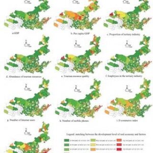
I looked at GIS applications for economics and there are some obvious examples that I had studied before or talked about in class, but one concept I found new and interesting was its application in tourism economics. GIS is used to look at movement patterns of tourists to help plan infrastructure as well as marketing and can help look at the economic impacts on specific communities.
 
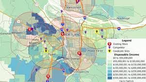
Another application I looked at was GIS applications in restaurants just because I work in a restaurant and thought it would be interesting to see how they can connect. One thing I found was site selection analysis which can allow businesses such as restaurants to look at traffic patterns and competition density among other factors to determine the best location for the restaurant\

.

Deal Week 2

Mitchell

Chapter 1 Introducing GIS Analysis

This chapter starts with a definition of GIS Analysis, it states ” GIS Analysis is a process for looking at geographic patterns in your data and relationships between features.”. This first paragraph also gives examples of how you may do this could be a very simple like by creating a map or a complex process “involving models that mimic the real world by combining many data layers”. To begin an analysis you must before anything else figure out what information you need, this is often formatted as a question. Other factors you must consider is how the analysis will be used and by who. To determine what method you will use you must know the type of data and features you are working with, you must also factor in your original question and what the analysis will be used for. Results of the analysis can be displayed in maps, values in a table, or a chart. The next section of this chapter discusses different types of geographic features. Discrete features, continuous phenomena, and features summarized by area. There are two ways of mapping geological features: Vector and raster. In the vector model feature shapes are determined by X,Y locations in space, whereas the raster model features are represented as a matrix of cells in a continuous space. The book details that while any type feature. can be represented in either model is it most common for discrete features and data summarized by area to be represented in vector, and for continuous  numeric values to be represented using the raster model. Continuous categories can be represented as vector or raster. There are 5 types of geographic attribute values: categories, ranks, counts, amounts, and ratios. You can identify these values in a geographic feature to help you determine what the feature is, to describe it, or to understand the represented magnitude associated with the feature. Categories and ranks are not continuous values. Counts, amounts, and ratios are continuous values.

Chapter 2 Mapping Where Things Are

The first paragraphs of this chapter explain the importance of investigating the patterns of multiple features on a given map. It gives the example of police using GIS in this way to track crime and decide where to assign patrols.  Which features to display and how to display them is determined by the information you need and how the map will be used. Before creating your map you must have geographic coordinates assigned to the features you wish to map. The brunt of this work is done by the GIS. An optional step before creating your map is assigning a category attribute with a value to each feature. To map single type features you simply draw all features using the same symbol. This chapter explains that GIS stores the location of each feature as a pair of geographic coordinates or as a set of coordinate pairs that define its shape whether that be a line or an area. Using a subset when mapping your features can help to reveal patterns that are less apparent when all features are mapped. Mapping by category by allocating different symbols for each category can help you to understand how a place functions. You can also display features by type to further reveal different patterns since features could belong to more than one category. When mapping using categories sometimes it is helpful to create separate maps for each category as the features may be too close together and make them hard to distinguish one from another. When mapping multiple categories it is important to map no more than 7 on a single map. The amount of categories reasonable to show on a single map can also be affected by map scale, and the features being mapped. If you have more than 7 categories sometimes you can make generalized groups for the categories to make the patterns easier to see. It is helpful to the people who will be looking at your map if you map recognizable landmarks for example: major roads or highways, administrative or political boundaries, locations of towns or cities, or major rivers.

Chapter 3 Mapping the Most and Least

This chapter begins by discussing how mapping the most and least is helpful to find places that meet ones criteria or to see the relationships between places. Mapping features based on quantities rather than just the location of the features adds another level of information to the map you are making. Quantities associated with discrete features, continuous phenomena or data summarized by area can be mapped. Count: The actual number of features on the map. Amount: the total of a value associated with each feature. Counts and amounts can be mapped for discreet features or continuous phenomena. Using counts or amounts is not suitable if you are summarizing by area as it can skew the pattern. It is recommended to use ratios to represent the distribution of features. The most common ratios are averages, proportions, and densities. Ratios show you the relationship between two quantities. Ranks order features form high to low, and depict relative values, this is useful when the direct measurement is difficult. Counts, amounts, and ratios are usually grouped into classes whereas ranks must be mapped individually. If you are looking for features that meet specific criteria or are comparing features to a specific meaningful value  you should create classes manually. But if you want to group similar values to look for patterns in the data you should use standard classification schemes. There are four standard classification schemes Natural Breaks, Quantile, Equal Interval, and standard division. To determine which scheme to use you must create a bar chart with the horizontal axis showing the attribute values and the vertical axis showing the number of features having a particular value. There are 5 given options in GIS to create maps to show quantities graduated symbols, graduated colors, chart, contours, and 3D perspective views.

Deal Week 1

Hi guys! My name is Devyn Deal. I am a junior majoring in Environmental Studies. I have a great love for the earth and enjoy doing outdoor activities. I love to keep house plants and have quite the collection at home. Above is a photo of me and my sweet girl Nora having a little sit after a hike.

My first connection to Schuurman Chapter 1 is that I too had no clue what GIS was before coming to college. I found it very interesting to see the example of an early version of maps produced by GIS. It is extraordinary to see how far GIS mapping capabilities have come. I had never considered how game changing GIS technologies are in that humans can come to a vastly different conclusion based on the same data depending on weather they are reviewing the data via a numerical output, or through a visual output. It was interesting to learn there are two different definitions of what the GIS acronym stands for. In reading this chapter I learned the word sphericity. This chapter enlightened me on just how many uses there are for GIS. I had no clue there was so many questions and so many different types of research GIS was helpful in, I had only considered the ways presented to me in previous geography classes where we utilized GIS. For example I had never considered how valuable GIS could be in the economic world, or in public health.  I am curious to learn more about how nonprofit groups use GIS to represent themselves. I would also love to learn more about how GIS and feminism intersects. I am curious what some proposed solutions would be in the discussion of how to represent barriers on a map that are fuzzy and not do not necessarily have a precise line, like the black bear and grizzly bear example.

The first GIS application I looked into was the conservation of loggerhead sea turtles as they are an endangered species. In the example that I found satellite transmitters were attached to female loggerhead sea turtles to track their movements. This data was used to better protect the species by having a better idea of where they most frequent. Before the use of GIS it was unknown where sea turtles went after laying their eggs on shore. This study found most adult female loggerheads from Georgia, North Carolina, and South Carolina migrate to the Mid-Atlantic Bight. This study was the first to track the movement of a large amount of sea turtles rather than just one in order to get a good idea of where their home base was.

https://www.esri.com/news/arcuser/0206/seaturtles.html?srsltid=AfmBOorGNPS9umDoCnAhQRYZB0wCvjcM5jIrVWBJtLHb9R7jnnTlEyuy

The second GIS application I looked into was habitat conservation. I found a study on the conservation of the Florida everglades. The everglades are home to 68 threatened species, three national parks, 12 wildlife refuges, and a marine sanctuary. Due to human intervention 50% of its wetlands have been lost and the water quality has deteriorated. The south Florida water district and the united states army introduced a restoration plan which was termed the “largest restoration project in world history”.  It plans to rescue the everglades ecosystem through a series of ecological and water system improvements. The photo I provided depicts Comprehensive Everglades Restoration Plan projects, district lands, and developmental pressure on the everglades.

https://www.esri.com/news/arcuser/0704/iris1of2.html?srsltid=AfmBOopAvPcEMjX2qfDfTPC0ndXr92MZpRzmIHOLPACpdxO54JbmAiYz


Baer Week 2

Chapter 1

GIS is defined as a “process for looking at geographic patterns in your data and at relationships between features” (Mitchell). All GIS analysis has to start but knowing what information it is you need to gather, so you have to start with a question. Once you have gathered the necessary information you need there are multiple ways to display it such as a map, charts, or a table with values. On the maps there are various geographic features. They are; discrete, continuous phenomena, and summarized by area. Discrete features are features that can be pinpointed. I think personally a better word is definite features, since the feature is either there or it isn’t. Continuous phenomena are features that are identified everywhere such as temperature and precipitation. They are features that have no defined borders, and often start out as sample points for certain areas. Then the GIS will assign values for the in between area (interpolation. This is honestly so cool to me. The idea that it will create a blended feature just sounds like a futuristic thing. Finally summarized by area are features that represent the density or counts of features in boundaries like business profits or population density. In all honesty this one looks the least cool (Hey you asked for comments). Features can be represented in GIS by using two models. The first model is a vector which has each feature in a table and the shapes are defined by “x,y” locations (like a coordinate plane). Vector areas are represented by polygons on the map. The second model is raster. Raster is a matrix of cells in a continuous space. The cell size that’s used for the raster will affect the results of the map. A small cell size will have more cells which leads to more detail, similar to that of a screen. When making GIS layers they should be on the same map projection and coordinate system. This way you avoid issues in distortion between layers. Each feature has one or more attributes that identify what it is or how big it is. The first attribute is ranks, which put features in order from high to low. Ranks are relative, so you only know the order, but you wouldn’t know how much higher or lower the values are from each other. The next two are counts and amounts. Counts show you the actual number of features on a map and amounts are any measurable quantity associated with any feature. And the final attribute is ratios, which show how two quantities are related. 

Chapter 2

Maps can be used for a lot of different reasons, whether it’s where a feature is or what the feature is. They can also be used to look at the distribution of features. By looking at this you can see patterns that form and they can help you better understand the area you are trying to study or map. Mapping where things are can better show you where you need to focus or where all of your criteria are met. One example that came to my mind was their watershed GIS that was able to articulate which watershed needed to be prioritized. One really important thing to do with GIS is to tailor the map to who you are marketing to. If I was showing a map to the sheriff’s office, I’m not going to include a layer for commercial sales. To me, this seems kind of obvious but at the same time, I wouldn’t have thought about this. The amount of detail also should be tailored, specifically to the format at which you are presenting the data. If you are presenting on a screen during a meeting, small details might not be the best. But, if you are working on a poster that will hang up in a hallway for an extended period of time, you can add many more details. Each feature in GIS needs geographic coordinates. They can be determined by street names or addresses. Also they can be identified by using longitude and latitude. GIS also requires you to have a code for each feature (i.e. robberies). I didn’t really understand why at first, but then it explains that a numbering system could allow your data to be broken down into subsets. The book says you should not use any more than seven categories for a map. However, in my opinion I think five is a better number because it’s less crowded. The book does come with a solution to complicated data sets. The solution is to have separate maps, one with the generalized data and the other with the subset data. I honestly really like this idea because it would allow one map to be simple, then IF you need more specific data you can look in the subset map. GIS can help you recognize patterns such as population density, characteristics, and relative location. However, you have to be careful because being too zoomed in could reveal different patterns than if you were to zoom out. This really reminds me of observer bias. But honestly it made a lot of sense. I really liked this chapter, I found it very interesting.

Chapter 3

When people map the most and least places for their subject. They are able to see the relationship between the areas. This allows more information to be processed. Not to mention, if you only map out the most frequent places for your feature, you’re not collecting any real data because you are not collecting any control. There’s nothing to compare it to. That’s like looking at a map of the U.S and the only feature is “The United States,” what would be the point? In the section “What type of feature are you mapping?” they resay what they say in chapter 1. They talk about the 3 types of features (discrete features, continuous phenomena, or data summarized by area.). They also reinstate that you have to remember who your audience is. This way you are not representing data that doesn’t pertain to the group who is receiving the map. Quantities are also an extremely important part of mapping most and least. They can be; counts, amounts, rations, or ranks. The chapter goes over counts and amounts again, however it does add some advice. Mapping counts and amounts are used in each of the three types of mappings. It can also be helpful to present quantities differently. Sometimes it is better to present exact locations rather than by generalized areas such as area codes. This also goes into proportions, which can show how much of that area represents the whole. This reminds me a lot of things like political maps, when they show who has voted per county. Creating classes for certain features is also a helpful tool. This allows you to see different features more easily. Using different symbols is the best way to do this in my opinion. Sometimes it is best for the classes to be percentages, this is because it would show you the dense areas vs. the not so dense. But sometimes there are outliers in the data that can skew these percentages. With these you should use a number for the classes, which would allow you to add needed breaks.