Chapter 1
1.1
Right off the bat, I like how straightforward the directions are. Though, there could be a bit more detail with where to save files… but, I understand the book may not be written to save files to hard drives.
1.2
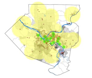
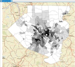
I really appreciate how the book first tells you what tab to go to, then group, then the individual features. It makes it a lot easier to navigate things. Learning how to zoom in and out seemed a bit silly to me, but I guess it doesn’t hurt to go over that.
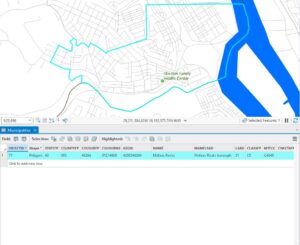
1.3
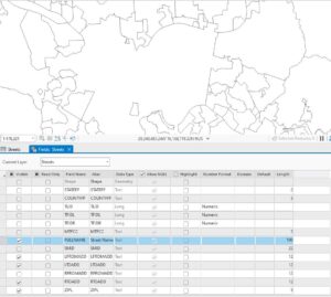
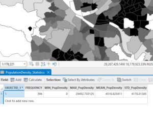
I was very surprised at how many “tools” there were in the “toolbox.”
1.4
I ran into a problem in this section… when trying to open the 3D map, I got an error that said “failed to open map view.” I couldn’t figure out how to troubleshoot this so I just read the rest of the tutorial and moved onto the next section.
Chapter 2
2.1
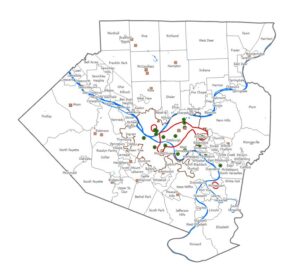
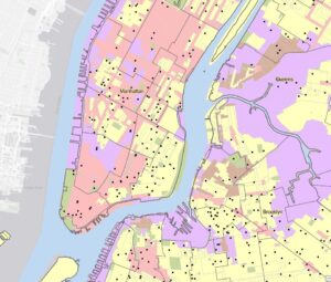
Starting off chapter 2, it was refreshing to see a map other than Pennsylvania… It was getting old. It is interesting to see a map that requires a lot of zooming in to distinguish features.
2.2
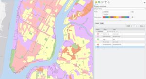
This section took me two tries to get down. On my first try, my labeling got all messed up and I restarted from scratch. On my second try, I found it a lot easier. I think I was just rushing through the first time.
2.3
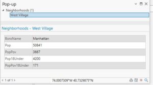
This section was pretty straightforward and didn’t give me any issues. I liked experimenting with the street width and color just because it’s so detailed and can easily get overcrowded.
2.4
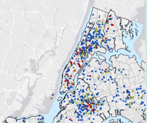
I had to skip this section as well because it was not opening for me. I made sure to read the tutorial in the book though.
2.5
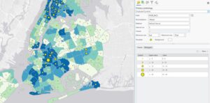
Chapter 2, tutorial 5 was a very straightforward section. I was overwhelmed initially when the under 18 symbols were so big but it was an easy fix.
2.6
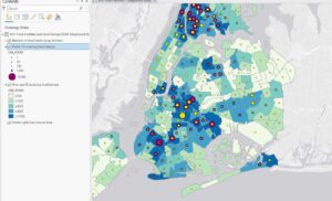
Using the swipe feature to reveal the map underneath was very cool.
2.7
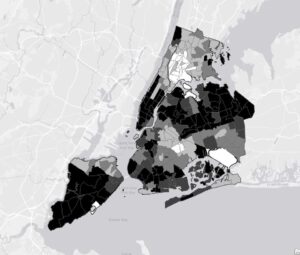
This section really explained why values of certain things are important when considering how detailed you want to be.
2.8
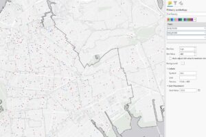
When I first opened this map and zoomed in and out, I noticed how cluttered the school symbols became when I zoomed out a lot, so it was nice that we fixed this in step 3.
Chapter 3
3.1
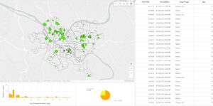
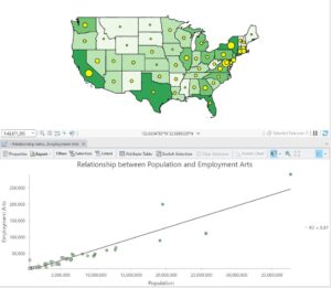
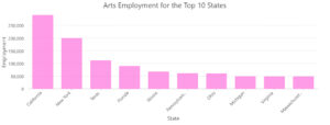
I enjoyed making the chart in 3.1. It felt like a very advanced version of making charts with google sheets in high school.
3.2
It was very cool to be able to “publish” what I was doing on Arc online. When I was trying to change the symbol color online, I couldn’t do it. I wasn’t seeing a color option like the tutorial said.
3.3
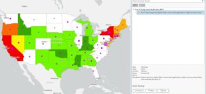
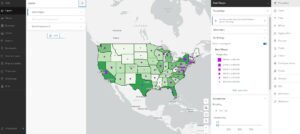
Learning how to publish work in 3.3 was pretty tedious and I was anxious for it to be over. It was pretty cool though.

3.4
3.4 was also a pretty tedious section and I am glad to be done with it.
