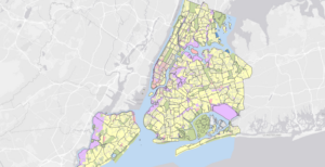
Chapter 1- Overall, I think this first chapter was a very good introduction to ArcGIS and I’m now more familiar and comfortable with GIS techniques. I like how the book is very explicit with what to do, but also explains how what it’s telling you to do will change the map. Also, I enjoyed the “Your Turn” sections throughout the book so far, because as the book explained, it really helps with the muscle memory of performing these actions and forces you to learn to do things on your own. I also think these gave me a better understanding of where everything is located on ArcGIS Pro. The first few tutorials were focused on showing us how to move around and navigate a map using the Explore button and bookmarks. Additionally, Tutorial 3 showed me how to click on a data point and pull up the summary statistics. Tutorial 4 was very interesting because it taught me how to add, label, and remove a feature class. We also made 3D maps, which is a really interesting way to visualize the data. Below are 2 images comparing the map of 2D data to the map of 3D data. The end of this chapter focused heavily on symbology and assigning unique symbols that can help distinguish between feature classes. This section familiarized me with the Symbology pane and how to change the map’s visuals. Overall, I didn’t have any problems with this chapter and I enjoyed putting what we’ve been reading about into practice.
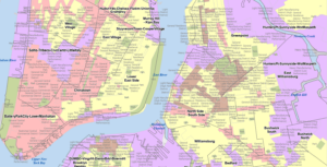
Chapter 2- The second chapter was still fairly easy, but I think it was a little more challenging than Chapter 1 and I did run into a few problems. Overall, the chapter went more into depth about symbolizing maps, using graduated symbols, scales, and dot density maps. I think the most confusing part of this chapter was choosing which methods to use in choropleth maps because it seems like you would need a pretty good understanding of statistical concepts like data distribution. I was just pressing whichever method the book told me to, but if I had my own set of data with a particular distribution, I’m not sure I would know which scale or method to assign it that would display it the best. Another slightly confusing part of this chapter was the definition query because I think this part may be a little too computer science-ey for me. I learned how to remove duplicate labels, change font size and color, and more about 3D maps. Another cool thing this chapter taught me was how to change the Visibility Range of a feature layer so that it can appear or disappear when you zoom in or out. I think that this aspect of ArcGIS helps with navigating the map and reduces the cluster and busyness by only presenting data when you’re zoomed to the correct visibility range. Below is a picture of some of the feature layer labels when zoomed in. The other picture shows the colors of the map that are displayed as Unique Values with some cool colors.
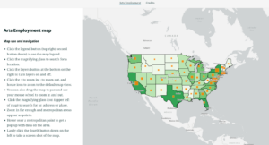
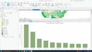
Chapter 3- Chapter 3 was interesting because it incorporated the web version of ArcGIS. This chapter started out by teaching us how to make a map layout, add legends, use the ruler to line things up, and export a map. I liked learning how to make the map layouts because I think this would be important for using a map for an educational purpose and presenting it to people. This chapter also taught me how to create a chart based on the data from the map. I have a picture of one of the graphs below, and I thought it was cool how you could select certain data points within a feature layer to include in the graph. This graph only shows the employment of 10 states, rather than all 50. Once again, I think this is an important technique that allows you to visualize the data better and look at trends without being overwhelmed by an entire dataset. After this tutorial, they switched to ArcGIS Online, which I have some experience with, but not as much as with ArcGIS Pro, so there was a bit of a learning curve, but luckily it seems pretty intuitive. I think the web version is very user-friendly and easy to use, but seems to lack some of the more advanced features of ArcGIS Pro. This section taught me how to share a map on ArcGIS Online and how to create an ArcGIS StoryMap. Creating a StoryMap seems fun, but I think it would be even better if I weren’t copying and pasting random text into a box and I was using my own words, maps, and data. Nevertheless, it was a good way to introduce how to use ArcGIS Online to reach a broader audience because of its cool visuals. Below is a screenshot from the ArcGIS StoryMap it had us make, where we could upload a map from ArcGIS Pro that can be navigated online.