Chapter 6
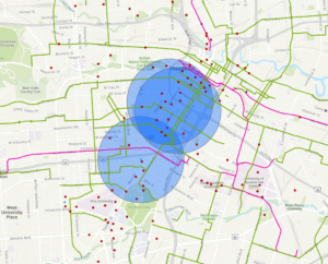
During this chapter, we went through how to map our own points on a graph, how to give them characteristics, and how to give them specific geographic coordinates. I thought it was really interesting using the app in order to add another point onto the map based on your current location, and then seeing this coordinate being replicated onto the ArcPro map.
One part of the exercise that gave me some trouble was when I was creating the symbols in the Status column. When I tried to create the other symbols, it often would only replace the first symbol instead of adding on to create the Dead, Unknown, and Ingrowth points. Once I figured out how to do it differently, the new points were in a new column. When I moved this graph to ArcOnline as well, it was missing the original point ‘Planted’ but had all of the other 3 points available to plot. I had to recreate the first point and redownload the graph to ArcOnline.
Chapter 7
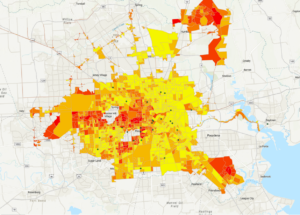
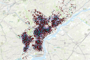
In this chapter, we examined data from the city of Houston, TX that looks at the local income of various neighborhoods, and the amount of roads, paths, bike friendly streets, etc for people to use. In 7b, we learned how to rematch correct locations with their addresses, that were originally mistakes in the data, and plot them on the map. In 7C, we mapped the bike lanes in the city, and created buffers for the paths within a 0.25 mile radius. We also mapped the number of bike stations in a given radius, to allow us to identify which areas of the city needed more accessibility to these resources.
I did not have any trouble with this chapter, and running the programs, which was very helpful.
Chapter 8
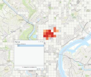
In 8a, the only issue that I ran into was that I could not make a separate layer for robbery_jan. I had the January data points showing up in my graph, but when I exported the features into a separate layer, it would not separate the regular robbery data from the January robbery data. I had to continue the rest of 8A just using the regular robbery data wherever it asked to input robbery_jan. Therefore, when I went to input the robbery density using Kernel Density, it shows up as a much larger density than what it is supposed to look like, if we were only using the january robbery data.
I also ran into issues in 8B. When i ran the hot spot analysis, there were only about 12 tiles that were colored in as hot spots. All of the other tiles that were supposed to be in the frame were depicted as “Not Significant”. When it was time to examine the pop-up, there was no SOUCE_ID, or Shape_Length, or any other descriptions of the popup file besides the OBJECTID listed. Therefore, I could not finish this chapter due to the issues it was causing me, and I moved onto chapter 9.
Chapter 9
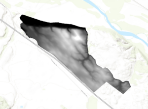
In 9A, we learned how to use the extract by mask tool to get the outline of a certain area to be the only one that was represented on the map. This is useful for when you are aiming to get the data on just one singular region only, and do not care about the data of the surrounding area, and do not want it distracting from the overall conclusion of your data.
When using the Hillshade tool, there is no part of the area that is in complete shade at the first time.
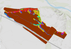
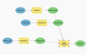
When adding the vineyard blocks and planning sites, there are 3 planning sites that have a great majority of low slope (less than 14 percent) topology. There are 3 planning spots that include at least some land that faces south, southeast, or southwest. There are 2 planning sites that might have an optimal slope and shadow combination, and thus would be the best spot for the vineyard, and that would be the plot on the far left, and the plot on the far right, both about half way down the slope of the hill.
Chapter 10
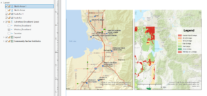
In the first part of the exercise, we are asked to separate the 70 Terrestrial Fixed Wireless, and the 71 Terrestrial Fixed Wireless from the rest of the data. There are many areas starting at the south west corner of Utah, and going up the middle of the state where there is fixed wireless technology. We learned how to make the data fade in and out of the map in a specific region over time, to show the progression in one figure. In the second part of this chapter, we learned how to label specific location points on a map, and how to format these specific locations into names on the map.
I ran into some issues when it was time for 10C, to create a presentation of the figures. The map was giving me trouble when I wanted to copy the scale bar into the figure, and when I wanted to put the north arrow into the figure as well. Every box that needed to be checked was checked, but it would not show up on the figure like it was supposed to. The name of the legend also would not disappear, even though I altered it maybe 8 different times. Overall, I still think I recognized how to insert a legend and a scale bar, it just simply would not work out for me.