My name is Natalia Mason, and I am a freshman majoring in Zoology and environmental science. I have an extremely strong interest in entomology and it is something I really enjoy learning about; although, zoology as an entire umbrella term is something that I find cool too. I had taken the desktop ArcGIS class and admittedly found it a tad bit difficult, but I have heard this class is more manageable, so I am looking forward to that. I have taken the Geog 292 quiz, looked through the ArcGIS online webpage, read through the Get Started: What is ArcGIS Online page, and all other things required of me.
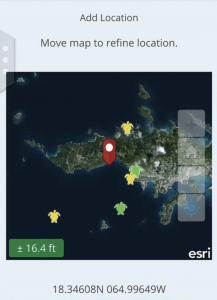
Upon looking through my ArcGIS online account I had found two things of note. The first thing I found was the community and forums tab that was attached to the account panel. Through it, one can find many resources that mostly seem to be geared towards offering map creation tips, and remedies for issues one might encounter when creating their own map. I feel as though this could be a vital resource, as it offers support in many different issues I may encounter, or helps me prevent possible mistakes in map creation. The help tab also seems to be a useful tool, as it offers support, without being generalized like the community and forums tab had been. It allows the user to search specific information and issues they might have encountered, while pulling data from existing tutorials.
I had read through the entirety of the get started page, and I found it to be relatively informative. A very interesting feature that the web design of GIS offers is offline accessibility. This feature is particularly geared towards field workers that collect data, so they are able to view and add data to their maps without having direct connection to wifi. I think this is a very smart feature to add because ArcGIS is geared towards a large population of natural science researchers. It also prompts me to wonder if this is a feature I will find useful in the future as I also intend to conduct field biological research. The second piece of information I found notable was the collaborative aspect of map creation. One way to do this is to set up groups that fall under the invitation only category in order to have multiple collaborators on a single map.
The ArcGIS Online basics tutorial showed me various things. One was that this application also offers base maps that an individual can apply to their map to convey a particular idea or to improve readability of their map. These basemaps can range from streets, to oceans, as the user has a large variety at their disposal. This is something that the Online GIS application has in common with the Desktop application. The second interesting feature to learn about was the distinction between a basemap layer and an operational layer. The former means a layer that acts the same as a backdrop, while the latter means a layer that contains some form of informational data. 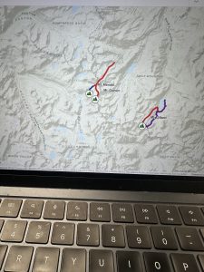
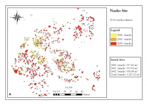
By searching up ArcOnline and beetles on google scholar, I found an interesting article that dives into the spatial distribution of Pine Beetles. The beetle in question is an invasive species in western Canada that gravely harms the forestry industry, so researchers had analysed their spatial distribution, in order to know which areas needed the most action in order to stop the infestation. The researchers had utilized ArcOnline to produce their maps.
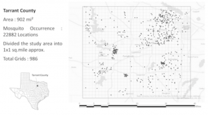
My second article was based on mosquito distribution in different temperatures and climates to see which areas their distribution was most dominant in. I had found the article after searching “ArcOnline,” and “mosquito.” The goal of this study was to understand mosquito behavior better in order to prevent further spread of mosquito borne diseases. There is a large known correlation of mosquito prevalence near bodies of water due to their semi-aquatic lifecycle, and the study reflected that.
Article Source: https://onlinelibrary.wiley.com/doi/full/10.1111/tgis.70009