Shaw Final

App 1:

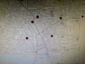
This app is designed to show people every hiking, walking, and biking trail in the state of New Jersey and also shows where all the black bear management zones are in the state. The idea of this app came from another app called all trails that shows users of the apps where trials are in the areas they are searching for. This app does not require users to report trails which most apps like this require. The app takes all its information from the parks department of New Jersey and their information of bears from the New Jersey environmental protection agency. This app will hopefully convince people that may not explore certain areas of the state like the Warren county areas because of its secluded areas to get out and explore without the fear of encountering a bear which is the most frightening animal you will come across. The trails would also be able to be live tracked which would allow people to track how far they have walked, ran, or biked while calculating elevation gain and other things that can be tracked. The app will be called NJ Trails.

App 2:

This app is designed to show where open job applications are in distance from the subway stations and lines in New York city. This will help people who work in the food industry and are trying to find a job or possibly look for a different job and want to know about their commute in the city. New York City is one of the most densely populated cities in the country with over 23,000 restaurants in the city and over 250,000 thousand residents that work in the city. There are constantly new ones popping up every day and restaurants closing every week. It is almost impossible for a simple line cook to figure out where to work next without putting hours of their own research into finding a new place of work. This application takes that stress and hours of work away and simply shows you when a new place is open to work with the simple click of a button. People are able to look at an opening and place their home on the map and see how long the commute would be. Restaurants would just have to post their job opening on the map and people who have the app will be able to get the alert that there is a new opening and see if it is a good fit for them to work there. This will help the businesses find workers faster and help residents who are in the job market find a place faster. The app will be called food 4 hire NYC.


(I could not figure out how to share it with the class so here are screenshots of them and they are public on Arc online)

Quartson Week 7-9 Final

For my final I created a Survey to collect data from students at OWU in order to find the best places to relax around campus. By understanding student preferences and experiences, the survey will map relaxation zones categorized by the features that make them calming and stress reducing. Ā It ask about their year in school which will help understand if relaxation preferences differ based on workload or study habits. The survey will ask about preferred relaxation methods (reading, socializing, spending time outdoors, etc.) to identify spots that cater to those preferences. Also knowing where students currently unwind allows the survey to identify popular and under utilized spots, potentially uncovering hidden gems. It will also allow them to rate Ā different preferences. Ā https://arcg.is/1Cj1T9

And then I also created an ArcGis StoryMap about homicides in Columbus. It gives data from this year and there is a video included that talks about the potential solutions. The map used for this pinpoints homicide locations throughout the city. Ā It gives details on each homicide like time of day, day of week, and victim demographics.Ā  https://storymaps.arcgis.com/stories/7dc47bed7641464bb3aea9d07d479798


Hagans Final

For my first app, I followed the format from Chapter 1 with the Redlands Attraction app. However, I created an app that had information about five different Dark Sky locations. Dark Sky International is a non-profit organization that aims to preserve the night sky, and they recognize areas all over the world as Dark Sky locations if they have protected land and skies. These places are all great for stargazing! First, I found the five locations I wanted to use on the Dark Sky International website (https://darksky.org/what-we-do/international-dark-sky-places/all-places/), then I created a CSV with the location name, a caption, and the coordinates that I could upload into ArcGIS Online. I also found pictures of each location and added them by enabling attachments on the layer. I saved this and created a feature layer that I used to create the web map. This part was pretty easy, it was mostly just opening the feature layer in the Map Viewer, then I could customize the basemap and style the points. Finally, once I made the web map, I opened it in the Instant App feature, which allows it to be viewed on different devices! Hopefully, this app is helpful for people who enjoy stargazing and want to discover some good destinations!

Here is the link to the app: https://owugis.maps.arcgis.com/apps/instant/attachmentviewer/index.html?appid=9fcd89442d8646c7ac7360aa8b230608

For my second app, I chose to show the change in ozone concentration in 10 US cities from 2000-2020. I modeled this app after Chapter 6. First, I had to find data on pollutants in the US, which was surprisingly difficult. I could find many sources ranking cities from most to least polluted, but none had actual data. Finally, I found data for ozone concentration on the EPA website. I found data for the years 2000 and 2020, so my app looks a little different than the tutorial we did in the book. Because I didnā€™t have data for the years in between, itā€™s more of an abrupt time slider rather than showing gradual changes over 20 years. Once I found the data, I had to put it in Excel in a way it could be recognized in ArcGIS. Then, I exported it as CSV and created a feature layer on ArcGIS online, where I enabled the time setting. After this, I opened it in the map viewer and had to play around a bit with the style so I could best show the changes in ozone since some of the values were very close. I found that the ā€œheat mapā€ style for the ozone concentration was the best for showing slight changes! Then, I added the time slider option and exported it into instant apps, which took forever to load! Eventually, I was able to add the map I created from the ozone feature layer to the instant app and add the legend and time slider! I wish I could have found more data from each of the years between 2000 and 2020 to show the change a little bit better, but I think this map gets the idea across pretty well! There may be a way to do this that I donā€™t know of, but I think if I could adjust the time slider (I played around with it and I couldnā€™t get it) to go from just 2000 to 2020, it might be a bit better, but for now, if you want to see the change, you just have to slide from 2019 to 2020! Again, while the map itself here isnā€™t super complex, I think for these kinds of maps, there is a lot more behind-the-scenes work with creating the CSV and finding the appropriate data. For the GIS 291 final, most of us used the Delaware County GIS data, so we didnā€™t have to create our own CSVs, but since ArcGIS online is a little more customizable, I imagine that most people will have to go searching for specific data and will have to format it correctly to upload as a feature layer like I did for both of my apps.

Here is the link: https://owugis.maps.arcgis.com/apps/instant/slider/index.html?appid=23e27784a1b04dc99b10a12bc9eac801

Allo Final

I decided to do my final on public health and ocean health.

I made a story about popular fast-food locations compared to county health rankings in the U.S. The story walks you through exploring the map and some of the counties with the most fast food and least healthy citizens. Public health is something that I recently have found myself really intrigued by, so this project came together very nicely in my head. I also included a video about the dangers of increased fast-food consumption and an article with a potential solution to this problem.Ā 

Link:https://arcg.is/0WaimL0


I also made a dashboard that looked at changes in global temperatures and ocean pollution to see if there was a connection between it and coral bleaching. I added links to websites to learn more about coral bleaching. I also gave some locations to search for on the map with severe bleaching, high temperatures, and pollution. I thought a dashboard like this would be a good way to see the effects of climate change and our role in keeping our oceans and Earth healthy.

Link: https://www.arcgis.com/apps/dashboards/8683e2e99af84f90ad8cbb4c3b5b9abb

Nagel Final Week

(Disclaimer: I still cannot get instant apps or any apps to work no matter what I try, it just ends up loading forever and ever on repeat. Waited three hours and gave up, so I just decided to redo everything in map and scene views. I can’t access any of the other apps or surveys from other classmates either, all of them either don’t load or say I don’t have permission access. I’ve been at this for hours and I yield. Dr. Krygier, you’re more than welcome to dock points for these not being true apps but at this point I’m at my wits end with this tech and its not worth the literal headache this is giving me. Hopefully this is still sufficient and gets my ideas across)

>>(‘Apps’ are linked in text)<<

App 1: 2D/3D Map

My main problem for selecting an idea from Chapters 1-4 is that this data just… wasn’t available or didn’t exist. For example, using a data layer which showed algal bloom or pollution predictive data in a certain area such as Alum Creek Lake. Said datasets did not exist. So I had to look at the web experience… and most of the data I wanted didn’t exist there either, so I had to improvise and go back to the introduction for an idea. Instead, I would try making a 2D/3D view of air traffic across the continental US… that dataset does exist but I don’t have access to it and need to install some kind of different program for ArcGIS Online to get it which I’m not doing. I could’ve done boat traffic but that data didn’t work, and there’s no way to convert a web scene into a web map so I was kinda screwed. So I had to stray from the path even more, finding two data sets which… sort of work together? Not sure what practicality it has for an ENVS setting or anything but it is in my interests. I managed to find a layer showing aircraft disasters in the 21st century and given recent events with Boeing, I thought it was fitting. Those kinds of things are also something I’m highly interested in, so this was really more for me than any of you… so sorry to disappoint on that front… assuming classmates are even reading this. I also couldn’t get the two maps to sync and transition between each other so I just ended up with a 2D and 3D map side by side, the 2D map showing a view of global air travel routes (the description doesn’t say how recent but it does say it was updated in 2023 and there’s really not any other data sets to go with that. The 3D map is semi interactive, showing the locations of aviation disasters that have occurred since 2000, the aircraft type, fatality count, etc. Yah this one just… didn’t work out how I wanted. I mean if you’re morbidly curious about horrible disasters, this one is for you?

App 2: Live Data

So I originally wanted to make a 3D view of Cleveland and use a topographical map and label some of my favorite fishing spots around the area and the stuff I’ve caught… but there’s no 3D data for Cleveland AND you can’t add labels or popups in the scene viewer which was just infuriating so I had to scrap that idea (much to my disappointment. Would’ve been a fun going away gift… maybe… I doubt any of you are going to be doing any fishing in the Cleveland area anytime soon.) Anyways, I went back to the live/real time data and had some more luck. Granted, I wanted to do air traffic but I don’t have access to those layers/files for some reason so… yah. So I went with the next best thing. My recent hyperfixation has been ships, specifically ocean liners. Unfortunately those haven’t existed since the 60s so the only data you can receive is from cargo and cruise ships. There I was thinking I could make a live data ‘app’ of ship traffic on the Great Lakes. How completely and utterly wrong I was… because that dataset doesn’t exist either. I found one dataset for real time vessel positioning since that showed up when hovering over the Great Lakes, but all the vessels displayed are in the Ohio River or in Chicago. The dataset didn’t have much of a description other than ‘real time vessel positioning in the surrounding area’. There’s a second dataset which shows the real time position of various large ships in different oceans… Yah this was a disaster.

chlebowski week 6

Week 6

notes para chapter 7:

  • Page 248 number 7 chose the layer USA States Generalized Boundaries
  • Page 248 number 11 chose population density instead of pop. per sq. mi. since that was not an available field
  • Same for the text as well

https://owugis.maps.arcgis.com/home/webscene/viewer.html?webscene=29ad4c671bc64dc599a71ade1b9994e6

  • Designing the 3d objects and watching them sprout up from 2d ones was very satisfying
  • I was blown away at the extensive 3d shapefiles that i was able to choose from, really allows for decent amounts of freedom and customization

https://owugis.maps.arcgis.com/home/webscene/viewer.html?webscene=0d46cf98aa2e4424ab1f58e5728916e4

Silly helicopter version

https://owugis.maps.arcgis.com/home/webscene/viewer.html?webscene=8871e440bc054329aff17731fc5ca08a

  • Added more silly large helicopters and cars that definitely do not have impervious surfaces left in the park to park at haha
  • Page 263 number 6 the analyze toolbar is the scene tool button
  • The slice tool option is very interesting, wonder what uses it could have besides like for aesthetic purposes of things clipping through other objects

it seems they havent cleaned up the public layer in a while


a biological application that could be used by 3d renditions of 2d map layers, especially by adding 3d objects into the layer is through making a visual map explanation of an experimental methods approach. this immediately reminds me of the chimney swift project that was proposed in 2018, a chimney shape file could have been used to put the idealized locations of said chimneys to give a very detailed explanation of where exactly they were to be constructed. this of course could be done with endless other project ideas, one that came to mind being placing 3d net shapes at locations where there would be the best chances to mist net and potentially band a song bird species of interest.

Tuttle Week Four

Chapter Three: Getting to know the experience builder. In the experience builder you can essentially code without coding. This is so interesting because I am able to add data from a public database and make it engaging without having to necessarily pay a fortune. Widgets are also so interesting because it allows the map to be interactive. Tutorial Three: 3.1 was fairly easy until I got to add a picture. I do not possess that ability because I am working with the sketchy online version of the textbook. I moved on to 3.2 once I realized I was stuck. The rest of the tutorial was easy. I could get through it. The only difference is that the aesthetics were slightly off because of the lack of picture. It was really cool to be able to add all of the information about hurricanes and earthquakes.

Chapter Four: Mobile GIS is a very cool way to create a simple application and how to do it on the go. Like the tutorial said, we live in a post PC world. Getting to make editable layers and design projects is such a unique skill that I will have once I am done with this class. Tutorial Four: The start of chapter 4 tutorial was really fun and intuitive. Once we got deeper into the tutorial it got more confusing. I had a hard time following it to be honest. It did stick with me just how easy it was to collect that survey data. I wish it didnā€™t make me download the app. I think that is one downside is that if itā€™s on mobile there might have to be an app. Less people are likely to fill that out when against say a google form.

Howard Week 7-9 (Final)

For the final project, I decided to create a survey using ArcGIS Survey123 and create a 3D scene.

Survey: I wanted to make a survey that could be useful for OWU, so I decided on making questions that would ultimately result in creating a map of study locations, along with factors that might influence where students do their work. I included questions on year, major/minors, on or off campus activities, how many hours a week the respondent spends on school work, where the respondent does most of their school work and if there is any place they don’t like to go to, how would they rate the study/work spots on and near campus, and what time of day during the week they typically do schoolwork. I believe that the results could show students and OWU staff similarities between characteristics and where they end up studying. Students can see where others involved in or studying similar things recommend studying, and faculty can see which study spaces aren’t used or liked by students.

https://arcg.is/0vfyaK0

3D Scene: I wanted to make a 3D scene mapping natural disasters. I found it hard to figure out the format of Scenes, and finding data sets that correlated with what I ended up focusing on (ex. data for specific area). I ended up focusing on California, since there was a lot of data on the state and natural disasters are common there. I first added a layer on earthquake epicenters, with taller 3d columns correlating to a stronger magnitude. Then, fires, as California is also known for those. I found a data set that included burn areas, prescribed burns, and other burns as well. I also found a data set on flooding and a damage score on buildings, but I made it a dot instead of 3D because multiple 3D sets looked very similar. Lastly, I found a data set on landslides and the reports made on them, and had to make it a 2D hashed line so it would be seen amongst everything else. Overall, I think this scene gives a good look at common natural disasters in the state, even if it was really hard to make.

https://arcg.is/0S0b9q

Gassert, Week 6

Week 6


Ā Ā Ā Ā Ā The return of 3D in GIS was not a huge shock. I like what it has to offer since it shows what the land/environment/topography actually looks like instead of just a flat map with labels. You can actually insert buildings and build a city with the 3D applications. I also find it interesting how 3D GIS is used for building cities in some movies. I can see how it helps the CGI artists with location accuracy.


Ā Ā Ā Ā Ā This 3D application was a little different from the 3D applications we used in 291. You can add whatever you want, and if too much is added it lags a bit (at least for me). If you really want to use the 3D feature, Iā€™d imagine you need a lot of storage space so that you can use it at its full potential. If it gets too crowded itā€™s hard to tell whatā€™s going on.Ā 


Ā Ā Ā Ā Ā As for an idea on how to use 3D in cities, it could be used to map out peregrine falcon nests since they like to nest on tall buildings. Biologists could utilize this to figure out how high up the birds tend to nest and the locations in the city they choose. Using the realistic 3D engine would make observations easier, as well as making it easier to find the nesting sites in the real world.