Week 1
My name is Dua Aasim, and I’m a senior double majoring in Data Analytics and Politics & Government. This is my Week 1 post, and I’m confirming that I completed everything assigned for this week. I reviewed the course blog, the syllabus, and the schedule, and I’ve created this posting as required. I also took the Week 1 quiz & downloaded Getting to Know Web GIS.
I poked around the account for a few minutes the way the assignment asked. Two things stood out to me: first, I like that this isn’t a local software like some of the stuff I am used to for Data Analytics, and I can access my work from anywhere. Second, the Community and Forums page was shockingly active. I didn’t expect to see so many current questions, responses, troubleshooting threads, and examples from real users. I honestly assumed it would be more “archive-like”.
I also completed the “Get Started: What Is ArcGIS Online” reading. Two things I learned from that page: First, I thought it was really cool that ArcGIS Online lets you combine layers from your organization, the Living Atlas, and your own uploaded data all in the same place and I’m honestly really excited to have access to so many sources of data. Second, web maps and web scenes function as the central building blocks for almost everything else you create in ArcGIS Online, whether you’re making dashboards, instant apps, or more specialized tools.
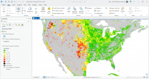
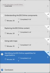
After that, I completed the ArcGIS Online Basics training course. I’ve attached my completion screenshot, and here are two comments on what I learned from the quizzes: first, I learned that there are so many specific sharing levels in ArcGIS Online which I assume is super handy when you want things to be a specific level of private. Second, I learned the distinction between basemap layers and operational layers: operational layers are the ones that allow editing, pop-ups, and analysis, whereas basemaps are for geographic context only and can’t be edited.
I also browsed additional ESRI courses under the Training tab and found a couple that looked interesting for later, and then I used Google and Google Scholar to look up GIS application examples by searching “ArcOnline” with different keywords. I found (https://utoronto.maps.arcgis.com/apps/MapJournal/index.html?appid=590a95cd059240388f003c49cd722dc9) this really cool Story Map titled “Sodomy and the City” which demonstrated the spatial proximities between taverns and consecrated grounds, and the religious ownership of transgressive spaces.
Week 2
In Chapter 1, I learned the basics of what Web GIS actually is and why it matters. The main idea is that GIS has moved onto the web, which makes maps and spatial tools way more accessible. Instead of having to install heavy software, everything can run in a browser. You also get the benefit of sharing maps with pretty much anyone. The chapter explains how the whole system works, starting with the portal, which is basically the home base where you store layers, maps, apps, and all of your content. I also got a clear picture of the difference between hosted layers and non hosted layers, and why hosted layers are easier to manage when you are working online. The chapter also talks about how apps, basemaps, and operational layers fit together and how all of this runs through the Esri cloud or ArcGIS Enterprise. It feels like a giant ecosystem that supports collaboration and makes GIS more flexible.
In Chapter 2, the focus shifts to how to actually make your maps look good and how to communicate your ideas. I learned about smart mapping, which is basically ArcGIS helping you style your data in ways that highlight patterns without you having to know cartography rules. I also learned how to set up useful pop ups, including adding photos and charts, and how to use Arcade to calculate values. The chapter also introduces StoryMaps and how they help turn a map into a full narrative. You can combine text, pictures, maps, and even swipe tools to guide someone through your topic. Overall, Chapter 2 is about taking your data and turning it into something people can easily understand.
My possible idea after reading these chapters is building a map that displays how fast fashion impacts a city, e.g. Columbus. Hypothetically, I would collect my own data on the locations of fast fashion retailers, thrift shops, repair services, and clothing donation points, and upload it as a hosted feature layer. Using smart mapping from Chapter 2, I can style each type of place differently to show the contrast between fast fashion concentration and sustainable options. I could also add photos as attachments and create pop ups that explain what I found at each location but not sure if this would be useful. Finally, if I desired I could pull everything together in a StoryMap to show how shopping patterns shape waste, affordability, and access to sustainable fashion in my area.
Week 3
Chapter 3 dives into ArcGIS Experience Builder, which honestly feels like the more modern, flexible option. What stood out to me is how Experience Builder lets you choose a layout first and then drop in widgets like maps, text, filters, sidebars, buttons, and charts. It’s basically a drag-and-drop website builder but built around GIS content. You can make single-page or multi-page apps, connect widgets so that selecting something in a dropdown updates the map automatically, and design the interface to look more polished and customizable. It feels more like building a real interactive dashboard instead of just a viewer.
Chapter 4 starts by explaining what makes Mobile GIS useful: it lets people view maps, collect data, and update features directly from a device, even offline. I didn’t realize how much depends on things like edit settings, feature layer views, and feature templates, which control what field users can see, add, or modify. The book also covers different strategies for building mobile apps such as native apps, hybrid apps, and web apps and how each fits different levels of customization or field needs. A big part of the chapter is about ArcGIS Field Maps, which combines map viewing, data collection, navigation, and form-based editing in one app. There are walkthroughs on making editable layers, preparing forms, and syncing offline edits. After that, the chapter introduces ArcGIS QuickCapture, which is more of a tap-to-collect app meant for rapid data gathering (like taking photos of damage or tagging assets while moving). Finally, it touches on AR: AuGeo, which turns GIS points into augmented-reality markers you can walk around and explore. I honestly didn’t know ArcGIS had AR tools built in, so that was surprising.
For my project, I could build a small Experience Builder app using a 2021 Freedom in the World dataset I have access to. It would have a world map styled by political rights or civil liberties, and a sidebar widget that shows each country’s full scores when clicked. I could also add a simple bar chart widget comparing regions. Using Experience Builder would make it feel more like an interactive data journalism piece rather than just a plain map.
Week 4
Chapter 5 focuses on caching and on-premises Web GIS. The biggest takeaway for me is that tiled cache layers exist basically to make maps fast. Instead of drawing every feature from scratch, ArcGIS stores pre-rendered images of map tiles so the map just snaps into place when someone zooms or pans. It makes a huge difference for high-demand apps. The chapter also talks about organizations that can’t use ArcGIS Online for security reasons (like government agencies or hospitals), so they run ArcGIS Enterprise on their own servers. Chapter 6 covers spatiotemporal data and real-time GIS, which was surprisingly interesting. Spatiotemporal layers store both location and change over time, so you can replay events like fires, storms, migration, traffic patterns, etc. The examples make it clear why you need a special data structure for this because normal feature layers can’t handle constant updates or streaming feeds. The chapter also explains GeoEvent Server, which ingests live data (like sensors or GPS trackers) and pushes updates to apps instantly. It’s basically GIS for anything that moves.
Last year, I worked with 311 city data for an internship. I think it would fit really well with the ideas from these chapters. I could take a month of 311 calls of potholes, streetlights, trash issues and publish them as a layer, then turn the density map into a cached tile layer so it loads fast. Since each request has a timestamp, I could also enable time on the layer and add a time slider to show how complaints rise and fall across the city. It would be a simple way to apply both caching and spatiotemporal concepts to data I’ve actually used.
Week 5
Chapter 7 of Getting to Know Web GIS, which covers 3D web scenes. This chapter felt different from the others because it shifts from regular flat maps to full 3D environments. The chapter starts by explaining what makes 3D important in GIS. Instead of showing only what is on the ground, 3D lets you show height, depth, and shape in a way that looks closer to real life. The book also shows the two types of scenes. A global scene is curved and works best for world or city scale projects. A local scene is flat and works better for small areas like neighborhoods or campuses. Chapter 7 also talks about the main kinds of 3D layers. These include point clouds from lidar, 3D objects like buildings, integrated meshes made from drone photos, and indoor layers that show rooms, floors, and hallways. I liked the examples where 3D scenes help people understand shadows, sight lines, visibility, and how new buildings might affect a place. The chapter also shows how 3D connects with newer tech like VR and XR. It is cool to see how GIS is being used in metaverse style tools, even if that still feels experimental. Another part I found interesting was indoor 3D GIS. I never thought about mapping the inside of buildings. The chapter explains how BIM data from architects can be connected to GIS so you can navigate inside hospitals, schools, or office spaces. To be quite honest, I didn’t even realize GIS softwares did that. My main question is how heavy 3D scenes are for normal computers. The book mentions level of detail and performance issues, so I wonder how realistic it is for small groups to use 3D regularly.
I could take my 311 data and build a simple local 3D scene where each neighborhood has a vertical bar showing how many requests it gets. Instead of a flat heat map, the bars would rise up from the ground to make the patterns easier to see.