Hagans Week 1

My name is Carsyn Hagans, and Iā€™m a sophomore biology and environmental science major! I just got done with GIS 291, so Iā€™m excited to see how this course goes.

When I was poking around ArcGIS, I noticed that it has links to a lot of different apps, and I remember from last semester that ArcGIS Online can be used for a variety of things. Also, there appears to be a pretty big online community that uses ArcGIS Online, and when I opened up the Blog and the Forum, there were a lot of posts and information about GIS, which would be helpful to anyone using the website that had questions.Ā 

When I looked through the Getting Started section, I noticed that while ArcGIS Pro and ArcGIS Online seem to have similar features, ArcGIS Online looks a little more modern and user-friendly, in my opinion. Because the online version can be done on a laptop, it is also nice to know I can use the Macbook keyboard shortcuts that I am used to. Another thing that I found interesting in the Getting Started section was the How to Visualize Weather section. This section talks about the different ways you can manipulate your scenes to show different weather effects, which seems like a very cool feature. Throughout this entire section, I mainly learned that there are so many ways to use ArcGIS Online to reach a diverse audience.Ā 

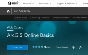
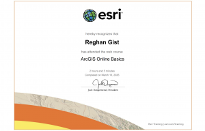
When I completed the intro course, a lot of it was either similar to how we created maps in 291, so I remembered it well, or I remembered it slightly from when we actually used ArcGIS Online. It was interesting to learn about some of the more specific ways that you can share web maps with specific people or groups, and it is nice that the Sharing tool is easy to manipulate. Also, it was interesting to see how ArcGIS Online is a little more limited in its capabilities than Pro, but it is still a very useful tool. Here’s my certificate šŸ™‚

One interesting way I found (on Google) that people have used ArcGIS Online is to map the distributions of reefs. Because reefs are so sensitive to temperature changes, lots of organizations are keeping a close eye on their health. People have used ArcGIS Online to map how reefs have become bleached and what their current conditions are. This is very useful for scientists or conservationists because it allows them to target their conservation efforts to one location that is at the most risk. Interestingly, I found a live feed of coral reef bleaching incidences that an organization keeps up to date with NOAA data!Ā 

https://hub.arcgis.com/maps/26e71d14067c4b3f8dd31d1a4e008cfb/about

Additionally, I found that ArcGIS Online can be used to share maps of animal distributions and populations. Specifically, I looked up the distribution and population density of sea otters, but Iā€™m sure there are many different maps that show how other species are distributed as well. I think this kind of information could be useful for a wide variety of people, from undergraduate students to researchers. These kinds of interactive maps can even be used in schools or museums when giving lessons on certain organisms!Ā 

https://www.arcgis.com/apps/mapviewer/index.html?layers=f631c975b1e348d89961eddc13b498a5

Allo Week 1

Introduction:

My name is Isabel Allo and I am a sophomore majoring in Biology and minoring in Nutrition. This is my first time taking a GIS class. So I created a new account.Ā 

Getting Started:

I looked around my profile and figured out I could add a profile photo, but I didnā€™t have a picture of the right size. In the settings, I couldn’t figure out the difference between the map viewer and map viewer classic. I like the Community and Forums part because I think it will be a good resource if I have a question or if I am confused about something. I clicked on a new map and found my house.Ā 

Reading:

One thing that I found interesting from the reading is what you do with this software is meant to be shared with others and collaboration is a big part of this. The software makes it very easy to share your work with others. I looked around the creating maps part of the reading and it makes me excited to start creating something. It’s very cool that there are so many possibilities for customizing a map. I also didnā€™t know anything about the scenes that you can make; that seems interesting too. I also like that this is about how to present data in a way that all audiences can understand and interpret efficiently.

Training:

I thought the training was very helpful. I liked the step-by-step on how to start creating maps and adding layers. I noticed a strong focus on the level of sharing that is possible here. I get the impression that this aspect is a very crucial part of this. I also didnā€™t realize before how customizable the maps and scenes are. There is a lot of room for creativity and a lot of possibilities when it comes to creating maps. With that, I now understand the role the apps play in presenting this kind of information.Ā 

Applications:

Using Google Scholar I decided to look up ā€œArcOnline Food Insecurity.ā€ I found an article titled ā€œGIS Project Helps with Food Insecurity and Waste.ā€ The headline reads ā€œAccording to the United States Department of Agriculture (USDA), Americans throw away 30 to 40 percent of the entire US food supply.ā€ Source: Baumann, Jim. “GIS project helps with food insecurity and waste.” ArcUser Fall 2020 (2020).

I also found another interesting article called ā€œThe Impact of the Via Bus System on Food Deserts.ā€ This study mapped all places that supply food and whether they were within walking distance of the bus stops nearby (ā‰¤ 0.5 miles and ā‰¤ 1 mile). Ā I thought this was particularly interesting because of how it considers the walking distance when determining whether food is accessible to all in the area.

Source: Maddox, Emily, “The Impact of the Via Bus System on Food Deserts” (2018). Theses & Dissertations. 347.https://athenaeum.uiw.edu/uiw_etds/347Ā 

Another interesting application I found was from the article ā€œEagles and Wind Turbines: Using Maps to Protect Animals and Increase Renewable Energy Useā€. This article was interesting because it shows a real application of an environmental scientist using this technology. This might be something I am interested in pursuing later on in my career so knowing that learning about GIS will be helpful is encouraging.

Source: Douglas Leeson, Thomas C. Hammond, Kate Popejoy, Alec Bodzin, Michael Hardisky & Sarah Lew (2022) Eagles and Wind Turbines: Using Maps to Protect Animals and Increase Renewable Energy Use, The Geography Teacher, 19:4, 178-182, DOI: 10.1080/19338341.2022.2117725

Benes, Week 1

  • I am Annabel Benes, a senior from Denver, Colorado. I just completed the GIS 291 therefore I am excited to see what comes next with GIS 292. I enjoyed the first course and look forward to learning new information for the rest of the semester.Ā 
  • Under my esri it said I didnā€™t have access, not sure what I missed in the login but I will set-up an appointment to figure it out. It was really cool to see all the different courses that could be taken. I also think it’s cool that we have access to looking at the blog and forums so we can have a further understanding of everyday applications.Ā 
  • I think ArcGIS online is really interesting. especially since you can access it anywhere from your personal computer and not be tied to a specific space. The notebook feature seems really cool and a good place to write down ideas and more in a consistent area. the wide range of data that can be shared and accessed is really cool./ being able to see various maps and content is really helpful. overall I already feel like this is more user friendly and will be easier to work with.Ā 
  • This was a very informative tutorial. I thought it was good to get a refresher about topics stated in GIS 291. I feel that this might be easier to work with but we will see.Ā Ā 

  • The two courses that seem cool to learn about are Create smart surveys and forms and creating an underground scene.Ā 
  • Two applications that I wanted to look into were Urbanization in Africa and Bears of the World. I thought these maps were really interesting and provided a lot of information and detail.

Schtucka week 1

Hi! My name is Pacey Schtucka and I am a first year at OWU. I am an Environmental Science major with a Geography minor. I took GEOG 291 last semester, so I already had access.

Poking around comments:Ā 

  • I went and added basic info to my profile while poking around the website.Ā 
  • It would not let me access anything on My ESRI, Iā€™m not sure if I am supposed to be able to see anything here. It said that I needed an invitation from an organization. I was logged in using my OWU credentials, and I also have accepted every invitation sent to me.
  • The ESRI community is really cool. I like that it is set up in a really digestible way. I also like that I am able to see what other people are using web GIS for. It acts almost as a discussion board. Here, people are able to share ideas, problems, and solutions.Ā Ā 

Get started comments:Ā 

  • From this reading, I am starting to understand the differences between web GIS and desktop GIS. I sort of feel like ArcGIS Online is a more universally friendly version of pro. It is able to be done from any online device, and it also seems more digestible. I also feel like ArcGIS Online is able to have a more collaborative feel than ArcGIS Pro. It is able to be shared with others more easily, and one of its marketing tools is that it is great for workspaces.
  • I think that ArcGIS Online having a notebook app is particularly interesting. In particular, I find it interesting that a mapping tool has a specific feature where users can brainstorm and perform analysis inside of the software itself. I also liked that this section gave me the option to view a sample notebook because I had no idea what it would look like, and see one helped me to better understand its uses.Ā 

ArcGIS Online Basics:Ā 

  • I feel like webgis is very similar to arcgis, but it also looks like it will be easier.Ā 
  • I really like that files can be stored in the software itself, and that the files are able to be shared over the software.Ā 

Taking advantage of ESRI online training:

  • Training that looks interesting:
    • Creating an Underground Scene in ArcGIS OnlineĀ 
    • Creating Stories with ArcGIS
  • One use for ArcOnline is to track deforestation. I searched ā€œArcOnline deforestationā€ and I was able to find articles about deforestation in specific areas or the globe as a whole. From searching around, I was able to see that ESRI has a particular interest in using this feature as an education tool to teach users about why they should care about deforestation. One source that I found stated that ā€œWWF has compiled and analyzed global data on deforestation and degradation trends, identifying 24 deforestation frontsā€ and the source also states ā€œwe use an emerging hotspots analysis to assess major trends and hotspots in tropical forests between 2004-2017.ā€ From this source I was also able to find a world view on deforestation, a part of this map is show below
  • Another use for ArcOnline is to keep track of data in a story map. I chose to search ā€œArcOnline student debtā€ as an example of a specific type of data that someone might want to track. I was able to find an interactive map that will show average student loan debt by US State and then percent of people with student loan debt. This sources talks about how they collected their data, and then how they were able to make the maps animate back and forth. From this, I was able to understand how I might be able to take data and make a representation of the data in ArcOnline that is easily to understand.

Source: https://storymaps.arcgis.com/stories/9c57e887cfd945b79a707fe293dbd4af

McFarland Final

For my first app I created a story map with an interactive map of the Big Island Wilderness Area in the upper peninsula of Michigan. I took a trip there over the summer and created this to give a description of what the trip was like for any other fishermen considering the trip. This corresponds to the second chapter of the book on creating interactive story maps.

https://arcg.is/TOfCf

The second app that I created utilized the WebApp builder to create a 3d representation of the populations of each county in Ohio. This relates to the chapter 7 section on making 3d maps. The added bonus to it being made with the WebApp builder is that it has a cleaner presentation and can be more easily shared. Applications are broad for this app, but I made it with people who are considering moving to ohio in mind, and when moving to a new state people often take county population into account.

https://owugis.maps.arcgis.com/apps/webappviewer3d/index.html?id=ec26f7f24eed407782934ab95de1ddf9


Pois Final

For my first app, I wanted to look into StoryMaps from Chapter 3. I ended up making a story map revolving around Sanibel Island, which is where my family and I used to travel every summer. Unfortunately, the majority of the island was wiped out by Hurricane Ian, so all of the pictures included are pre-hurricane. I customized how the story looks and it was actually a lot of fun, and I set up a tour of all of my favorite places we would always visit.Ā  I was able to see a preview of how it would look on different devices, and it was cool to personalize everything. I think it would be fun to utilize this feature for a project/presentation.

https://storymaps.arcgis.com/stories/96078b1a1a0348b7a42b9837d533e973Ā 

For my second app, I wanted to try out the 3D web scenes. I stuck with the same location and used Sanibel Island, and I found data that revolved around one of my favorite places included in my story, which is Ding Darling Wildlife Preserve. The data revolved around various tree species within the preserve, so I applied the layer and then made the trees/plots 3D, identified the species of trees in each area, and applied the labels. It was interesting to see the variation of things that I could do with the 3D functions and the data.

https://owugis.maps.arcgis.com/home/webscene/viewer.html?webscene=1b336d4731864293b4162ad4bb11b488Ā 


Rose Final

Rose Final:

  • My first map is a simple map showing food insecurity rates throughout the United States. One of the layers shows the rates around the country and how they vary based on shade of color. There is also a layer showing food banks around the United States through the Feeding America program, a prominent organization that aims on decreasing food insecurity throughout the country with food banks and providing proper meals and resources. This was sparked by my HHK background and my interest in public health and especially our food system. Although a very simple map one is able to see some of the hotbeds for food insecurity and whether or not they are being provided some aid from Feeding America food banks. This data allows us to analyze and try to help in the future.Ā 

https://owugis.maps.arcgis.com/apps/mapviewer/index.html?webmap=e1cd6f06ceeb4fa0b974bf8b6e39a777

  • This app shows the MTA subway lines throughout New York City along with popular attractions throughout the city as well. Many of these attractions include highly visited Christmas attractions like the Rockefeller Christmas Tree and more. Being from New York I know first hand how crazy it can get during the holidays. The idea is to help people, mainly tourists, who are not comfortable riding the subway lines or navigating New York find their way around using the subway line and visiting attractions. This would best be fit for a mobile app that everyone can use and access on their phone with ease.Ā 

https://owugis.maps.arcgis.com/apps/instant/notification/index.html?appid=1e0ee9b107ed47f28882b17121f7b87d

Gullatte final

I made an app based off of the first few chapters we read. I made an app that allows people looking specifically for condos in Delaware to do just that. It is interactive so it allows you to click the locations of the condos. It will tell you the name and the numbers of lots it has in total. My plan was for this to be a mobile app so people looking for condos could do it with ease. I think I turned the data into a scene and then uploaded it to the final app.Ā 

https://owugis.maps.arcgis.com/apps/instant/3dviewer/index.html?appid=132633a1a10e4bb39714dd17acf158c5

This map is sort of an exhibit map. I used the 911 data from Delaware county to show others the heavily populated areas and if they were to build a new police station, where I would put and why. It is a neat concept and you can go through each slide that I presented and see what specific area I am talking about. This could be useful if presented in a better manner to the government if they were planning to build more police stations.Ā 

https://owugis.maps.arcgis.com/apps/instant/exhibit/index.html?appid=67c83c5ef3c3428c88a80d9fe9287bf2

Hollinger Final

Chapters 1-4 App:

https://owugis.maps.arcgis.com/apps/instant/attachmentviewer/index.html?appid=1df466deebe8476e86a28f4c0d4ace68

For my first app, I decided to create my idea for Chapter 1. It is very similar to the Redlands Attractions Map Tour, but I decided to do a tour of some of Ohioā€™s State Parks. First, I had to compile my data and create a CSV. I picked 5 state parks: Salt Fork and Mohican because I love to go camping there, Wingfoot because I worked there, Alum Creek because itā€™s so close to OWU, and Hocking Hills because the geology is so unique! After I decided on my parks I created columns for their longitude and latitude and filled them. Then, I made a column for a Description/Caption. I described each park based on the ODNR website information or on what I already knew about the park. I then embedded the link to the website. I then went to ODNRā€™s public Flickr account and found a picture for each park. I downloaded this CSV from Excel and uploaded it as a hosted feature layer. I then enabled attachment on the layer and added my images. Then I configured the symbology for the points and chose which fields to include in my popups. After that, I created an Instant App with the attachment viewer template. I chose to use an attachment-focused view instead of a map-focused view like we did in the exercise because it looked aesthetically better. After that, I published the app. I think this app would be really useful for people who are visiting the state or just looking for parks to visit!

Chapter 6-8 App:

https://owugis.maps.arcgis.com/apps/instant/slider/index.html?appid=333c829c01d04c5889cd37dacec4c463

I made this app based on the content in Chapter 6. My original idea was to do a time series on freshwater usage around the world over time. However, the time field was not working on that data, so after trying to clean and modify it I decided to just find a different dataset. This one was for a Store in the United States and it tracked their sales and where people ordered from overtime. So, I created a hosted feature layer and then configured my map. I symbolized each sale with a shopping bag and set the attributes I wanted to display in the popups. If you click on a sale it will now show things like whoā€™s order it is, the price, the location, what they ordered, when they ordered, and shipping information. I then made sure the Time Settings were enabled for my layer. After this, I created an Instant App with the Slider Template. I customized the color of the time slider to match my sale icon and I added the legend to the map. Then, I was finished and published the app! I think this would be really useful for employees at all levels of this business to see what type of products are selling, where they are selling to, when they are selling, and for packaging and shipping items.

Here is the link to the store data I used:Ā https://www.kaggle.com/datasets/blurredmachine/superstore-time-series-dataset/


Brokaw final

https://owugis.maps.arcgis.com/apps/mapviewer/index.html?webmap=d48f82d6a2e844f4958f5b265a9abe55

For my first application I created a map of Delaware County, OH and the zip codes within. I then used ArcGIS online to search for all water wells in Ohio. All of the blue dots are locations of water wells sites. I feel this application would be useful seeing how many people still use a well today or are reliant on city water.Ā Ā 

https://owugis.maps.arcgis.com/apps/webappbuilder/index.html?id=e49e6fc8084544b3ba7ae7202b161b8

For my 2nd application I used the ArcGIS Web AppBuilder to display an interactive web page display of Ohio and all oil and gas fields. Using the App builder and this theme you can search for an address or place, find the legend, filter, and also have directions from one location to another. I think an application like this would be useful for having to visit multiple locations in a short period of time.Ā  The blue dot isĀ  your current location and is a feature you can choose to add.Ā