GTKWGIS Chapters 1 & 2
Chapter 1
This chapter reviewed the basic concepts of Web GIS and ESRI, its importance and the building blocks to it.
Web GIS is a combination of the web and geographic information systems. Since the first GIS was developed in the 1960s, it has evolved from a local file-based computer system to multiple servers. The web offers global reach using web technologies such as JavaScript, Web Graphics Library, Websocket, etc. It also serves a significant purpose in our society, particularly in areas such as our government, businesses, scientific advancements, and daily life.
There are multiple patterns of Web GIS applications, such as: Mapping and visualization, data management, field mobility, monitoring, analytics, designs and planning, decision support, constituent engagement, sharing, and collaboration.
Web GIS is able to perform its capabilities thanks to ArcGIS Online and ArcGIS Enterprise, acting as software that the web can use from its multitude of hosts and platforms. These represent the new-generation of Web GIS, where users can search, discover, and use the layers, maps, and apps on desktops, in web browsers, and on mobile devices anywhere, anytime. Web GIS also provides the privilege to create and join groups, share content items containing data, and content items that have indexed metadata, as well as the option f keep their information private.
There are 5 types of content items: data, layers, tools, web maps + scenes, and apps. Data can be used to publish web layers; web layers can be used to create web maps and web scenes; web maps and scenes, and web tools can be used in apps or to create apps. Apps are what bring Web GIS to life. Bundles of apps are organized by ArcGIS to make it easier for the user.
Basemaps + Operational Layers + Tools = Web GIS map
I learned how to use these components back in GEOG 291 as well. Basemap layers are essentially the context for the app, a 2D or 3D background. Operational layers are simply interactive theme layers; they have a large range of uses. Tools are what perform the tasks beyond the initial mapping, like routing or geocoding. The tutorials in this book teach readers how to build Web GIS apps. One is Attachment Viewer- an instant app template to build an app. It has three main sections: map pane, attachment pane, and feature pop-up pane.
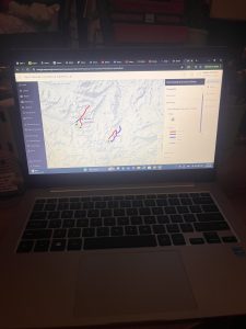
Tutorial 1: Introduces the main attractions in Redlands, California. This tutorial was very tedious, but it taught me a lot about the basics and mechanics of making an app. At times, the tutorial didn’t exactly line up with the app, so I had to guess through a lot, but it was overall fulfilling to see it up and running afterwards! https://owugis.maps.arcgis.com/apps/instant/attachmentviewer/index.html?appid=295da18970b44b6ba2b9d2aed5e6b194
Chapter 2
This chapter goes over smart mapping and storytelling with GIS. It explains web layers and how they are the building blocks of web apps. It also explains feature layers, being web services you can reuse in web maps, scenes, and apps. These will definitely be important to remember for any future projects. Hosted feature layers organize layers of data in ArcGIS- good for visualizing data on top of editing. There are many forms of hosted layers. The chapter also explains how to make your own feature layer from your own data, from an existing template, or even an empty feature, to have full control over each field. Moving on to smart mapping, intelligent defaults are used to allow for various results. It analyzes your data quickly in many ways, suggesting the right defaults when you add layers and change symbolizing fields (for example, a smart map using symbol color and size to show one or two numeric fields).
Storytelling using WebGIS, the experience a user has is extremely important and depends on factors such as how fast, easy, and fun an app is. (“dont make me wait” or “dont make me think about what button to click”). Another part ot storytelling with Web GIS is the 5 Ws: who, what, when, where, and why. Where is about location, when is about time, and what is about theme.
Maps + Narrative + Multimedia = Story
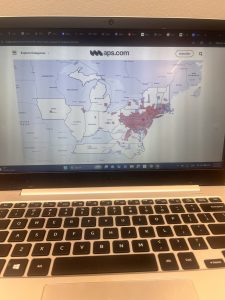
Tutorial 2 went much smoother for me, especially thanks to tutorial 1. It showed me how to create a Web GIS app that has spatial patterns of US population change, explore the reasons behind the patterns, and share what Ifound with the public using an ArcGIS StoryMaps story. I had no trouble making the feature layer as the geocoding wasnt super new to me. My favorite part was stylizing my layer as the smart mapping was easy to follow. There was a point where I had to use Arcade, which confused me, it was to make pop-ups but I got lost at some points. I also appreciated the questions and answers at the end, I used those a lot to fact-check myself.


 .
.