Miller – Weeks 3+4

Week 3

Chapter 3 introduces the Experience Builder, which allows users to create interactive experiences using maps, widgets, themes, and layouts. Each web experience starts with a template or blank document, and users can add a theme for visual appeal. You can then add your own maps or maps made by other users, and use message or data action widgets to refine map data or the map’s extent. 

The tutorial was pretty straightforward and involved using many widgets, which were more time-consuming than difficult. 

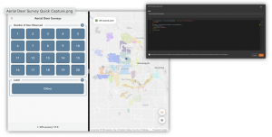
Chapter 4 focuses on mobile GIS applications. The three main approaches to building mobile GIS apps are native apps, web apps, and hybrid apps, emphasizing practical uses for these tools, especially for field data collection. A major portion of the chapter covers creating smart surveys with Survey123, designing forms in the web designer, and collecting data in the field. It also explains how to edit feature layers and templates to ensure consistent, accurate data entry. The chapter continues with ArcGIS field maps, showing how to prepare web maps with smart forms for map-based data collection. It also introduces QuickCapture, which allows for easy one-tap data capture in the field. Finally, the chapter explains AuGeo and explains how to prepare spatial data for AR visualizations and use it for understanding geographic context. 

The tutorial was different from previous activities in that it added the aspect of collecting data with Survey123, the Field Maps mobile app, and QuickCapture, which I found interesting and potentially useful. AuGeo was also really cool to use, and I really liked the interactive experience it provided. 

One application that could be created from these chapters would be using Survey123 and Field Maps to better monitor water quality in a county or city. This would allow for a higher quantity of reliable information to be shared among those involved in the water industry or in environmental science fields, where water quality is a growing concern. 

Week 4

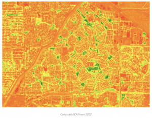
Chapter 5 explains how caching is important for improving the performance of web maps. By pre-generating map tiles with tile layers, systems can be applied to maps much faster than rendering data. This is especially important for datasets or applications that are large. In short, tile layers trade flexibility for speed, in that once they are cached, they are not easy to edit in real time. The chapter also explains on-premise Web GIS, which is where GIS infrastructure is hosted locally rather than in the cloud. This allows users to have more control over data and who has access to it. Cloud-based GIS and on-premise systems appear to have individual benefits of control and convenience. 

The tutorial for this chapter began with adding a portal connection with ArcPro, then adding a web layer and publishing a map from ArcPro as a web layer and a raster tile layer, and comparing them. I did not previously know that ArcGIS Pro and Web versions could be connected so easily, which I will definitely use in the future.

Chapter 6 explains spatiotemporal data, which adds the aspect of time to GIS, and allows users to see patterns over time. This can be moving, discrete, stationary, or change, each of which is a different type of change. This is especially useful for things like weather or other environmental changes. Real-time GIS can also be used to take in live data from sensors, GPS, and IoT systems. I thought that the application of IoT to create smart cities and homes to better manage resources within them was a very interesting real-world application of GIS. This chapter also explains ArcGIS Mission, which from myn understanding, is similar to a forum where users can find works related to a cause they are interested or working in. 

The tutorial for this chapter involved creating a web map, a dashboard app, and using arcade. Then, dealing with temporal data, creating an animated web map. 

I would like to use cached tile layers to create a live or animated traffic map to better inform the residents of Delaware, Ohio about the current status of roads in the area, as I feel that there is a lot of unnecessary traffic in odd areas of the city. This could also be used to urge local government officials to put more resources into the planning and development of roads, in ways that would better conduct the flows of traffic based on where it is occurring now. 

Miller – Weeks 1+2

Week 1

Hi all, my name is Luke, and I am a Junior ENVS Major here at OWU. Having already taken the 291 course, I was already familiar with the layout of the class page and website. I did, however, go into the settings and change the theme to “coffee”, which I thought looked nice, and also added a short biography to my profile. 

While reading through the “Get Started” article, one thing that stood out to me about ArcGIS Online was how much easier it is to share maps and data with the Online version compared to the Pro version. Being able to collaborate and share information seems like a very useful aspect of ArcGIS Online. Another aspect I read about in this article was that ArcGIS Online is also available on iPhones and tablets, which seems like another very useful feature. Overall, ArcGIS Online appears to be a more accessible software, with more emphasis on collaboration and sharing than the Pro version. 

In the ArcGIS Online Basics training course, I learned about the sharing capabilities within the software, such as the private, group, organization, and public sharing options. These options allow users to limit access to maps that might be private and share them with their desired audience. I also learned about the different types of layers, such as features, tiles, and map images, and how to identify whether a layer is a basemap layer or an operational layer. 

Two courses I found that might be interesting to complete were the “Forest-Based Classification and Regression Analysis Using ArcGIS Pro” and “Analyze Imagery with Raster Functions Using ArcGIS Online.”

One article I read came from the ArcGIS blog and explained how mapping can be used to display urbanization patterns and the expansion of urban areas. This can be done in a variety of ways, but the most common is measuring green space within an area and calculating NDVI, as shown in the image below. 

https://www.esri.com/arcgis-blog/products/arcgis/imagery/use-imagery-and-demographics-to-address-rapid-urbanization 

Another study I found interesting came from a parks district in my home state of Minnesota, which used aerial drone imaging to take pictures of deer, then used ArcOnline to create deer zones to better understand local deer populations. 

Week 2

Chapter 1 emphasizes the sharing capabilities of ArcOnline and how it can be used at any level of experience with GIS mapping. In short, the online version makes GIS more available to everyone, allowing GIS users to share information with peers in other professions and the general public. Content types were also highlighted in this chapter, such as data, layers, web maps, scenes, tools, and apps. It also explains the difference between basemaps and operational layers, in which basemaps provide reference or context, and operational layers can be edited by users for whatever purpose they need. I also learned about the difference between hosted and non-hosted feature layers, where hosted layers use data stored within the ArcGIS software, and non-hosted data comes from outside sources that a user or organization uploads. Attachments can also be uploaded to Arc and used to include more information or a visualization of a location on a map. 

The Chapter 1 tutorial showed how to create a map, upload imagery and files, and do basic edits to it, such as editing data within a point. It also explained how to share a completed map and how to create a web app from a web map. 

Chapter 2 dives deeper into the many types of layers and how to publish them. It also introduces the concept of smart mapping, which allows users to style their layers so that their maps display an intended purpose. Some examples of this are heat, color, and size, relationship, dot density, and type and size map styles. Pop-ups can also be useful for creating a more detailed map. When a location is clicked, a default pop-up shows the list of attributes and values for that location. Users can also add images, charts, and other external data to pop-ups to create a more interactive map. This chapter also highlights the different ways that users can explore and preview maps, such as map tour blocks and slideshows.

The chapter 2 tutorial showed how to edit layers using the styles pane, and how data can be displayed in a way that is visually appealing and makes sense. Using storymaps was a little complicated with how many options there were to add different types of text, images and animations. I found the express maps to be useful in creating a quick and simple visual. 

One application I thought of was to use data from colleges and universities to visualize changes in student enrollment over a period of time. This could be used to see trends in the preferences of college students when selecting schools, which could be used by schools to make changes to meet their enrollment goals. This could also be further developed into a web app that allows prospective students to suggest where they should go to college, based on how their interests and educational needs line up with those of students currently attending those schools.