Hi, my name is Rene Villanueva Henkle, and I am a senior at OWU. This week I did the quiz and looked around the ESRI portal.
I had already put in information on my profile in 291, so I did not need to worry about that. It’s nice that there are so many resources available to new users on the ArcGIS site, and that there are many others willing to help as well.
I’m excited to see other people’s projects on ArcGIS, I remember Dr. Merkel showed us someone’s 1:1 recreation of Middle Earth in her Folklore class, and I found that dedication fascinating. I also think that the aspect of making interactive maps that others can truly connect with is a very powerful tool.
I had no idea that there were so many different layer types within ArcGIS, I figured that this would be a much simpler program than ArcGIS pro. I will have to spend some time learning about the apps that I can use to help make data accessible.
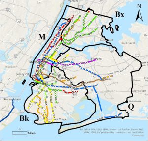
This map shows all subway related fatalities in NYC over a 13 year period between 2008 and 2021. I would have expected there to be much more fatalities per line within Manhattan as it is the densest area, but there seems to be the same amount of deaths along each line, no matter if in Brooklyn or Queens.
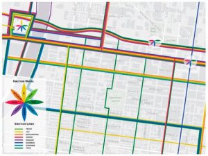
This map shows recorded emotions by travelers when on these commuter routes. The colors indicate an emotion that is shown in the legend. Hotspots are represented by a flower on the map itself. I find this way of looking at cities to be largely beneficial and can really help with urban planning by showing where problem areas are.