Update 7/25/2022
100 points
Assign: Monday, November 7
Due: Monday, December 5
Time and Animating Maps
Maps have been static throughout most of their history. Most maps showed static data, or at least data that suggested it represented one specific time.
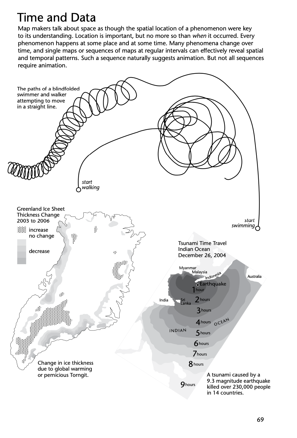
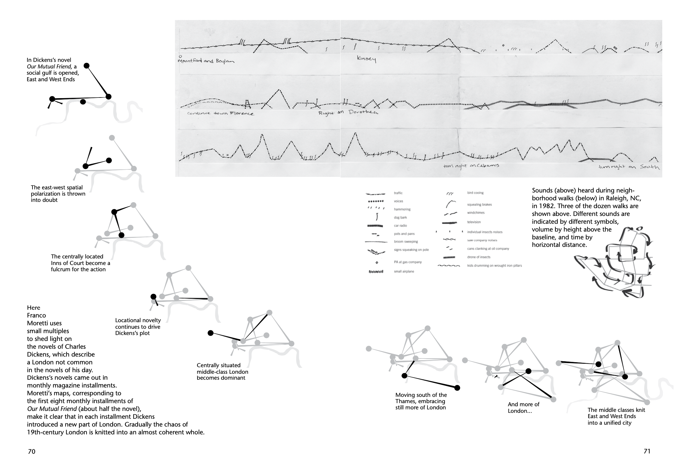
It is possible to show temporal data with static maps. Some examples from Ch. 3 in Making Maps follow.
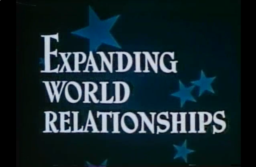
Early animated maps were created using cel animation techniques – just like cartoons. This was a tedious and expensive process.
Expanding Word Relationships (1947)
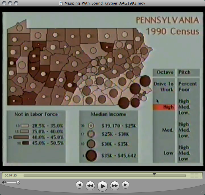
By the 1990s map animation could be done on a Mac or PC and exported to video. Various examples are shown in this skeevy old video I made in the early 1990s. Making Animated Maps with Sound
Animated maps are relatively common today, especially with natural phenomena like the weather.
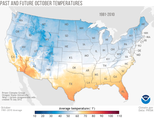
Or past and predicted October temperatures in the US.
Statistical, human data can also be animated. Below is a map of C02 Poisoning in the US.

(source of some of the above maps is here)
In general, the idea is that showing data that has a temporal component on a map that actually changes is somehow more effective for understanding the data. Maybe!
The growth of Walmart, animated:
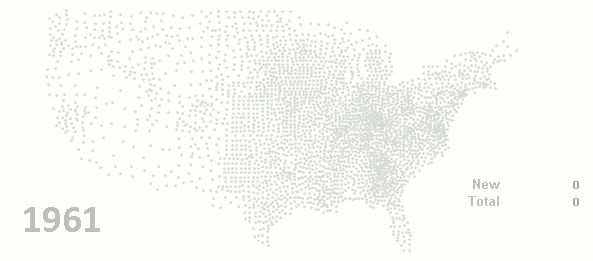
The growth of Walmart, small-multiples:
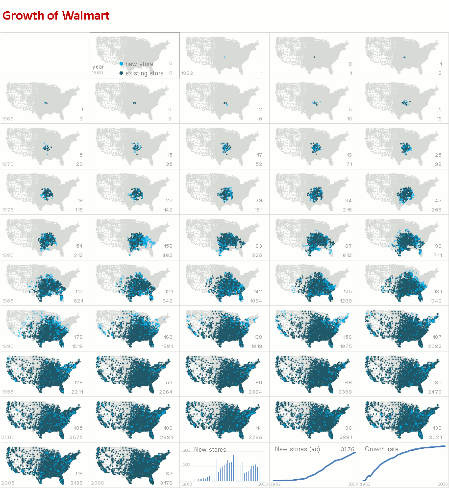
(Source of Walmart maps)
Review ArcGIS Pro Animation Basics before you start this lab. Jot down two options or ideas that are discussed in the review in your Lab Log.
Animating our three map types
Much of the work towards animating your maps has already been done in all the data organization done in labs 3 and 5. You have already watched your animated maps in ArcGIS Pro. The goal of this lab is to get the animations out of ArcGIS Pro and in a form you can embed on your course web pages. Thus, you need to revisit your HTML and update those pages with your exported, animated maps.
I’m using my file and project names below. Substitute yours.
Animations (in ArcGIS Pro) are composed of keyframes, which in our case consist of a map from each decade between 1900 and 2020. Keyframes can be set with certain characteristics (like type or graphics on the animation) and the transitions between keyframes can be adjusted.
We’ll run through the process with your choropleth map (graduated color) and you can manage the other two map types on your own.
As with other parts of ArcGIS Pro, the animation capabilities can be tricky and a bit confusing at times. Move methodically through the process and don’t get frustrated.
Open your ArcGIS Pro project and make sure everything is complete up through Lab 7 – and that all your classification and symbolization work is done and reviewed by your instructor. Any changes to the classification and symbolization will require you to repeat the process below to create a revised video.
Click the View tab, and above Animation click the Camera Add symbol (Add Animation)
Right-click on Wisconsin_Choropleth and Zoom to Layer to properly scale your map
Under the purple map tab (way at the top) click the Animation tab
On the left, above Create, click Import then Time Slider Steps
Your animation timeline shows 14 keyframes, one for each decade of your data
Under the purple map tab, and animation, the duration of the animation is 39 seconds.
Change the duration to :14 (one second per frame) and Enter
Hit the Play button (Playback) to watch the animation at the current speed
Obviously, you can putter with the animation speed if you want, along with other animation characteristics. Feel free to explore options: ArcGIS Pro Animation Basics
Add the Year, Title, and Legend to your Animation
In your Keyframe Gallery (at the bottom) click once on your first map and shift-click once on your last map to select all.
In the Overlay section of the menu (circled, below) click to expand all overlay options:
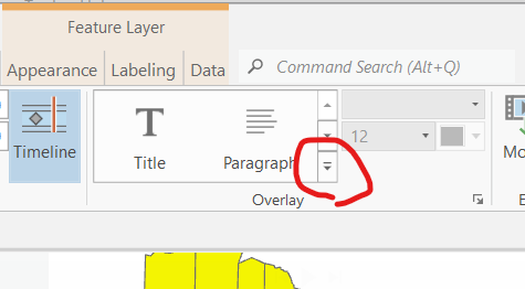
Under Dynamic Text click Map Time
Replace the two lines of jibberish with this jibberish:
<dyn type=”animation” property=”startTime” format=”yyyy”/>
[if this does not work: leave one line of the jibberish, add “yyyy” as the format then orange x it closed]
…and click the close box (orange x in box)
Play the animation. You can adjust the type size of the year.
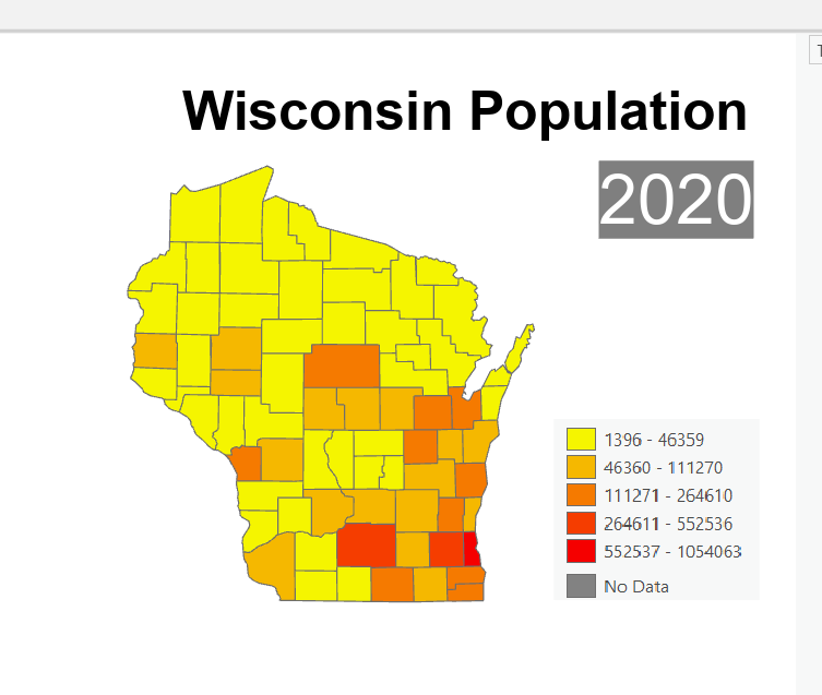
Add a static Title for your state to the map. Mine is Wisconsin Population
Add a legend to your animation
Open up the legend under the Wisconsin_Choropleth layer
Use the Windows Snipping Tool to grab just the legend:
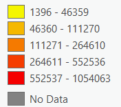
Save the legend to the Desktop
Open the Overlay options and click on Image
Add to the animation, adjusting the size and location.
Save.
Each state is shaped differently, you will have to putter to fit the title, year, and legend on the map in a way that looks ok. Have your instructor review your work before you export to video.
Export your Animation to Video
Your map and the layout of the various “map pieces” – title, year, legend – visually arranged on the screen reflect the output when you save to video in ArcGIS Pro.
You will have to move windows around in ArcGIS Pro, possibly closing some, so that you can see your entire map as well as the map pieces. My map is below, right before I exported it:
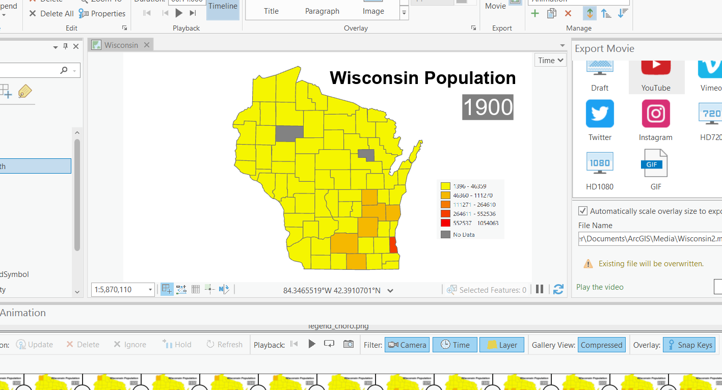
In the Export area of the menu, click on Movie
There are various options here which in essence vary in resolution. YouTube, for example, is lower resolution than Vimeo. You need to know what you are doing with your map animation video to make the correct selection here.
We want to embed our videos in our HTML pages. In order to do that, we need a site to host our animated maps. YouTube is an obvious choice, as it’s part of your Google account. If you want better resolution, you can chose Vimeo (but you need a Vimeo account). Vimeo is free but has a limitation on how many videos you can upload.
There are various other options you can adjust during export.
Please save the video to a location you can find, possibly your HTML folder.
Before exporting the graduated symbol and dot map animations, I suggest uploading your video to YouTube (or wherever you chose), getting the embed code (from YouTube) for the video, then placing that code in your HTML. Upload the updated HTML to your OWU server space and take a look. If there are problems (size, layout, resolution) go back to ArcGIS Pro and adjust and reexport. Once your choropleth animated video is done, move on to the next two map types.
Uncheck Wisconsin_Choropleth and check Wisconsin_GraduatedSymbol.
Since you are creating a new animation (different map) you should delete the keyframes from the first map and begin the process over (Import Time Slider Steps).
It’s possible you may be able to keep the year and title from the original map, but I haven’t quite figured that out. Be patient!
Completing the Lab
By end of class on the due date:
- two ideas or options from your review of ArcGIS Pro Animation Basics.
- three videos, exported and embedded in your HTML pages (on the web).