Update 7/13/2022
100 points
Assign: Wednesday, Sept. 28
Due: Monday, Oct. 10
Getting Data into ArcGIS Pro and Processing for Animation
The data (historical population, by county, for your state) downloaded from the WWW must be processed in order to use it in ArcGIS Peo. There are two basic data processing tasks involved in this project. In Lab 3, you used Excel to clean up and combine your data into an Excel file.
In Lab 5 you will import your .xlsx file into ArcGIS Pro. Additional processing is required to prepare the data for animation. For now, we are working with the total population data. In the past we have calculated percent population change (which is more interesting to map) but ArcGIS Pro is making this difficult to do with data intended for animation. I’ll update this lab when I figure out an easy way to generate the population change data.
The Details
The process below consists of getting a map of your state by counties, adjusting it’s map projection, then processing your total population data in ArcGIS Pro so that it can be animated. That data will be joined to the state map, and a few more adjustments made for animation.
With the new ArcGIS Pro, this is a brand new lab with instructions that are bound to have some errors and typos. Let me know and I’ll fix them.
- A map of your state counties in ArcGIS Pro
I’m using Wisconsin as an example. Substitute your state name.
Open ArcGIS Pro (shortcut on desktop)
Under New > Blank Templates > Map
Name: Wisconsin
Location: Documents\ArcGIS\Projects (yes, create a new folder for this project)
Contents: change “Map” to Wisconsin
Right click on Wisconsin > Add Data
Navigate to: C: GIS Lab Data > ESRI > ESRIDATA_2000 > usa > counties.shp
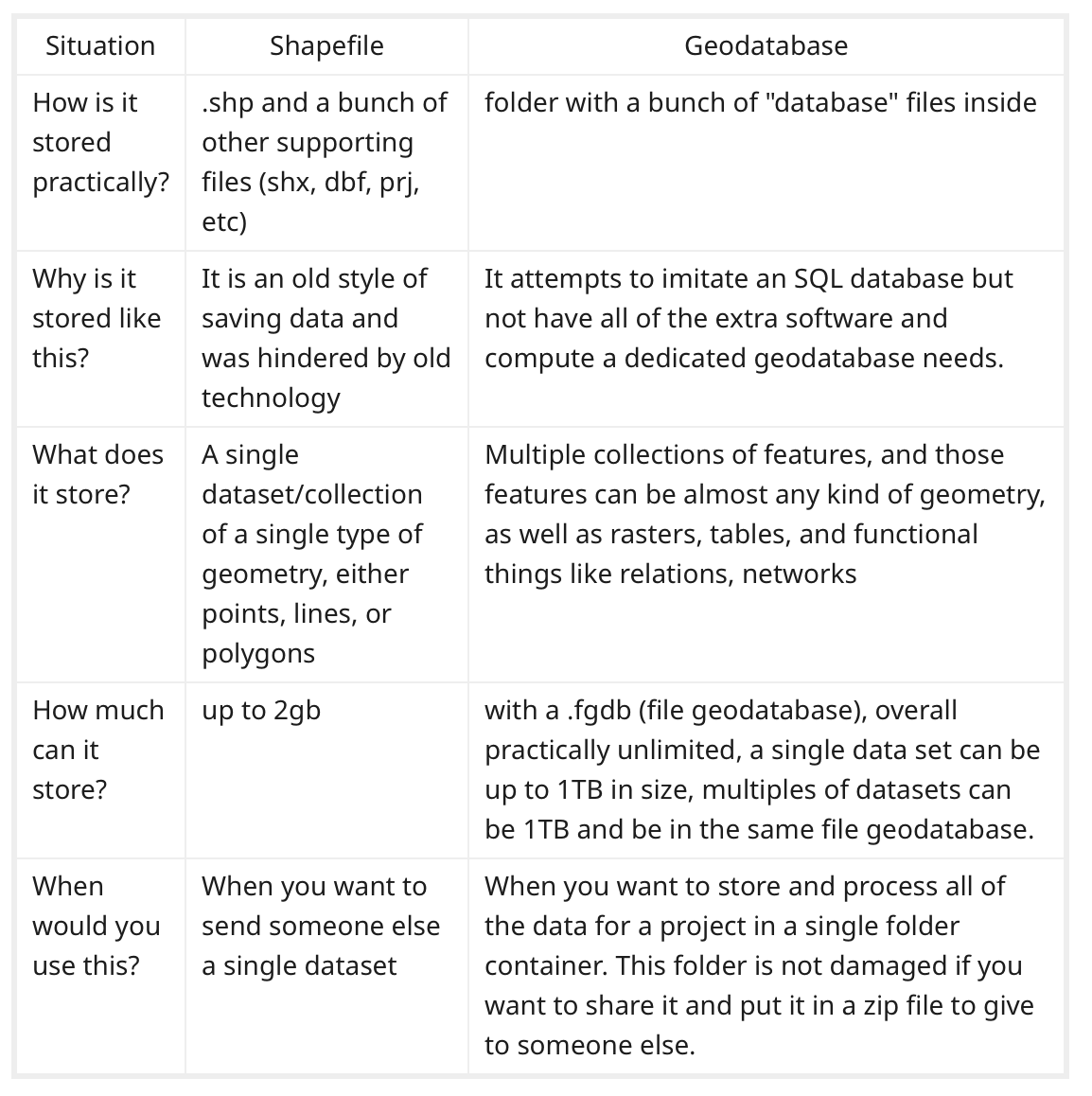
Fun Facts: shape (.shp) files vs geodatabase (.gdb)
Click on Map tab at top (to right of Project)
Click on Select by Attributes
In pop-up, next to Where select STATE_NAME
is equal to
select WISCONSIN > OK
We have selected WI out of the entire US!
Right click on counties layer in Contents (on left)
Selection > Make Layer from Selected Features
Change name of new layer – “counties selection” – to Wisconsin Counties
Right click on original “counties” layer in Contents > remove
Also remove Topographic
In Map tab, click on small globe to upper right of Explore: full extent
We are actually still using the counties.shp data, thus the extent is the entire US, but can’t see the rest. We need to extract and save our state counties as a separate file.
Right click on Wisconsin Counties
Data > Export Features
- Output Name: Wisconsin_Counties (underscore is important)
Remove Wisconsin Counties layer (the layer without underscore)
Click Full extent icon: state should fill screen
Save project
Use the Windows Snipping tool to make a screen shot of progress to this point, and include it in your lab log along with comments on any issues that arose in this step.
2. Select and add an appropriate map projection
Important information on map projections and coordinate systems: KW Ch. 5 (Geographic Framework)
Both are set as part of a Map (Wisconsin) and apply to all layers in the map (Wisconsin_Counties)
Right click on Wisconsin and select Properties > Coordinate Systems
Scroll down and click on tiny triangle next to Projected Coordinate Systems
Click on triangle next to Continental
Click on triangle next to North America
Scroll down and click on US Contiguous Albers Eaual Area Conic > OK
Is your cow tipped? Here’s how to fix it:
Right click on Wisconsin and select Properties > Coordinate Systems
Right click Contiguous Albers Equal Area Conic > Copy > Modify
Change Central Meridian to your state’s central meridian. WI is -90. Save > OK
Use Google Earth to find the central meridian of your state.
Save
Right click Wisconsin_Counties > Attribute Table
Notice the connection between the attribute table (data) and map
Close Wisconsin_Counties table and Save
Use the Windows Snipping tool to make a screen shot of progress to this point, and include it in your lab log along with a comment on why the Albers Equal Area conic is a good choice for map projection in this project.
3. Import your Excel file from Lab 3
If new layers or files are not appearing where they should, right click and choose refresh
View tab > Reset Panes > Reset Panes for Geoprocessing
Add data
Navigate to your .xlsx file (Lab 3). Mine is wisconsin-1900-2020_transpose.xlsx in my Data folder in my Geog 112 folder.
Open (add) and you should see ‘1900-2020$’ – the sheet name from your .xlsx fileRight-click ‘1900-2020$’ then OK
Save
4. Transposing data
We transposed our data in Excel, but have to do it again. Data gymnastics. Temporal data in ArcGIS works best, according to ESRI, when unique spatiotemporal values are stored as separate rows in a single column.
In the Geoprocessing pane, type Transpose Fields in the search box. Click on it
- Input Table: ‘1900-2020$’
- Under Fields to Transpose (next to Field) click Add Many (small circle button)
- Select all (small button, bottom left) then uncheck Year then scroll down and Add
Vital: scroll down and see if any of the FIELD names have changed under VALUE
For Wisconsin, blanks (Fond du Lac) have been replaced with underscores (Fond_du_Lac)
Also, St. Croix is now St__Croix. Yikes!
VitalVital: carefully change the names in the VALUE column to match those in the FIELDS column
They MUST BE EXACTLY THE SAME.
Before you proceed ask me if there are any odd differences you can’t fix.
- Output Table: replace entire path with pop_total_transposed
- Transposed Field: County
- Value Field: Pop
The transposed field is a new field in the output table that will store the names of the counties. The value field is a new field that will store the population values. You can use any name for these fields.
- Attribute Fields (not add many) click and select Year
Run. Transposed data added to Contents
Close ‘1900-2020$’ table
Open pop_total_transposed table
Save
Catalog Pane: the new table is under Databases
Use the Windows Snipping tool to make a screen shot of the transposed table, and include it in your lab log along with comments on any issues that arose in this step.
5. Changing numbers stored as text to numerical values
In pop_total_transposed table: hover over Pop: It’s text! We can’t map text, we need numbers. Thus we need to create a new column (Field) that is numerical so we can map out the data.
Click on Add Fields button (upper left corner, Next t0 Field: in the pop_total_transposed table)
In the Fields View, your new field is indicated with a green marker
- Change name: “Field” to PopTotal
- Alias: PopTotal
- Data typle: click and change to Float (this type allows decimals)
The Fields tab (top of page) should be selected: Save (on the right)
Close the Fields view. You should see pop_total_transposed with a new Population column (Field) with <NULL>
Right click on PopTotal and Calculate Field
This is where we could have calculated population change, if the table was arranged differently
- Input Table: pop_total_transposed
- Field Name: PopTotal
- Expression Type: Python 3
Under Fields double click on (old text field) Pop
- Population =
- !Pop!
OK
Check that new column (Population) is the same as old POP (except its numerical now)
Right click on (old text field) Pop and Delete
Save
6. Convert time values to date format
Convert our years (numeric format) to actual date format for animation.
Geoprocessing pane: hit back (arrow) and search for Convert Time Field > open
- Input Table: pop_total_transposed (pop_change_transposed)
- Input Time Field: year
- Input Time Format: click calendar and under Date Format select yyyy
Ignore local
- Output time field: Year_Converted
- Output Time Type: Date
Run
Check that Year_Converted column in table is all there. If so…
Save
Delete old Year column > Save
Use the Windows Snipping tool to make a screen shot of the outcome of steps 5 and 6, and include it in your lab log along with comments on any issues that arose in this step.
7. Join the modified table to the layer with your state map
Joining is a common GIS function where we combine (connect) two data tables together using a common column of data in both tables.
Right click on Wisconsin_Counties > Attribute Table<
We need to join the attribute table from Wisconsin_Counties with the pop_total_transposed table (with our population data in it) so we can map the data (and eventually animate it).
Right click on Wisconsin_Counties > Joins and Relates > Add Join
- Input Table: Wisconsin_Counties
- Input Join Field: NAME
- Join Table: pop_total_transposed
- Join Table Field: County
- Click Index Joined Fields then Validate Join
If you get an error message let your instructor know
Run
Save
To make things easier to work with, hide unneeded columns / Fields
Right click on Wisconsin_Counties layer and select Attribute Table
Right click on any field header and select Fields
Uncheck Visible
Scroll down and recheck at end, County, PopTotal, and Year_Converted (all under alias)
This leaves us with the county name, total population, and year: you can always go back and make invisible fields visible again.
Use the Windows Snipping tool to make a screen shot of your joined data table with the three visible columns, and include it in your lab log along with comments on any issues that arose in this step.
8. Map Symbolization
We’ll do much more with map symbolization in Lab 7 but for now we’ll run through a few modifications that will allow you to symbolize your map.
Right click on Wisconsin_Counties and select Symbology
- Primary symbology: Graduated Colors (also known as choropleth)
- Field: PopTotal
- Normalization: <none>
- Method: Natural Breaks (Jenks)
- Classes: 5
Under More: Reverse Symbol Order
Click once on Upper Value and select Reverse Values
Under More: Format All Symbols
Click on Properties
Change Outline Color to White and width to 1pt and Apply
Under More: Show Values out of Range
These are the no data counties! They were blanks in Excel and <null> in ArcGIS Pro
Under Label change name to No data
Double click on dark grey color box for No Data
- Color: 20% gray
- Outline color: white
- Outline width: 1pt
In Symbology pane, click on last icon, Advanced Symbology Options
Decimal Places: change to 0 and Enter
Save
Feel free to putter with more options here.
Use the Windows Snipping tool to make a screen shot of your map, and include it in your lab log along with comments on any issues that arose in this step.
9. Enable time and animate the map
Animation in ArcGIS Pro requires you to enable time on the map
Right click Wisconsin_Counties > Properties > Time
- Layer Time: Each feature has a single time field
- Time Field: Year_Converted
Leave the rest the same > OK
A time slider should appear
On the left side of the time slider, click Time disabled (clock symbol) to change it to Time enabled
Under the Time tab at top, click on Time Snapping and set it to Decades
I’ve noticed that the Decades setting has a tendency to reset to years. You may have to readjust later.
Make sure Span (on left) is 0 (decades)
You can hit the Play All Steps (play) button (to right of Time Snapping) and adjust speed.
Save
Use the Windows Snipping tool to make a screen shot of your state map with the time bar, and include it in your lab log along with comments on any issues that arose in this step.
We will return in Lab 8 to set up our animations and export them to video.
In this exercise, you have learned how to join data you found on the WWW and processed in Excel (.xlsx) to an existing ArcGIS Pro map. You modified the map projection and further processed the data in ArcGIS Pro so it could be mapped and animated.
Next: you will make important decisions about how to classify and symbolize your population data as a choropleth (value by county), dot, and graduated symbol map in Lab 6. But first, the beloved mid-term project evaluation!
Completing the Lab
By end of class on the due date:
Prepare to show your instructor your county map, symbolized and with the time bar (which requires the data tables to be properly processed).
Email me the link to your blog entry for Lab 5. The blog entry should include
-
- comments and screen shots as requested above for steps 1, 2, 4, 5, 7, 8 and 9