Chapter 3: ArcGIS Experience Builder
The introduction of this chapter describes ArcGIS as more than just an app: like the name suggests, it is an experience. Its various facets can be curated and combined into whatever application your specific project needs, and because every step is completed through the ArcGIS platform, combining these different steps and components is seamless.
The flowchart showing the connections between data sources, the ArcGIS Online Enterprise, and client apps has appeared in every chapter, but seems to fit well into this discussion. You can take data sources in the form of shapefiles, geodatabases, photos, and the like from any source, and use ArcGIS desktop tools to turn them into ArcGIS layers and tools and perform analytics. Then, this information (as processed by ArcGIS) can be turned into an app using more ArcGIS apps and templates.
I ran into a few issues during this section. When I selected a line of text below the 2D and 3D map views to change its size, the entire section of text was deleted and undoing the action did not retrieve the text, so I had to recode the hurricane and earthquake summary. Additionally, when I selected hurricane and earthquake locations in the table, all of the locations remained on the map, but those selected were highlighted in blue. Maybe I missed some steps, but those two (albeit minor) issues stood out to me.
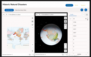
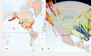
Figure 1: The Live View of my completed ArcGIS Web Experience for Historic Natural Disasters.
Chapter 4: Mobile GIS
As the name suggests, this chapter discusses the importance of online GIS, and its increasing prevalence today. Nowadays, everyone has mobile devices, and being able to access GIS apps and experiences on your phone, on-the-go, means that GIS can play a much larger role in our everyday lives. According to the chapter, mobile GIS is more accessible, versatile, location- and time-accurate, and can withstand a larger volume of users as compared to traditional desktop GIS. Mobile uses can also appeal to a wider variety of users, from individual consumers to entire organizations.
Another aspect of Web GIS that seems pretty interesting is the fact that editing capabilities can be modified to include people in the same group or organization. Similar to Google Docs, you can collaborate in real time and track editing history. Now, like any group project, I’m sure there are ups and downs to this, but it is certainly a feature advantage over desktop GIS. It certainly makes GIS a useful tool for citizen science! I find ArcGIS Indoors to be a neat application as well. There are so many busy indoor places that can be hard to navigate, such as malls, stadiums, offices, and campus buildings. It only makes sense that they would have navigation services as well!
While creating the survey for Tutorial 4-1, the interface felt like a slightly upscale version of Google Forms. The rest of this chapter wasn’t too bad either–it was kinda fun to explore all the different ArcGIS apps!
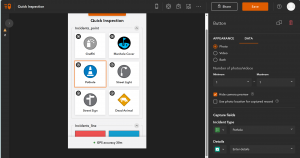
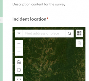
Figure 2: The web view of my QuickCapture app.
Application using these topics:
I think it would be really cool to create a birdwatching app using the QuickCapture app. When you’re out birdwatching, you can snap a quick picture of the bird, then send it to the database for all users to see. This might even help map migration and population patterns in the long term!