Chapter 3:
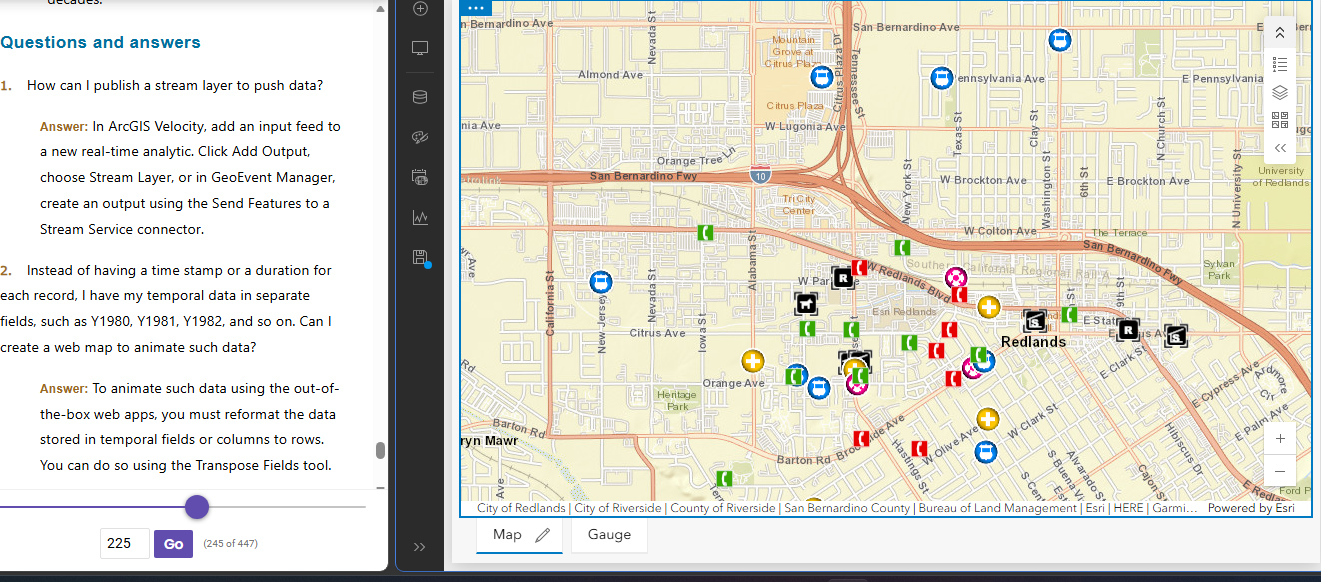
Chapter 3 covers the basics of creating a web experience, which consists of multiple pages and or windows. I think the level of customization is cool, as you can add different aspects such as widgets. There are two types of widgets, basic ones, which act out app functions such as legends and layers. The other type of widget is called a layout widget, which spreads the widget out across different pages. The web experience can also display widgets consisting of 2D or 3D features, and they can be set to perform their actions either automatically, or manually through the use of a button. The format of the web experience is quite user friendly in the way that one can create them using templates, preset themes, and can access data from ArcGIS online, which offers a very large selection of datasets to choose from. The platform that the experience is created on is called an experience builder, which can come in the form of multiple different versions. The chapter goes into these different types of experience builders in a very general sense, but I wonder what the differences would be like if I tested them all out on my own. My time with the web experience creation was quite smooth, and the tutorial was quite clear. The web experience builder made it very easy to download and import data to manipulate it. Overall, I liked the web experience creation, and I like how visually clean the widgets turn out.
Chapter 4:
The fourth chapter delves into the existence of a mobile application of ArcGIS, which I think is really interesting to offer, as last semester I knew GIS as a hefty software that required a PC just to run. To me, it begs the question of the overall benefit of desktop ArcGIS over ArcGIS Online, which has struck me as much more user friendly and convenient in terms of its extreme mobility. The features that ArcGIS Online offers are pretty cool too, as you can pinpoint your exact location on a map, increase efficiency when conducting data collection by replacing paper datasheets, up to date special monitoring, and an easy mode of communication. I really liked that the chapter included the limitations of this seemingly perfect convenient platform, which makes a lot of sense that it does have limitations, as it is adapted from such a large application. Some of these limitations include CPU speed, network connection, and limited screen size. On online GIS, one can still edit layers, delete layers, and make general actions as allowed by the organization owner of the map or dataset. This chapter also reinstates how the different modes of ownership work within an ArcGIS map, as public, and different levels of city staff have differing amounts of accessibility. I remember this concept being brought up from the introductory tutorial from week 1. There are also different types of approaches that can be used for the ArcGIS mobile apps, such as browser based approach, native based approach, and hybrid based approach.
Applications:
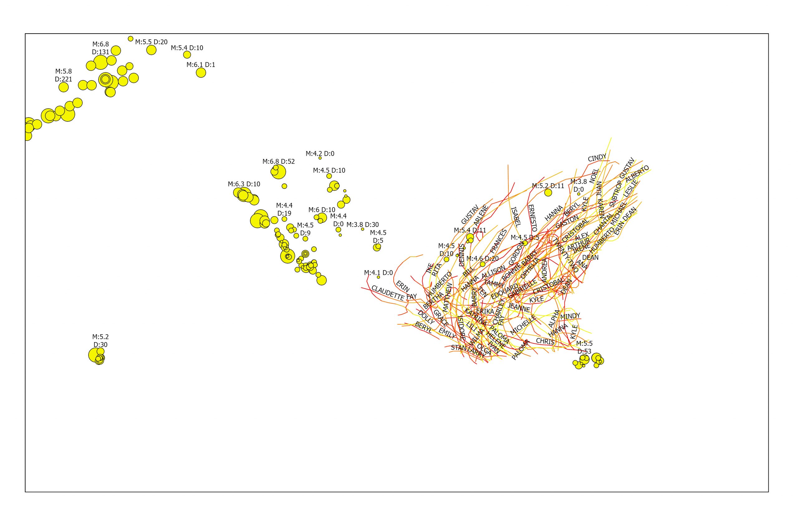
I could use the formats covered in chapter 3 and 4 to potentially create a map that features the distribution of monarch butterflies around different urban agricultural plots versus natural growing pollinator gardens, as I think it would be interesting to see what kinds of areas their adaptability can be seen. Monarch butterflies are heavily migratory species, and I was curious to see if their migratory patterns change over time based on the development of agriculture, and if so, how drastic that change is. In order to measure that change, I could even compare newer data with data recorded from a much longer time ago. Another idea of mine was to capture the distribution deer roadkill reports and their adjacence to different dense urban areas, because I think that it would be a valuable display of data in the context of land management, and conservation of predators. It would also presumably be an easy project to obtain data from, as drivers are instructed to report a vehicular deer kill whenever they occur, and I would assume that data is public domain. I probably would have to include the landmarks of the cities for reference, so the only data I would be manually entering would be the deer roadkill data.