Keckler Final

App 1: Story App

https://storymaps.arcgis.com/stories/55108ead79bc42979a28e6dfd510a0b9 

For my first application, I collected the locations of cats around the campus and immediate area- as well as some other cats that I wanted to showcase not limited to this area- in order to create a map. Clicking on the points provides brief descriptions of each cat including if they are outdoors, can be pet, and a picture or two of them. From that point, I created a story app, called “Delaware Cats: and other notable felines,” where users can interact with my map and learn a bit about the risks of allowing pet cats to freely roam outdoors such as contracting diseases, fighting, cars, etc. I also provided a video where users can learn about spaying and neutering cats since feral cat colonies are an issue in many areas- including Delaware- and spaying and neutering improves the animal’s quality of life. Then, I concluded with a couple of image galleries of my cats alongside a very old picture of me and my old cat Snoopy.

App 2: Instant App

https://owugis.maps.arcgis.com/apps/instant/3dviewer/index.html?appid=ac103aa3dd7b42af91bd020ab6386692

For my second application, I created an Instant App of my 3D Web Scene of the Blue Limestone Park. I added trees, cars, swings, benches, a table, and other playground structures using the fun park layer from the seventh chapter. Unfortunately, the models would not cooperate with me enough to rotate, so everything is facing the same direction. In addition to that, the sizes of the trees are misleading- many appear much larger on the map than they do in reality. Regardless, this scene can be used to gather an idea of what the park is like and the amenities that it has to offer visitors.

Johnson- Week 8; Final!

https://arcg.is/1ureGD0

For my first application, I decided to make an interactive survey that relies in the hands of students to report where Ginkgo trees are on campus! Since coming to Ohio Wesleyan, I’ve noticed that every year, new students will question what the horrific aroma around campus is and to their surprise, it is the fruit that Ginkgo trees drop. I thought it would be cool to have the entire campus be aware of the trees and locations of where they are so they could possibly avoid them on their routes to classes. Along with this, being aware of not to step on the fruit that has been described as a mix of rotting flesh and vomit.


https://arcg.is/0OjOai

For my second application, I decided to do another survey to track the activity of students on campus in an attempt to publish activity in different buildings. One of the worst things is when trying to find a space to study, there are already a lot of occupants there that can make studying difficult. Along with that, walking from Smith dining hall to the science center only to find study areas packed can be really annoying and a waste of time and energy. I made another survey that once information is tracked, can be placed on a map, similar to restaurants or fitness areas that let people know ahead of schedule the estimated wait time.

Dodds final

https://survey123.arcgis.com/share/f2e9ed22cdf442dbafc3d34eb156aa45?portalUrl=https://owugis.maps.arcgis.com

I developed two integrated applications designed to tackle the issue of litter in a collaborative and data driven way. The first application is a user friendly survey tool that enables individuals to document various types of trash they encounter. This app collects detailed information, including photos, descriptions, and the precise geographical location of each item of litter. The data gathered is not only comprehensive but also easily accessible, allowing for a wide range of users to contribute effortlessly.

The second application builds on the data collected by the survey app and translates it into actionable insights through a heat density map. This map visually highlights the most littered areas, emphasizing their proximity to bodies of water. By combining user input with geographic information systems, the app provides a clear visual representation of litter hotspots, making it easier for organizations and communities to prioritize cleanup efforts and implement targeted interventions

https://owugis.maps.arcgis.com/apps/instant/interactivelegend/index.html?appid=97c66b652ca44bb6b0a0b7468a45b79d

Kelner Week 4 + 5

Week 4:

Chapter 6 delves into real-time GIS and spatiotemporal data, which enable tracking and visualization of movement, changes, and stability over time and space. Key data types include: Moving data – which tracks objects or events in motion like traffic or wildlife; Discrete data – for specific, semi-random occurrences such as accidents or weather; Stationary data – for fixed objects with changing properties like population density; and change data, illustrating growth or shifts, such as urban development or invasive species spread. These tools allow users to focus on specific moments or trends over time, offering flexibility to display many or few events and analyze their temporal dynamics.

Application: By using moving data we could look at program that would be able to track migratory birds. An application like this could help find specific fly ways a species uses.

Week 5:

Chapter 7 looks at 3D GIS. It offers additional dimensions over 2D, making it a powerful tool for applications such as urban planning, storytelling, and architectural design. It enhances understanding of object size, position, and relationships. Photorealistic 3D scenes recreate reality with photo-textured features, while cartographic scenes adapt 2D mapping techniques—using height, size, color, and transparency—to represent abstract data like population density or earthquake magnitude. 3D scenes consist of surfaces (foundations), operational layers (features anchored above or below surfaces), textures (interior and exterior covers), and atmospheric effects like lighting and fog. ArcGIS supports 3D mapping through tools like Scene Viewer, ArcGIS Pro, and CityEngine, which create web scenes grouped into photorealistic and cartographic layers. 3D scene layers include building models, integrated meshes (stitched from drone footage), point clouds (large datasets from lidar), point scene layers (optimized for speed), and voxel layers (volumetric data for atmospheric or oceanic studies). Advanced 3D forms—extended reality (XR), virtual reality (VR), augmented reality (AR), and mixed reality (MR)—make GIS more immersive and interactive, while ArcGIS Urban integrates 3D mapping with planning tools to manage and visualize urban projects effectively.

Application: Making an app that looks at nesting sites of peregrine falcons on top of buildings and bridges would be kinda cool to help show nearby food sources and protection from weather.

Kelner Week 3

Chapter 3:

ArcGIS Experience Builder is a low-code tool that enables users to create interactive content and web experiences with ease. It supports drag-and-drop interfaces, 2D and 3D data integration, and customizable widgets to enhance functionality. Users can start with templates or build layouts from scratch, incorporating themes, source data, and device-specific optimizations. Built on technologies like ArcGIS Online, ArcGIS Enterprise, HTML5, and ArcGIS API for JavaScript, it allows for the creation of apps, maps, and interactive tools through features such as message actions (trigger-based automation) and data actions (user-initiated tasks like exporting data). Experience Builder offers components like pages, windows, and outline views, along with a variety of widgets for organizing content and improving usability.

Chapter 4:

Mobile GIS extends traditional GIS functionality to portable devices like smartphones, tablets, and laptops, offering mobility, real-time information, and locational awareness. It supports efficient data collection and management through apps like ArcGIS Field Maps, which enables users to plan, track, and update field data seamlessly. Mobile GIS leverages GPS, wireless communication, and mobile operating systems (Android, iOS) for accessibility and versatility, though smaller screens can limit visibility compared to desktop GIS. App development strategies include browser-based, native-based, and hybrid-based approaches, emphasizing the need for simple, user-friendly designs for mobile platforms.

Application: With surveys and  the benefit of mobile GIS I think an app that would collect real time data for birds spotted in certain areas would be a cool concept.

Kelner Week 2

Chapter 1:

After taking 291 WebGIS seems much easier to grasp and it seems like a more streamlined and beginner centered software. I feel like in Chapter 1 this is reflected with the user base of the software and how popular it is for businesses and government while still being easily usable by more casual, day-to-day users. The group and organization system seems really cool and makes the data much more accessible which is very convenient for businesses especially. The tutorials were also a lot easier to follow in my opinion. I was able to follow them and learn the ropes in a more efficient manor than when I used ARCGIS. Apps are also a pretty cool aspect of WebGIS that I found very interesting and very easy to understand.

Chapter 2:

Chapter 2 of the GIS guide explores tools for crafting visually compelling and meaningful maps. It highlights feature layers as the most versatile type of interactive layer, easily shared across web maps, 3D scenes, and applications. Esri’s geospatial cloud offers extensive resources, enabling users to design custom layers using their own datasets, pre-made templates, or by starting from scratch. With intuitive smart mapping tools, creating polished maps—like heat maps, dot density visualizations, and color-coded comparisons—becomes accessible even to those with minimal technical expertise. The ArcGIS Living Atlas is another valuable resource, providing ready-made layers such as base maps, satellite imagery, and data on topics like infrastructure and environmental conditions.

For a project I would want to create an interactive map that shows some good birding spots at my favorite park.

Dodds week 4

Chapter 6 explored the use of real-time GIS and spatiotemporal data, which helps track and visualize how things move, change, or stay the same over time and space.                                                Moving Data: Tracks objects or events in motion, like traffic or wildlife.
Discrete Data: Displays specific, random events, like accidents or weather occurrences.
Stationary Data: Shows fixed objects whose properties change over time, such as population density.
Change: Illustrates growth or shifts, like urban development or the spread of invasive species.
Real-time GIS lets us view this data in real-time or over time, and we can decide whether to focus on specific moments or ongoing trends.

Tutorial 1: I initially struggled to find the map needed for the exercises, but importing data from the Living Atlas solved the issue.
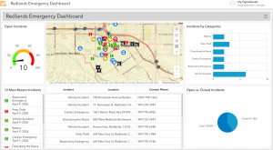
Tutorial 2: I created a dashboard to monitor incidents in Delaware County, customizing the appearance and data displayed.
Tutorial 3: I used categories to organize data on the map, making it easier to focus on specific areas.
Tutorial 4: Arcade scripting allowed for more advanced formatting, improving the display of the data.
Tutorial 5: I worked with time-series data, organizing it by time zones to keep it accurate.
Tutorial 6: The final tutorial animated population changes in the U.S. over 200 years, showing how populations shifted over time.
Application Idea: Real-time GIS could be used to track crowd sizes in Delaware businesses or OWU dining halls, helping people avoid crowded places. This would be similar to a “popularity tracker”  which showed peak and off-peak times.


Veerjee Week 4

Chapter 6: Spatiotemporal Data & Real Time GIS
Within spatiotemporal data as well as real time GIS, there are several things to consider displaying. These are:
Moving: To show where things are going
Discrete: Show what is going on, good for semi random occurrences
Stationary: things that stay still, but have valuation shifts.
Change: Seeing how things change or grow.
I can also use these to display many or few things, and showing either specific points of time or the duration of time for events.
Tutorial 1: I immediately ran into a problem where I was unable to find the map that is likely required for the rest of the tutorials in this chapter. I am able to add a temporal layer by importing more data from the living atlas or finding it on my own.
Tutorial 2: To create a dashboard, i will want to click on “create dashboard”, add some tags, and bind it to a new folder. And it will essentially act as an individual app which will let me analyze what is going on if I were to view it independently. I can also add it onto my map / workspace. I can also set some different bounds based on like percentage points, different looks for the gauges, and different ways to make it look better. We can also display the different items being displayed on the gauge, the book decides to do the most recent incidents through an advanced formatting field.
Tutorial 3: For the 3rd tutorial it will be creating a category. These categories can be used to make different selections and things appear on the map. This will be in conjunction with other lists that can be made, this function can also be used to zoom into different areas of the map based on the category selections.
Tutorial 4: By using the methods of an Arcade feature, advanced formatting can be used. The arcade feature works similarly to a script, where various codes can be implemented in order to display things at a more advanced level than once otherwise done.
Tutorial 5: For the 5th tutorial, this is essentially finding a spreadsheet and uploading a timeseries data, and utilizes time zones in order to organize things properly. In this case, it is UTC-05 which is US Eastern Time.
Tutorial 6: For this tutorial, this is all about animating the population of various cities as time changes. I will want to use the options seen on the time slider to show the method of displaying population change over time.
Description of an application: Creating a dashboard that actively sees 311 incidents reported within Delaware County.

Week 8 Final – Godsey

Application 1: https://arcg.is/1GibeH0

For the final project, I created a smart Survey123 form to better understand students’ interests on the Ohio Wesleyan Campus and improve student engagement and morale. The survey had 7-8 questions about the students and the events they attended. The first question prompts the student to enter their OWU email address to ensure the results come from currently enrolled students. The second question asks for the date and time of the event they attended to make sure the event was real and registered. I then added a list of OWU’s events in the fall of 2024, which could be updated for every semester and year. I also included another option for fraternities/sororities/club events that only appears when selecting other. For example, if selecting other under event attended, the student will be prompted to choose the type of event (fraternity event, sorority event, academic event, cultural event, special interest event, etc.), which will then show a list of every club in each section (ex. under cultural events it lists all the cultural clubs such as horizons which host culture fest). Then, the student is prompted with four questions regarding the event (how they heard about it, what they liked/disliked, and comments/suggestions).

Application 2: https://www.arcgis.com/apps/dashboards/0f775368e70445489d77f1b88dbf14cf

I created a dashboard app for the second application to monitor the responses to the OWU Student Interest Survey123. The dashboard has several features emphasizing important information, including location, event attended, and how the students heard about this event. The main location feature includes a map with the responses’ locations, demonstrating where the most popular events are located on campus. I also created a table to display how the students hear about the events, highlighting the most effective way to reach the student body and get the word out about stuff happening on campus. The final feature I’ve added is a pie chart that sorts the responses into the events attended to understand the most popular events.  

Norman Week 2

The first chapter discusses applications of Web GIS in different fields and how its use is increasingly valuable in different scientific fields, businesses, governments, etc. People also use these types of applications in everyday life. Having this software on the Web makes data and different features more accessible. The tutorials were fairly easy and showed how to upload data, add fields, and add feature layers.

The second chapter has six tutorials and goes more in depth looking at feature layers and different ways that you can format maps to best display your data. These tutorials were definitely more challenging than the first chapter, but I didn’t have too much trouble with it. I think the software is very cool and I love the incorporation of all the different base maps and data.

I think I would like to do something with economic data since I am a politics and economics major. I think looking at employment data could be interesting.