Chapter 7
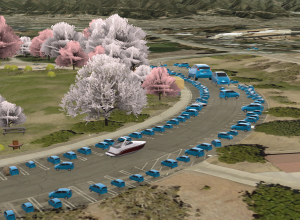
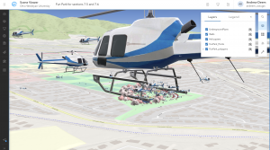
This chapter was all about 3D web scenes! Following the theme of previous chapters, it started out explaining the basic terminology of web scenes. I learned that web scenes are just another name for a 3D web map, which we already have plenty of experience with in this class. Web scenes are especially useful for better visualization of many different applications. The textbook mentions that web scenes can be good for urban planning, architectural designs, and even filmmaking. The latter was an application that I hadn’t previously thought of using Web GIS for…but what I’ve learned taking this course is that this type of software can be used for pretty much anything! Similar to web maps, scenes are also capable of having multiple layers. These layers can have completely different visual styles, like photorealistic layers or cartographic layers. For designing urban planning or architecture, I can see the photorealistic effect coming in handy. This is what I’m envisioning for my second web app design for this course. Later in the chapter, before the tutorials, there are general step-by-step guidelines to get you started on creating a web scene. I found this especially useful and will also be revisiting this when I need help designing my scene. VR (virtual reality) and AR (augmented reality) also find a place in this chapter. The differences between the two are described along with some visual examples. I’ve seen some pretty cool applications for VR, specifically for video games where completely new worlds are constructed. Crazy cool technology!
Future applications
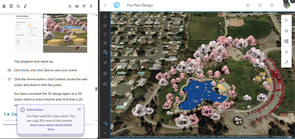
Before I even finished the chapter, I decided I wanted my second web app to be a web scene displaying some form of nature conservancy/park/garden design. In order to accomplish this, I plan on following one of the tutorials supplied at the end of the chapter (likely the park design one). Included in this design will be a native species layout with pop-ups giving some basic information about the species. The exactness of the layout will depend on what public data/symbols I can use for the feature layers.