Pinde Fu Chapter 1: Chapter 1 starts off with a brief history of GIS, then it transitions to the differences between web and desktop GIS. The web version makes it easier to share information globally and within organizations, it can be accessed by a large number of individuals across disciplines, has better cross platform capacity, it is intuitive and easy to use, and is easy to maintain since the web administrator doesn’t have to update it for clients.Web GIS also has easy access to layers and data from portals like living atlas making it easy to make maps.
In the case of websites there are portals in which one website is used to access another. Web GIS has geoportals in which there are gateways to geospatial information. Another unique application of the web version is that it can be accessed via a phone. This makes it more available to those working in field settings. Marking a location on the map using a phone while in the field is a great way to collect spatial data for later use.
When making something in ArcOnline it can be shared so others can access it, this includes: web layers, web maps and scenes, and apps. To make any of these you can use the same types of data as the desktop: CSV, shapefiles, and so on, however it is also possible to upload powerpoint files and pictures. When creating layers there are similar types like raster and vector layers like in desktop, the main difference are the map types that are able to be made, such as scenes. Apps are a large feature of ArcWeb as they are easy to use and versatile. Some apps that were referenced in this chapter were: StoryMaps, Experience Builder, Web AppBuilder, Dashboards, instant apps, Hub Basic, Map Viewer, Scene Viewer and so on. There are also bundles of apps, and these are categorized by speciality or how they can be used (Essential apps, Field apps…).
Layers within ArcOnline can be categorized as either hosted or nonhosted. The difference between the two is that hosted layers come from the living atlas, whereas nonhosted layers come from the user’s own database, or hard drive.
A tutorial that I’m interested in is titled: Reveal lake shrinkage due to severe drought.
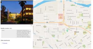
Tutorial 1.1: Working with attachment viewer. This app requires a CSV file. To turn this CSV into a map, go to the content section, new item, your device, then click the desired file, the default fields were used and the longitude and latitude were set to long and lat.
When a map is published the overview tab can be used to get a general description of the map, as well as metadata. The data tab displays attribute data of the hosted features. It also allows for those with access to edit the data and fields. The visualization tab allows you to change default properties like style, filter, pop-ups, and labels.
To add attachments, under layers select the desired layer, then go to the data tab, then select the layer, then add attachment on the far right column, then select the file and upload. Enable attachments needs to be toggled on for this to work.
1.2: Using the same map from 1.1 we added a field by going to the data tab, then fields, then add field on the top right. To add data to a field, you can then go back to the table tab, and type data directly into the field.
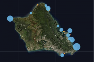
1.3: Using the same data we were working with in 1.2, we opened the map in map viewer. It was already highlighting our points of interest. The baselayer was changed to community map. To alter the symbology of the point select the layer, then go to style on the right side of the screen, style options, here you can brows through different ways to select points and resize them.
To manage pop-up’s select the popups on the setting bar, then type the name of the pop-up in the type of display you would like, we used title, then click the curly brackets, delete all field except for the caption or whatever you want displayed, then if you want to show attachments open the attachments section and choose how you want it to be displayed, we chose as a list.
1.4: Using the map made in 1.3 we turned it into a web app by clicking the create app button on the contents pane, then instant apps, we then selected attachment viewer. To sort by a field, select the layer you want to use, then field, then select the field to sort by, for us we used the ID, so that it displays 1, then 2, and so on. This was all done in attachment focus. Using map focus shows the map and the attachments on the side.
This could be useful to highlight field sites and show them to an audience or organization, as you can include images and descriptions of the site, along with things that could potentially be done there.
Pinde fu Chapter 2: Types of hosted layers: Feature layers, Hosted Web Features Services Layers, Tile layers, Vector tile layers, we map tile services, scene layers, image layers, and image layers.
- Feature layer: support vector feature querying, visualization, and editing. Used for visualization on top of basemaps.
- Web feature services: open geospatial consortium
- Tile layers: layers that support fast map visualization using a collection of predrawn map images or tiles
- Vector tile layers: reference a set of web tiles containing 2D and 3D vector content. Tiles adapt to resolution.
- Web map tile services: layers that are open geospatial consortium standard complaint
- Scene layers: support fast map visualization
- Image layers: display and analyze raster data
- Map image layers: Map is generated on the fly, returned as a PNG, JPG or GIF
Smart maps are those that help make maps faster, which can be useful for those who have little experience with GIS or cartography. When using smart mapping it will help style your layer for the best interpretation.
Arcade is a way to edit the pop-ups of layers that you do not have edit access to. You can use coding expressions to change what is shown.
Living atlas is a collection of layers, maps, tools, and apps provided by esri and others who use WebGIS.
Storytelling with GIS: when using GIS for apps, they should be fast, easy to use, and fun, including lots of pictures, charts and videos if necessary. This chapter is mainly about storymaps and how to use spatial information for storytelling. Storymaps are built on blocks which are essentially anything you add such as text or images. A sidecar is an immersive block which puts an image side by side with text. A slideshow will fill the screen. A map tour block allows you to showcase places one at a time. A swipe block allows for comparison between two maps. A timeline block shows events through time. Storymaps also allows for the creation of express maps which are lightweight maps, with limited editing capabilities.
Tutorial 2.1: In this section we are building a storymap from a CSV file. I started by creating new content, then uploading my file, then going to the data tab and editing the field names by going to field, clicking on a field then edit, then changing the names.
Tutorial 2.2: In this section I was able to add an attribute by going to the styles pane, then selecting add field and then census data 2020. To use the color and size smart map, I selected it then configured it in the style options. Here I chose to display if the 2020 census data was above or below the 2010 by diving by 2010 census, and then selecting above and below. To apply a shadow effect on the arrows go to the effects section, then drop shadow.
2.3: I changed the pop-ups by altering the title to be {city}, {state}. This was done in the pop-ups pane. I also added an attribute expression by clicking on add expression. To get the expression to display in the pop-up, click select fields, then deselect all fields, then select the fields you want to display.
2.4: To add images from a url to a pop-up, go to pop-ups, add content, image, click the curly brackets, picture_URL field, then type a title, then click the type of url being used, in this case it was Wikipedia_URL. To add a chart go to pop-up, media, the plus sign, then chart
2.5: To make a story map go to apps then select story map. Here you can work with it like google sites, and add covers and titles. To add a youtube video click the plus button and then video and link, this lets you use any link to add a video. To add a map that is interactive click the plus button then sidecar, in the media area add the map, then add text on the right. To make the map interactive or to zoom in on certain points, click the plus then media action, then click on the same map then zoom in to an area then click save.
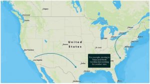
2.6: This section I learned to use the swipe feature in storymaps. To do so click the plus then swipe. This allows you to display two maps side by side. To add an express map click the plus, then map, then new express map. This allows you to edit a map on the fly, we used it to add arrows to display people moving from state to state.
This could be useful for presentation, especially ones that rely heavily on spatial data or ones that could use it for better contextual information.