Chapter 5: catching and on-premises Web GIS
This chapter goes over ArcGIS Enterprise and “caching”, an important technique if you want a fast performance. For ArcGIS Enterprise, while it functions similarly to ArcGIS Online, Enterprise runs as an on-premises, user-managed component of the Esri geospatial cloud. It supports various configurations: organizations that may not have internet connections, organizations that want to keep their own operational layers on their own while simultaneously using ArcGIS Online with hybrid, and it also allows organizations to publish services on their own and have their own functionalities. Most of the skills learned in the previous chapters overlap with Enterprise, as well, which makes it even more handy.
For this chapter, we learn what raster tiles, vector tiles, map image layers, and feature tiles are/do. Raster tile layers basically deliver maps to clients as image files and are good for basemaps or maps that stay consistent. Vector tile layers deliver map data as grouped tiles and are rendered based on a style related to the data. The map style can be customized, such as hiding a layer’s visibility or changing symbols/fonts. They can adapt to the resolution of the display and appear sharper on high-res displays. They are also usually generated based on data density. Map image layers can be drawn dynamically by the server or using tiles. They are mainly for customers who need rendering capabilities that don’t exist in feature layers (ex. color shaded relief), or customers with large datasets. Feature services can generate feature tiles on demand and allow web clients to display more features. Caching helps achieve high performance for all of these options.
Tables 5.1 and 5.2 were helpful to visualize how these web layer types are important and which capabilities they fit into.
Tutorial 5: share a raster tile layer and a vector tile layer to ArcGIS Enterprise or ArcGIS Online, and create a web app to compare the two layers.
Chapter 6:
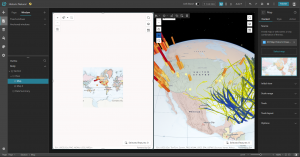
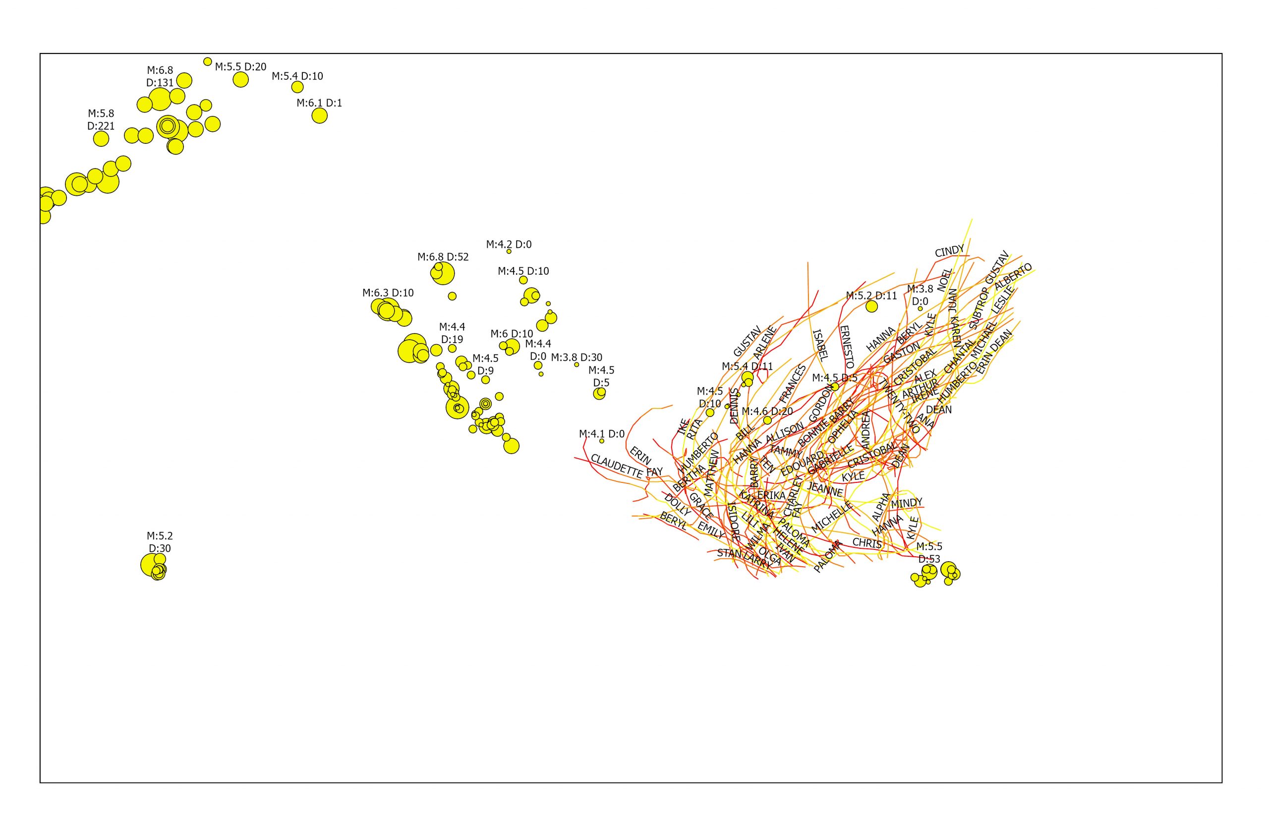
This chapter went over spatiotemporal data and real-time GIS. The basic concepts of spatiotemporal data, the values and challenges of IoT, and the ArcGIS products that can meet these challenges. The ArcGIS products include ArcGIS Velocity, ArcGIS GeoEvent Server, ArcGIS Dashboards, and ArcGIS Mission. spatiotemporal data is all about observations of objects and events that move or change over time. IoT is about physical objects or things, ones that can collect and exchange data. Geolocation provides that context, and GIS can transform the raw data into useful information.
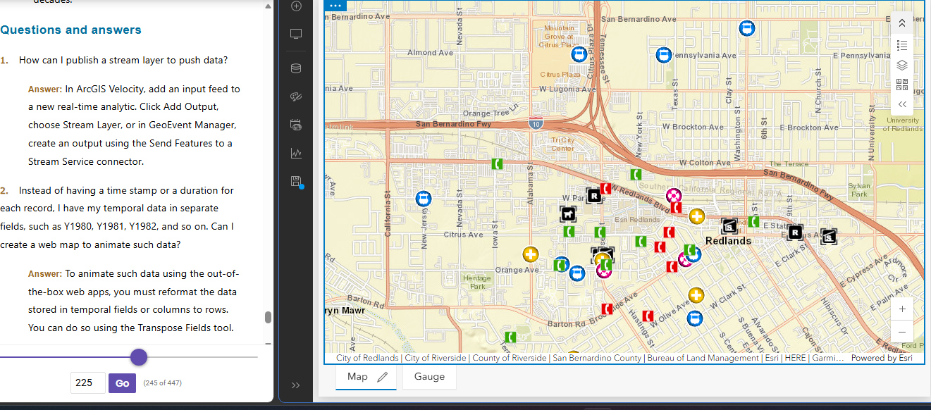
Tutorial 6: Create a dashboard web app for the city of Redlands, California, to coordinate response efforts for the city’s medical, police, and fire departments.