Chapter 5
This chapter introduces ArcGIS Enterprise, its components, and its supporting platforms to build a private WebGIS. ArcGIS Enterprise and organizational subscriptions to ArcGIS Online are complementary implementations of Web GIS. They provide similar functionalities, such as a portal website. ArcGIS Enterprise on Kubernetes is a new deployment option that accompanies Windows and Linux as supported operating systems for ArcGIS Enterprise using microservices and containerization to provide a cloud-native architecture. Map image layers can be drawn dynamically by the server or by using tiles from a cache. Map image layers and feature layers are appropriate for visualizing operational layers. Feature services can generate feature tiles on demand when requested by newer ArcGIS client apps which enable web clients to display more features from the service and provide faster load time by generalizing complex geometries for display. Standards specify the interface that different vendors should use and are an important way to achieve interoperability among different vendors. You can publish web layers using ArcGIS Online and ArcGIS Enterprise web pages directly or using ArcGIS Pro to visualize, analyze, compile, and share GIS data in 2D and 3D environments.
Chapter 6
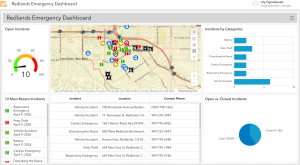
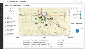
This chapter introduces the basic concepts of spatiotemporal data, the values and challenges of loT, and the ArcGIS products that can meet these challenges. The chapter also teaches how to use real-time layers in web maps, create dashboard apps with actions and Arcade-based formatting, create time-enabled layers, and animate time-series data. Spatiotemporal data comes from many sources ranging from manual data entry to data collected using observational sensors or generated from simulation models. Spatiotemporal data includes observations of objects and events that move or change through time such as when and where an observation took place and what activity was observed. loT is the network of physical objects embedded with sensors and network connectivity that enable these objects to collect and exchange data. The science community, the US federal government, and the private sector have embraced the loT to support the creation of systems and products ranging from enterprise applications to consumer applications. An important application of the loT is the smart city which integrates loT technology to make more efficient use of physical infrastructure.