McNichols Week 5

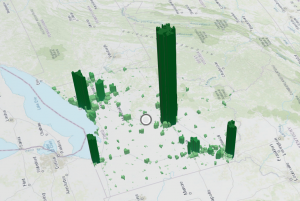
The additional dimensions that 3D GIS offers over 2D serves as a better vehicle for a lot of different applications like urban planning or defense simulation. It helps people understand size and relative position of objects. Photorealistic 3D scenes use photos to texture features, while Cartographic scenes take the mapping techniques of 2D and applies them to 3D using height, size, color and transparency to display features like population density or earthquake magnitude that aren’t viewable from a 3D representation on its own. 3D scenes are composed of surfaces that provide a foundation for other content, features that are anchored above or below the surfaces (these are the operational layers), textures that provide the exterior or interior covers of the 3D features (often with aerial imagery or cartographic symbols), and finally atmospheric effects like lighting and fog. 3D scene layers can be used to present simple representations of buildings (textured or untextured), more complex digital models of buildings that let you interact with its components and look at its specific properties, category layers (windows, walls, etc), or filters that let you select elements with specific attributes. Integrated mesh scene layers construct complex images just from stitching together drone footage by matching angles from different data points together into a single synthesized projection. Point cloud scene layers quickly display large amounts of symbolized point cloud data, usually collected via lidar (This one looks like a heat map). Point scene layers thin out the dataset from point clouds to increase visualization speed and visibility. Voxel layers create a volumetric vizualization, often used for atmospheric or oceanic data.

There’s not an Elevation mode to select in 7.2 so Alaska’s gonna stay a little funky.

I’m really curious why some of those cars are such different sizes when so many others are at-scale.

Assignment idea: I think it’d be interesting to make a 3d web scene of one of the parks we run at for cross country.

Keckler Week 4

Chapter six was a welcome change from last week. It was more within my level of understanding and comfort compared to working with 3D maps and mobile apps. There were a couple things that tripped me up, such as the coding. Initially, I had made a mistake with my coding because I was having trouble understanding the directions in the tutorial. Luckily, the changes that the codes made were immediate, so I could act accordingly once something did not appear or appeared incorrectly. Though, the heart icon would not work at all, so I proceeded despite that hiccup. I do wonder about how the emergency information is input and updated so frequently. Do dispatchers input the information, and it is input into GIS in tandem? Or is there another process? While putting together the animation for the population change, everything went as it should. The final animation was a bit anticlimactic, though. The slider moved itself and showed how populations moved west into the states and so forth. I am not quite sure what I expected, but the slider did precisely what it was supposed to. It showed the change in population within the US over the past two hundred years over a few seconds.

An application idea that I have from chapter six could be to use the Delaware Data to show how parcel plots in the county- or maybe just the city- have changed over the past ten or twenty years since the county has been growing so much. Another idea that I have could be to document all of the places I go to throughout a regular day- perhaps a week- and make a time slider of that to see where I go to and how much time I spend in each place throughout the day.

Veerjee Week 3

Chapter 3: Experience Builder

This is mostly for a more complicated way to create apps, maps, and more. Things an experience builder could include: components such as pages, windows, and outline views. It could also include various widgets such as functional & layout widgets. Widgets are classified into two groups, message actions & data actions. When using a message action, it listens to various triggers and performs assigned actions. For data actions, they provide actions to a button that users are able to click on, a usage could be to export records to a file. 

  • Tutorial 1: Creating a basic webpage that included 2 different maps, an image, and methods of switching between the two of them through a view selector. 
  • Tutorial 2:This was more about how to create various actions for the data, in this case it was the action of making sure the the maps of 2d & 3d match, and with selections when the 2d points are selected, only those ones will appear on the 3d map. These are done by utilizing the action tab that appears once map tabs are selected under the outline window.
  • Tutorial 3: This was mostly about how to add a text box that included statistics. It is fairly similar to things we have done in ArcGIS pro, except as a presentation-like format. From this point forward, I have realized I am messing up the styles/formats of the web experience, however I am going to just add the features & try to salvage it as best as I can.
  • Tutorial 4: This tutorial was about how to create a table & how to make it so it displays certain fields in a specific order. Also adding a search bar & filters for the data.
  • Tutorial 5: When adding a filter I will want to use an SQL expression to ensure that the map itself flows. I can choose various criteria that I want my maps to be filtered by. I got pretty lost halfway through, but from what I am able to judge, I am also able to make filters for the table that I had added in the previous tutorial  & also be able to make a donut chart. And when going through the actions, I am able to trigger something to spawn a chart for various data that I give said chart. 
  • Tutorial 6: This felt like it brought everything that we have made together, and I believe I misunderstood some instructions referring to the cosmetic effects of the main page. This tab was about making a header & more pages with the ability to swap between them.

Chapter 4: Mobile GIS

There are many reasons why Mobile GIS is useful, such as mobility, locational awareness, ease of data collection, real-time info, large user volume, and many ways to communicate. GIS is useful in a bunch of different technologies. I will want to be careful in concern to the utilization of the web interface as phones are needing more simplistic designs. There are three main schools of thought when it comes to app development strategies: 

  1. Browser based – which is using apps through mobile web browsers. This will be fairly limiting the user’s experience as it will not be utilizing the phone’s features.
  2. Native-based approach – which will be using a mole app, a disadvantage for that would be learning skills for the coding languages 
  3. Hybrid-Based approach – A combination of both native & browser based approaches
  • Tutorial 1: To get to the ‘set rule’ option, go into edit, then find ‘behavior’. And instead of ‘If show’, go to the thing you want to see, and then select the conditional. This is very similar to a software such as Google Forms
  • Tutorial 2: I thought it was fairly cool that I could use Survey123 to submit data from my phone. It seems fairly intuitive to collect data & be able to check them out using the page.
  • Tutorial 3: I had gotten very lost early on in this section. I think it is because I screwed something up within the tutorial section for the surveys. However from what i can gather, thiss will be tying the survey itself to sync with a feature layer by going into where the survey is collecting responses. I can add a new field for the various different types of data being collected and make them appear as points on the map. And they will appear as lines within the map. 
  • Tutorial 4: Same issue as tutorial three, but here is what I was able to gather from the tutorial, this will be adding some form of visibility layer with conditional statements. This will be done by adding another layer, and adding various expressions to make it “Incident_Type == Pothole”, for example. And this will allow a user to filter the different types of data within the map. 
  • Tutorial 5: It appears that in this tutorial I am able to use another app in order to compile data to put directly into my field map rather than filling out a form to put into the map by using skills from tutorial 4.
  • Tutorial 6: In tutorial 6 we are using the map created in tutorial 3,  this will be using the quick capture software to do. And this will be a great way to include a user-friendly app interface that includes icons for each type of thing you want input on. 
  • Tutorial 7: This is just showing how to utilize what was made in Tutorial 6.
  • Tutorial 8:  Utilizing AR will be a way to add more context for the things made in the previous sections. 
  • Tutorial 9: Utilizing AR will be a way to add more context for the things made in the previous sections.


Application description based on Ch 3 & 4 using my data:

  • Create a web experience. (Ch 3)
  • Creating a survey form for a department to report suspicious activities will be a really good use for GIS tech, maybe creating something for Public Safety? (Ch 4)

Johnson Week 4

Real-time GIS has the ability to ingest real-time data, real-time visualization of data, GeoEvent and velocity, alerting, update schema, add  additional processes, ArcGIS online feed items, and feature layers. In Chapter 6, these abilities are touched on as well as allowing the ability to see different patterns over time. For example, a map tracking real-time traffic in an area also has the ability to go back days, weeks, months and even years and display objects, traffic patterns, weather patterns, and accidents that allow people to use this information and make inferred guesses on how these patterns will carry out in the future.

Application Idea: Having previously worked at Planet Fitness for 2 years, a gym that alleges a no judgment zone, we had a popularity tracker that was on our website and app. On it, guests could see what hours were most popular pertaining to visitation rates, hours that were slower, and recommended times to go. All of this information was kept up to date with real-time statistics coming in based off of the check in swipes of guests. That being said, this information was not specifically Real-Time GIS, but the design is relatively the same. After seeing different maps based on population and traffic patterns, I thought a good idea would be to implement something for OWU students, or even just Delawarians that businesses and eateries could use for every customer and person either using whatever said facility or are present. This could help for busier times such as First Fridays, to let people know how many people are present, inferred wait times, and other places that are less busy. The same would be true for OWU campus in regards to dining halls.

Roberts Week 4

Chapter 6: The introduction of chapter 6 talks about incorporating real-time data into ArcGIS Web apps and touches upon the idea that there is technology all around us that can be used in such programs (ex. all the technology in a smart home). I saw an example of this in week one when we looked for applications of ArcOnline resources when I found the web app that monitors weather stations throughout the United States (when the program was active).  When moving onto the tutorial, I found the dashboards feature to be pretty straightforward. I also forgot that I made one in 291 until I saw the dashboard under my Content page, but I think I understand the functions of the dashboard app more than I did in the Spring. I did have an issue with the advanced options while making my current dashboard and was not able to get the heart icon to appear despite double checking the code I entered compared to what the textbook instructed. This was a little disappointing, but I was glad that the other coding for highlighting and coloration did not give me any issues. I liked the resulting visuals from the instant app even though it took me a frustratingly long time to figure out how to change the title after a spelling error. I could see the slider being helpful for displaying other chronological data as well, but would also be interested in exploring other similar instant apps on my own time.

Assignment: One of the ideas that I could create using ideas from this chapter is a dashboard for people in Ohio to use before they would go on a hike or other outdoor excursion. The dashboard could include real-time weather updates and have a map that includes information about trails. Another option could be to use the Delaware data and create an animation similar to the one in the tutorial that shows the development and distribution of buildings and land parcels over time.

dodds week 3

ArcGIS Experience Builder and Mobile GIS are powerful tools within the ArcGIS suite, offering flexible and user-friendly solutions for creating and using geospatial content across various platforms. ArcGIS Experience Builder enables users to create web experiences with minimal coding by using drag-and-drop functionality and integrating widgets to interact with both 2D and 3D data. Users can start with templates or build from scratch, customizing layouts for mobile optimization, adding themes, and employing a range of widgets (e.g., maps, legends, charts, and survey tools) to enhance interactivity. The tool’s flexibility allows for integration with ArcGIS Online, ArcGIS Enterprise, and ArcGIS API for JavaScript, making it adaptable for diverse mapping applications.

Mobile GIS, on the other hand, brings traditional GIS functionality to portable devices such as smartphones, tablets, and laptops. It offers easy access to geospatial data, real-time updates, and interactive mapping through apps like ArcGIS Field Maps, which supports field data collection and management. Mobile GIS leverages GPS, wireless communication, and mobile operating systems to allow users to track, capture, and update data on the go. However, smaller screens can limit visibility and detail compared to desktop versions. Together, ArcGIS Experience Builder and Mobile GIS can support a variety of applications, such as studying and monitoring gas leak patterns in Delaware County. This project could ensure the safety of residents by using interactive maps, data analysis tools, and additional data collection methods beyond traditional surveys.

I messed around with an interactive soil map where my locations where i sampled soil for my independent study were marked and had pop ups with the photos of different land use in the area.

Dodds Week 2

Chapter 1: Getting Started with Web GIS
Web GIS brings together the internet and geographic information systems (GIS), making it easy for people to use geographic data from anywhere. It’s becoming popular in areas like government, business, science, and even day-to-day life. Web GIS has tons of applications, from mapping and data management to analytics and decision making. The main pieces of Web GIS include users, groups, content (like maps and data), and metadata. Apps are where the action happens, things like StoryMaps or mobile apps that let users interact with maps and data. Inside these apps, you’ll find basemaps (which give context), operational layers (for interactive data), and tools that help with things like routing and location searches.

Chapter 2: Smart Mapping and Storytelling with GIS
Chapter 2 dives into tools for making maps that look great and tell stories. Feature layers are the most common type of interactive layer in maps, and they’re reusable across web maps, scenes, and apps. Esri’s geospatial cloud hosts lots of these layers, letting users create custom layers from their own data, templates, or even from scratch. With smart mapping tools, you can make professional-looking maps: think heat maps, dot density maps, and color-coded comparisons, without needing a ton of technical skills. ArcGIS Living Atlas is also a go-to for ready-to-use layers that include basemaps, imagery, and details about things like infrastructure and the environment.

For my project I would like to do something with bird sightings around campus. I was inspired by crowd sourced information and love creating free resources. I could highlight 2-3 species of interest.

Norman Week 1

oduction:

I think that the ArcGIS living atlas of the world is a really interesting tool. I played around with it a little bit and it was cool. I also like the incorporation of using different web layers in your maps.

Tutorial: 

I found the tutorial fairly easy except for some features were a little different than they were described. It didn’t really trip me up thought. I thought it was a good overview of how to use the software and I feel like I will be able to use it successfully. The basics mostly seem pretty intiuitve.

GIS Uses:

I looked at uses of GIS in transportation planning, which is something I am interested in. I found a few interesting uses including traffic flow managment. It also helps with public transit planning in analyzing things like population density, planners can determine where stops and transit sites should be. Another way it can help with transit planning is through route optimization.

Veerjee Week 2

Chapter 1: There are a lot of reasons to be using webGIS for more major projects that are meant to be publicized. Some of the reasons they have listed are: Global reach, large number of users, low costs per users, better cross-platform capabilities, ease of usage, and easy to maintain. Some of the main organizations or reasons to use it, and reasons why I may use it in the future are for Business and Governmental use, however I was interested to see that people use Web GIS for their daily life. A majority of the stuff brought here seem fairly basic, yet good information to keep in mind while working on maps. Such as the dominance that phones currently hold in the information technology world for the average person. It also reminds us on how some of the different types of data interact. The first tutorial was more about how to upload data into webgis & share it. The second tutorial was more about how to add a field and add some data through the web page. The third tutorial was about how to add the feature layer into a proper web map. I had not been able to find the community map, so I decided to just use the streets map. It was pretty cool to make a functioning webpage for a map.

Chapter 2: This chapter overall is a little more ‘intense’ than the previous one. There is a lot of focus/emphasis on the creation of feature layers and the techniques of doing these feature layers. Tutorial 1 had a good review on how to implement data & how to change a few of the fields’ names. Tutorial 2 had more symbiology work, in this case it was a comparison between the population of 10 years prior and to a set date. Tutorial three was pretty cool by having me create an expression and using the data to appear on my pop-ups, I know that I will need more practice doing this to fully remember it. Tutorial four was about how to add various types of media in the popups window, particularly links, images, and charts using the data that is saved in the csv. The fifth tutorial I got stuck on towards the end as I was a little confused on how the map actions worked, however the rest was fairly intuitive as it was setting up a storymap. I think these will be pretty interesting to utilize, especially for things like the trip project that I will likely be doing. Tutorial 6 was more about how to add a swipe block to use map activities. I will likely want to use this for if I were to make a story map to say ‘hey, we will be going here, here and here’, which may be a great strategy for the vacation idea.

Description of an application of WebGIS using my data or that from Geog 291:

  • Landmarks around my city. I can find a bunch of important buildings and take pictures of them from my city. As my hometown is so small, I will likely be able to find or take pictures over a weekend. I will then attach it all to a single map and make an app out of it. (Ch 1)

Roberts Week 3

Chapter 3: This chapter’s tutorial was a bit more complex than the previous ones and took me longer to complete. I ran into several minor issues including a missing dynamic content button and the fields pane being empty when writing expressions in the text box. Fortunately I was able to work through both issues after visiting the ESRI community page and finding a comment and solution for the exact issues I had. Later on I had an issue where a ‘sort by’ value that was listed in the book wasn’t an option for me to select, but it appears that my chart still matched the information that I wanted it to present. I also noted that when the book instructs you to type a URL you need to add ‘https://’ to the URL even if it is not mentioned in the tutorial, otherwise the URL will not work. It seems like the experience builder app has a lot more functions to unpack and practice, but I would imagine that after using it several times it could be very helpful in interactively displaying data.

Chapter 4: I enjoyed this chapter and found it much easier to figure out than the previous chapter. I did run into several issues in which the book was not similar to the screen as a result of an update, so I had to use trial-and-error to figure out how to proceed. For example, the ‘set rules’ setting for the incident type question was completely different from what the book showed, so I actually had to instead edit the dependent question’s rules to get the same result as the textbook. The tutorials of the different apps were interesting and I could see how they could become useful, but it was inconvenient that each app was its own entity and had to be downloaded seperately.

Assignment: I think the survey feature could be useful in monitering invasive species, so creating an app to report sightings of spotted lanternflies in a region could be efficient. The ability to add locations and photos would also make the survey especially convient. Another idea I had was to use the web experience as an interactive way to display information about natural landforms in Ohio or state parks.

Note: I completed the Delaware data inventory when I was in Geog 291.