chlebowski week 3

notes:

  • C1
    • in 1.3 number 4 is that I do not see a basemap that is labeled ā€œCommunity Mapā€ which is strange as I remember using that same basemap for some story maps that I have recently made. I decided to use the ā€œStreetsā€ basemap instead as it looked like the closest one to community map.
    • The configure pop-ups button is just called pop-ups in the settings toolbar
    • It was pretty cool making a web map that can previewed with mobile phone dimensions, especially considering how useful it could be as so much information in the past 5 or so years has been consumed simply on our phones

  • C2
    • Page 41 shows all of the smart-mapping styles; I love these so much i cant put my finger on why but they are just so interesting to read and especially to play around with them when deciding which one to use to represent data and even what type of data suits each style the best
    • 2.1 number 6 there is no state location type, only a region location type that uses the state field instead
    • I am not a fan of the color theory of red being gains, as i often see in media that red can also effectively be used as losses and blue for gains as well, instead i like a color like green for gains
      • As protest i changed my gain arrows to pink !!!
    • 2.3 number 5 globals is not a button, it is called profile variables
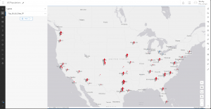
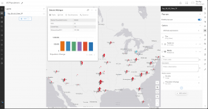
    • Despite backtracking the settings and rechecking the csv sheet, the bargraph in the city pop-up menu does not want to show, even when i selected it in the configure chart, it shows the space where it should be but it does not show any information
    • 2.5 number 21 there is no place map button, just click save
    • 2.5 number 24 there is no map action option in the block palette, there is adding a map and media action but no map action
      • Oh okay it wants us to use the media action button!!!

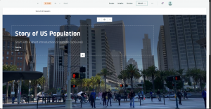
My story map!!!!: https://arcg.is/1ubG1n

An application that could be created from these two chapters would be a story map based on a compilation of birding trips and what you saw, heard, and felt during the trips! Maps could be inserted into the story map using spreadsheet data of bird sightings over an extended period of time with location data on where you went birding, where you spotted specific birds, pictures of the birds (or even if you got your own in the field), a description and overview of the specific birds that you saw (linking to other informational websites), and possibly a comparison to the amount of birds that are commonly and uncommonly found in the areas versus what you saw!

Point data on where specifically you saw each bird based on external devices like ebird.org or by simply placing points on a map and running a story map through each of the points, explaining the amount and different types of avians seen at each location, and maybe a link to recent research about the birds hast were seen or just links to website explaining their range or behaviors in greater detail.


Katterhenrich Week 3

In the first chapter, I learned how to create layers from CSV files and add attachments to them, as well as how to add an ID field to a layer to display photos in organized sequences. I also learned how to add feature layers in Map Viewer and configure its style and pop-up.Ā  This tutorial also taught me how to transform web maps into web apps using the attachment viewer template. I like how the app I ended up creating was user-friendly and accessible across platforms.Ā 

In the second chapter tutorial, I learned how to create a feature layer from a CSV using geocoding, and how to configure layer styles on the visualization tab using smart mapping. I also learned how to use ArcGIS Arcade to configure layer pop-ups and how to add images and charts to these pop-ups. Finally, I created a story map and added swipe blocks and an express map

Katterhenrich Week 1

Hi, my name is Auzlynd, I am a junior majoring in environmental science and biology.

I already have an OWU ArcGIS Online account from taking the Geog 291 course earlier this semester.Ā 

In the My Profile section, the projects I did in 291 are saved there. The training section shows courses you can take to gain skills in web mapping and analysis and The ArcGIS blog section shows what is new in ArcGIS Online with various other articles.Ā 

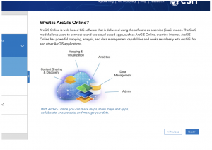
From the reading ā€œGet Started: What is ArcGIS Onlineā€ I learned that ArcGIS is a cloud-based mapping and analysis software with many uses like making maps and analyzing data. It also serves as a facilitator for sharing and collaborating. You can create maps, scenes, apps, and notebooks and manage the data you explore and analyze. This software can be used in field activities as well as configuring sites and provides tools for accessibility.Ā 

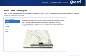
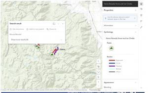
The course ā€œArcGIS Online Basicsā€ helped give me a solid foundational understanding of all the features of ArcOnline. I have attached some screenshots.

Using ChatGPT I looked up how hiking or camping could be applied in GIS. I learned that GIS can be used to make maps of trails used for hiking and these include useful information like difficulty, trail length, elevation gain, and points of interest. This is helpful so that hikers and backpackers can plan hikes and navigate trails. Here is a source I found that I thought was interesting: ā€œPlanning of recreational trails in protected areas: Application of regression tree analysis and geographic information systemsā€ (Aleksandra M. Tomczyka, Marek Ewertowskia)

Chlebowski Week 1

Howdy, my name is Chewy and I am a senior zoology major! I took 291 a year ago so I wanted to eventually take the online portion of the course as well to round out the experience. Hoping to learn some cool things here since I have already played around in arconline before, especially in some super rudimentary story maps that I have made and other random basemaps for other classes.

My Profile (2 comments)

  • By clicking on the profile tab, it brings up many links that lead to an ArcGIS blog where updates about the software and the future are made and shared among the community, a community tab to answer commonly asked questions, and a training tab for helpful courses.
  • Additionally, the help tab at the bottom features video tutorials, helpful web pages of how to use new tools like the Calculate Composite Index Tool and ArcGIS Data Pipelines as well as helpful tricks and tips.

Get Started: What is ArcGIS Online (2 comments)

  • On the sidebar, in the maps section under measurements, it gives detailed instructions on how to measure distance and area in map viewer: using the measurement toolbar, click either the measure distance or measure area option. After this, click once to start the measurement and depending on what option is chosen, clicking once will measure to a vertex of the line or area, and double clicking will complete the measurement.Ā 
  • In scene viewer, you can construct scenes that present geographic information in 3D environments like in street views, topographic maps, and navigation visuals. These can be altered and customized to change their weather, time of day, elevation profile, and many other settings to make the experience as full as you want it to be.

Since I already finished the ArcGIS Online Basics, I decided to complete the course titled ā€œTelling Stories with GIS Maps”

Yellowstone Lake_chewy (arcgis.com)

2 applications:

ā€œUsing Geographic Information Systems to Select Suitable Columbian Sharp-Tailed Grouse Habitat in Northern Idahoā€: https://digitalcommons.du.edu/geog_ms_capstone/39/

Used GIS raster layers to find areas of best area viability for the grouse species in different seasons by using a system that ranks the land with all 5 variables being met being the most suitable for the specific time period.

ā€œUtilization Probability Map for Migrating Bald Eagles in Northeastern North America: A Tool for Siting Wind Energy Facilities and Other Flight Hazardsā€: https://journals.plos.org/plosone/article?id=10.1371/journal.pone.0157807

Determined most common bald eagle routes in northeast US and how these coincide with both high wind speed locations as well as with wind turbines over 100 meters in size to gauge the relative danger of bald eagles and developing turbine initiatives in this area.

Zimmerman Week 1

Hello, my name is Jack Zimmerman, and I am a senior majoring in Quantitative Economics. I took this course as a general requirement, but I am interested in data analysis and thought this course would be fun. Additionally, my primary area of research is real estate, so I thought this would be an excellent complement to my existing knowledge.

Looking Around:

The overall site layout on ArcGIS seems fairly straightforward and intuitive. I explored some layers created by other students and added them to the map. Data management seems to be something I need to reconcile later.

Getting Started: What Is ArcGIS Online

I spent most of my time in the ā€œManage content and dataā€ section. Looking at the ā€œPerform analysisā€ subsection. It seemed interesting, but I think I will stick with doing analysis with R Studio. The primary issue was that data must be publicly available, which is something I canā€™t do with the data I want to use. The second issue is ArcGIS’ credit system. Doing analysis requires credits, and I have already used all of mine to import some data. Next, I looked at the ā€œManage content and dataā€ section. Overall, this section was pretty unhelpful, and it just told me stuff I already knew. A few of the embedded links inevitably led me to some helpful articles on data management. However, I still need to do further reading.

Web Course: ArcGIS Online Basics

This was okay. I found myself just using the book and just skimming over this.


ArcOnline Applications:

I know I want to do something with real estate, so I looked up papers on real estate-based applications. My goal was to find papers on methods and processes for handling data.

Paper 1: Laban, K. N. (2017).Ā Integrating Gis and Real Estate Management Systems to Market and Manage Facilities on the WebĀ (Doctoral dissertation, University of Nairobi).

The first paper I looked at, ā€œIntegrating GIS and Real Estate Management Systems to Market and Manage Facilities on the Web,ā€ discussed combining real estate management systems with GIS maps. This paper is super detailed (121 pages detailed) and includes information about cleaning and analyzing data. Below is an outline of the process used in the paper and one of the websites created.

Paper 2: Kwon, P. (2012). Analyzing Southern California Residential Real Estate Prices: A Spatio-Temporal Approach.

The second paper I looked at, ā€œAnalyzing Southern California Residential Real Estate Prices: A Spatio-Temporal Approach,ā€ analyzed both spatial and temporal autocorrelation patterns in real estate data. The approach taken by the paper to analyze the data seemed a bit too simple but was nonetheless interesting. I think the paper also made a few mistakes in how they clustered the areas and conducted the tests, but they somewhat fixed it in the end. The paper used Moranā€™s I as the metric to measure spatial autocorrelation. I hadnā€™t heard about Moranā€™s I, but I did look it up, and it is very similar (mathematically) to other correlation measures, such as Pearson and Spearman. However, the way the paper implements it seems to make percentage changes in housing prices a function of inverse distance. This doesnā€™t seem appropriate since variation correlated to the percentage change in housing prices usually exists exogenously, not at the spatial level. Anyway, I went way too deep into that. Hereā€™s an image showing the clusters of housing prices over the years.


Benes, Week 3

Chapter 1:Ā 

  • First off it was really interesting to see all the advantages of Web GIS and it seems more friendly to use than desktop GIS.this seems to be a program where you can heavily connect to various data and people to gain information and learn.I didnā€™t quite fully understand the information about hosted and nonhosted feature layers but it might make more sense down the line. The tutorial was a little hard for me to understand, I wasnā€™t able to download the files correctly. Therefore I am planning to set-up a meeting to discuss that.Ā 

Chapter 2:

  • The beginning of this chapter talks about hosted layers more in depth which was helpful. I thought it was really cool to see the sample smart-mapping styles. I think the idea of storytelling through GIS is really cool. In the previous course we did a little storytelling but I am interested to see more components. I was struggling again to get the download correct therefore I wasnā€™t able to complete the tutorial.Ā 

Shaw week 3

Chapter 1:

  • Web GIS is the combination of the web and geographic information systems.
  • The first operational GIS was developed in the 1960ā€™s by Roger Tomlinson.
  • Web GIS is used within the government, business and science world, and even in people’s daily lives.
  • ArcGIS online is a software offering web GIS, ArcGIS.
    • With the benefits and easy to use software ArcGis online has been picked up by many governments and commercial organizations around the country.Ā 
    • ArcGis enterprise is a web gis software product that organizations can use.
  • ArcGis online has four software components: Portal for ArcGis, ArcGis server, ArcGis data, and ArcGis web adapter.Ā 
  • In chapter 1 the first tutorial shows you how to create a Web GIS app that introduces the points of interest (POIs) on maps.

Chapter 2:

  • Smart mapping and storytelling with GIS
  • Feature layers: the most common type of operational layers
    • Web layers are essentially web services that can be reused in many web maps, scenes, and apps.
  • This chapter mainly focused on hosted feature layers, which are the most widely used operational layers.
  • Smart mapping enables users to visually analyze, create, and share professional-quality maps.
  • Tutorial 2 will show you how to create a Web GIS app that presents the spatial patterns of populations.Ā 


Geog 291 application:

I used the applications from chapter 1 and 2 to help me show the population in Delaware county as well as the population that was above a certain age.

Allo Week 3

Chapter 1:
I think it is very cool and important that a part of data analysis can be so visual. I know for me that this makes data more digestible and understandable. I liked the figure describing the multiple pathways and ā€œgeneric workflowā€ for creating web apps. One thing that I think will take some getting used to is figuring out and deciding what map style will be the best to display certain information. I assume this will come with trial and error and testing out what works best with what kinds of data.
A question that came up is how do I access ā€œArcade?ā€
Tutorial 1:
This tutorial was very helpful in terms of learning how to get a map/app to look the way you want it to. This eased some of my worries about picking and choosing what style goes with what. I believe now it is really whatever looks right in the moment and it can always be changed to represent something different.
Chapter 2:
I think the ArcGIS Living Atlas is such a cool resource that really has a lot of information present in one place. It is also cool that it can be updated in a matter of minutes. The idea of storytelling through these maps and apps is such an engaging way to think about gaining information. I like the visual of Maps+Narrative+Multimedia=Story.
Tutorial 2:
I liked that this tutorial focused on the story aspect of the maps and how to cohesively present a story about the data that is both understandable and interesting. I wasnā€™t able to figure out how to add the curved arrows on my map, but I figured some of the other stuff out.

Both tutorials gave me examples of what the readings discussed and I thought it was very helpful. Put it all together and into practice. I believe my question about Arcade was answered in Tutorial 2. I appreciated that the tutorials came with all the data and images needed to complete it. I thought that made working through it much easier and almost seamless.

Idea:
One idea I had was (from Chapter 1) to map supermarkets in Delaware and how many average shoppers are there a week. I could use the pop-ups to describe each store and the people that shopped there. I also could use the story feature to illustrate the history of each store and indicate whether it is a chain store or a local one.

Schtucka week 3

Chapter 1:Ā 

WebGIS allows for work to be done everywhere and also serves as a way for information to be accessed, essentially, instantly. I feel like WebGIS is a more evolved and user friendly version of ArcGIS. This is because WebGIS has a lot of perks compared to ArcGIS, but there are still similar aspects like creating an app/map and the terminology with that. The first perk is that it is good for sharing. WebGIS allows for your app to be seen by literally billions of people. Along with that, there are options that allow for you to select who sees your app, it can be globally or it can be within your organization. WebGIS is also easy to use. It was designed to be convenient, simply, and be able to be used without having any technical background. Another perk of WebGIS is that it is affordable. You donā€™t have to pay for the software itself, and there is a low cost per user per app. Conversely, in my opinion there are also a lot of similar features to ArcGIS. The most basic creation in WebGIS is an app. An app consists of a basemap, operational layers, and tools. All of those features are what is used to create a map in ArcGIS. A basemap is the very first layer of an app. It provides background information or serves as a basic point of reference. An operation layer is the different theme your apps will have. These are things like buildings, data, etc.. These serve as the interactive layer and are more likely the reason for creating the app. A tool is what is used to create an app and to do things beyond mapping itself. This can be data analyzing, customization, etc..

I could not find the ā€œSelect fields for: Locationsā€ in the chapter 1 tutorial so I was unable to complete 1.4Ā 

Chapter 2:Ā 

I was not aware of how many different types of layers there are in WebGIS. In ArcGIS everything is just called a layer by our textbook, and now there are a lot of different layers. At the most basic level, there are hosted VS non hosted layers. A hoster layer becomes a hosted layer when it gets published to ArcGIS Online. ArcGIS ā€œhostsā€ your layers and the data that is in them. A nonhoster layer is when your layers or data are not posted into ArcGIS online but instead are in a user-managed database. There are also a bunch of different subcategories for these layer types. For hosted layers, there are hosted feature layers, hosted web feature service (WFS) layers, hosted tile layers, hosted vector tile layers, hosted web map tile service (WMTS) layers, hoster scene layers, hosted image layers, and hosted map image layers. If you want to post a hosted layer to ArcGIS Online, there are a few ways you can do so. The first way is to create a feature layer from your own data. Your data could be a CSV file, a shapefile, a file geodatabase, or other things. To do this, you would go to ArcGIS Online Content, then click New Item, select where you want to upload your data from (IE: google drive, device, etc.). The second way to create a hosted layer is to create a feature layer from an existing template. To do this, you want to have an empty layer containing the same attribute fields with no data. To then find a template go to ArcGIS Online then go to content, new item, feature layer, and then use a template. The third way to create a hosted layer is to create an empty feature layer and define your own fields interactively. To do this, you also go to ArcGIS Online then go to content, new item, feature layer, create a blank layer, and then choose the type of geometry you need. After you create the layer, you go to the item page, data, fields, and add fields.

IDEA:

My app idea is to use the ā€œGPSā€ data from the Delaware data set to make an app to educate people on the different GPS monuments in Delaware county. I would make a feature layer that symbolizes all of the monuments, then I would configure their popups to tell a little story about what each monument is and when it was founded. I would then create a pie chart consisting of the dates that each were founded to allow the viewer to compare the history of each GPS monument. I would also try to find a link that would take the viewer to an informational site saying what a GPS monument is, and maybe even an educational video.Ā 

Quartson Week 3

This opening chapter goes over the fundamentals of Web GIS. It explores how the cloud revolutionized data storage and sharing, and how Web GIS software has evolved over time. While the chapter goes about the technical aspects of geospatial cloud capabilities, I found the historical background of Web GIS particularly interesting. Chapter 2 takes a deeper look into web app development within Web GIS. It talks about different features like feature layers. These features let you customize and style however you would like and this helps you create a pretty decent map. Something that I found really interesting was also the different type of mapping styles in chapter two. Like I have never heard of a vector field, a predominant map, dot density or comparing ā€œAā€ to ā€œBā€ map. I’m not gonna lie, I had a hard time trying to create an app so I will probably have to come in person to do that or Iā€™ll probably just see if I can find some youtube videos that will show me how. Other then that though the readings were pretty fine. I found a map that showed different characteristics about the U.S population like the age groups of people who worked in different cities.Ā Ā