White Week 4

Chapter five focuses on how and why to build a private Web GIS as opposed to using ArcGIS online and the public cloud. For security, connection, or functionality reasons, you may want to have a private Web GIS and this can be done through ArcGIS Enterprise. Hybrid Web GIS is also discussed which works for and incorporates both ArcGIS Online and ArcGIS Enterprise. There are many similarities between the two but one thing that stands out is that ArcGIS Enterprise runs on user-managed infrastructures. Organizations can directly run these infrastructures or they can be run by other cloud providers. Connection issues are a big reason for this on-premise GIS work as some organizations may not have connection considering how government or corporate regulations can hinder/disallow the use of the public cloud in any capacity. Hybrid use occurs as organizations want to maintain their operational layers but also use ArcGIS Online components and functionality like basemaps or sharing. Thirdly, organizations need ArcGIS Enterprise in order to publish the results of geoprocessing services. I think it’s important to take away from this that the things we have learned with ArcGIS Online like publishing feature layers, and creating web maps, generally apply to Enterprise with subtle differences and distinctions. The book then discusses ArcGIS Enterprise as a user-managed component of the ESRI spatial cloud. ArcGIS Enterprise supports on-premise and cloud configurations as well as a mixture of the two. ArcGIS Enterprise involves various software components that work together like Portal for ArcGIS (or Enterprise portal) which is basically a geospatial content management system. This content is united and shared throughout an organization by ArcGIS. Portal for ArcGIS provides user types, roles, and privileges like ArcGIS Online. Next, ArcGIS Server has the ability to create and host various types of geospatial web services, as the main component that makes geographic information available to others within an organization and those outside of the organization if wanted. ArcGIS Server has 8 license roles. I’ve read through these but don’t feel the need to comment on each one. ArcGIS Web Adapter is the next software component followed by the final one of ArcGIS Data Store. There are relational data stores for hosted feature layers, tile cache data stores for hosted scene layers, and spatiotemporal data stores for dealing with real time observational data and data analysis for large data sets. The next part of the chapters explains Base ArcGIS Enterprise deployment which is essentially an important setup of ArcGIS Enterprise. There are various requirements for this deployment and they function collaboratively and cohesively. There are also three flexible deployment cases including single-machine deployment, and multi-tiered deployment. The difference here is that components are installed on a single machine whether it be physically or virtually for the former and components are installed separately for the latter. There is finally the highly available deployment scenario. Portal collaboration is essential for organizations. One example is like NYC which has various bureaus, and then another subset of various departments arranged is this hierarchy type of order. Everything can have their own ArcGIS Enterprise or ArcGIS Online organization but in order to share common objectives and so forth curated content must be shared which is done through groups. Distributed collaboration is used for sharing with external Web GIS deployments. This is valuable for working with and sharing content across organizations. Layers, web maps, and web apps are the kinds of content that can be replicated with this distributed collaboration. The most recent evolution and current stage of GIS deployment is distributed Web GIS. Moving on, the specified web layer types that ArcGIS Online and ArcGIS Enterprise can create and host are highlighted with a focus on raster tile, vector tile, map image layers, feature tiles. Rater tile layers deliver maps to client applications as image files. These can take time and a lot of storage to create. The benefits include versatility in terms of application and device use, advanced cartography, and support raster data sources like elevation or imagery. Vector tile layers deliver map data as many grouped vector files. These deliveries are produced in Protocolbuffer Binary Format. Benefits include the capacity to customize map style, labels remain upwards when rotating, adaptability to the resolution of the display devices, and vector tiles are smaller than raster tiles and can be generated more quickly. A notable takeaway here is that vector tiles generally make tiles based on data density. Next there are map image layers which can be drawn by the survey or by using tiles from a cache. When tiles are used, the underlying vector data remains available. With this, map image layers support visualization and spatial or attribute queries. Map image layers were most common in the past but now we have feature layers supporting many features and tile layers supporting fast display and so map image layers have kind of fallen out. The fundamental uses of map image layers are customers who need rendering capabilities non-existent in feature layers or customers that have large data sets in need of server-side rendering rather than the client rendering them locally. Feature tiles of feature services is the following section of the chapter, discussing how feature services can make feature tiles in real time when requested by more advanced and modern ArcGIS client apps. Feature tiles allow web clients to show more features from the service with a quicker load time. Caching is relevant in all of this as a useful technique to improve performance by temporarily storing data, as we have learned whether it be for pre-drawn map tiles or frequently accessed query results. In terms of caching, map image layer racquets have the slowest performance, rats and vector tile requests are faster and can reduce the load on the web server. The visual for this section was helpful for comparing map image layers, raster tile layers, vector tile layers, and feature layers. I should have just looked at this rather than all of the tedious text lol. In terms of publishing strategy when choosing layer types, there are a range of choices to consider when choosing a layer type for data. The format whether it be raster or vector and the temporal component of static or dynamic are the fundamental factors for web layer type allocation. There are web service standards that facilitate the ability for different systems and applications to work together and exchange data across boundaries whether that boundary be geographic location or organizational boundaries. The chapter proceeds to talk about how we can publish web layers using ArcGIS Online and ArcGIS Enterprise web pages or use ArcGIS Pro to do so. The chart of the workflow to share web layers using ArcGIS Pro is helpful to see. In three fundamental steps, the first is to prepare the data using ArcGIS Pro, then author the map in ArcGIS Pro including adding web layers and configuring symbols and other properties, and thrifty, share the web layer. The final part of the chapter provides some context on making data accessible to ArcGIS Enterprise in order for it to serve the web layers whether it be generating a map or tending to queries for example. When sharing web layers here, the data is either copied to the server or referenced by the server. The reference option is better from my understanding. 


Chapter 6 comments on spatiotemporal and real-time GIS data use for dealing with objects and events that move, appear, and change through time. There is a demand for real-time data in coherence with mobile proliferation and in turn there is a need for real-time GIS to perform various functions. Spatiotemporal data comes from a range of sources whether it be manual data entry or generation from simulations models. Mobile proliferation has caused an increase in volunteered geographic information and this has been enhanced through things like GPS improvements and wireless data communication. Spatiotemporal data is grouped in moving (trains), discrete (criminal incidents), stationary, (highway speed) or change (flooded areas) classifications. Real-time GIS deals with current and continuous data, enhancing situational awareness, emergency repose, and decision making by delivering data on the spot and performing analysis at the time of the crime per se (when things happen) The time value of an event can be a point in time or a duration of time like the time a lighting strike occurs or when a wildfire starts and ends. One attribute field for storage purposes for the former and two attribute fields for the latter. There are various terms that are critical for working with spatiotemporal data including time measurement system, time reference system, time representation, and temporal resolution. The term I was least familiar with was temporal resolution which is the time interval at which events are sampled like how a weather station reports temperature in every 15 minute intervals. Smaller temporal intervals result in larger temporal resolution and vice versa. The internet of things (IOT)  is basically a massive network connecting things and people. There are two fundamental types of IOT applications including enterprise and consumer IOT. Consumer applications apply to the consumer like connected cars, health, or smart homes whereas enterprise IOT applies to the enterprise at large like smart cities, environmental monitoring, and so forth. Smart homes involve something cool that stood out to me called geofences virtual perimeter for a real-world geographic area, either dynamic or static. Moreover, the relative sensor data of IOT requires context and geolocation does just that and then the GIS transforms the raw data to useful info that can be acted on. Location and geoanalytics work together with onboard sensors. The book gives a nice example of how smart cars must integrate their onboard sensors with the geospatial cloud for routing, legal, and safety purposes. Real-time GIS involves cloud, server, and client-side tech. IOT is everywhere and so this poses a challenge to real-time GIS in terms of volume and velocity of data. In order to combat this challenge, Esri’s geospatial cloud has ArcGIS Velocity and ArcGIS GeoEvent Server. Both are scalable and used for real-time GIS. OInput connectors, processors, and output connectors are provided for taking in real time data, performing analysis, and producing results. In more depth, the three shared fundamental components of ArcGIS Velocity and ArcGIS GeoEvent Server revolve around ingesting, processing, and outputting. Ingestinnn interacts with distinctive data sources and different data formats. Processing processes the real-time data and is able to perform real-time filtering and analysis. Filters include attribute filters for attribute expressions and spatial filters for events based on their spatial relationships with a geofence. Real-time analysis has many strong capabilities like the ability to detect incidents or create a buffer around an earthquake or flood. Outputting involves sending the processed data to whatever destination(s). Sending more formal communication or simple and clear alerts are possible here. All of these components can be configured to trigger further specific alerts or actions. In regards to ArcGIS Velocity, this is relatively new. The main thing is that it is a software-as-a-service (SaaS) platform that runs on ArcGIS Online and is managed by Esri. This requires a subscription not a software license. ArcGIS Velocity introduces three new types of items to ArcGIS including feed items, real-time analytics items, and big data analytic items. Feed items allow users to receive sensor inputs, real time analytic items allow users to perform real-time processing of those inputs, and finally big data analytic items allow users to access and analyze big data repositories that are long time observations and historically stored. A cool and core function of ArcGIS Velocity is the capacity to create feeds to collect real-time streams of data. There are two methods of poll and push that ArcGIS Velocity supports in terms of the delivery of real-time data. Poll is the traditional method where the client polls the server in intervals or whatnot. Push is a newer way to serve data in near real-time using the HTML5 WebSocket protocol in which that protocol is pushed to the web client on the spot by ArcGIS stream services. Stream services can be added to web maps and this is super useful for visualizing real-time data feeds with high data volumes or unexpected data changes. Map viewer has the capacity to show real-time data layers using both pull or push and web apps can be made using only configurable apps like ArcGIS Experience Builder, ArcGIS Dashboards, or custom JavaScript code. The chapter next talks about ArcGIS Dashboards and how this applies to real-time GIS. Essentially these dashboards integrate web maps and other data sources to create comprehensive operational views that serve a similar purpose to say the dashboard of your car. The views update automatically as the associated data changes. I’ve already learned about and worked with ArcGIS Dashboards and so I won’t comment too much for this. A huge application was COVID 19 information sharing by organizations. Arcade is used Dashboards as a data source and for advanced formatting. Next is ArcGIS Mission which is a real-time geospatial communications and situational awareness product. Mission provides a comprehensive picture of the operating environment and assists in the movement and communication of team members whether it be first responders or others. Mission Manager is the relative web app, Mission Responder is the relative mobile app, and Mission Server is an ArcGIS Enterprise server that links manager and responder. Two fundamental benefits are geospatial collaboration and tactical awareness whether it be for disaster relief or law enforcement. Something super cool is the chat tool in Mission that allows for text chats, map sketches, and attachments to be sent. The following section of the chapter is about animating time series data for which the temporal nature of real-time data allows the establishment of the time series. Visualization of the data at each interval fundamental which allows trends and patterns to be visualized over time. Time series data can also be played back. One example of this ability to play back the time series data is replaying the events of an emergency to evaluate the response and make any needed changes. I think this is critical in today’s world. The workflow that illustrates the typical approach to creating web apps that can animate time series data is helpful to see. ArcGIS Pro or ArcGIS Online can be used. Another approach is to publish time-enabled web layers by publishing time-series data to ArcGIS Online or ArcGIS Enterprise. ArcGIS Pro and ArcGIS online have some requirements to do this. A tip is that if we use ArcGIS Pro and open the properties window of a layer and specify the time fields, the result is the enabled time on this layer. This layer can then be shared to ArcGIS Online or ArcGIS Enterprise in order to create a time-enabled web layer. Another approach is to add the time-enabled layer to a web map through which the data can be configured in discrete or cumulative intervals and we can configure the time setting if we want. The final approach is to create a web app from the web map through a time-aware ArcGIS web app template or using ArcGIS Web AppBuilder in which a time slider or time widget is provided for the animation of the data. 

For the chapter 5 tutorial, I was shown how to connect ArcGIS Pro to portals but I was already connected so I skipped this preliminary part. I learned how to publish vector tile and raster tile layers. Lastly, I made a comparison web app to compare the vector and raster tile layers. The focus involved data and a map of the major earthquakes and hurricanes in the United States between the years of 2000 and 2008. The end product was a nice ArcGIS Story that utilized the swipe content block and a side-by-side app. This tutorial was brief. For the chapter 6 tutorial, there were basically two sections, each had a case study associated. In sections 6.1 to 6.4, I created a dashboard app that shows continuous data feeds and photos in near real time. The focus was the city of Redlands, California, and the goal was to assist in response efforts for the city’s local law enforcement/emergency response. The data was provided as web layers for this. I also used Arcade-based formatting here. The end result was super cool and had six total components, an interactive map, a gauge, a table, a list, a pie chart, and a bar chart. For the text part of the tutorial, in sections 6.5 and 6.6, I developed a time-enabled feature layer and a web app that had time animation. The goal of the animation was to display the spatial and temporal patterns simultaneously of US population change over the last 200 years. — I’ve integrated screenshots of my work above. — Both tutorials went smoothly for the most part with some hiccups here and there but I bumped along through it like turbulence. 

For an idea from chapter 5, I could formulate an application to display and compare land us, e change through time. With this I would need to publish a raster tile layer like an old or traditional  image of the land as well as a vector tile layer, possibly a more modern layer showing up to date boundaries and so forth. Then I could make a comparison web app to compare the vector and rater layers. Turning this into an ArcGIS story at the end would be nice too and more visually appealing. I could then analyze the impact of new development and changes over time. I would employ a comparison widget like a swipe content block and or a side-by-side app. Some patterns that could emerge include loss of forested areas, changes in farmland, urban development and more. I feel like this comparison would be cool to see as in my experience with visualizing landscapes, I often encounter older aerial images. Another idea would be to compare elevation data to a city’s drainage network under the context of flood assessment and vulnerability assessment. This would be valuable for displaying the relationship between drains as critically important infrastructure and the topography of the city/area in terms of elevation. I thought about this as with the proliferation of more intense storms, flooding is becoming more dangerous and frequent. My shore town experiences a lot of flooding and some areas have poor infrastructure like drains. This could assist urban planners and really all stakeholders involved. I did some work on this in my environmental justice class and so I tried to connect those ideas here. 

For an idea from chapter 6, I could create an application to show the population change of hammerhead sharks over time. This species in particular along with others like whale sharks have experienced notable population fluctuations historically and so I think it would be interesting to seek out that data for the population and develop a time-enabled feature layer. I would then create a web map and then a web app with a time animation component showing the spatial and temporal trends of hammerhead shark population change over the last 100 years per se. If I wanted to focus on a more recent context and explore the great hammerhead as a critically endangered species and the events that have contributed to this more currently, maybe I could employ a time series spanning the past 50 or 25 years. A smaller time span would allow for patterns to be more visibly exposed I think with subtle changes and specific movements. I would need to make sure the hammerhead population data is in a supported format like a CSV file, shapefile, or file geodatabase. I could also focus this more locally/regionally (like in well-known habitats), or more generally on a global scale. Another idea could revolve around transportation and logistics involving things like fleet tracking, route optimization, incident management, etc. I thought about this because my family business uses a company called Lytx for mapping and visualization, fleet tracking, geofencing, and much more.

White Week 3

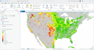
Chapter 3 explores the use of ArcGIS Experience Builder as an interface and tool to build more functional web apps with minimal programming and minimal code involved. There are integrated premade widgets with this that provide functions like mapping, table view, querying, charting, and reporting. Essentially these things interact with the 2D or 3D data we are working with. The primary elements of experience builder are templates, themes, widgets, pages, windows, layouts, data sources, and actions. These are all discussed and the table, filter, chart widgets, dynamic content, and actions components are put into action in the tutorial. There are three options for how to use experience builder. You can start with a template for apps for mobile devices, you can modify and customize templates for whatever medium or screen size of your choice, or finally you can build a web app from the very beginning allowing for the creation of a precise and personalized web experience. A web experience is essentially a web app created through experience builder. From my understanding, experience builder prioritizes a mobile device design and layout. Widgets seem to be super effective and useful. You can formulate a custom widget or theme as well as make widgets react to various actions. Basically these widgets are tools that can be added to the map/app and how they show up and perform can be configured by us whether it be to analyze data or to work with feature layers by adding or editing them. In terms of the work flow for configuring a web experience we start with starting from scratch or selecting an existing template to use. Something important I took away from this from the book is that the categorization website is a template that exists across multiple pages. Then you pick the theme which is just for looks not impacting the layout and its content. At this point, we can bring in feature layers that we assembled or that we downloaded, etc. We can also bring in web maps or web scenes. The fourth step in this workflow is to work with basic/ functional widgets or layout widgets. A basic widget has functional capacity acting as a tool for the app including map, legend, layers, query, filter, edit, chart, elevation profile, survey, and more. Layout widgets are organizational widgets that help for organizational purposes including section, column, row, fixed panel, sidebar, and more. These are the two types of widgets. Once we implement widgets into the web experience, then we can configure associated data sources, styles, and actions. Next, different layouts can be made of the page(s) of the web experience. The options include layout for small, medium, and large screens. The layouts are kind of refined and adapted to the web experience. This reminded me of a bit of smart mapping in the previous chapters and geog 291. The final step is the finalization process including saving, publishing, and sharing the web experience. The previous process is versatile and is nice allowing us to visualize how our creations apply to say a mobile device versus a desktop. We have options of mode inducing a draft, published version, or published with unpublished changes where the draft mode is the best case scenario for edits to be made without impacting the published version. This is the general workflow. The book moves on to discuss the basic components of web experiences which can have one page or be multiple pages or windows as I have indicated previously. The web experience overall as one consistent theme yet each page can have individualized template layouts. A page as the foundation of these web experience apps contain a header, a footer, and a body, by default. A menu widget can be added to apps with more than one page to show those pages in a menu selection type of thing. Windows are different from pages in that windows only have body content but can appear in a certain position or appear next to a relative widget tool. The fundamental uses of windows include splash, alert, confirm, and ToolTips. Each page or window has an outline view which actually displays all the widgets involved. This makes widget functioning and management more efficient as if you want to copy a widget it can be copied and the settings will be carried over without having to recreate the widget essentially. Widget settings for configuration include content, style, and action. Content has to do with the data sources, the associated links, the behavior, and so forth. Style has to do with things like size and color. Actions are performed by widgets and allow widgets to work together and work off one another. Widget actions include message actions and data actions. Message actions act on their own based on triggers, requiring you to define a trigger, a target, and an action. Data actions occur manually and these must be selected from a pre-configured list. The three components of message action configuration are triggers, targets, and actions. Basically a trigger is the event that starts an interaction like a map extent change whereas a target is the widget or the framework that responds to a trigger. An action is the actual function or operation that the target performs like zooming out and panning to a new location. Dynamic content uses different widgets to show information that changes based on user interaction, things like data updates, or other connections. Basically various widgets like text, list, or image are connected to a data source in which attributes or statistics for instance, populate them. The final part of the chapter talks about the three editions of experience builder. One point highlighted is that the ArcGIS Online edition doesn’t allow for custom widgets. Developer edition is the most advanced and enhanced edition but has to be set up.

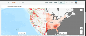
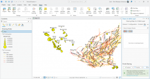
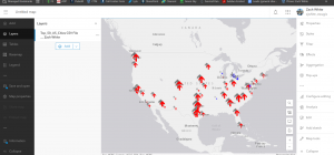
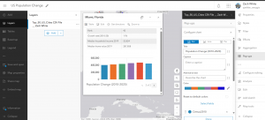
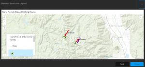
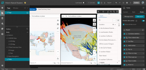
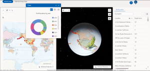
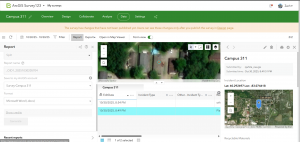
In this tutorial for chapter 3 I created a single page and ultimately a multipage 2D and 3D web experience using the ArcGIS Experience Builder. I added widgets, including section, map, image, text, table, tilter, chart, and menu. In addition, I configured widget content, styles, actions, and animation. I did this all without programming which is part of why this is so efficient and useful wide-scale. I like how experience builders can integrate 2D web maps and 3D web scenes, that is that these 2D and 3D views can be in one app whereas before I remember these kind of being separated. The tutorial went smoothly for the most part. It took me a while and there were inconsistencies in the process and the actual actions I was performing in experience builder. You kind of have to just work through these things, use your intuition, make the best decision based on your experience, push through. The main problem I had was adding the URL (bit.ly/3pGylar) to the alerts page. I kept getting a warning saying that only HTTPS is supported. I made sure I typed the URL probably considering it is case sensitive but I could not get the sample from the ArcGIS API for JavaScript document site. What I did instead was go to the site and copy the full URL from my browser and put that in. It worked out. Here are some screenshots from my work, one from the design window and one from the preview window:

One idea for an app using material from chapter three is to create an experience involving a corporate map and facility finder. I thought about this in the context of my family business. We have a new headquarters and new office buildings. This could help employees, visitors, or applicants. navigate a large facility area. Widgets could be used to locate a certain building and pop-up windows could show things like office hours of operation, reference images, and maybe even directions can be integrated in some way. I would use the filter widget to allow the user to filter for a department or something. I could even go all the way and add an embed widget for which I could include a live Survey 123 form for facility feedback of the new corporate headquarters.

Another idea would be to use the web experience setup to formulate a 2D as well as a 3D mapping of urbanization and development generally here in Ohio or elsewhere. The intention would be to display the impact of urbanization on agricultural endeavors.

Chapter 4 discusses the connection between Web GIS and the proliferating use of mobile technology in the modern era. The chapter explains how Web GIS has adapted to that trend, the need of many populations all over the world through which feature layers can be edited and the implementation of three options of app building. ESRI mobile apps are introduced like ArcGIS Field Maps. I remember a bit about the popular types of apps and frontiers from chapter one. Chapter one touched on this idea of mobile pervasiveness and Web GIS and how to best utilize Web GIS in this modern context. I like the idea of mobile GIS and I like how the book compares this to desktop GIS. This got me thinking about how with geog 291 we needed a desktop, or a strong windows computer but with mobile GIS you just need your phone for instance. Before I get into what the book says I think something super valuable about mobile GIS is its facilitation of field work. Whether it be in data collection or real time information collection, I think mobile GIS has particular prominence and advantageous capacity out in the field. The book also mentions the facilitation of communication through which professionals in the field and consumers can both simply interact or collaborate on a deeper level. Location awareness and mobility are some other benefits of mobile GIS. I think Mobile GIS’s application to a range of wireless communication technologies like Wi-Fi, cellular, or even Bluetooth is super cool. As with everything, there are limitations and so technology has become so advanced that these limitations are minimal I would say but also are continuing to be minimized. With that, limitations must be considered in that the screen size of a phone is much smaller than that of a computer, along with other functioning capacity like battery size and CPU speed. Ultimately, mobile GIS can be used by anyone whether it be an individual for personal use, to learn what are the best places to visit in a city, or more formal use for an organization to explore data or conduct field surveys. The next part of the chapter talks about editing feature layers, views, and working with feature templates. Although you can edit features with ArcGIS Online, the book points to the fact that ArcGIS Pro is the best option for editing capabilities. We can allow users to add photos or other files to feature layers if we enable attachments and we must be the wonder of hosted feature lay or the admin of an organization to make such edits. Edit tracing is also a capability through which changes in the data of a feature can be monitored and analyzed. One way to make it so different groups can see different sets of info in our hosted feature layers is to create a view layer from the hosted feature layer. This is super useful for allowing organization members to maintain the authenticity and up to date status of data while also sharing the data with other groups and the public. This view would have editing capabilities turned off but the good thing is the public sees any updates or changes to the other layer that is manipulated by the organization as both layers reflect the same data. A cool side note is that Survey 123 is used to create smart surveys, Arc GIS creates a feature layer and the associated view(s) for us. Moreover, a feature layer can have a feature template which defines the type of data items that users can add to a layer. A benefit of this is that it ensures the accuracy, reliability, and consistency of the data while making things in terms of editing efficient for the user. This feature templates are used a lot with mobile data collection. Next, there are three mobile app development strategies including the browser-based approach, the native-based approach, and the hybrid-based approach. Native apps are the apps that we install and download on mobile devices. These are good but have a high cost limitation. ArcGIS native apps for field operations include ArcGIS Field Maps, ArcGIS Survey123, ArcGIS QuickCapture, ArcGIS Navigator, ArcGIS Companionâ„ , ArcGIS Earth, ArcGIS Mission Responder, and ArcGIS Indoorsâ„¢ mobile viewer. These apps intentionally apply to all areas of field work like planning, navigation, coordination, and more. ArcGIS Field Maps is very versatile and supports the planning, tracking, understanding, and data capture phases of field workflow. ArcGIS Field Maps allows users to show web maps, seek out places and features, and be directed to those places. There is a web app and a mobile app. The mobile app has an offline mode through which you can manage work while in remote areas or areas in the field out of the office basically. The mapcentric data capture component is cool as it allows users to collect and organize geographic info with an interactive map. ArcGIS Field Maps knows what is happening in the field and feeds tracking data into a location-tracking feature service which stores tracked locations as features. ArcGIS Field Maps is integrating ArcGIS Navigator and two interesting things with this is that an organization’s own data and unique or specialized navigation rules can be used along with the option for downloading maps for offline mode navigation use. ArcGIS Survey123 allows us to collect field data in a structured way and create surveys with pre-defined questions that connect to feature templates, domains, default values, and so forth. Offline and online data collection is possible with this as well and survey results can be stored in hosted feature layers and can be shared. The two ways to design smart forms with Survey123 are Web Designer and ArcGIS Survey123 Connect. The first option is easier while the second option is a desktop app that applies to more complex rules and advanced questions. ArcGIS Survey123 Connect has the ability to pull data from CSV files and use JavaScript for more advanced capabilities. ArcGIS QuickCapture involves rapid data collection. Essentially this is used to collect data up in the air from a plan or helicopter, from a moving vehicle on land, etc. It organizes the data to be collected and users can do inspections by collecting locations or even photos rapidly. ArcGIS QuickCapture allows whatever data is captured to be sent back to the office or headquarters and whether it is additional data or new data this data can be transported and used in real time. ArcGIS Indoors mobile app pertains to happenings within an organizational internal environment. The relative indoor mapping, routing, and collaboration create a scenario in which you can feel more comfortable and connected with your workplace or campus or business. Wayfinings navigation helps you find your way around for instance your campus through using Wi-Fi and Bluetooth IPS. There is also a calendar integration which considers calendar events and connects them to navigational needs and how to navigate timed obligations and how to get to those things. Explore and research allows for searching for people, or a certain building, or a certain event like if you want to know where the convention is being held for example. You can report incidents or or problems to your organization of a facilities team via launch actions. Lastly, users can share their locations in order for the organization to support activities or support research direction and so on. ArcGIS Companion is a native mobile app. Thai app gives access to your ArcGIS organization, content, and profile and allows you to see alerts and news or updates from your organization. ArcGIS AppStudio allows you to form custom mobile apps across platforms, for instance using ios and windows. The book moves on to explore VR, AR and LBS’s. An LBS or a location-based service, uses a device’s geographic location to provide specific information or features. Points of interest (POI’s) are considered and used. Volunteered Geographic Information or VGI is essentially geographic data contributed by the public not a formal organization and this is often employed on mobile devices. Through crowdsourcing, VGI can add value to warning systems for natural disasters, epidemics, or other real time societal occurrences. VGI is a source of big data and Survey123 is best for VGI collection as when a survey form is shared with the public, anyone can partake in it. VR is a simulation of a 3D map or environment that is generated by a computer and can be interacted with in what seems like a reality using special electronic equipment. VR is becoming more immersive and accessible with the advancement of tech in coherence with mobile proliferation. AR is similar but different in that it overlays information that is computer-generated on the live view through a device like an iPhone or a camera device. ARworks well with Mobile GIS because a mobile device gets information based on where you are, where you are facing, and so forth. It can overlap this info in the camera view. The fundamental distinction between VR and AR is that AR enhances the perception of reality whereas creates a simulated view of reality by replacing the real world with the simulation. ESRI has AuGeo which is a mobile app that augments reality. You can do things like overlay symbolized point features from hosted point feature layers in ArcGIS Online, over a view captured by the camera on their device. ArcGIS runtime toolkits have an AR view element that developers for instance can use to construct specialized AR experiences like table tip and world-scale experiences. For tabletop 3D content is placed on top of a real world physical surface or scene through a simulation. With the world-scale experience GIS data is retrieved and shown on top of the camera view appearing like it is actually visible in real life. Mobile GIS can not only retrieve GIS continent but also use things like edge computing and computer vision technologies to detect objects in the camera views. For instance Survey123 can recognize plant or animal types for leaf images or fur images.

For the tutorial there were four total exercises I did and I downloaded and used the Survey123, Field Maps, QuickCapture, and AuGeo mobile apps when needed.

I had an issue with tutorial 4-1 Question 13 and 14 with setting a rule for the incident type question. I wasn’t able to make the visibility of the recyclable materials question conditional on whether the incident involves recyclables. This was annoying and took me time working at it, but I was able to continue and it didn’t cause that much of a problem down the road with things.

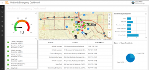
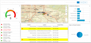
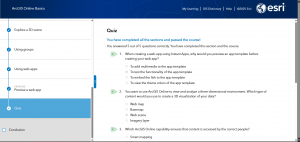
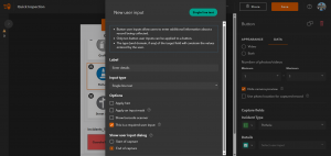
For tutorial 4.6, questions 18-20, I ran into another issue. Basically I was trying to configure the pothole incident type to require users to specify the details when reporting a pothole. When I attempted to create a new user import, I was able to do everything except actually create it. There was NO create button. Here is a screenshot of what I mean. This was the very last part in tutorial 4.6 and so I moved because it became super frustrating. I also got three warnings when I tried to save it.

For tutorial 4.7, question 5, I was unable to add details about the pothole incident. This was because of an issue earlier in 4.6. Only a photo was taken and sent through. I get the gist of it though.

An idea I have for chapter 4 is to create an app that can report roadside hazards. I thought about this given the big hurricane that recently swept through Jamaica and the Caribbean. Things like fallen trees, street damage and potholes, debris, or non functioning lights are examples of potential reportings. ArcGIS QuickCapture would be great here as these hazards can be reported while driving along, pictures can be taken of the hazard, and so forth. This can assist emergency response teams as well as other essential entities. I can envision this data collection syncing in real time to a live dashboard or map. Another similar idea is flood damage assessment and management. An example of how ideas from chapter 4 could be used here is that first responders could use ArcGIS QuickCapture for a general evaluation of the extent of damage done by the flood/storm. Then I could have a survey123 form for more specified teams to come in and assess in depth, attaching photos, requesting resources, collaborating with agencies and so on. Furthermore, a super cool application for ArcGIS Field Maps that I found researching is hydrography used by ships, coast guard, and other law enforcement. Field maps include the navigation component and goes beyond just producing charts and so this has become a big use for ports all over. Crews can also partake in viewing or collecting data out at sea with offline mode if needed.

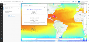
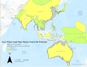
I think the app I will make from chapter 1-4 will be an ArcGIS story map that shows the circumstances of species like the sand tiger shark in the face of ocean warming. I’ve explored sea surface temperature and other relative layers from ArcGIS Living Atlas of the World. I am passionate about the oceans and I think it would be cool to show temperature trends over time, integrating sharks in some way. I wanted to do this idea even more considering the recent category five hurricane that developed to that level of intensity literally as a result of warm and warming waters.

White Week 2

Chapter 1).

Chapter one highlights how Web GIS is simply the combination of the world wide internet and GIS. The text underscores the versatility of Web GIS in terms of applicability, accessibility, convenience, collaboration, and representativity and feasibility in use. GIS is both a science itself and a mechanism, a tool for science. With the increased significance of spatial location and analysis, Web GIS is adding more value perhaps now than ever before. Whether it be through government, business, daily life, or science Web GIS is considered and applied progressively. The chapter then discusses Esri’s Web GIS capabilities. We have learned and worked with ArcGIS Online a decent amount so I won’t get into details with it. The main idea is the benefit of cloud computing. There has been a trend for organizations to adapt ArcGIS Online and ArcGIS Enterprise. A big benefit of ArcGIS Online I think is the access to ArcGIS Living Atlas of the World. We have worked with this in Geog 291. The chapter proceeds to comment on the evolution of Web GIS from closed to open geospatial web services, from a one-way to a two-way information flow, the recent trend towards mobile pervasiveness, and more. The capabilities of Mobile GIS I read are fascinating to me. Like employing augmented reality to it. Wow. Web GIS has even started to integrate AI! These five main content types of Web GIS are data, layers, web maps and scenes, tools, and apps. This was a bit of a review from Geog 291. The basic components of a Web GIS app are base map layers, operational layers, and tools. Basically, base map layers provide foundational geographic context while the operational layers contain the more particular data on what the map is focused on communicating or analyzing and so forth. The chapter next gets into a discussion of feature layers, a critical component of web services. I learned a lot of feature layers and worked with them previously so I won’t add too much here. However, what I took away from hosted and non-hosted feature layers is that hosted indicates more general public storage/use ran by ESRI for instance whereas non-hosted signifies more private storage/use for example within your organization. There are a range of ways that ArcGIS allows for the creation of web apps. One example is to use desktop tools to convert a shapefile as the data source to a feature layer. Then to create a web map in 2D or a web acne in 3D from the feature layer and finally employing an instant app template. There has also been a positive trend towards adding attachments as data sources. I think this is great because as the text conveys, pictures and videos have great meaning, frequently meaning or value that only pictures or videos can capture by whatever means. The Attachment Viewer template can be used for a multitude of purposes that I mentioned before whether it be daily life or crucial government work. I like that the tutorials are integrated.

Chapter 2). 

Chapter 2 gives an overview of story maps and storytelling with GIS. Web layers are the foundation to web apps and stories are basically a facet of web apps, that is a primary type of web app. ArcGIS Story Maps is the new-generation story app and is the focus of this chapter and our work. The chapter also discusses ArcGIS Living Atlas of the World and how already configured layers can be extracted from this. The chapter opens with an explanation of feature layers, particularly hosted layers that we will be working with. A main point is that hosted layers pertain to vector feature layers. I remember from Geog 291 that this includes things like points, lines, or polygons. The relative data points (coordinate-based) have both location and attributes. There are 8 different types of hosted layers that can be published to the geospatial cloud. There are additionally distinctive ways to create and publish these hosted layers. One way to publish a hosted layer is by creating a feature layer from our own data which I had some experience with in Geog 291 working with the Delaware data and shapefiles. You can also simply use a template that is there or you can create and empty feature layers and go in and manually develop things like fields. Next, the chapter provided me with a refresher of smart mapping. Smart mapping is different from traditional software defaults and processing because smart mapping provides a unique and individualized analysis, creation, and product ready for sharing. Smart mapping also works actively for example as you change or add fields, the internal functioning of smart mapping persists to basically overlay your decision with smart choices to develop the best maps possible. I think this is super awesome. While smart mapping is endlessly useful, you can also manually adjust any changes the system makes.

The chapter talks about pop ups and this was a bit of a review as well. What I think is great about pop-ups and the fundamental point here is that they enhance the attributes associated with each feature layer in the map. These pop-ups present geographic info in an interactive way and I think this is critical for applications in the modern era where people almost expect a pop up or expect more information to be given to them as they click on locations or points etc. You can also formulate pop-ups and male them show what you want whether it be simply a picture or even a video with text. ArcGIS Arcade is the following topic of this section. Rather than having to go in and modify data and do tedious work, Arcade is an expression language that acts as a service in ArcGIS to basically configure pop-ups. Arcade allows you to build expressions using fields. The book relates Arcade with the formulas in Excel. Arcade can also evaluate logical statements, even expressions with various statements. The purpose of Arcade is not to write a single-purpose web app built from a template but rather to work with existing expressions that are used for visualization and labeling purposes. Next is an evaluation of ArcGIS Living Atlas of the World. I won’t say too much about this as I learned about it and worked with it previously. Basically it has thousands and thousands of layers stored for it to use. Another core element of this is that data is updated actively and recent data is prioritized especially for live sequences like traffic or natural disasters. A big part of storytelling is tending to today’s clientele who are predominantly technically advanced but at the same time extremely lazy and minimally attentive. There are three keys to facilitate a smooth user experience and these are important to employ when creating web layers, maps, and apps. That is to make things easy, fun, and fast. ArcGIS Story Maps combines interactive maps, user experiences, and multimedia content to tell stories while intuitively integrating the W’s of storytelling to make the narrative strong. The new generation, ArcGIS Story Maps, has a range of advancements from the previous classic ESRI story maps. A bock is an element used to develop the story whether it be a sidecar or a photo. There are also immersive blocks that standout and add more detail/content. The block pallet is the collection of all blocks used to facilitate the interactive component and allows you to select blocks and add them to the story. A sidecar is really cool and allows for vertical-scrolling showing multiple slides and I think this is good for thematic data comparison in an engaging way. You can zoom to points as the narrative moves (slides) along to emphasize things or whatnot. Furthermore, there is a slideshow block which uses horizontal scrolling. This creates a presentation where the block, for example the photo, encompasses the whole screen, creating an enriching visual experience. There is a narrative panel with text that moves along. There is the map tour block which can be used in the guided or explorer mode/layout. With this you can take a specific set of locations or sequence of the data and move through those clusterings/groupings in a narrative format. Then we have swipe blocks and time blocks where the former allows for comparison between two maps or images and the latter shows data in a chronological order for which you can add text for each event. Finally, the chapter concludes with a brief overview of express maps. Express maps are simple and can be created in the story builder. These can be used to efficiently add context to the story. You can actually draw features whether it be a street (a line) or a business district (an area). You can configure pop-ups to further contextualize the features with this. Express maps can be used to simply sketch out what you are envisioning if need be. Arcade was used in this process as well as tools like geocoding and smart mapping. I could add a swipe block to compare the locations of shelters or hospitals to some demographic data. For instance, I could show shelter locations compared to vulnerable low-income populations in order to assist the public with demonstrating resource availability and proximity to their local shelter in the event of this natural disaster.

Tutorial things).

For 1-1 the terminology was a bit off and did not directly line up to what I was actually performing in ArcGIS Online. Particularly there were issues with the attachments. I still smoothly figured it out but just wanted to mention. Essentially, I created a Web GIS app to display the main attractions or as the book explains points of interest (POIs) in the city of Redlands, California. During this process, I first created a base web map in the Map Viewer. The instant app shows the location of these places for efficient visual representation but also includes general information integrated in pop ups and so forth. For chapter 2’s tutorial I created a story and refamiliarized myself with the value of story maps and their capabilities and uses. I created a Web GIS app that shows the spatial patterns of US population change over time, looks into why those changes have occurred, and shares what I discovered/created with the public using ArcGIS Story Maps.

An application I thought up that could incorporate the chapters and their associated tutorials is an instant app on natural disaster related action. I had a class last year called science communication. This reminded me of this class. I would either do an instant app or actually maybe an ArcGIS Dashboard. I like the dashboard idea to convey location-based data and analytics for actively visualizing trends and making real time decisions through real time data, charts, images, and other forms of media/content. I was going to do a story map but I wanted it to be more data driven and functional for this type of serious and reactive situation dealing with a natural disaster, less of a narrative flow type of thing. Something super cool that stood out to be from the chapters was the discussion of ArcGIS Living Atlas of the World. Given the strong hurricane that is currently brewing in the Caribbean sea and down near Jamaica, Tropical Storm Melissa, I’ll focus this application on hurricane management/response. I would aim to intuitively communicate efforts to prepare, how to manage the storm’s impacts, and then real time responses. In doing this, this would support both the public and the federal government with emergency response teams and so forth. The goal would be to communicate scientific information to a representative audience, in a fast, meaningful, easy, and fun way. I would do this by adding real time hosted feature layers, ensuring to find a way to display the hurricane’s forecasted track and progression. This should be possible through ArcGIS Living Atlas of the World. I could also bring in other csv files or shapefiles and publish those as hosted feature layers if needed. I would add a feature layer that has to do with roads whether it be evacuation routes or road closures. I would also consider adding a feature layer of point features including shelters. Shelters are critical infrastructure in times of emergency and natural disaster and so are hospitals. After I added these published layers I would create a web map working with the symbology and styling elements. I would form the web map employing various smart mapping tools like displaying the icons based on a size that reflects their capacity. I would make sure to use smart colors like red for road closures and green for open evacuation routes etc. I would also configure pop-ups to show contextual and fundamental information like the name of the shelter and its phone number and maybe an added attachment image of the shelter for visual reference. Another feature layer pop-up could show the category of the hurricane where it is at, and other weather conditions. Next, I would develop a web app. I would utilize smart mapping for this as well to configure the layer style and so forth. I would use a helpful base map like the community basemap to enhance the operational layers, making sure not to disrupt or diminish those operational feature layers. I would create two versions or just share with the public (everyone) and privately with the municipality/city or emergency response teams. The nice thing is users can access the app on their mobile device or their computer if they prefer.

If I were to just do a story map, I would do this on tracking an endangered species, the sand tiger shark. Through a story map I would be able to focus on more of a narrative layout including text, map(s), and multimedia. Geographic data can be collected on the existing population and then mapped out on web GIS. I would give context on their role in the ecosystem, why they are endangered, and sharks at large. I would bring in already collected GPS data to show movement paths as well as critical habitats that these sharks go through or consistently return to (inhabit).

White Week 1

My name is Zach White and I am a senior environmental studies major. I am minoring in politics and government as well as Spanish. I am from Philadelphia, Pennsylvania and Atlantic City, New Jersey. I love the ocean, music, basketball, and fishing.

I completed the email and its required due diligence for Tuesday 10/14. I’ve also taken the Geog 292 quiz and that went smoothly. I have an Arc account from Geog 291 but I still did some exploration. I added my basic information to the my profile section in my ArcGIS online account. I also reviewed the My Settings, My ESRI, Training, Community and Forums, ArcGIS Blog, and Help sections of my account. I think ESRI training is a great resource and can facilitate our learning and progression as we do applications and so forth. I was also reminded of the ArcGIS Blog tab through which we can display our applications of GIS and just a useful resource overall for ArcGIS related work. I like that through the my profile section we can see an overview gallery of our items. We can also customize our maps and applications by manually selecting them and reordering them in whatever way we want. While there is some sort of structure by relevance there by default, this is nice to be able to personally assemble this content.

I also completed a read through of Get Started: What Is ArcGIS Online. One facet of the text that stood out to me was the fact web GIS is browser based for our Geog 292 course. This is different from Geog 291 where we worked with installed software. I think a core benefit of this web GIS is that we can access it anywhere, facilitating effective and efficient collaboration through private or public sharing groups. Access through ArcGIS apps or mobile devices is super cool. I also like that ArcGIS Online is more accessible to a wide range of users and applicable to a more representative selection of operations/functionalities. For instance, ArcGIS online supports field activities and fosters field work.

Another main point is that ArcGIS Online is flexible and versatile and you can join in different ways and merge/convert accounts. You can join an organization with an ArcGIS account created for you, you can join with your organization-specific login, you can join with an existing public account, you can join with a new account you create with an ArcGIS login, or finally, you can join with a new account you create with a social login. Additionally, I found that through settings you can change your password or security question. I don’t know why I choose to include this, probably because I frequently forget my passwords to things. Finally, I learned about the details of ArcGIS Notebooks that can be used for conducting analysis and showcasing that analysis. Python code can be worked into this as well.

I then moved on to some training with the Web Course: ArcGIS Online Basics. One thing I noted from the course is that the ability to create a geospatial hub that allows for collaboration between colleagues, teams, agencies and so forth is a core function of ArcGIS Online organizations when solving real world problems. I also learned that web scenes are different from web maps in that they exist and function in a 3-D environment. Another cool thing that taps into how generally compatible ArcGIS Online is that web maps can be created with ArcGIS Online content without any proficiency or experience with coding.

Screenshot from the create a web map section of part 3:

In section 4 I learned about one of the critical and ultra-convenient tools employed by ArcGIS Online. That is smart mapping. The web GIS essentially works through its internalized set of cartographic principles and elements to identify and suggest things like the symbology of a field. Needless to say you can also manually alter the symbology or whatnot. The cool thing is even when you do that on your own, ArcGIS Online applies its cartographic values and mapmaking tools to whatever change you made to make that change most successful.

One additional training course that sounds interesting to me is Field data collection and management using ArcGIS. I would also consider the course that entails analysis in ArcGIS Online.

ArcGIS Online Application 1).

I looked into ocean warming as a facet of global climate change. Coral bleaching was a common topic that came up and so I explored this. I found some work done showing sea surface temperatures the implications of coral bleaching that occur with warming waters. This map used ArcGIS Online and ArcGIS Living Atlas of the World to pinpoint coral reef stress from heat, helping to identify areas at risk and so forth. I think this map is useful for directing conservation and learning about ocean acidification and warming. This is a nice display of raster data.

Map in a minute: Map sea temperature and coral bleaching using arcgis online and arcgis living atlas. ArcGIS Blog. (2023, August 2). https://www.esri.com/arcgis-blog/products/arcgis-online/mapping/map-in-a-minute-map-ocean-temperature-and-coral-bleaching-using-arcgis-online-and-arcgis-living-atlas

ArcGIS Online Application 2).

Next, I explored some relative data on my favorite type of shark, the sand tiger shark. The work I found identified areas where these sharks are most vulnerable to fishing and overexploitation for shark fin soup. This particular project that I include was made into an ArcGIS story map showing where restrictions on targeting these creatures exist, where they don’t, and where they need to be established. Sharks are the apex predators of our oceans and this conservation work is vital for the future of the planet. I like the story map a lot. It is super engaging as you scroll through, incorporating some text, great imagery, and the map(s) that were developed.

Wise, A. (2023, December 8). Where are sand tiger sharks most endangered?. ArcGIS StoryMaps. https://storymaps.arcgis.com/stories/bd17cb2144474996a42294dda927496b

One final application I found is improving storm drain efficiency and infrastructure related to storm surge. I did a project on flooding and storm surge so this is interesting to me. The particular work I read focused on the storm drain network in Santa Monica California. Stormwater infrastructure is super critical especially in the face of global warming and its associated more intense storms and tidal events. I was just in Florida and there was a storm off the coast and a king tide. The water was exceptionally high, higher than I’ve ever seen. High waters can be excessively damaging. I think this use of ArcGIS Online to identify storm drain networks, engage stakeholders of the watershed and so forth is going to be an essential thing moving forward.