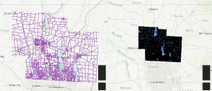
App 1: This web page features an interactive map that overlays Delaware County’s land parcels with street centerlines. The goal is to provide users with an easy way to explore the relationship between different parcels and streets, allowing for basic spatial analysis. I utilized an experience builder template to create the page, enhancing its visual appeal with the inclusion of Delaware County’s crest and a county map sourced from the web.
Users can interact with the map by clicking on individual parcels, which will display detailed attribute table information, such as acreage, ownership, and land use type. Likewise, selecting a road or street from the centerline map will reveal specific details about the chosen roadway, including whether it’s a local street or part of a major highway or interstate. The layout is designed to give users a comprehensive yet user-friendly experience when analyzing both the streets and land parcels in the county.
(Link kept saying error, had this problem in my other class) Here is the image
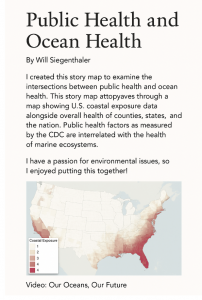
App 2: This story map explores the critical intersection between public health and ocean health, emphasizing how coastal exposure levels in the U.S. relate to the overall health of counties, states, and the nation. By mapping out U.S. coastal exposure data alongside public health statistics, it highlights how environmental factors—particularly those related to marine ecosystems—can directly impact public health outcomes. The map shows varying levels of coastal exposure, with a visual representation of different regions of the country that face the greatest environmental risks. Additionally, the story map features a video titled “Our Oceans, Our Future,” which delves into the pressing issues surrounding ocean health and its effects on human well-being. This project aims to foster a deeper understanding of how our environmental and public health systems are interconnected, shedding light on the importance of protecting both our oceans and the communities that depend on them.
(Link kept saying error, had this problem in my other class) Here is the image of the post I made.