Schtucka week 7-9 (final)

For my first app (chapters 1-4), I focused on chapter 4’s creating a survey using Survey123. I created a survey that would be used to find the most walked route on campus for the morning and afternoon hours. The answers from the survey would be compelled and the most common answers would be mapped to show the most common route from the earliest response time-12pm and then 12pm-the latest response time. 

https://survey123.arcgis.com/share/09361ba2dc554b61846fb93a5ce7a6a0  

For my second app (chapters 5-8), I dialed in on chapter 7’s area of 3D scenes. In WebGIS’s living atlas, I found data on the U.S. Forest Service showing all the different forests from the National Forest System along with their regions. Using this, I created a 3D scene app that allows the viewer to see the different regions of forests by color, and the 3D aspect is that each forests’ shown heights are representative of the area they cover in acres. Along with this, the app also shows the forest’s name over their polygon. Viewers are also able to click on each forest and read a pop-up window about the forest. This allows the viewer to analyze which region has larger forests, and if there is any particular forest they wish to look into more, they are able to get basic information about it. 

https://owugis.maps.arcgis.com/apps/instant/3dviewer/index.html?appid=970594785442421b8760a12ecda1d344

Schtucka week 6

One of my favorite aspects of ArcGIS was the ability to make 3D map renditions, and so I am able to complete those from WebGIS as well! 3D maps in WebGIS, however, are referred to as either web scenes or 3D scenes. The book states some of its own examples of 3D scenes as giving a wider ability for story telling, helping with architectural ideas, urban planning, stimulations for defense, and creating films. I would also like to add to that list that 3D scenes allow for views to get a greater understanding. Sometimes, normal maps and scenes are hard to understand from their 2D view. What’s even more interesting about 3D scenes is that they are able to add an “X-ray” feature to a scene, allowing the viewer to move in and out of the objects to see what is inside. Furthermore, 3D scenes also allow those looking at them to see how sunlight or other implements might impact an area that a 2D scene wouldn’t be able to do. This allows for a further analysis of the scene and its contents. 3D scenes are able to be broken down into two different types. The first type is a photorealistic scene. A photorealistic scene is supposed to look as close to real life as possible. They utilize photos and texture features to recreate it to the best of their abilities. Typically, they are best used to show visible objects (like a city). The second type is cartographic. These use a 2D mapping technique and transitions them into a 3D scene. A lot of the time, these use attribute-driven symbols: height, size, color, etc. They do this to display physical, abstract, or invisible features.


I am not exactly sure what I would make from this chapter. I think I would pick an already created map and turn it into a 3D scene or take a feature in the map and turn it 3D. This would create a cartographic scene as opposed to a photorealistic scene. I think it would be interesting to take a 2D map of campus and have a pop up window for one of the buildings that would be a 3D rendition of it and allow it to be x-rayed. 


Schtucka week 5

I think that the real time aspect of WebGIS is really cool. It has the ability to update the position and location of an object as it moves spatially. This is made possible by the use of mobile phones, sensors, and the internet creating an abundance of data that is found in real time. To get more specific, the real time data is referred to as spatiotemporal data and it is found by observations of objects and events while they move or change through time. The book gives the example of when something is located and where it is located. This type of data has four main categories: moving, discrete, stationary, and change. Moving data can be considered as something that moves locations over time. This consists of objects like airplanes, buses, cars, etc. The second category of discrete data are just by chance occurrences. The book states that they are something that “just happens” and examples can be anything from criminal incidents to geotagged Instagram posts. The third kind of data is stationary. This kind of data is something that stays in one space, however, the value that it contains changes. The book gives examples of wind speed and direction and also water level gauges. The fourth data type is change. As the name suggests, these data are those that change or grow throughout time. The book gives the examples of wildfires, floods, urban sprawl, and LULC change. These categories of data are updated in two different ways: point in time or duration of time. Point in time references the one moment an event occurs and are usually put in a single attribute field. Duration of time is typically when something starts and ends. These types of recordings are usually recorded using two different attribute fields, one for starting and ending. 

For this section of the book, I would like to create a map that students would be able to use to look at reported crimes on campus. Students would be able to send in an instance, and the instance would then show up on the map and use an icon that would represent it. For example, a stolen bike would have a bike symbol, and gun shots could have a gun symbol. This would use discrete data and the time would be recorded as a point of time.

Schtucka week 4

Chapter 3 

One cool feature that I like about WebGIS is the variety of ways that users are able to customize their experiences. One example of this is what WebGIS calls Experience Builders to build apps. Experience Builders have multiple steps with options in order to utilize app building with them. The first step is to either pick a premade template or to start building your app from scratch. If  you choose to use a template, you are picking to use what is essentially a premade app layout with preconfigured widgets (placed in certain areas with certain styles). If you don’t choose to use a template, you would do this step from scratch. The next step in using an Experience Builder is to then choose a theme for your app. This theme will be a preset style for how your app appears. However, one thing to note is that the theme will not impact the layout of your app. After choosing the layout and theme of your app, you then begin to add data. This data can be anything. It can be 2D maps, 3D scenes, or even feature layers that you create or import from elsewhere. Once your data is imported, you then will configure your widgets. When using Experience Builders, you have the option to use two different kinds of widgets. One of the options is a basic widget, and the other is a functional widget. After adding the widgets, you then add the relevant data sources, styles, and actions. The next step is to refine layouts for all of the devices, this is simply just making sure that the app will be correctly formatted on any device that it is used on. The final step is to just save, preview, publish, and share. 

For 3.1 the URL did not show up in the online book, so i couldn’t insert the proper image 

I also had trouble linking a section to the Data Summary Views Navigation; due to this issue, I was not able to successfully complete 3.3 

Chapter 4 

I think the fact that WebGIS is mobile to be used on a phone is really interesting. ArcGIS is only able to be utilized on a desktop, which was really hard for me during that class. However, WebGIS can be accessed anywhere, including phones. Being able to be mobile gives WebGIS a lot of advantages. For example, it is easier for the software to utilize location awareness. It allows for the use of GPS, cellular networks, WiFi, bluetooth, compasses, and way more. It also allows for the collection of data to be done easier. It erases the human error risk with paper data collection. ArcGIS does this as well, but instead of using a desktop, users are able to just use their phones or other mobile devices. There is also the added benefit of live connection to mobile networks adding near-real-time information. WebGIS has a greater ability to monitor spatial and temporal information. Being mobile also allows the software to be able to be used by more users, therefore, there is a greater demand. Some examples given in the book of devices WebGIS works on are: smartphones, tablets, smart watches. These features are compatible with a number of different operating systems as well, these include Android, iOS, and Microsoft. This is different from ArcGIS as it only worked on Microsoft/Windows. Along with this concept, WebGIS also makes it easier to communicate. There is an added feature of communication and collaboration with professionals and consumers.They are able to communicate in many ways compared to ArcGIS, such as voice notes, texts, photos/videos, email, social media, calling/video calling. There is also the options for wireless communication. This can be done via Bluetooth, Wi-Fi, 5G networks, satellites, etc.

IDEA:

I think for my final project chapters 1-4 app, I want to create an app about educating the users about something within the Delaware Data, and then create a survey about when they want to include more or have it act as like a quiz and have it linked on the app

Schtucka week 3

Chapter 1: 

WebGIS allows for work to be done everywhere and also serves as a way for information to be accessed, essentially, instantly. I feel like WebGIS is a more evolved and user friendly version of ArcGIS. This is because WebGIS has a lot of perks compared to ArcGIS, but there are still similar aspects like creating an app/map and the terminology with that. The first perk is that it is good for sharing. WebGIS allows for your app to be seen by literally billions of people. Along with that, there are options that allow for you to select who sees your app, it can be globally or it can be within your organization. WebGIS is also easy to use. It was designed to be convenient, simply, and be able to be used without having any technical background. Another perk of WebGIS is that it is affordable. You don’t have to pay for the software itself, and there is a low cost per user per app. Conversely, in my opinion there are also a lot of similar features to ArcGIS. The most basic creation in WebGIS is an app. An app consists of a basemap, operational layers, and tools. All of those features are what is used to create a map in ArcGIS. A basemap is the very first layer of an app. It provides background information or serves as a basic point of reference. An operation layer is the different theme your apps will have. These are things like buildings, data, etc.. These serve as the interactive layer and are more likely the reason for creating the app. A tool is what is used to create an app and to do things beyond mapping itself. This can be data analyzing, customization, etc..

I could not find the “Select fields for: Locations” in the chapter 1 tutorial so I was unable to complete 1.4 

Chapter 2: 

I was not aware of how many different types of layers there are in WebGIS. In ArcGIS everything is just called a layer by our textbook, and now there are a lot of different layers. At the most basic level, there are hosted VS non hosted layers. A hoster layer becomes a hosted layer when it gets published to ArcGIS Online. ArcGIS “hosts” your layers and the data that is in them. A nonhoster layer is when your layers or data are not posted into ArcGIS online but instead are in a user-managed database. There are also a bunch of different subcategories for these layer types. For hosted layers, there are hosted feature layers, hosted web feature service (WFS) layers, hosted tile layers, hosted vector tile layers, hosted web map tile service (WMTS) layers, hoster scene layers, hosted image layers, and hosted map image layers. If you want to post a hosted layer to ArcGIS Online, there are a few ways you can do so. The first way is to create a feature layer from your own data. Your data could be a CSV file, a shapefile, a file geodatabase, or other things. To do this, you would go to ArcGIS Online Content, then click New Item, select where you want to upload your data from (IE: google drive, device, etc.). The second way to create a hosted layer is to create a feature layer from an existing template. To do this, you want to have an empty layer containing the same attribute fields with no data. To then find a template go to ArcGIS Online then go to content, new item, feature layer, and then use a template. The third way to create a hosted layer is to create an empty feature layer and define your own fields interactively. To do this, you also go to ArcGIS Online then go to content, new item, feature layer, create a blank layer, and then choose the type of geometry you need. After you create the layer, you go to the item page, data, fields, and add fields.

IDEA:

My app idea is to use the “GPS” data from the Delaware data set to make an app to educate people on the different GPS monuments in Delaware county. I would make a feature layer that symbolizes all of the monuments, then I would configure their popups to tell a little story about what each monument is and when it was founded. I would then create a pie chart consisting of the dates that each were founded to allow the viewer to compare the history of each GPS monument. I would also try to find a link that would take the viewer to an informational site saying what a GPS monument is, and maybe even an educational video. 

Schtucka week 1

Hi! My name is Pacey Schtucka and I am a first year at OWU. I am an Environmental Science major with a Geography minor. I took GEOG 291 last semester, so I already had access.

Poking around comments: 

  • I went and added basic info to my profile while poking around the website. 
  • It would not let me access anything on My ESRI, I’m not sure if I am supposed to be able to see anything here. It said that I needed an invitation from an organization. I was logged in using my OWU credentials, and I also have accepted every invitation sent to me.
  • The ESRI community is really cool. I like that it is set up in a really digestible way. I also like that I am able to see what other people are using web GIS for. It acts almost as a discussion board. Here, people are able to share ideas, problems, and solutions.  

Get started comments: 

  • From this reading, I am starting to understand the differences between web GIS and desktop GIS. I sort of feel like ArcGIS Online is a more universally friendly version of pro. It is able to be done from any online device, and it also seems more digestible. I also feel like ArcGIS Online is able to have a more collaborative feel than ArcGIS Pro. It is able to be shared with others more easily, and one of its marketing tools is that it is great for workspaces.
  • I think that ArcGIS Online having a notebook app is particularly interesting. In particular, I find it interesting that a mapping tool has a specific feature where users can brainstorm and perform analysis inside of the software itself. I also liked that this section gave me the option to view a sample notebook because I had no idea what it would look like, and see one helped me to better understand its uses. 

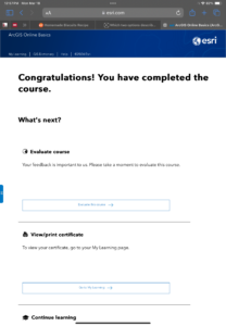
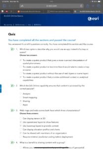
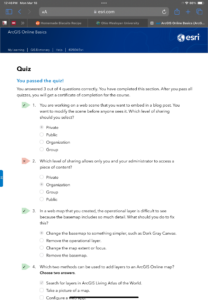
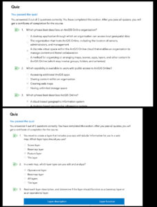
ArcGIS Online Basics: 

  • I feel like webgis is very similar to arcgis, but it also looks like it will be easier. 
  • I really like that files can be stored in the software itself, and that the files are able to be shared over the software. 

Taking advantage of ESRI online training:

  • Training that looks interesting:
    • Creating an Underground Scene in ArcGIS Online 
    • Creating Stories with ArcGIS
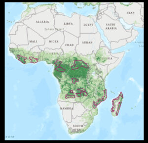
  • One use for ArcOnline is to track deforestation. I searched “ArcOnline deforestation” and I was able to find articles about deforestation in specific areas or the globe as a whole. From searching around, I was able to see that ESRI has a particular interest in using this feature as an education tool to teach users about why they should care about deforestation. One source that I found stated that “WWF has compiled and analyzed global data on deforestation and degradation trends, identifying 24 deforestation fronts” and the source also states “we use an emerging hotspots analysis to assess major trends and hotspots in tropical forests between 2004-2017.” From this source I was also able to find a world view on deforestation, a part of this map is show below
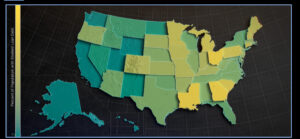
  • Another use for ArcOnline is to keep track of data in a story map. I chose to search “ArcOnline student debt” as an example of a specific type of data that someone might want to track. I was able to find an interactive map that will show average student loan debt by US State and then percent of people with student loan debt. This sources talks about how they collected their data, and then how they were able to make the maps animate back and forth. From this, I was able to understand how I might be able to take data and make a representation of the data in ArcOnline that is easily to understand.

Source: https://storymaps.arcgis.com/stories/9c57e887cfd945b79a707fe293dbd4af