Tooill – Week 4

Chapter 5-

This chapter was pretty short and focused on creating vector and raster tile layers. Vector tile layers store geographic data as points as points, lines, and polygons. They represent the geometry and attributes of features and are more flexible and efficient. They are best used for interactive maps. Raster tile layers are image tiles. They show small portions of a map. They are used for mapping consistent geography that isn’t expected to change very quickly, such as static basemaps.

  • The tutorial walked me through how to add and publish a portal, but my portal was already set up, so I did not have to do that.
  • I downloaded the data for this chapter onto my computer and then added a vector layer to a new project that I created from the data I downloaded.
  • To be honest, I’m not really sure how I added the vector layer. I went through all of the directions and did as the tutorial said, but there was never a specific step that said I was adding a vector layer. Then, all of a sudden, I was configuring vector tiles and analyzing and publishing my vector layer.
  • Next, I created a raster layer. The steps to creating a raster layer were very similar, and again I’m not really sure where the actual raster layer was created. I think it was maybe just already created from the data I downloaded for the chapter and all I had to do was add it.
  • After I created both the vector and raster layers, I compared them by using a slider/swipe on story maps.
  • A practical application for this chapter would be evaluating wildfire risk. Raster layers would include consistent information, such as vegetation and elevation, while vector layers would include data on things like buildings and boundaries.

Chapter 6-

In this chapter, I created a dashboard web app for the city of Redlands, California, to coordinate response efforts for the city’s medical, police, and fire departments.  This web map displays the most recent incident details, monitors real-time locations (with minimal lag is the idea), and allows users to filter incidents by the type that they are.

  • To start this tutorial, I searched for Redlands Dashboard Map owner:gtkwebgis5 and opened the web map in map viewer. Then, I added a temporal layer of sample data.
  • This temporal layer added live cameras by the California Department of Transportation that shows near-real-time highway photos in the pop-ups.
  • I shared this web map with everyone and then I created a dashboard web app with the map that I had just created in the previous steps.
  • I added lots of elements to the map, including a gauge, chart, table, list, and map.
  • The gauge is responsible for displaying how many open incidents there are, with green representing not many open incidents, yellow representing many open incidents, and red showing too many open incidents.
  • The list element lists the open incidents as they occur.
  • The chart is responsible for representing the ratio of open to closed incidents.
  • The table includes information about incidents, such as the location and contact information.
  • Finally, the map just shows geographic data on where the incidents are occurring.
  • The tutorial then tried to have me configure actions and targets, but I struggled with getting these to work because not all of the expressions were working like they were supposed to even though I was copying and pasting them directly into the expression box to make sure that I didn’t type them in wrong.
  • A practical application from this chapter would include creating a dashboard web app that monitors environmental features such as air and water quality or weather.

Tooill – Week 3

Chapter 3 –

In chapter 3, I learned how to create a public web experience to display data, specifically earthquakes and hurricanes. I listed data in tables that allows users to select records and filter maps. Using this data, I was able to display earthquake summaries in a chart and popups, which I then organized to allow users to filter features based on attribute fields. I also learned how to customize widgets.

  • First, I created a new experience builder with a blank canvas.
  • I entered the sample chapter 3 disaster data onto the blank canvas. This data created a 2-D map.
  • On the experience builder, I created widgets by dragging them from the panel of widgets. Then, I customized the size of the widgets to better fit the screen and incorporate other widgets.
  • Along with the 2-D data, I also added 3-D data following the same steps and adding widgets. With one of the widgets on this layer, I added an image widget that I uploaded from my computer.
  • I learned how to make animations so that switching slides in the presentation is more fun!
  • I learned how to configure map message actions, which allowed me to automate responses to specific events within the application.
  • With text widgets, I was able to add lots of different content and information about the earthquakes and hurricanes that happened in the different locations included with the data set.
  • I added chart and table widgets to display information on the web experience.
  • I was able to add multiple pages to the web experience I created, allowing me to have a home page and different content pages.
  • Last, I shared my web experience with the public after previewing it.
  • I think that most of the instructions for this tutorial worked or at least were easy to figure out if they weren’t correct.

Chapter 4-

In chapter 4, I learned about 4 different applications. I learned how to make surveys, use field maps, Quick Capture, and AuGeo. I really liked learning how to use Survey123. However, I was having a hard time with this chapter tutorial because a good portion of the tutorial was inaccurate and I could not get things to work. It was only a couple of steps, but it created a cascade that made it impossible to do following instructions because a previous step did not work. I was not a huge fan of having to download a couple of extra apps onto my phone just to use it for a few steps of the tutorial, especially when some of the instructions were inaccurate.

  • This chapter started off with logging into Survey123 associated with ArcGIS Online.
  • I created a new survey using the prompt from the book: A university wants its students, staff, and the public to report nonemergency incidents on campus. With this prompt, I was able to create questions that coincide with different incidents that may occur on campus, including AC, lighting, graffiti, etc.
  • On this application, I was able to add questions pertaining to description of the incident, as well as contact information.
  • Learning about Field Maps is helpful, but I wish that the steps on the tutorial would have been up to date with the program because I got stuck and couldn’t do much with it. I got stuck at street cracks and guardrail issues, which inhibited me from being able to do things with that layer later on.
  • An application that could be created using the information I just learned about Survey123, Field Maps, Quick Capture, and AuGeo could be one that collects data on the best places on and off campus to study or on different species of plants found along hiking trails.

Tooill – Week 2

This week in chapters 1 and 2, I created a Web GIS app that introduces the main attractions or points of interest (POIs) in the city of Redlands, California. I also gained more experience creating story maps and learning about the things that they have to offer.

Chapter 1:

  • I created a new item and uploaded the cvs file from the chapter 1 data I downloaded.
  • I learned how to add new layers and added one with the attachments for this chapter.  I then added an ID field to the layer.
  • I also learned how to share layers with the public.
  • I familiarized myself with editing and changing symbols used to identify different map features.
  • I learned how to configure pop ups and attach different contents to them.
  • After creating the web map, I created an instant app using the web map. I remember creating an instant app in GEOG291, but I did not quite remember it and was unfamiliar with how the process worked.
  • I added the desired attachments, changed the basemap layer to more accurately and clearly show surrounding features, and published my app to the public for everyone to view it. I did have some trouble initially creating the instant app because I could not get the attachments to stick. The tutorial instructions threw me for a loop because they were outdated and did not show the exact steps to get to where I needed to be. It took me some extra time, but I finally figured it out well enough to get the attachments placed.
  • The point of this particular application was to show different attractions in the Redlands location, namely the University of Redlands, Esri’s headquarters, Citrus Plaza, and LOOK Cinemas. The instant app shows the location of these places but also includes general information about them as well.

Chapter 2:

  • I downloaded the cvs file for Chapter 2 that includes the following data: Rank, city, state, census 2010 and 2020, estimates for 2012, 2014, 2016, and 2019, median household income for 2019 and 2021, median home value in 2019 and 2021, Wikipedia pages for the cities, and pictures of the cities’ seals or flags.
  • I followed a lot of the same steps that I followed for the tutorial in Chapter 1.
  • I configured more popups with images and then created a story map.
  • Like the apps, I remembered making a story map in GEOG291, but I didn’t entirely remember everything, and I think that this tutorial went much deeper into what you can do with story maps than what we did in GEOG291.
  • In this tutorial, I added maps, media (a video, could add others though), and map actions. The map actions were confusing because the tutorial instructions were outdated for this part. There was no map action option to choose, instead it was media action plus a few more steps. It took me a while, but I was finally able to get map actions created to show Denver and Detroit specifically.
  • Then, I added a side car that allowed me to display a 3D web scene of the population changes. Afte that, I added arrows to show movement relationships between states, specifically between California and Texas, and New York and North Carolina. This part kind of felt not related to the rest of the content, but it was good to learn, nonetheless.
  • I also added swipe blocks that were able to show change over time in populations from the two maps that I added. It showed these changes by allowing me to slide a bar that enlarged and shrunk the maps I was looking at.
  • The story map did not look great initially, but once in preview mode, it actually looked kind of professional and seems to be a great way to display information.

An application that could be made using the information from these chapters and tutorials is a story map that discusses change over time in population of a specific species. Geographic data can be gathered on the current population and mapped out using web GIS. Previous geographic data can be found on the species if they have been well studied before. The story map would include information on the species and an interactive swipe block that can show the two different maps (past and present) to allow viewers to see the change in population number and locations.

Tooill – Week 1

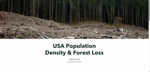
Hi everyone! My name is Megan Tooill and I am majoring in Zoology and Environmental Science. I am a junior and part of the softball team here at OWU!

This week, I completed the syllabus quiz, and I already have an ArcGIS Online account from GEOG291.

After reading “Get Started: What is ArcGIS Online,” I learned that I can access Python resources to analyze data that I may find throughout the program. I also learned that I can take advantage of the built-in tools and apps to collect my own data.

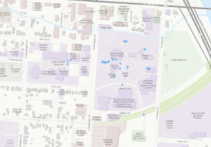
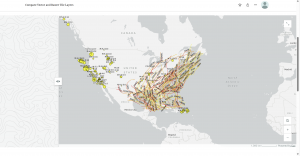
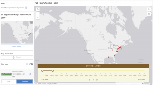
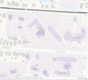
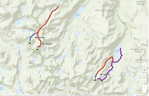
I then completed the ArcGIS Online Basics course. The map below is the map that I created from data provided to me by the ArcGIS Online program. I changed the basemap to topography to show the Sierra Nevada Alpine climbing routes. I learned that there are different methods of sharing work done on ArcGIS Online, like sharing to a group, an organization, or keeping content private between you and your administrator. I was also introduced to interactive legends in this training that I did not previously know about from GEOG291.

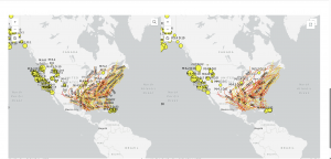
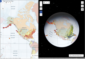
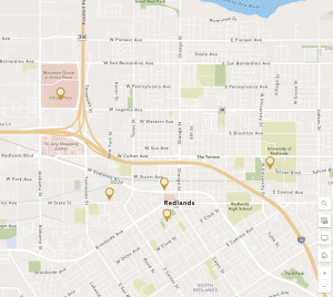
One application of ArcGIS Online has been through conservation efforts. For example, the program has been used to display suspected breeding grounds for Wedge-tailed Shearwaters on O‘ahu, Hawai‘i. From this information, conservationists were able to create educational and outreach programs to help protect this species. The map is shown below.

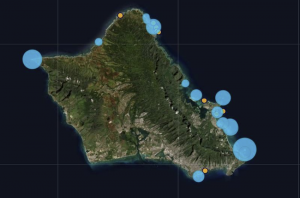
Urmston, J. (2021). Using ArcGIS as a Conservation Tool  for Wedge-tailed Shearwaters (Ardenna pacifica)  on O‘ahu, Hawai‘i. Journal of the Hawaii Audubon Society, 81.

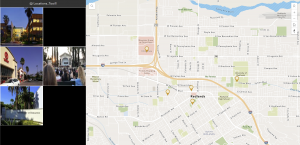
A second application of ArcGIS Online is improving public transportation routes. ArcGIS Online has been used to investigate the walkability of bus routes in order to improve efficiency in transportation in Orange County, California. The map below depicts southbound bus stop locations.

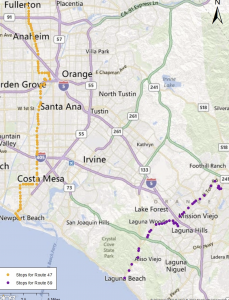
Chen, S. (2012). Investigating bus route walkability: Comparative case study in orange county, california (Order No. 1532811). Available from ProQuest Dissertations & Theses A&I; Publicly Available Content Database. (1288414798). Retrieved from https://owu.idm.oclc.org/login?url=https://www.proquest.com/dissertations-theses/investigating-bus-route-walkability-comparative/docview/1288414798/se-2