Lloyd Week 5

Chapter 7 introduces and expands on 3d web maps or web scenes. The book explains that 3d maps are much more interactive and intuitive regarding interpretation and analyzation. The authors state that 3d maps are more interesting for users as well, which I definitely agree with. Web scenes include different types of visual effects, such as photorealistic or cartographic. The four main types of scene elements are either surfaces, features, textures, or atmospheric effects. As a layperson who uses maps occasionally, I personally enjoy the texture features of 3d maps as they help me really understand what I am looking at. The book also introduced Lidar, which is an element that uses lasers to show point cloud layers that provide different measurements. These measurements can communicate elevation or class codes.

The book gives a nice in-depth description regarding how to create web scenes on page 238 which will come in handy when I am creating my application for part of the final assignment. The next part of the chapter discusses virtual reality (VR), XR where the X represents any type of current/future computing technologies, and the metaverse. Before reading this, I was already familiar with VR as it became popular within the last couple years and I have tried many VR games before. A metaverse is something I have experience with as well, as I play a good amount of Fortnite which I suppose is considered a metaverse! However, I don’t know much about XR but the book states that it is some sort of combination between AR, MR, and VR. I computed a quick Google search on XR and learned that different types include: retail and online shopping, entertainment and video games, and education.

After reading this chapter, I feel more prepared to complete the second part or second application that I am interested in making for my final project, as well as having a better understanding of 3d web scenes and different types of virtual realities.

Lloyd Week 4

Chapter 6 introduces spatiotemporal data and the Internet of Things. I enjoyed learning about the basic terms and the different groups that this data can be categorized in. Before this, I was unaware of what spatiotemporal data is, and I think that it is pretty cool that different things can be communicated on maps through these categories. Additionally, I did not know what the term “Internet of Things” meant or referred to. After reading about it, I now understand that it is any sort of object with a sensor and network connection that can communicate different types of data, as well as collect data. The part of IoT that resonated the most with me was items/devices that are found in smart homes. The book used the examples of an Amazon echo and sprinkler systems, and I believe that Ring doorbells could be part of this category as well.

The book also highlighted the newer developments of ArcGIS Velocity, which is a real-time GIS product and has the ability to perform disaster recovery and is offered as a subscription. There are many new features/items that the Velocity offers to ArcGIS, such as feed items, real-time analytic items, and big data analytic items. Another point that I found interesting was the use of ArcGIS for dashboards in cars. I really enjoy the concept of dashboards (for data) in general, just because I believe that they communicate data in a very simple and straightforward way and are similar to infographics. So when the book touched on the use of ArcGIS dashboards, I was intrigued.

Application: For this chapter, I would like to create a web map that includes real-time layers. I’d be interested in looking at population levels in Columbus, OH and seeing how the levels fluctuate in real time. The reason I would choose Columbus is because it is such a large city with many different types of populations, so I think the data could be insightful.

Lloyd Week 3

Chapter 3:

This chapter focuses on the Experience Builder aspect of ArcGIS, which offers a bunch of new features that were not previously available. The main trait of the experience builder is that it is flexible and allows for configurations of layers. The scenes or maps that you can bring in can be either 2D or 3D and the layers you create and how you design them is all up to you. Pages are the main component and windows will appear next to any widgets. The two types of widgets have different functions and are customizable as well. There are two different groups of actions that are available for each widget, and a few components corresponding to one group, the message actions. Once again, I enjoy that the book provides in-depth tutorials for different applications, because it really helps a layfolk (like me) be able to put these new ideas into practice.

Chapter 4:

The ideas presented in this chapter are representative of the fact that many people nowadays use smartphones rather than PCs or tablets. In light of that, Mobile GIS, its advantages, and its features are described. Mobile GIS can be accessed without a wired connection and offers many more types of communication in the app. Mobile GIS also provides a quicker way of accessing the data we want since smartphones tend to operate more quickly than computers, and the wireless connection is what allows for this. There are a few limitations discussed regarding mobile GIS, which is the inconvenience of trying to work with so much data and so many features on a much smaller screen. For certain types of actions you can take in ArcGIS, it would make more sense to use WebGIS rather than mobile due to these limitations. The two features that seemed most interesting to me were the QuickCapture and the ArcGIS indoors mobile app.

Application:

I am super interested in the idea of highlighting the city of Delaware’s main attractions after looking at the tutorial titled “Explore your surroundings in AR.” I think it would be really  fun to go around downtown Delaware and use my phone for educational purposes in order to learn more about the key attractions downtown just by using my phone camera.

Delaware Data Inventory:

(I did not take 291)

  • Zip Code: The 2000 consensus recorded all of the zip codes in Delaware county and they were then cleaned and evaluated in 2003. This specific layer was created using the USPS’s website and is updated each month.
  • School District: This layer provides an overview of the different school districts in Delaware county. It was cool to see how the districts are broken up throughout the county.
  • Building Outline 2023: This layer is super busy and contains over 100k records, as it is an overview of every building in Delaware county as of 2023. The site recommended that I zoom in, in order to be able to view all of the records.
  • Parcel: This layer was really interesting! This is another one where you have to zoom in so that you can really understand what you’re looking at. It shows different pieces of land or property that are taxable, and if you click on different sections, it goes into even greater detail by showing you the owner of each property.
  • Street Centerline: This layer shows every single street in Delaware county. These streets are all paved and are either public or private roads.
  • Condo: The data for this layer is more spread out, as condos are much less common in Delaware county. If you click on a condo, it tells you the name of the condo neighborhood, and some other information.
  • Subdivision: The data in this layer is split up by condos and subdivisions in Delaware county. I am less familiar with how to interpret this data, so it was a bit confusing.
  • PLSS: PLSS stands for Public Land Survey System, and this layer consists of all parts of the PLSS parts of the US and Virginia Military survey districts in Delaware county.
  • Township: This layer represents all the townships that are part of Delaware county. It was interesting to see how these were split up and what townships are surrounding me.
  • E911 Data: This layer provides 911 agencies the information they may need if they were to comply with phase 2 of 911 requirements. It says this data is updated on a daily basis, which I thought was super cool.
  • Building Outline 2021: Once again, this layer shows an outline of every single building or structure in Delaware county as of 2021.
  • Original Township: This layer confused me a bit, because it is almost the exact same as the “Township” layer. Again, it shows the townships in Delaware county and how they are split up.
  • Recorded Document: This layer shows all addresses in Delaware county that are certified. I zoomed into OWU and clicked on a few datapoints and they were categorized as University Housing, which is obvious but still cool to me.
  • Dedicated ROW: This layer was probably one of my favorites that I have seen in this data inventory. This shows all streets that are designated as Right of Way, and almost all streets surrounding OWU count as designated ROW.
  • Precinct: The properties of this layer give an overview of all the voting precincts in Delaware county. I do not vote in Delaware county because I’m from Cuyahoga county, so it was cool to see all the places that people can go to in order to vote.
  • Map Sheet: This layer was very straightforward, with its summary stating that it shows all map sheets that are within Delaware county.
  • Farm Lot: Different farm lots are split up in this layer. There was not much information provided on what exactly this could mean, so again I am unsure of the significance of this layer.
  • Annexation: The data in this layer shows annexations in Delaware county from the year of 1853 up until now. There is one big data point of annexation for all areas surrounding OWU.
  • Survey: There are many small data points in this layer, each representing a different section of land that was surveyed by the map department.
  • Tax District: This layer shows how the tax districts of Delaware county are split up and provides information of the numbers that correspond with each tax district.
  • GPS: This layers represents data points of all GPS monuments that are in Delaware county (super cool!).


Lloyd Week 2

Chapter One: This introductory chapter gave me a better idea of how Web GIS works and was a deeper dive into that compared to the article that was assigned last week. The purpose of this chapter is to describe how the new version of Web GIS differs from past versions, such as how the site evolved and what it offers now. The chapter gave an overview of the components of ArcGIS and the content types of the site.  There were some helpful tutorials included as well and I enjoyed that they communicated each step clearly, along with providing pictures when necessary.

Chapter Two: This chapter provided more detailed information on layers, the purpose of different types of layers, and what exactly we can communicate with these different kinds of layers. The sample table of smart-mapping is super useful as well and I know I’ll be referring back to it when creating different types of maps. I also liked how the authors explained what steps a user should take based on what type of story they want to tell with their maps. I was especially interested in the idea of express maps, because I liked how this can allow you to draw different features on a map (in my experience, this makes navigation a whole lot easier).

Applications: An application for these two chapters could be my personal story, because this intrigued me when I saw this example on page 35. I could place different markers based on where I grew up, where I live now, the schools I went to, etc. I think that creating an express map would be the best way to portray this information. This is because I could mark the points of each area I’d like to focus on, and also be able to draw arrows from one destination to another. An express map could allow me to annotate different areas on the map and explain my personal story even further.


Lloyd Week 1

Hi everyone! My name is Maggie, I’m a senior and I am a psychology major and business minor. I’m taking this class because my roommate is a geography major and recommended that I dip my toe into the geography world (I also needed a 0.5 credit to graduate in May). I’m excited to learn more about geography and to have a little challenge during the last half of my senior year spring semester. In my free time, I enjoy doing puzzles, playing Fortnite, and hanging out with my cat named Frankie (she is perfect).

After looking through the account settings and poking around this website, I found that I enjoyed the idea of being able to set my own color theme for my viewing pleasure. I also liked how everything seemed pretty straightforward and easy to navigate.

One notable and interesting idea I learned from the reading for this week was that you can add layers to your maps with ArcGIS and allow other users to view/use them as well. Another thing I noticed was how detailed and helpful each section was for certain actions one can take in ArcGIS. I will definitely be referring back to this article when I need assistance or clarification in the future!

I did not take 291, so for my free training this week I completed the ArcGIS online basics course. One of the first things I learned from this course was the different types of web layers and their purpose/function. I also received some practice actually working with a map in the website which is something I had never done before, so I enjoyed that!

ArcGIS Online Basics_Certificate_03212025

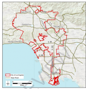
In regards to my Google Scholar search, I was interested in seeing anything having to deal with cats. The first article I came across was about the distribution of feral cat trapping permits in Los Angeles, California. In this area of California, and in other urban areas, feral cats are an increasing problem. In this specific area, there is an estimated amount of 3 million feral cats, and only specific places have permits to legally trap feral cats for a multitude of reasons. The following map shows a distribution of locations where forms/documents have been filled out by individuals when trapping a feral cat.

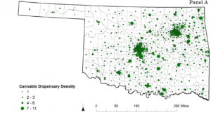
An additional application I was interested in was the number of cannabis dispensaries in specific areas in the United States. The state that came up in my search was Oklahoma, which I know nothing about and so I thought that was intriguing! The following map shows the density of cannabis dispensaries in the state of Oklahoma.

I really enjoyed the time I spent learning the basics of ArcGIS and I am eager to continue using this website to expand my knowledge in this area.

Sources:

Cohn AM, Sedani A, Niznik T, Alexander A, Lowery B, McQuoid J, Campbell J. Population and Neighborhood Correlates of Cannabis Dispensary Locations in Oklahoma. Cannabis. 2023 Feb 7;6(1):99-113. doi: 10.26828/cannabis/2023.01.008. PMID: 37287730; PMCID: PMC10212267.

Kingsley, G. (2015). Distribution and correlates of feral cat trapping permits in los angeles, california (Order No. 10800044). Available from ProQuest Dissertations & Theses A&I. (2067466408). Retrieved from https://owu.idm.oclc.org/login?url=https://www.proquest.com/dissertations-theses/distribution-correlates-feral-cat-trapping/docview/2067466408/se-2