Ogrodowski Week 4

Chapter 5: Caching and On-Premises Web GIS

ArcGIS Enterprise is more user-managed than ArcGIS Online and allows for the use of on-premises GIS, which may be helpful for organizations operating with limited internet connection. The chapter refers to ArcGIS Enterprise services as being “deployed,” which I think is a good word in this context. It also allows operations to remain more private and limited to the specific organization, while also utilizing ArcGIS data and basemaps (through hybrid Web GIS). The ArcGIS Portal compiles the various types of ArcGIS data and shares it within the designated organization. It serves as the “connector” between ArcGIS Online and the organization’s ArcGIS Enterprise. ArcGIS Server allows for the use of geographic information by the organization.

This chapter also describes the differences between different web layers hosted by ArcGIS Online and ArcGIS Enterprise. I appreciated the refresher on vector and raster layers: vector layers contain more specific data typically based on density, while raster layers are more complete image files like basemaps. Raster layers are best for unchanging data, and they take up more storage, while vector layers may frequently change, but are lighter in terms of storage. Also, ArcGIS Online uses caching, which involves returning to previous requests on the web server to generate tiles, reducing response time and improving user experience. The raster and vector layers are precached, so they are already stored in the database and can be accessed quickly. At the end of the description portion of this chapter, there were a lot of helpful flowcharts and tables detailing the requirements and ideal uses of each type of layer.

In the embedded version of the maps in Tutorial 5.3, the left side is the raster map, and the right side is the vector map. The vector map has noticeable higher-resolution lines and labels, and the raster map data disappears when you zoom in enough.

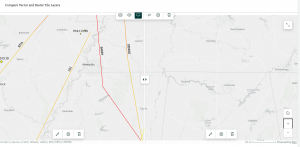
Figure 4.1: side-by-side of vector (left) and raster (right) tile layers. An indication of which is which comes from the disappearance of raster data at a zoomed-in extent. When saving the raster data, we kept it rather coarse to reduce the amount of storage required for the layer.


Chapter 6: Spatiotemporal Data and Real-Time GIS

As the name suggests, spatiotemporal data is data that changes through time. Different types of spatiotemporal data include moving data, discrete data, stationary data, or change data. Real-time GIS utilizes spatiotemporal dat and can either focus on point-in-time data (one field) or duration of time (two fields: one for start time, one for end time). When working with spatiotemporal data, it is important to consider systems of time data, such as measurement and reference systems, representations, and temporal resolution (time interval of sampling).

Another neat aspect of widely disseminated spatiotemporal data is the Internet of Things (IoT). This chapter refers to the IoT as an “ecosystem,” which I think is a neat (and pretty accurate!) way to refer to the massive web of time-based information that is utilized by any GIS-based service. The IoT contains a lot of raw data that GIS applications turn into useful information. An example that the chapter uses is smart cars, and how routing, maps, and road conditions are all utilized by the car for a smooth and safe driving experience.

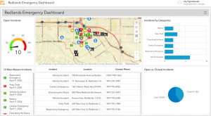
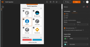
Figure 4.2: the completed emergency dashboard after Tutorials 6.1 and 6.2. As I was working on this, it was updating and the open incidents number went down!

Ogrodowski Week 3

Chapter 3: ArcGIS Experience Builder

The introduction of this chapter describes ArcGIS as more than just an app: like the name suggests, it is an experience. Its various facets can be curated and combined into whatever application your specific project needs, and because every step is completed through the ArcGIS platform, combining these different steps and components is seamless.

The flowchart showing the connections between data sources, the ArcGIS Online Enterprise, and client apps has appeared in every chapter, but seems to fit well into this discussion. You can take data sources in the form of shapefiles, geodatabases, photos, and the like from any source, and use ArcGIS desktop tools to turn them into ArcGIS layers and tools and perform analytics. Then, this information (as processed by ArcGIS) can be turned into an app using more ArcGIS apps and templates.

I ran into a few issues during this section. When I selected a line of text below the 2D and 3D map views to change its size, the entire section of text was deleted and undoing the action did not retrieve the text, so I had to recode the hurricane and earthquake summary. Additionally, when I selected hurricane and earthquake locations in the table, all of the locations remained on the map, but those selected were highlighted in blue. Maybe I missed some steps, but those two (albeit minor) issues stood out to me.

Figure 1: The Live View of my completed ArcGIS Web Experience for Historic Natural Disasters.

Chapter 4: Mobile GIS

As the name suggests, this chapter discusses the importance of online GIS, and its increasing prevalence today. Nowadays, everyone has mobile devices, and being able to access GIS apps and experiences on your phone, on-the-go, means that GIS can play a much larger role in our everyday lives. According to the chapter, mobile GIS is more accessible, versatile, location- and time-accurate, and can withstand a larger volume of users as compared to traditional desktop GIS. Mobile uses can also appeal to a wider variety of users, from individual consumers to entire organizations.

Another aspect of Web GIS that seems pretty interesting is the fact that editing capabilities can be modified to include people in the same group or organization. Similar to Google Docs, you can collaborate in real time and track editing history. Now, like any group project, I’m sure there are ups and downs to this, but it is certainly a feature advantage over desktop GIS. It certainly makes GIS a useful tool for citizen science! I find ArcGIS Indoors to be a neat application as well. There are so many busy indoor places that can be hard to navigate, such as malls, stadiums, offices, and campus buildings. It only makes sense that they would have navigation services as well!

While creating the survey for Tutorial 4-1, the interface felt like a slightly upscale version of Google Forms. The rest of this chapter wasn’t too bad either–it was kinda fun to explore all the different ArcGIS apps!

Figure 2: The web view of my QuickCapture app.

Application using these topics:

I think it would be really cool to create a birdwatching app using the QuickCapture app. When you’re out birdwatching, you can snap a quick picture of the bird, then send it to the database for all users to see. This might even help map migration and population patterns in the long term!


Ogrodowski Week 2

Chapter 1: Get Started with Web GIS

This chapter served as a basic introduction to working with 2D maps on ArcGIS Online, as well as making Instant Apps. A lot of the techniques were very similar to those used in the desktop version, like attribute tables, field views, and feature symbology. As someone who is more used to web apps as opposed to desktop (for example, the Google workspace over Microsoft Office apps), I found ArcGIS Online and the Instant Apps site to be a little bit more intuitive than the ArcGIS on desktop, but maybe this is just because I have experience with ArcGIS now. However, I did notice that the web app feels a little cramped with the presence of more menus that use larger text, and I preferred the general layout of the desktop version. Additionally, a few aspects of the Chapter 1 Tutorial did not exactly align with the ArcGIS Online interface, but I didn’t have too much trouble adjusting.

Figure 1: Redlands Attractions Map.

Chapter 2: Smart Mapping and Storytelling with GIS

I’m not sure if this feature was included on ArcGIS Pro, but the Smart Mapping feature discussed in this chapter seems to, at the very least, present difficult mapping methods more clearly. I think it is interesting (and probably helpful) that ArcGIS has its own coding language, Arcade. Learning so many coding languages can be difficult, but I am sure that there will be input menus (like those in ArcGIS Pro) linked to the code to make any necessary “coding” really easy for beginners. Also, the ArcGIS Living Atlas of the World seems like a LIFESAVER. Having a huge database of hosted layers eliminates a lot of initial data collection, which would probably have a tendency to be frustrating and discouraging as an early step in a GIS project. It also emphasizes the science behind GIS and its collaborative nature, which I find cool.

One of the most interesting facets of GIS is the almost psychological nature. In order for maps to be effective, they have to be physically appealing and aesthetically organized. StoryMaps, for example, are best received when they are fast, easy, and fun to use. I find the concept of StoryMaps super clever and effective. The actual maps themselves are just one of multiple important components: according to this chapter, adding a narrative and multimedia contributes to the overall story as well.

In Tutorial 2.2, we make a map of the 50 most populous US cities, which are shown by graduated symbols. It appears that New York City and Los Angeles are the two biggest cities in the US, which is consistent with the data in the Excel spreadsheet. After changing the map to have ratios of population change from 2010 to 2020, it appears that the fastest-growing cities in the US are Seattle, Washington, and Fort Worth, Texas. Thankfully, this chapter wasn’t too difficult, as we used ArcGIS StoryMaps in GEOG 291 as well.

Figure 2: A video on US population growth and change that I added to my StoryMap.

Potential Future Applications:

Similar to the Chapter 1 reading and tutorial, I could make a travel guide for my hometown with must-see or personal favorite places. I could even color-code the legend based on what purpose each location serves. More specifically, I could see myself marking all of the environmental and conservation-based organizations in my area and linking each location to a volunteer position webpage, hopefully encouraging community action or collaboration between organizations in my local area.

Ogrodowski Week 1

Hi! I’m Lily Ogrodowski, and I’m a first-year Environmental Science major and Chemistry minor. I took GEOG 291 earlier this semester, so I have already created and am familiar with my ArcGIS account, and I took the introductory quiz.

ArcGIS Online Website Exploration

From poking around the ArcGIS Online website, I was excited to learn about the ESRI Community website, which allows you to discuss and ask questions about topics with other people in the GIS community. It seems like a really efficient way to collaborate and solve problems!

Additionally, on the Scene tab, you can create your own scene or explore one of the preloaded ones. I was intrigued by the 3D model of Boston, and it was incredibly detailed! Like Google Earth but better. One of the preset views was color-coded, so it must be possible to add layers and features to a 3D scene, which seems like a really interesting concept.

Get Started: What is ArcGIS Online?

It seems like ArcGIS Online is more geared towards project sharing and collaboration than desktop ArcGIS was. Because it is web-based, it is probably more widely accessible (even on mobile!), and files get uploaded or shared to the cloud instead of just being saved onto your computer. 

I also really like how the site enumerates real-world problems and then links to a tutorial for mapping the associated data. For example, the site piques your interest in reducing an invasive weed, then provides you with a tutorial on how to map campgrounds that are particularly affected so that action can be taken. How cool!

One more thing: while reading about using the Scene feature, I thought it was really interesting how you can adjust the sun’s position. Watching a day, month, or year in the intended area to see how much sunlight it gets is pretty fascinating to me. Especially in regions near the poles where levels of sunlight are highly variable throughout the year, this seems like a really interesting study.

Web Course: ArcGIS Online Basics

Figure 1: My certificate from completing the ArcGIS Online Basics Course.

Real-World GIS Applications

I was thinking about ice cream while doing this work, and I decided to look up GIS applications on ice cream…which were unfortunately lacking. However, it led me to an article discussing an apparent prevalence of fast-food restaurants near high schools in Santa Clara County, California. The study concluded with the help of geographic analysis that high schools with more fast food restaurants clustered around them actually have higher obesity rates.

Figure 2: Map of Santa Clara County Fast Food Restaurants (pink dots) within a certain distance of High Schools (black flags).

Some of my favorite hobbies include fiber arts, whether they be knitting, crocheting, embroidery, or the like. I found a super cool article where a person hand-embroidered GIS-generated maps depicting a bike route along the Mississippi River.

Figure 3: Hand-embroidered, physical renditions of a GIS map of the Mississippi River. How cool!

Sources:

Nixon, Hilary, and Lauren Doud. “Do fast food restaurants cluster around high schools? A geospatial analysis of proximity of fast food restaurants to high schools and the connection to childhood obesity rates.” Journal of Agriculture, Food Systems, and Community Development 2.1 (2011): 181-194.

Biggs, Heidi. “Stitching Together Body, Land, and Data through Embroidered Geographies.” Proceedings of the Twentieth International Conference on Tangible, Embedded, and Embodied Interaction. 2026.