Allo Final

I decided to do my final on public health and ocean health.

I made a story about popular fast-food locations compared to county health rankings in the U.S. The story walks you through exploring the map and some of the counties with the most fast food and least healthy citizens. Public health is something that I recently have found myself really intrigued by, so this project came together very nicely in my head. I also included a video about the dangers of increased fast-food consumption and an article with a potential solution to this problem.Ā 

Link:https://arcg.is/0WaimL0


I also made a dashboard that looked at changes in global temperatures and ocean pollution to see if there was a connection between it and coral bleaching. I added links to websites to learn more about coral bleaching. I also gave some locations to search for on the map with severe bleaching, high temperatures, and pollution. I thought a dashboard like this would be a good way to see the effects of climate change and our role in keeping our oceans and Earth healthy.

Link: https://www.arcgis.com/apps/dashboards/8683e2e99af84f90ad8cbb4c3b5b9abb

Allo Week 6

I really liked this tutorial because it expanded the possibilities of the 3D maps. Overall, I didn’t have many problems following this one. The only thing that came up was that some objects in my scene looked out of proportion (like the huge cars). I wasn’t able to troubleshoot that part. I would like to know the other applications for 3D maps like this. I am still thinking about how I want to apply this to my final. One question I thought of during this week was whether we should use the data in the Delaware Data folder for the final.

I don’t really have many thoughts from this week. I noticed that I am picking up on a lot each week and each tutorial is easier than the last. I also move through them quicker now. As I mentioned before, I am still thinking about the possibilities of the final but I did think of one idea.Ā  If I end up going with the grocery store idea, I can use the 3D features to make the buildings I want to showcase.Ā 


Allo Week 5

Chapter 6:
I loved learning how to make the live-updating dashboard. I didnā€™t know that something like this was possible. It’s very cool that the data will be updated on the stop. I am curious to know the other applications for something like this. I wonder if there are any other uses besides incident updates. I also believe that this is one of the easier tutorials to follow. I didnā€™t encounter many issues and moved through them fairly quickly. The only part where I struggled was with Arcade. While I appreciated that this was also a chance to get to learn how to use it, it wasnā€™t as straightforward as the rest of the tutorial. For example, I kept receiving error messages within the code and couldnā€™t find a solution after troubleshooting. I had to skip over the Arcade portion completely due to all the error messages. The time-enabled feature layer was also something interesting to create. It’s another way to add more detail to what you are working on. Each tutorial shows me more possibilities.

Ideas:
After completing the tutorial I wanted to think more about other potential applications of the dashboards. I specifically was thinking about environmental applications. One that I thought of was a dashboard that tracks flooding or extreme weather. In regards to my other ideas I have had for the final project, I think I could use the dashboards to track foot traffic at certain grocery stores.

Allo Week 4

Chapter 3:
The beginning of this tutorial was pretty straightforward. I encountered an issue with the Data Summary part because there was no URL to type in to insert an image. I tried to use a random natural disaster image from Google, but it didnā€™t work. I donā€™t know if I missed something but I didnā€™t see a key for either the 2D/3D maps so I wasnā€™t sure how to interpret them correctly. Despite that, I thought the process of adding the 2D/3D maps to the builder was fairly easy. I like the animations you can add to the maps because they really add to the storytelling aspect. The next configurations were a little more complicated but I figured out how to add all of the triggers. The rest of the tutorial went well with a few obstacles.

Chapter 4:
The survey part was very easy and I will be thinking about how to add that to my ideas for the final project. The other parts of tutorial 4 gave me more trouble and I couldnā€™t navigate them well. I am not sure if it was more parts missing in the PDF or if my software looked different than expected. Specifically, 4.3 and 4.4 were just not cooperating so I skipped over the majority of those parts. Because the other parts went wrong the mobile app was all off too. I decided to explore the app without strictly sticking to the tutorial to move through it. I am disappointed that I struggled with this tutorial, but I still feel I learned some valuable information about the features.

Delaware Data:
There is data on School districts, zip codes, condos, and PLSS, and more. I looked at the condo data and it had all the areas in Delaware County that have condominiums polygons. I clicked through a couple of them and it showed more data about each. I also created a new folder in my drive and added the data needed.

Idea:
I still like the idea I had from last week about the different grocery stores, local vs. chain. However, I can incorporate what I learned from Tutorial 3 into it. I can use the app builder from tutorial 3 and create more of a flowing story about the stores. I can also use the animation/trigger features to make it more engaging and visual. I donā€™t know how much the 2D/3D visuals will play a role, but I could add both to make it more visually appealing.

Allo Week 3

Chapter 1:
I think it is very cool and important that a part of data analysis can be so visual. I know for me that this makes data more digestible and understandable. I liked the figure describing the multiple pathways and ā€œgeneric workflowā€ for creating web apps. One thing that I think will take some getting used to is figuring out and deciding what map style will be the best to display certain information. I assume this will come with trial and error and testing out what works best with what kinds of data.
A question that came up is how do I access ā€œArcade?ā€
Tutorial 1:
This tutorial was very helpful in terms of learning how to get a map/app to look the way you want it to. This eased some of my worries about picking and choosing what style goes with what. I believe now it is really whatever looks right in the moment and it can always be changed to represent something different.
Chapter 2:
I think the ArcGIS Living Atlas is such a cool resource that really has a lot of information present in one place. It is also cool that it can be updated in a matter of minutes. The idea of storytelling through these maps and apps is such an engaging way to think about gaining information. I like the visual of Maps+Narrative+Multimedia=Story.
Tutorial 2:
I liked that this tutorial focused on the story aspect of the maps and how to cohesively present a story about the data that is both understandable and interesting. I wasnā€™t able to figure out how to add the curved arrows on my map, but I figured some of the other stuff out.

Both tutorials gave me examples of what the readings discussed and I thought it was very helpful. Put it all together and into practice. I believe my question about Arcade was answered in Tutorial 2. I appreciated that the tutorials came with all the data and images needed to complete it. I thought that made working through it much easier and almost seamless.

Idea:
One idea I had was (from Chapter 1) to map supermarkets in Delaware and how many average shoppers are there a week. I could use the pop-ups to describe each store and the people that shopped there. I also could use the story feature to illustrate the history of each store and indicate whether it is a chain store or a local one.

Allo Week 1

Introduction:

My name is Isabel Allo and I am a sophomore majoring in Biology and minoring in Nutrition. This is my first time taking a GIS class. So I created a new account.Ā 

Getting Started:

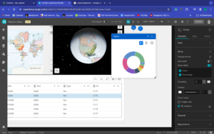
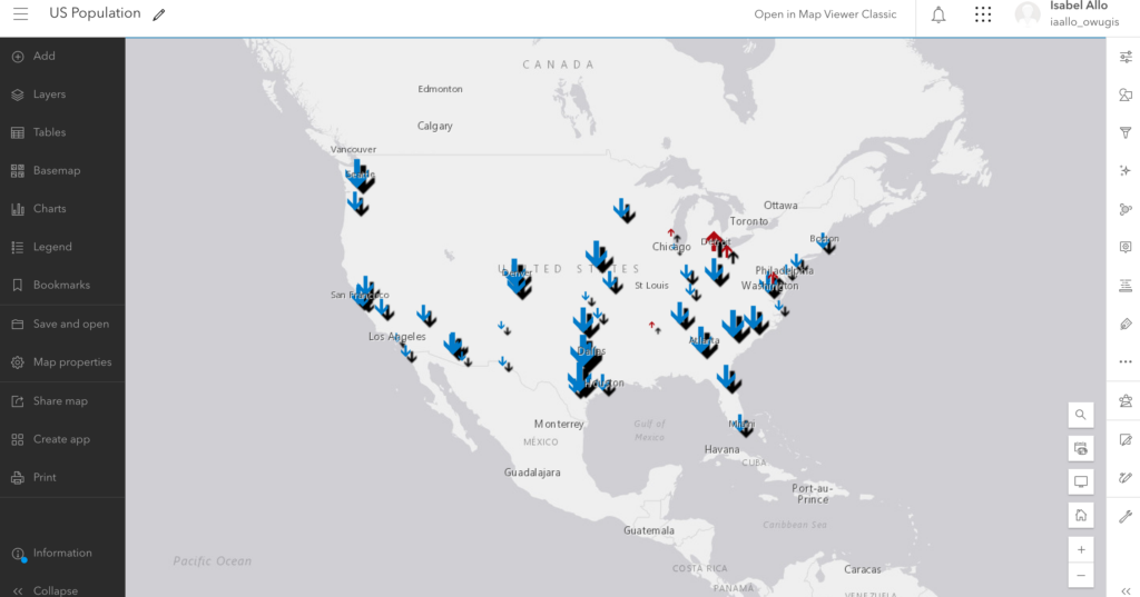
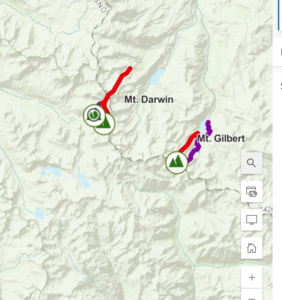
I looked around my profile and figured out I could add a profile photo, but I didnā€™t have a picture of the right size. In the settings, I couldn’t figure out the difference between the map viewer and map viewer classic. I like the Community and Forums part because I think it will be a good resource if I have a question or if I am confused about something. I clicked on a new map and found my house.Ā 

Reading:

One thing that I found interesting from the reading is what you do with this software is meant to be shared with others and collaboration is a big part of this. The software makes it very easy to share your work with others. I looked around the creating maps part of the reading and it makes me excited to start creating something. It’s very cool that there are so many possibilities for customizing a map. I also didnā€™t know anything about the scenes that you can make; that seems interesting too. I also like that this is about how to present data in a way that all audiences can understand and interpret efficiently.

Training:

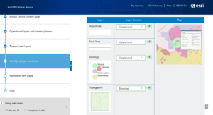
I thought the training was very helpful. I liked the step-by-step on how to start creating maps and adding layers. I noticed a strong focus on the level of sharing that is possible here. I get the impression that this aspect is a very crucial part of this. I also didnā€™t realize before how customizable the maps and scenes are. There is a lot of room for creativity and a lot of possibilities when it comes to creating maps. With that, I now understand the role the apps play in presenting this kind of information.Ā 

Applications:

Using Google Scholar I decided to look up ā€œArcOnline Food Insecurity.ā€ I found an article titled ā€œGIS Project Helps with Food Insecurity and Waste.ā€ The headline reads ā€œAccording to the United States Department of Agriculture (USDA), Americans throw away 30 to 40 percent of the entire US food supply.ā€ Source: Baumann, Jim. “GIS project helps with food insecurity and waste.” ArcUser Fall 2020 (2020).

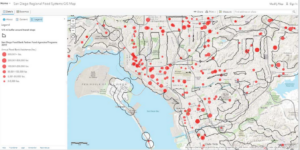
I also found another interesting article called ā€œThe Impact of the Via Bus System on Food Deserts.ā€ This study mapped all places that supply food and whether they were within walking distance of the bus stops nearby (ā‰¤ 0.5 miles and ā‰¤ 1 mile). Ā I thought this was particularly interesting because of how it considers the walking distance when determining whether food is accessible to all in the area.

Source: Maddox, Emily, “The Impact of the Via Bus System on Food Deserts” (2018). Theses & Dissertations. 347.https://athenaeum.uiw.edu/uiw_etds/347Ā 

Another interesting application I found was from the article ā€œEagles and Wind Turbines: Using Maps to Protect Animals and Increase Renewable Energy Useā€. This article was interesting because it shows a real application of an environmental scientist using this technology. This might be something I am interested in pursuing later on in my career so knowing that learning about GIS will be helpful is encouraging.

Source: Douglas Leeson, Thomas C. Hammond, Kate Popejoy, Alec Bodzin, Michael Hardisky & Sarah Lew (2022) Eagles and Wind Turbines: Using Maps to Protect Animals and Increase Renewable Energy Use, The Geography Teacher, 19:4, 178-182, DOI: 10.1080/19338341.2022.2117725