Two ArcGIS Online Apps
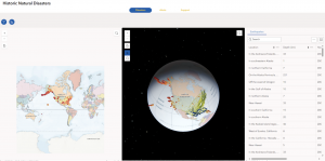
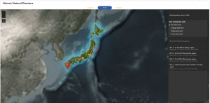
Where I Grew Up: My Life in Japan
https://storymaps.arcgis.com/stories/9652057980734ca2a8c19e7550362d4d
Ohio School District Dashboard
https://www.arcgis.com/apps/dashboards/f284e43d83c748dbb0157e8947b8b0c4
Geography 292: Geospatial Analysis with Web GIS
Module 2: 3/16/2026 - 4/28/2026, OWU Environment & Sustainability
Two ArcGIS Online Apps
Where I Grew Up: My Life in Japan
https://storymaps.arcgis.com/stories/9652057980734ca2a8c19e7550362d4d
Ohio School District Dashboard
https://www.arcgis.com/apps/dashboards/f284e43d83c748dbb0157e8947b8b0c4
Chapter 7
In this tutorial, I learned how to create web scenes and 3D web apps using ArcGIS, transforming maps into more immersive and interactive experiences. It was fascinating to see flat 2D maps evolve into 3D maps that tell a visual story. In Section 7.1, I started by exploring the Scene Viewer through the StoryMaps app, checking out various types of scene layers. Next, in Section 7.2, I created a thematic web scene to visualize the population and population density of the United States in 3D. By applying extrusion based on each state’s population, the flat map turned into a three-dimensional landscape that clearly showed differences in population density, from sparsely populated areas to high-density regions like Washington, D.C.
In Section 7.3, I tried designing a 3D park scene using realistic 3D symbols like trees, benches, flowers, cars, and boats. However, nothing appeared on the map, and I soon realized that the original park data was missing… In Section 7.4, I used elevation data to visualize features not only on the ground but also underground and in the air, including tunnels and helicopters. There was even one enormous helicopter that really stood out. Finally, in Section 7.5, I learned that even small edits to 2D data can dramatically enhance the expressiveness of a 3D scene.

Chapter 5
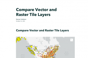
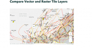
In this tutorial, I used ArcGIS Pro to work with data showing major earthquakes and hurricanes in the United States between 2000 and 2008. Using this dataset, I created and shared both vector tile layers and raster tile layers, then compared their differences through a web app. I published both types of layers to ArcGIS Online and explored how they differ in visual quality, file size, and zoom levels. This helped me better understand the styling flexibility and performance of vector tiles compared to raster tiles.
At the end, when I reached the “Which is which?” question, I concluded that the right side was the raster layer, because each point appeared to have fixed pixel-based values rather than dynamic features. Overall, this chapter went very smoothly for me!!
Chapter 6
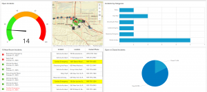
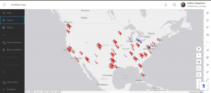
This tutorial was all about bringing real-time GIS data to life. I created a dashboard web app for the city of Redlands, California, designed to help coordinate emergency response efforts. The dashboard included several dynamic layers showing the near-real-time locations of police, fire, and ambulance vehicles, along with 911 call incidents across the city. Each layer refreshed automatically every few seconds, so the map was constantly updating , it felt like watching a live control center! In the dashboard, I also added lists and tables to display the latest incident details, charts to summarize categories and counts, and even a filter tool to narrow down incidents by their status. Using Arcade expressions, I customized the list to highlight cardiac emergencies in red, making it easier for dispatchers to spot critical cases right away.
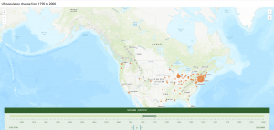
After that, in Exercise 2, I switched gears to a more historical theme, building a web app to show population changes in major U.S. cities over the past 200 years. Using a CSV dataset, I visualized how cities grew and evolved over time through animated maps, showing both the spatial and temporal trends in population growth.
It was fascinating to see how GIS can handle both real-time monitoring and long-term temporal analysis, two very different but equally powerful applications.
Chapter3
In this tutorial, I used ArcGIS Experience Builder to create a multipage web experience that integrates both 2D and 3D, all without any programming. I added widgets like Section, Map, Image, Text, Table, Filter, Chart, and Menu, and configured their content, styles, actions, and animations.
There were so many widgets that seem really useful in real projects, so I’m glad I got to learn how to use them. This tutorial was quite complex and took a lot of time, but when I finally finished it, I felt so happy seeing a web experience that looked just like the ones you often see online. It was really satisfying to realize I could actually do it myself!
Chapter 4
In this tutorial, I created a smart survey and used Survey123 to collect data. I also created an editable feature layer using feature templates, built a web map with forms, and collected points and lines using Field Maps. On top of that, I created a QuickCapture project and used it in QuickCapture, prepared data for AuGeo, and explored a simple AR experience.
The first part, making the survey form, was really easy and straightforward. But after that, things got pretty challenging. The instructions in the book didn’t always match what I saw in the web GIS interface, which made it take a lot of extra time. I really found myself thinking, “ESRI, please check this and update it!”
Chaoter 1
In this tutorial, I published a feature layer using a CSV file, added attachments, created a new attribute field, and entered its values. Then, I added the layer to a web map, configured the style and pop-ups, and built a web app using the Attachment Viewer template. According to the book, this app can be used on smartphones and other devices, which I think is really convenient.
Honestly, when I started this tutorial, I was using a different edition of the book for the first time and felt completely lost. I thought I’d never get it done. But in the end, I managed to complete it, and it feels great to have it working!
Chapter 2
In this tutorial, I created a feature layer using geocoding, styled it with smart mapping, and configured the pop-ups using Arcade. I also added images, links, and charts to the pop-ups. After that, I built an ArcGIS StoryMaps web app, embedding videos, images, web maps, and scenes, and set up sidecar and swipe blocks.
One thing that really surprised me was seeing how small New York’s population was in 2010 compared to now, while Columbus actually had more people in 2020 than I expected.
In tutorial 2-2, there was a part where I was supposed to choose “above and below” as the theme, but when I was doing it, that option wasn’t available, so I just went with “above.”
Hey, I’m Haruno Tadokoro and I’m a junior majoring in Environmental Science and minoring in Politics & Governance. I took GEOG 291 in the first module.
This week, I reviewed the course blog, syllabus, and schedule, completed the required readings and training, and took the quiz.
Since I already completed the ArcGIS Online account setup and the “ArcGIS Online Basics” training in GEOG 291, I reviewed my account briefly this week and made sure everything still works.
After reading ESRI’s “Get Started: What Is ArcGIS Online” page, I learned that ArcGIS Online is very convenient because I can access it from my own computer and work anywhere. I also like that publishing and sharing data online reduces the burden on internal systems and makes data management more efficient.
While taking the ESRI Training Course “ArcGIS Online Basics,” I found information about basemap layers, operational layers, and 3D scenes.
Basemap layers provide geographic context, like imagery, boundaries, or roads, while operational layers are placed on top and contain the data you can interact with—such as viewing information, editing features, or running analyses.
I also learned that besides creating 2D web maps, ArcGIS Online allows users to build 3D web scenes to better visualize and analyze geographic information in a three-dimensional environment. Both the Map Viewer and Scene Viewer can access a default collection of Esri basemaps.
I’m interested in two other ESRI courses: ArcGIS Pro Fundamentals and ArcGIS Pro: Essential Workflows. They both seem helpful for improving my GIS skills and learning how to use ArcGIS Pro effectively.
I found an interesting layer in the ArcGIS Living Atlas called “Asian Alone or in Any Combination by Selected Groups.” It shows recent ACS 5-year data about Asian populations by tract, county, and state. I thought it was cool that the layer updates automatically every year and can be used in different ESRI apps like ArcGIS Pro and Story Maps.
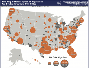
Also, I found a map called “Metro Population Growth and Decline in the United States.” It shows how metro populations across the U.S. are growing or shrinking based on both domestic and international migration.
According to the data from the U.S. Census, large metro areas like Houston, Dallas, and Phoenix are growing fast, while some big cities like New York, Los Angeles, and Miami are losing domestic residents but gaining immigrants. I thought this was a great example of how GIS helps visualize complex population trends.