Chapter 1
I’ve always been an “own your files” guy but I like the collaborative aspect of the cloud, and that the public has some access to the services as well. Everything being online makes me worry about security, but although I don’t know the technical stuff very well I think AWS has to be pretty secure considering how many things run on it.
Definitely so far web gis seems to have more features and a simpler layout than desktop, and seems much more simplified for people like me who are significantly more nature and field work aligned than into technology.
Still super excited to mess around with mobile stuff. If it’s not assigned I might on my own anyways. And augmented reality is always interesting. I have to imagine putting geographic layers over your vision would give a whole new perspective on the landscape and the map/scene. We didn’t get to do a whole lot with scenes in 291 so doing those more online will be sweet
A lot of this was gone over in the online esri tutorials. I found myself skimming through a bit that already made sense to me, either from there or 291.
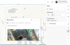
I thought the first tutorial was easy and fun to do. Configuring the pop ups was a bit of a struggle, because as much as I tried I couldn’t get the picture to upload for ESRI. the link to the powerpoint did show up in the pop up caption, at least. These kinds of stories are an exciting way to show images by location and in my opinion, makes geographical information palatable to the general public. I guess that’s the whole point of GIS isn’t it!
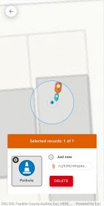
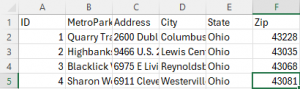
After this I didn’t realize we didn’t have to do the assignment at the end, and I skipped ahead to chapter 2 a bit to try and figure out how to do it. I decided to just map out a few of my favorite metro parks and actually started making a CSV file with their locations. I ended up asking Krygier before getting further and decided to save time and use that as a bit of a starter idea? It would get significantly more complicated than just parks and popup images like I was planning, in that case.
Chapter 2
Smart mapping sounds really interesting and seems like it would help with some of the confusion I had with desktop GIS, particularly things like making aure all the data is cleaned and lined up. Well, I can’t imagine it can compensate for sloppy nasty data but it seems like it would help make it clear *where* the slop is.
Arcade makes no sense to me, I had to look over the book a few times to see that it’s just a way of doing math. Because I can do that, but generally I see anything that looks like code and my brain shuts off.
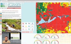
The Living Atlas sounds fun to look through. The concept of having premade layers to combine and tell your own story sounds like a good way to be creative with less busy work. I think there’s a lot of potential for artistic expression and flow in this program, and I’m wondering what kind of interactive forest cover, tree type, hydrology, who even knows layers for my metro parks app. Finally I’m glad to be doing stories more because I didn’t really parse that in 291.
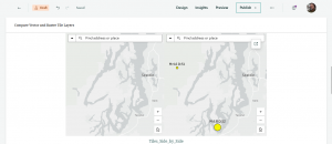
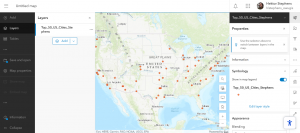
In the second tutorial, I found the way the CSV file seamlessly fit into the data appealing. I’m glad I did the tutorial before working more on my other assignment, because I would not have realized that you still have to kind of plug the data in, at least with the addresses. Anyways, it all showed up, but I had significant trouble with such a small thing: even with all the panes closed I could not get the map to the exact right extent to show all the cities with their names. Like I said, just a small thing that made me mad. I don’t know if the program has set zoom distances or if I just have butter fingers. In the map, at the end of 2.2, I just hit “zoom to layer” and accepted that viewers would just have to click on some cities to see the names.
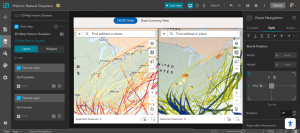
Also kind of an aside but if I was making this tutorial I wouldn’t want the shadows. I thought they were ugly and distracted from the actual information being displayed.
On to arcade, it was bad. I struggled to find globals until I realized it was actually the profile variables menu. Eventually, I got it, and configured the pop ups.
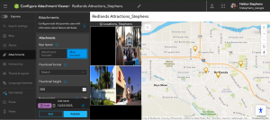
On to the story, I struggled to find the right scene and web map because I was searching in the wrong search bar! It’s the top top one. Then starting out the story was ok but I couldn’t find the add map action button anywhere, no matter where I looked. I tried messing around with the map tour but that was something else. The text in the menu is weirdly light so I could barely see it! So, I moved on. I added the scene, and then, the express map and last image. So, the story is mostly complete.
I guess my idea, based on what I started in chapter 1, could definitely involve metro parks! I could make a map of them and make popups with pictures of things to see there, as well as data about things like trail difficulty, wildlife, or distributions of trees or wildflowers. Maybe I could make an easy visual guide for which parks to go to to see which plants or wildlife?