Kelner Final – Week 8

For my first app I made a survey with survey123 to help locate and collect data to help fill out a life list. A life list is quite literally just a list of birds you have seen in your life so this is kind of a cool way to help collect that data. It is a 4 question survey that collects data for: which bird it is, what the date and time where when observed, where the bird was spotted, and an image of the bird if available.

Application 1: https://arcg.is/KrCDz

For my second app I have a map that updates in real time as the survey is filled out. The survey data is imported and overlayed onto the base map and is indicated by red diamonds to help stand out from the background. While the data is added to the map it is also input into a histogram to help show the most popular time of day that birds are active.

Application 2: https://owugis.maps.arcgis.com/home/item.html?id=4ea82ae450ef4e498090ed57dab06c3f#overview

Kelner Week 4 + 5

Week 4:

Chapter 6 delves into real-time GIS and spatiotemporal data, which enable tracking and visualization of movement, changes, and stability over time and space. Key data types include: Moving data – which tracks objects or events in motion like traffic or wildlife; Discrete data – for specific, semi-random occurrences such as accidents or weather; Stationary data – for fixed objects with changing properties like population density; and change data, illustrating growth or shifts, such as urban development or invasive species spread. These tools allow users to focus on specific moments or trends over time, offering flexibility to display many or few events and analyze their temporal dynamics.

Application: By using moving data we could look at program that would be able to track migratory birds. An application like this could help find specific fly ways a species uses.

Week 5:

Chapter 7 looks at 3D GIS. It offers additional dimensions over 2D, making it a powerful tool for applications such as urban planning, storytelling, and architectural design. It enhances understanding of object size, position, and relationships. Photorealistic 3D scenes recreate reality with photo-textured features, while cartographic scenes adapt 2D mapping techniques—using height, size, color, and transparency—to represent abstract data like population density or earthquake magnitude. 3D scenes consist of surfaces (foundations), operational layers (features anchored above or below surfaces), textures (interior and exterior covers), and atmospheric effects like lighting and fog. ArcGIS supports 3D mapping through tools like Scene Viewer, ArcGIS Pro, and CityEngine, which create web scenes grouped into photorealistic and cartographic layers. 3D scene layers include building models, integrated meshes (stitched from drone footage), point clouds (large datasets from lidar), point scene layers (optimized for speed), and voxel layers (volumetric data for atmospheric or oceanic studies). Advanced 3D forms—extended reality (XR), virtual reality (VR), augmented reality (AR), and mixed reality (MR)—make GIS more immersive and interactive, while ArcGIS Urban integrates 3D mapping with planning tools to manage and visualize urban projects effectively.

Application: Making an app that looks at nesting sites of peregrine falcons on top of buildings and bridges would be kinda cool to help show nearby food sources and protection from weather.

Kelner Week 3

Chapter 3:

ArcGIS Experience Builder is a low-code tool that enables users to create interactive content and web experiences with ease. It supports drag-and-drop interfaces, 2D and 3D data integration, and customizable widgets to enhance functionality. Users can start with templates or build layouts from scratch, incorporating themes, source data, and device-specific optimizations. Built on technologies like ArcGIS Online, ArcGIS Enterprise, HTML5, and ArcGIS API for JavaScript, it allows for the creation of apps, maps, and interactive tools through features such as message actions (trigger-based automation) and data actions (user-initiated tasks like exporting data). Experience Builder offers components like pages, windows, and outline views, along with a variety of widgets for organizing content and improving usability.

Chapter 4:

Mobile GIS extends traditional GIS functionality to portable devices like smartphones, tablets, and laptops, offering mobility, real-time information, and locational awareness. It supports efficient data collection and management through apps like ArcGIS Field Maps, which enables users to plan, track, and update field data seamlessly. Mobile GIS leverages GPS, wireless communication, and mobile operating systems (Android, iOS) for accessibility and versatility, though smaller screens can limit visibility compared to desktop GIS. App development strategies include browser-based, native-based, and hybrid-based approaches, emphasizing the need for simple, user-friendly designs for mobile platforms.

Application: With surveys and  the benefit of mobile GIS I think an app that would collect real time data for birds spotted in certain areas would be a cool concept.

Kelner Week 2

Chapter 1:

After taking 291 WebGIS seems much easier to grasp and it seems like a more streamlined and beginner centered software. I feel like in Chapter 1 this is reflected with the user base of the software and how popular it is for businesses and government while still being easily usable by more casual, day-to-day users. The group and organization system seems really cool and makes the data much more accessible which is very convenient for businesses especially. The tutorials were also a lot easier to follow in my opinion. I was able to follow them and learn the ropes in a more efficient manor than when I used ARCGIS. Apps are also a pretty cool aspect of WebGIS that I found very interesting and very easy to understand.

Chapter 2:

Chapter 2 of the GIS guide explores tools for crafting visually compelling and meaningful maps. It highlights feature layers as the most versatile type of interactive layer, easily shared across web maps, 3D scenes, and applications. Esri’s geospatial cloud offers extensive resources, enabling users to design custom layers using their own datasets, pre-made templates, or by starting from scratch. With intuitive smart mapping tools, creating polished maps—like heat maps, dot density visualizations, and color-coded comparisons—becomes accessible even to those with minimal technical expertise. The ArcGIS Living Atlas is another valuable resource, providing ready-made layers such as base maps, satellite imagery, and data on topics like infrastructure and environmental conditions.

For a project I would want to create an interactive map that shows some good birding spots at my favorite park.

Kelner Week 1

Hi I’m Hayden Kelner, I’m a sophomore majoring in Zoology and Environmental Science. I took the 291 module at the beginning of the semester so I’m excited to continue learning about how to utilize GIS. While poking around in the training tab I found a tutorial on migrating data to help make field maps. I love field work compared to sitting in a building so making the transfer of that data a more seamless experience caught my eye. I then looked at the Community Forums and that excited me because one of my biggest struggles in 291 was finding things. With access to the forums it’ll make troubleshooting a lot easier. I also enjoyed scrolling through some posts and seeing how recent they were uploaded.

When looking at the ‘Get Started: What Is ArcGIS Online’ page, I found a section on floor-aware maps. It mentioned that there are certain datasets in the system that show no only the buildings on the map but also a map of the building’s floors. Along with that I found the tab on Scenes and while clicking through I noticed a section that talked about adding weather overlays onto the scenes so I am excited to see how that can be used later on.

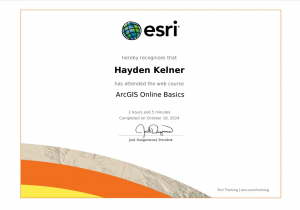
While doing ‘Web Course: ArcGIS Online Basics’ I enjoyed making the map in Module 3 and getting to see how this program works in comparison to the desktop version we used in 291. I also enjoyed getting to see how to use scenes because the 3D aspects of online mapping has always been something I’ve thought was very cool.

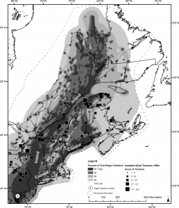
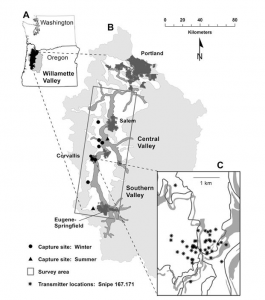
For my research on Google Scholar I looked up “ArcOnline Migratory Birds” I found an article on migratory eagles in Northeastern North America. It’s pretty cool seeing their routes collected by GPS data and then seeing their routes mapped out. I also found an article on mapping the migration patterns on Wilson’s Snipe. I’ve always loved birds so getting to see their migratory patterns and routes that they follow is always interesting. It’s also cool to see where they fly over and how that relates with their food sources so we can help preserve these feeding areas so the birds can continue to successfully migrate in the future.

Links:

Mojica, Elizabeth K., Bryan D. Watts, and Courtney L. Turrin. “Utilization probability map for migrating Bald Eagles in northeastern North America: a tool for siting wind energy facilities and other flight hazards.” PLoS One 11.6 (2016): e0157807.

Cline, Brittany B., and Susan M. Haig. “Seasonal movement, residency, and migratory patterns of Wilson’s snipe (Gallinago delicata).” The Auk 128.3 (2011): 543-555.