Massaro Week 4

Chapter 5: This chapter was very useful in learning how ArcOnline and Enterprise can interact. However, I was a little bit confused by the fact that we imported the maps from Enterprise but didn’t use them. Instead, we used maps that were created by someone else. I thought it was cool to see the difference between the vector and raster tiles. The chapter explained caching, but I still think the concept is a little confusing. I understand that caching can upload tiles faster than traditional methods, but I still don’t quite understand how to use them and apply them to my own mapping. Something else that was a little confusing was the difference between caching locally and choosing one of the other options. The text sort of explained it, but not it a way that was easy to understand. After I did the work on the enterprise, I was able to display my data using a story. This is a part of the process that I really enjoy because it’s interactive and a great way to display your finished data.

Since I found this chapter a little confusing, I’m not sure exactly how to apply this data correctly using my own data. However, an idea would be to create a map of the different food banks in Ohio. The point of the food banks could vary depending on how many people they serve. And the vector and raster data could show different numbers of tiles and the names of the food banks.

Chapter 6: This chapter started off by discussing IoT and the integration of smart technology in our daily lives. Learning about this was super cool because it talked about how the use of IoT can be sustainable, especially in terms of smart homes, heating, cooling, and electricity. Something else that the chapter went over was creating a web layer that refreshes very often. This is super cool, and I can see why it would be useful, especially to police and first responders. When I was working with a web layer that was changing, it was cool to see it change as I was inputting data into the map. Something that took me a little bit to figure out was the coding aspect of this web layer. While it wasn’t entirely confusing, it was still very tedious, especially when I made a small mistake. Overall, I loved how interactive this map was, and that I could see it constantly changing. While I think that adding the data displays, like the table and chart, can be quite useful, I wonder if there is another way to display the data without it being so cluttered. In the second part of this chapter, I created a web layer that displayed population growth over time in cities in the US. 

An idea for applying the data I learned from this chapter would be to create a map displaying all of the major roads in Delaware. The map could be frequently updated. It would display car crashes or road stops. Similar to a GPS. Additionally, I could create a map of Delaware that displays its population growth over time.
Massaro Week 3

Chapter 3: This chapter taught me how to create a web experience with both 3D and 2D data. It was super cool to see how the different maps were able to show the data in different ways. This chapter also went over the process of adding widgets to the maps. The widgets are very useful because they make the data interactive and narrow the data down to show patterns to the viewers. The widgets also helped in organizing the map so that it was easier to navigate and understand. Something else that was mentioned in this chapter was the use of GIS software on different devices, like mobile devices. This is super useful because it makes the software easy to access and edit. In turn, this also makes the software more accurate because users can update it as needed. 

If I were to create a map using my own data for this, I would do something along the lines of tracking the population growth in cities in Ohio over the years.

Chapter 4:This chapter taught me how to create a survey and analyze the results of the survey. I did run into a few issues with the viewing of certain questions. One of the questions was only supposed to be viewed if a certain answer was selected on a previous question. However, I think the program from the book and the current program are different because I was not able to edit it in the way the book was describing. The pictures from the book also didn’t align with what I was seeing on my computer. I was able to use information from the survey to create a map with certain lines and points representing the specific incidents within an area.

A way that these aspects could be applied would be to report utility work that needs to be done on campus. For example, broken showers and toilets. Another example of an application of this would be tracking animal sightings in a nature reserve. People could submit a survey of where they saw the animals. The sightings could be turned into points, and a line could be drawn between close sightings of the same animal to infer its daily activity and travel.

Massaro Week 2


Chapter 1: Something that I think is super interesting about ArcGIS Online is how many people you can connect with on it. Another thing that I think is super interesting is the fact that people are able to view, interact with, edit, and give you suggestions on maps that you have created. Something that we explored in 291 was using a hybrid of online and enterprise GIS. This was helpful because the enterprise was more specific to an individual and more detailed. But online, it is more interactive and widely used to communicate information. Something that I found a little confusing was the apps that you can create. Since I created my own app in the chapter, I was able to understand how it worked, but I’m still confused about how exactly it can be applied to certain things. 

Chapter 2: Overall, I very much enjoyed this chapter. Something that the book keeps mentioning is the use of smart-mapping. This is something that sounds super interesting, and that I would love to explore in the future. Something else that I think will be very useful in the future is the Living Atlas. I worked with this a little bit in 291, but I would like to see how it can be applied to GISOnline. Something that I really enjoyed about this chapter was the fact that we both got to create maps and a way to present them, and the data that they show. I will say that I am not as keen on the arrow symbols that they had us using to display the population growth. From the 3D perspective, the arrows were more useful, but from a 2D perspective, they made the map look a little cluttered and confusing. Additionally, when adding the zoom features for the maps into the sidecar, the arrows got smaller as we zoomed in. I feel like this defeated the whole purpose of zooming in to better display the data. An issue that I ran into when inserting the picture and Wikipedia page for the different states was that the state symbol or flag did not appear within the box. One other thing that annoys me when using the storytelling mode for GISOnline is that the font changes when you change it from a paragraph to a heading. I feel like this makes the project look messy and not as cohesive. 

An application based on the ideas from these two chapters would be a sort of campus tour map. This would use the applications from Chapter 1, where you can add descriptions and images for each of the buildings on campus. Additionally, this could be incorporated into ideas from Chapter 2 by creating a story that shows the history and growth of OWU over time. This could be in terms of an increase in student numbers, students within certain majors, or an increase in buildings since the campus first opened.

Massaro Week 1

Hi, my name is Elaina Massaro. I am a freshman planning to double major in environmental science and zoology. 

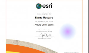
For this week’s work, I took the quiz and ensured that I had the book available for the course. A majority of the work for this week was work that I previously did in GEOG 291. After poking around on my online account for a bit, some things that I think are interesting are that you are able to share maps you have created with people in your organization, and that maps can be interactive and tell a story for the viewer. I completed the training course for ArcGIS Online. Some things that I found interesting from this course were how sharing can be applied to different parts of a community and how 3D maps can be used to display data to viewers. Some other courses that I am interested in are Field Data Collection and Management Using ArcGIS and ArcGIS Field Map’s Migration Guide. In GEOG 291, I looked into Google Scholar and uploaded links to different applications of GIS.