Dodds final

https://survey123.arcgis.com/share/f2e9ed22cdf442dbafc3d34eb156aa45?portalUrl=https://owugis.maps.arcgis.com

I developed two integrated applications designed to tackle the issue of litter in a collaborative and data driven way. The first application is a user friendly survey tool that enables individuals to document various types of trash they encounter. This app collects detailed information, including photos, descriptions, and the precise geographical location of each item of litter. The data gathered is not only comprehensive but also easily accessible, allowing for a wide range of users to contribute effortlessly.

The second application builds on the data collected by the survey app and translates it into actionable insights through a heat density map. This map visually highlights the most littered areas, emphasizing their proximity to bodies of water. By combining user input with geographic information systems, the app provides a clear visual representation of litter hotspots, making it easier for organizations and communities to prioritize cleanup efforts and implement targeted interventions
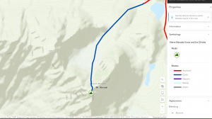
https://owugis.maps.arcgis.com/apps/instant/interactivelegend/index.html?appid=97c66b652ca44bb6b0a0b7468a45b79d

Dodds week 4

Chapter 6 explored the use of real-time GIS and spatiotemporal data, which helps track and visualize how things move, change, or stay the same over time and space.                                                Moving Data: Tracks objects or events in motion, like traffic or wildlife.
Discrete Data: Displays specific, random events, like accidents or weather occurrences.
Stationary Data: Shows fixed objects whose properties change over time, such as population density.
Change: Illustrates growth or shifts, like urban development or the spread of invasive species.
Real-time GIS lets us view this data in real-time or over time, and we can decide whether to focus on specific moments or ongoing trends.

Tutorial 1: I initially struggled to find the map needed for the exercises, but importing data from the Living Atlas solved the issue.
Tutorial 2: I created a dashboard to monitor incidents in Delaware County, customizing the appearance and data displayed.
Tutorial 3: I used categories to organize data on the map, making it easier to focus on specific areas.
Tutorial 4: Arcade scripting allowed for more advanced formatting, improving the display of the data.
Tutorial 5: I worked with time-series data, organizing it by time zones to keep it accurate.
Tutorial 6: The final tutorial animated population changes in the U.S. over 200 years, showing how populations shifted over time.
Application Idea: Real-time GIS could be used to track crowd sizes in Delaware businesses or OWU dining halls, helping people avoid crowded places. This would be similar to a “popularity tracker”  which showed peak and off-peak times.


dodds week 3

ArcGIS Experience Builder and Mobile GIS are powerful tools within the ArcGIS suite, offering flexible and user-friendly solutions for creating and using geospatial content across various platforms. ArcGIS Experience Builder enables users to create web experiences with minimal coding by using drag-and-drop functionality and integrating widgets to interact with both 2D and 3D data. Users can start with templates or build from scratch, customizing layouts for mobile optimization, adding themes, and employing a range of widgets (e.g., maps, legends, charts, and survey tools) to enhance interactivity. The tool’s flexibility allows for integration with ArcGIS Online, ArcGIS Enterprise, and ArcGIS API for JavaScript, making it adaptable for diverse mapping applications.

Mobile GIS, on the other hand, brings traditional GIS functionality to portable devices such as smartphones, tablets, and laptops. It offers easy access to geospatial data, real-time updates, and interactive mapping through apps like ArcGIS Field Maps, which supports field data collection and management. Mobile GIS leverages GPS, wireless communication, and mobile operating systems to allow users to track, capture, and update data on the go. However, smaller screens can limit visibility and detail compared to desktop versions. Together, ArcGIS Experience Builder and Mobile GIS can support a variety of applications, such as studying and monitoring gas leak patterns in Delaware County. This project could ensure the safety of residents by using interactive maps, data analysis tools, and additional data collection methods beyond traditional surveys.

I messed around with an interactive soil map where my locations where i sampled soil for my independent study were marked and had pop ups with the photos of different land use in the area.

Dodds Week 2

Chapter 1: Getting Started with Web GIS
Web GIS brings together the internet and geographic information systems (GIS), making it easy for people to use geographic data from anywhere. It’s becoming popular in areas like government, business, science, and even day-to-day life. Web GIS has tons of applications, from mapping and data management to analytics and decision making. The main pieces of Web GIS include users, groups, content (like maps and data), and metadata. Apps are where the action happens, things like StoryMaps or mobile apps that let users interact with maps and data. Inside these apps, you’ll find basemaps (which give context), operational layers (for interactive data), and tools that help with things like routing and location searches.

Chapter 2: Smart Mapping and Storytelling with GIS
Chapter 2 dives into tools for making maps that look great and tell stories. Feature layers are the most common type of interactive layer in maps, and they’re reusable across web maps, scenes, and apps. Esri’s geospatial cloud hosts lots of these layers, letting users create custom layers from their own data, templates, or even from scratch. With smart mapping tools, you can make professional-looking maps: think heat maps, dot density maps, and color-coded comparisons, without needing a ton of technical skills. ArcGIS Living Atlas is also a go-to for ready-to-use layers that include basemaps, imagery, and details about things like infrastructure and the environment.

For my project I would like to do something with bird sightings around campus. I was inspired by crowd sourced information and love creating free resources. I could highlight 2-3 species of interest.

Dodds week 1

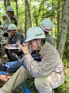
My name is Ellie Dodds. I am a senior environmental science major and history minor. I took GIS 291 two years ago (back when it was 191!) but I am excited to take the second part. I love envs but I am more of a hands on field work kind of person but I like the idea of being able to use GIS to better do field work. Here is me in Japan looking at soil!

While poking around on the website I noticed training courses that deal with coding and that peaked my interest! I did some coding in high school but haven’t been able to apply it here at OWU. I am most interested in the Python courses but Java and JavaScript are what I worked with before.  The community forums also looked helpful for later on in this course.  I found the scene viewer page on the Get Started: What Is ArcGIS Online to be a nifty cheat sheet on the different icons. I noticed an elevation tool which looks cool because I love topographic maps. I definitely intend to work that into my gis this semester if possible. I found the clickable links to be helpful for navigating this much information.

The training was easy to follow and  I didn’t run into any hiccups.  I found this to be much easier than the desktop version. I loved working with the scenes, I didn’t realize that it would be in this course.  It had super specific instructions.


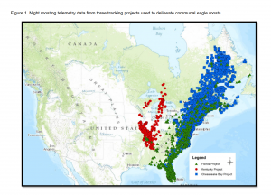
Online I found many applications relating to birds. I found someone working on an online bald eagle location map based on crowdsourced data.

Lukei Jr, Reese. “CREATION OF A NATIONAL REGISTRY FOR BALD EAGLE COMMUNAL ROOSTS.”

I also found one that used museum collections and arconline to map about bees.

Day, Baylie Lenora. “Thematic Mapping of Apidae Holdings Within the University of Arkansas Arthropod Museum.” (2024).