McNichols Week 8 Final

Application 1 –  I created a Survey123 application to facilitate the documentation of invasive spotted lanternflies within Delaware county.  The application allows users to provide their location, a picture, a description of the sighting, their name and email address. The default range of the location feature has been set to contain the entirety of Delaware county. It is set to take the location of the device as a starting point. The location, photo, name, email, and date & time fields are all required while the description is not. It caches the name and email fields.

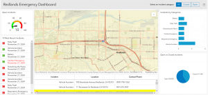
Application 2 – I created a dashboard for the results of my survey. Its definitely properly documenting spotted lanternflies and nothing else. I would have gotten this all done on monday but I couldn’t find the variable names I needed to use to format all the elements of the dashboard.

McNichols Week 4

Not too much to report, everything went smoothly. At one point I had to turn off my adblock for the timeline QuickApp which I thought was interesting. I think these programs could be used to chart the growth of invasive species populations like the Spotted Lanternfly as an assignment, though I’m not sure how readily available that data is to the general public.

McNichols Week 3

I’ve run into the same issue with Dynamic Content in 3.3 that Haley described but can’t find a fix for it. The ESRI community post I’ve found didn’t help as I’ve already formatted it the way they’re recommending with no success. 11/08 I’m back, it was just hidden behind all the open panels and zooming out fixed it. The editor missed a https on a link in 3.6. Everything else went fine. I think in terms of the experience builder assignment I’m thinking about the work I did with the Ohio EPA: as a stormwater program intern I conducted inspections of construction sites and had to reach a certain quota of large and small sites for the agency. I think it would be interesting to document a chronology of those site visits and filling those quotas.

There isn’t an “Imagery Hybrid” option, I’m guessing it’s “Imagery with Labels?” There’s been a couple other issues that came up but I figured it out with 4.1 and 4.2. Visual and UI updates keep slowing me down. There’s not a Community Map option in 4.4, my keyboard is freaking out so I’m gonna return later. Based on other people’s work I’m just going to choose the imagery with labels. I wish there weren’t so many non-functional changes to this program that make the older versions of the textbook harder to follow. There’s just a lot of small things, like in 4.6 when I clicked on the name it opened up a little pop-up to the side of the page that did not have the visualization tab to select from. Everything else went fine.


McNichols Week 5

The additional dimensions that 3D GIS offers over 2D serves as a better vehicle for a lot of different applications like urban planning or defense simulation. It helps people understand size and relative position of objects. Photorealistic 3D scenes use photos to texture features, while Cartographic scenes take the mapping techniques of 2D and applies them to 3D using height, size, color and transparency to display features like population density or earthquake magnitude that aren’t viewable from a 3D representation on its own. 3D scenes are composed of surfaces that provide a foundation for other content, features that are anchored above or below the surfaces (these are the operational layers), textures that provide the exterior or interior covers of the 3D features (often with aerial imagery or cartographic symbols), and finally atmospheric effects like lighting and fog. 3D scene layers can be used to present simple representations of buildings (textured or untextured), more complex digital models of buildings that let you interact with its components and look at its specific properties, category layers (windows, walls, etc), or filters that let you select elements with specific attributes. Integrated mesh scene layers construct complex images just from stitching together drone footage by matching angles from different data points together into a single synthesized projection. Point cloud scene layers quickly display large amounts of symbolized point cloud data, usually collected via lidar (This one looks like a heat map). Point scene layers thin out the dataset from point clouds to increase visualization speed and visibility. Voxel layers create a volumetric vizualization, often used for atmospheric or oceanic data.

There’s not an Elevation mode to select in 7.2 so Alaska’s gonna stay a little funky.

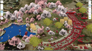
I’m really curious why some of those cars are such different sizes when so many others are at-scale.

Assignment idea: I think it’d be interesting to make a 3d web scene of one of the parks we run at for cross country.

McNichols Week 2

WebGIS has global reach, a large community of active users. Its often cheaper to build a program with WebGIS than to build and install a standalone program, it has better cross-platform capabilities, and it is easier to use and maintain. Being stored on the cloud offers ArcGIS online a lot more scalability, agility, and cost efficiency compared to on-premises data storage. Variable web GIS sites all being stored within ArcGIS instead of independently hosted allows for easier communication between them, and the platform has also allowed for a two-way flow of information allowing users to volunteer geographic information. It also prioritizes function for mobile devices as those are the primary way the majority of people are accessing online information. The platform also allows the conversion of 2D maps into 3D web scenes that can also be interacted with through virtual reality. Web GIS content is broken down primarily into data, layers, tools, web maps, scenes, and apps. An app is comprised of a basemap that provides geographical context, the operational layers that you interact with, and the tools that perform tasks beyond mapping like analysis. There is not a community map option on the main page Basemap button of 1.3, I did find one though by using living atlas. Working from the assignment ideas from chapter 1 I could create a map of the different locations I’ve traveled to as a part of cross country and track, we’ve gone pretty far.
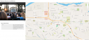
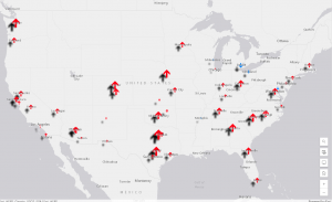
Feature layers are the most common operational layers, they’re basically web services that can be reused across many different programs. Hosted layers are stored in the Esri geospatial cloud while unhosted layers are stored independently. Hosted layers are granted a lot more features and flexibility through Esri. One feature available through Esri is Smart Mapping, which allows you to change the style of a feature layer into a heat map, a comparison map, density maps, and much much more. Pop-ups allow you to provide additional information and insight. The Arcade feature is similar to Microsoft Excel’s formulas which allows you to add values to pop-ups for information that’s not in the attribute field of the layer. The living atlas is an incredibly large database of layers, maps, tools, and apps produced both by Esri themselves and by contributors, a wealth of resources available for use. WebGIS wants you to prioritize an app being fast, easy, and fun. Through a use of maps, narrative, and multimedia you can create a story that engages your users. The most populated cities in the chapter 2 tutorial are New York City and Los Angeles. The drop shadow settings seem pretty extreme and are very unaligned with a lot of the smaller arrows.
 

McNichols Week 1

Hi! I’m Ethan McNichols, I’m a senior Environmental Studies major and a double minor in Data & Society and Social Justice. I play Dungeons & Dragons, I’ve operated a discord server to centralize folks who play on campus so they can find games and other players. Its been in various conditions of activity and functionality over my four years here, currently working on cleaning that up so it can be handed off to an underclassman when I graduate because I think having that infrastructure is important. I also play Magic: the Gathering,  which just recently got an official club! I’m the treasurer for that now. I’m learning HTML on my own time to potentially end up making my own website/blog since I’m getting pretty fed up with the direction large social media sites are moving. I’ve also been listening to Ginger Root’s new album Shinbangumi a lot, I highly recommend it!

I’m going to try and stay ahead of my work in 292, it wasn’t awful to get caught up in 291 but it’ll be better to not have to deal with that at all on the latter half of the semester. (Written 10/16 lol. Didn’t finish this post before I was on a 3 day trip for Cross Country. *now* I’m going to try and stay ahead of my work).

I confirmed my new GIS account. With a budget of 1000 credits that I found in my settings I’m curious what all we’re gonna do. Just from reading the “getting started” section the notably different features seem to include a favorite system and a comments/rating system, as well as integration with social media sites to be able to share things. Floor-aware maps seem like an interesting function but I don’t know how much we’re going to be working with interior spacial details.

The training button seems to be broken. Everything below that seems to as well. They all open a new tab which fails to load. I ran into this last week and it seems to still be an issue a week later, on a different computer. I’ll send an email to Krygier about it.

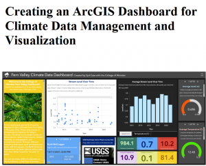
For the google scholar stuff I looked up “Ohio climate” because I’m interested in how this is being used for local climate change. Turns out there’s a 2022 senior thesis from Wooster about how up to that point there was not a centralized place for this data, so they’ve been working to update some of Wooster’s server infrastructure to serve as the beginnings of a centralized ArcGIS dashboard for managing and visualizing local climate data.

Edit:

It loaded, I did the training. This page is also stalling out on me. Its late so I’m not waiting for the certificate to load.