Patel – Week 4

            Chapters 5 and 6 of Getting to Know Web GIS dive deeper into how to share and organize maps online in an orderly fashion for GIS work. Chapter 5 explains ArcGIS dashboards. ArcGIS dashboards let you pull together live maps, charts, and indicators to tell a real-time story with your data. ArcGIS dashboards are like mindmaps or hw sites that let you pull all info into one spot to get the full picture. Dashboards can be used to monitor activity, like tracking wildfires, traffic, or even your own data feeds. The cool part is how everything is connected. Clicking something in one panel updates the rest instantly. Chapter 6 then shifts gears to ArcGIS StoryMaps, which turns GIS data into a kind of interactive narrative. You can mix maps with text, images, and videos to guide people through your data like a story instead of just showing them raw info. It feels more creative and expressive than the dashboards in my opinion. Together, these chapters show how GIS isn’t just for data management it’s also for communication and presentation. Reading them gave me ideas for how I could use my own data, like turning my walking route maps into a live dashboard that tracks my total distance and then wrapping that into a StoryMap showing how my routes change over the seasons.

Patel – Week 3

Under Construction (I will be Comming back to this to see if this is the assignment)


Chapters 3 and 4 of Getting to Know Web GIS expand on the practical tools and workflows that bring Web GIS to life. Chapter 3 introduces the concept of web layers the building blocks of online maps and explains how different types such as feature, tile, and imagery layers are published, styled, and shared. It emphasizes how cloud based platforms like ArcGIS Online simplify data publishing so users can focus on visualization and analysis rather than software management. The chapter also explores how web maps serve as the foundation for web apps, dashboards, and story maps, showing how dynamic mapping can communicate ideas more effectively than static displays. Chapter 4 dives deeper into smart mapping, discussing how symbology, classification, and pop-ups can enhance spatial storytelling by turning raw data into intuitive, meaningful visuals. It also highlights tools for analysis such as spatial queries, buffering, and heat maps that allow users to uncover trends and relationships hidden in spatial data.

Application idea: Using my own GPS data, I could design an ArcGIS Experience Builder app that displays my walking routes over time, with widgets that show the total distance covered, elevation changes, and areas visited most often. Pop-ups could include date and weather details for each route, creating an interactive story of my weekly movement patterns. This project would connect what I’ve learned from Chapters 1-4 by combining map publishing, smart visualization, and app creation.

Dylan Patel – Week 2

Chapters 1 and 2 of Getting to Know Web GIS introduce the foundations of what makes Web GIS such a powerful evolution of traditional geographic information systems. Chapter 1 focuses on how Web GIS moves mapping and analysis into the online environment, allowing for greater accessibility, interactivity, and collaboration. Instead of being limited to desktop software, users can now create, share, and analyze spatial data through browsers and mobile apps. This shift transforms GIS from a specialized tool used by experts into a connected platform that supports teamwork, decision-making, and public engagement. Chapter 2 explores the structure of GIS data, including the differences between vector and raster formats, how feature layers are organized, and why coordinate systems and map projections are crucial for accuracy. Understanding how data aligns spatially ensures that maps are not only visually appealing but also meaningful for analysis.

Patel-Week 1 (292)

Hello, I’m Dylan Patel and I’m a Jr currently majoring in Environmental Studies. I’m from Anaheim Hills near Disneyland.

This week I not only completed a quiz for the syllabus but also explored my account information and more on ARCGIS online. I discovered how to find my profile information, my settings, my ESRI, training, community & forums, ArcGIS blog, and how to seek help.

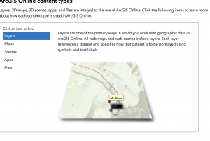
Within the info on Get Started with ARCGIS online in ESRI I found ArcGIS Online bundles map/3D scene creation, apps, analysis tools, and Python notebooks. I found the information to be very helpful when it came to navigating each I enjoyed how it broke everything down into there own categories.

Two courses that interest me are ArcGIS Online: Essential Workflows and Going Places with spatial Awarenes

ARCGIS ONLINE SOURCES THAT INTEREST ME

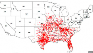
For me I really liked the website Gensler found and decided to write about it. This map shows the distribution of 9 banded Armadillos in the US. I always thought that Armadillo were in australia only but to my suprise they exsist in the Americas as well which also supprised me. Everyday you learn something new.

https://www.mdpi.com/1424-2818/17/2/138