Buroker Final

Ben Buroker

Spring 2023

Geog 192

Dr. Kyrgier


Final Web Apps


Parcels and Street Centerlines Web Page: 

https://experience.arcgis.com/experience/9e93ee35c4474c41a858e178718ad14a


This web page contains a map of both the Delaware land parcels and Delaware street centerlines. The thinking behind this was that viewers could compare both the street centerlines and parcels and make some basic observations about the location of different streets and parcels. I used an experience builder template to make this page and included an image of the Delaware County crest and an image of a Delaware County map from an online source to make the page look a little bit more finished and complete. Clicking on specific parcels allows viewers to see the attribute table information and look at specific acreage, ownership, and land use type for each parcels. Similarly, viewers can click on roads/streets in the centerline map and view which road , interstate, or street they have selected. 


Hydrology Dashboard:

https://owugis.maps.arcgis.com/apps/dashboards/fe2ee5295707429e905969fd6d3cc5f4


This dashboard contains a map of the Delaware County hydrology. The map can be zoomed in and out of, and viewers can navigate throughout the map with their mouse. Contained in the left sidebar of the map are some images and titles of notable hydrology in Delaware County, along with a box containing the Area and Name of the hydrological features in the county. Viewers can click through this box, or select individual features in the map and read about the area and name in a pop-up box. This map would be useful for people interested in learning more about the locations and names of the hydrology of Delaware County.

Buroker Week 6

Ben Buroker

Spring 2023

Geog 192

Dr. Kyrgier


Week 6:

Assign: Read and complete GTKWGIS chapter 7. Create a new blog entry with comments, notes, and questions on these readings. This is: <Your Name> Week 6

  • Include a few-sentence description of an application based on ideas from chapter 7, using your own data or the Delaware Data (from Geog 191). This edition of the tutorial includes ideas under “Assignment” (p. 35 in the 5th edition of the tutorial).

Write-up: 

The terminology of “web” and “3D” for 3d scenes/maps are important to remember. It is intuitive that another dimension of data will improve the visualization, analysis, and communication of a map. The two types of 3d scenes are photorealistic scenes and cartographic scenes. Photorealistic use photos to create features and cartographic uses 2d thematic mapping techniques to display features which may not be as visual. There are a multitude of ways you can represent the 3d images or data. I think the point cloud maps are cool because they provide some context to the lidar data that I have heard Dr. Rowley talk about quite a bit. It’s cool to see what lidar data would look like when compiled into a 3d map. I got a little lost when they started talking about all the r’s, AR, VR, XR, MR… it’s a lot.

Exercise 7.1:

I couldn’t do 7.1 because this was the description it gave online on how to do it… This is the same problem from earlier in the book; where the instructions didn’t include the ending of the paragraph. I fixed this for future chapters by using the hard copy of the book from the GIS lab, no the ebook.

Exercise 7.2:

I’m having some issues with this exercise because it is asking me to choose “population per square miles” when it is not an option that I have in the drop down menus. I am instead using “population density” whenever I am asked to do this. I feel like it is close to if not the same as pop. per sq mi.

This is my web scene after completing 6.2. The spike in Washington is weird and I don’t know how to address it…

Exercise 7.3:

Making the “fun park” was enjoyable and pretty straightforward. It made me feel like an architect but it was actually really useful to see how you can format a 3d scene to make it look “pretty” or a certain way for a specific layout/project.

Exercise 7.4:

There is something going on with arc online when formatting the park walls towards the end of exercise 7.4. When you are asked to select the “height field” from a drop down box, there is one option with text and two blank options (pg 258). I believe some of my buildings don’t have walls because of this glitch.

Exercise 7.5:

This section was difficult. I had no trouble adding the car, but for some reason once I tried to add a helicopter my map became overrun by helicopters of various sizes. I only completed all the steps to add two to my map… so I don’t know why there are so many.

Exercise 7.6:

This exercise was cool. It was good to see all the measure tools. It was kind of frustrating trying to navigate the movement controls of the 3d map with my laptop though. It was hard to use my trackpad and the online wifi made the map a little glitchy I think. I would be interested in trying to do this sort of navigation on one of the wired PC’s and with a mouse.


Potential Application: 

I can see a 3d scene being used to make a map of a location in Costa Rica from Dr. Rowley’s Bahia Ballena project. I think if we had the basemap data or images we could add in the surrounding “stuff” like trees, buildings, and walls and format/place them in the correct spots. I think a 3d scene like the ones I made above could be a good tool to help people at OWU who haven’t been to Bahia Ballena visualize the town and better understand what is going on. The adding and formatting of the 3d scenes was pretty straightforward, I just don’t know what kind of data you need to begin the process. 

Buroker – Week 5

Week 5: 

Assign: Read and complete (skip chapter 5!) GTKWGIS chapter 6: Spatiotemporal Data and Real-Time GIS: Tile layers and on-premises Web GIS. Create a new blog entry with comments, notes, and questions on these readings. This is: <Your Name> Week 5

  • Include a few-sentence description of an application based on ideas from chapters 5 & 6, using your own data or the Delaware Data (from Geog 191). This edition of the tutorial includes ideas under “Assignment” (p. 35 in the 5th edition of the tutorial).


Write-up: 

I’d never heard of spatiotemporal data before this chapter so I’m interested in learning more about it. I understand the benefit of “real-time GIS” and how it can be applied to real world problems. I can see how manually entering data or using sensors to immediately have data in a gis program could be super useful. The four types of spatiotemporal data are moving, discrete, stationary, and change data, and I can see how all of these can be applied to real time data based on the examples given in the textbook. The IoT is kind of a scary phenomenon because it consists of such a broad range of everyday things that impact our everyday lives. (ex. “airplanes, taxis, bicycles, lights, refrigerators, sprinklers, heart-monitoring implants, biochips, security cameras, and unmanned automobiles”).


Exercise 6.1, 6.2:

This is my incident dashboard after completing 6.1 and 6.2. This went very smoothly and was enjoyable to do. I like moving things around to make them fit in a way that I liked. There were a few times were it asked me to type a specific title or “something” but just did not include what it was… there was just a blank spot

Exercise 6.3:

My dashboard looked mostly the same after 6.3 as it did after 6.2, with the addition of the category selector in the top right and the actions on the 10 most recent incidents tab. I think these are cool functions of the map and added a lot of depth to what it could show.


Exercise 6.4: 

When trying to type in the Arcade Script, I got this “unable to execute arcade script” in the list box. I don’t feel confident enough in my coding experience to understand what is going on. The same was true with the table arcade script, any time I added anything at all to the advanced formatting box I got the same unable to execute message. I chose to reset to the regular script so that the table and list still displayed the earlier information.


Exercise 6.5: 

This exercise went well. No major hiccups. I do find it somewhat more difficult to navigate the arcOnline home pages because I don’t have a ton of experience using them. I think I’m more comfortable in map viewer and other online applications because I have experience with arcGIS on the PC’s. 


Exercise 6.6:

This is my web app created in 6.6. I thought this was straightforward and everything worked well. The instructions were clear and it was cool to see how a web map could become a web app. I feel like this is a useful technique to know how to do and one that I will be able to use going forward. I did see a few more typos similar to the ones that I mentioned above in this exercise, it seems like somehow words were being dropped off the ends of sentences which made it kind of hard to know what the book wanted me to label things.


Potential Application:

I could see myself using the steps from 6.5 and 6.6, making a web map and then turning it into a web app with Dr. Rowley’s Costa Rica data. Part of our goals is to make a web map/app for the town of Bahía Ballena and I could totally follow the instructions and methods we used in these exercises to generate an interactive app that can be shared with the town.

Buroker Week 4

Ben Buroker

Spring 2023

Geograph 192


Week 4: Chapters 3 and 4


Chapter 3:

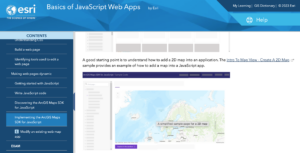
The “Experience Builder” function of arc online is one of the things that blows my mind about the webpage. The things that ArcOnline can do are really incredible and useful. I think the web experiences capability is super cool and will be fun to play around with when designing web apps and maps.

Exercise 3.1:

I always get scared having to add data in any GIS setting because it has gone wrong in the past… But I successfully added the 2d sample map so that was good. I had a hard time adding the “Views Navigation Widget” because it didn’t automatically link to my map and there are no options in the right hand tab under “Link to:”.


Exercise 3.2:

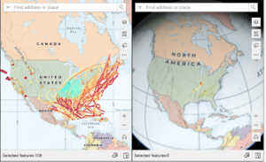
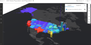
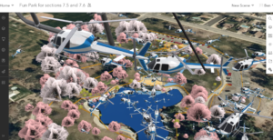
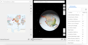
Screenshot from the preview tab only showing the hurricanes and earthquakes selected on the 2D Map on the 3D Map.


Exercise 3.3: 

When I click on the “Dynamic Content” button on the toolbar nothing comes up. This is on page 91 of the book. I can’t complete any of the next steps because I don’t see a “statistics”, “data”, or “operator” button.


Exercise 3.4:

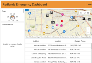
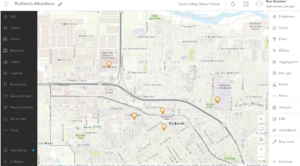
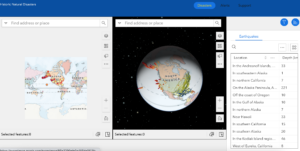
This is my map after adding the earthquake table in 3.4. Also this link is a draft view but should still work! (https://experience.arcgis.com/experience/85e2290efe0a405da0f13fcabb6ec603/?draft=true)


Exercise 3.5:

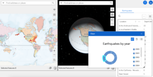
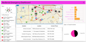
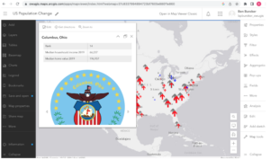
My map after 5.3 showing the chart function and only the selected earthquakes from the year selected on the donut chart. Creating this went smoothly and I apprecaite the depth of information you can provide with charts like this one. 


Exercise 3.6: 

I had a hard time with embedding the image on the new page I created because the Url in the book didn’t have an https and the text box/arconline only supported https. I just added “https://” to the front of the URL and it embedded an image. I don’t know if it’s what it’s supposed to be though.

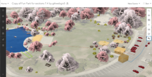
This is my finished map with the new header from 3.6.


Chapter 4:

The mobile apps strike me as a super powerful part of arconline. The introduction section about the “post-PC” era made a lot of sense and it is cool that things like GIS are adapting to the technological developments and are able to be used with the powerful technology my generation has grown up with. The concepts and advantages section on pg 110 and 111 is very compelling and makes it easy to see how the mobile apps could be useful for people using GIS.


Exercise 4.1:

On page 127, where the tutorial asks us to pick “Imagery Hybrid” for the basemap of our survey, I couldn’t find an option labeled this. I just chose imagery with labels, hopefully that is what they wanted.

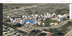
This is a screenshot of my survey preview after this section was completed.


Exercise 4.2:

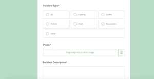
It was entertaining to practice taking the survey I just created and to see how it all worked. I liked how the recyclables question popped up when I selected recyclables as the incident type. I can imagine creating much more in depth and informative surveys using this framework.


Exercise 4.3:

At the top of page 136, where the tutorial tells you to notice how the “incidents_layer” has attachments enabled, it doesn’t actually have attachments enabled. I manually enabled it using the toggle buttons. Before I could share my layer/map that I made in this exercise I needed to go into settings and click the “Public Data Collection” box.This might have been prompted earlier in the tutorial and I missed it but I wasn’t able to share until I did it. 


Exercise 4.4:

There is no conditional visibility option as mentioned on page 139. I think that the name has changed to calculated value as there is an “add expression” cue under this option. I actually couldn’t figure out what it was asking me to do at this point and wasn’t able to complete this tutorial. This also meant I couldn’t complete 4.5, the Field Map exercise because I didn’t have the Public Works Inspection web map that I was supposed to be able to make in 4.4.


Exercise 4.6 and 4.7:

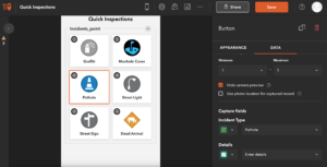
This is the Quick Inspections quick capture map that I created in exercise 4.6 and used on my phone to capture images in 4.7.


Exercise 4.8:

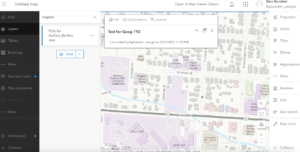
This is the test POI that I created in the map for this exercise.


Exercise 4.9:

The AuGeo app is super cool and being able to look at the first person camera view of the POI’s you add is really cool. It was also really simple to add a POI and this could be really good for something like making a campus map with street level views.


Potential Application:

Exercise 4.9 inspired me to think about the applications of AuGeo and I could really see it being used to make an OWU campus map that included POI’s that would open up to street-level images of OWU buildings. This way, visitors could look at our typical campus map, click on a building they want to see, and then see it from street level. As I mentioned above it is pretty simple to create the POI’s and I believe the photos are already out there so I feel like this is a pretty realistic application of the techniques we practiced.


Buroker Week 1,2,3

Ben Buroker

Spring 2023

Geogprahy 192

Week 1, 2, 3: 


Write-up: 


ArcOnline Exploring: I have previously logged into my arconline account in Dr. Krygier’s earlier GIS class (before the 191 and 192 modules). I enjoy working with ArcOnline and think it is a good addition to the desktop GIS software. I find it relatively easy to navigate and use to view and make maps. Everytime I go on it I am surprised by how many tabs and different buttons/capabilities there are, and this time was no different. I’m excited to hopefully understand the function of all of these tabs at the end of the course. 


Get Started: What is ArcGIS Online. Readthrough: I think one of the most exciting things about arc online to me is that you can work on maps collaboratively and virtually with other users and organizations. This is an incredibly powerful tool to connect people and to accomplish projects with people in far away locations. I read about this in the “Get Started” tab in the “Share and Collaborate” section and can see this being super useful when working with a professor or in a professional capacity and not having to go on a desktop machine or share drives/folders. I was interested in the app section of the readthrough, because I haven’t had much experience with ESRI (?) apps beyond ArcOnline and ArcPro, so clicking through them on arconline was interesting. There is a large span of content/ industries covered by the apps, and it really highlights how diverse and powerful GIS can be. I was particularly interested in the GeoPlanner app, and a bit more research showed that it can be used to design and plan buildings and other structures in accordance with the geographic information of the area.


Getting Started Course(s): I had already completed the ArcGIS Online Basics course, so chose to do the “Basics of JavaScript Web Apps” because I am anticipating having to make a Web App for an independent study with Dr. Rowley and think this may be useful. My first impression is that using HTML format for web pages is familiar, because of work that I have done with Dr. Krygier in previous classes. That feels good and is making me excited about potentially being able to do this (the coding is a little scary). The section on software development kits (SDK’s) and introducing maps to online apps makes sense and I feel is applicable to what I want to do with Dr. Rowley.


Interesting ESRI online training: The “Get Started with ArcGIS QuickCapture” seminar seems interesting. It focuses on how you can use QuickCapture to take images and make them into data to be used in arc. I was interested in this because it includes “rapid data capture from moving ground or air-based vehicles” which could potentially include remotely sensed data. Another course of interest is the “Creating and Sharing GIS Content Using ArcGIS Online“ because I am interested in being able to share maps that I make with other people. I think this might provide some insights on how to share maps in a variety of ways.


GIS Application Areas: Making interactive web maps using arc online. I know I’ve talked about it before but this website details how you can make these maps and post them online which is something I’m very interested in doing at the moment. It is a 13 page pdf tutorial of how to do this. This website details how to map flood risk areas with arc online. I think this is an interesting topic and is something that the remote sensing class worked on doing in ArcPro on the desktop machines. I think it would be interesting to see how the online software compares and if there are any major differences.


Week 2: Chapters 1 & 2:


Assign: Read and complete chapters 1 & 2. Create a new blog entry with comments, notes, and questions on these readings. This is: <Your Name> Week 3

  • Include a one-paragraph description of an application based on ideas from chapters 1 & 2, using the Delaware Data. Also, post ideas to Geog 192 Google Group and comment on other students’ ideas.


My first impression reading chapter 1 is that the capabilities of Arc online are immense. There is so much powerful stuff that the software can do. It’s pretty amazing. Learning about the five main types of content supported by arc online, data, layers, web maps and scenes, tools, and apps, was really helpful and explanatory. I also found the attachments section, starting on page 17, very interesting because I have never been able to attach a picture of ppt or video to an Arc map before and this could be a super informative and useful addition to a map.


Chapter 1: 

This is the Redlands attractions map from Exercise 1. It was kind of tedious to make with the new ArcOnline software but generally pretty straightforward and workable. The others parts of the chapter were also straightforward and easily completed when working slowly and methodically.

Chapter 2: 

I wasn’t able to correctly code in a new expression in chapter 2 and so I didn’t have the growth rate (2010-2020) pop-up  when I clicked on specific cities. The book’s description of the expression generator tab was different from what it actually looked like so this was kinda difficult. 

This is what my map looked like after 2.4. I couldn’t find the “sample chapter2 owner.gtkwebgis” so I was not able to do the tutorial for 2.5 and 2.6.


Potential Application: I can see the sort of techniques we used in chapters 1 and 2 being used with the Delaware data for the school districts. I could potentially see us generating a map similar to the map in chapter 2 with the Delaware county school district. We could also use the techniques from chapter 1 in order to make a similar map from subdivision data. Highlighting where all of the subdivisions are in Delaware County.