Moore Week 3

Chapter 3: 

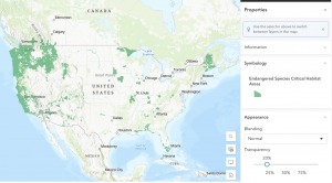
Chapter 3 introduces ArcGIS Experience Builder, which is a more flexible tool for creating web applications. To be more specific, it allows users to design apps with customizable layouts and to integrate multiple types of content (like maps, charts, and text) into the app. Users can control how the app looks and behaves across different devices. This makes it possible to create interactive experiences tailored to specific audiences or purposes, depending on what data you are displaying. What stood out to me is how customizable it is compared to other tools. You can organize an entire interface of info relating to your map, instead of simply creating the map. You can choose from different pre-made templates and widgets, allowing for room for creativity when deciding the best way to display your information. I also thought it was interesting that there are both layout widgets (that organize content) and functional widgets (that perform tasks). As previously mentioned, the app can be displayed across different devices, including mobile phones. This makes the apps being created much more accessible and versatile. As someone who has experience with graphic design, I appreciated how Experience Builder encourages well thought out design. Sometimes, when scientific data is displayed, it can come off as boring to the average person due to the lack of visual flair. ArcGIS Experience Builder negates this by allowing freedom for design. It’s more than just showing data; it’s guiding users through a visual experience so they can explore the information effectively. 

Chapter 4: 

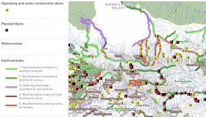
Chapter 4 introduces ArcGIS Web AppBuilder and expands on the idea of mobile GIS. In particular, Chapter 4 highlights the advantages that mobile GIS provides. This being an avenue to easy data collection, real-time updates, and the ability to access these GIS tools/data from virtually anywhere. Everything previously mentioned makes it much simpler for users to gather and update data directly in the field without needing to return to a desktop computer.  Web AppBuilder is another tool for creating web GIS applications that happens to be effective when used on mobile devices. It is more template-based, meaning it is quicker and easier to build these applications. However, it offers less customization and fewer options for organizing compared to Experience Builder. This tradeoff is important depending on what the app you’re creating is trying to achieve. For example, the simplicity of Web AppBuilder may make it easier for the general public to use, or just easier to access in general. As well as a quicker application production time when time and resources are limited in specific cases. Despite the simplicity of Web AppBuilder when compared to Experience Builder, it still provides a variety of built-in widgets. These include search tools, measurement tools, and filters. All of which allow users to interact with the map/data without needing an extensive knowledge of GIS programming or cartography.  Overall, both chapter tutorials were understandable and simplistic to perform. 

Applications: 

I could create an interactive web application involving water quality. I am very interested in hydrology, and the concepts discussed in these two chapters could aid in displaying/gathering data related to hydrology and water quality. Let’s say I find and use data from local streams and ponds collected by scientists. I could design an app to show maps of sampling locations, and input filters that let users focus on specific bodies of water. First, I would need to decide if I want to use Experience Builder or Web AppBuilder. Experience Builder could allow me to design a highly detailed and fully customized interface, effective for scientists and other academics to study water quality patterns. On the flipside, Web AppBuilder would allow me to design a simpler, more user friendly version of the previous app that could be easily accessed and understood by the general public. 

Moore Week 2

Chapter 1:

Chapter 1 is primarily focused on the basic fundamentals of Web GIS and some differences it has to other GIS systems, as well as its functions. One idea that stood out to me is how GIS has shifted from being a private software with projects conducted on private computers to something that is interactive and collaborative on the web through Web GIS. The chapter highlighted the importance of this. It allows GIS data to become much more accessible to whoever may need it. As well as provide a place to store and collect said GIS data. It is very convenient to have all of this data so easily accessible. In my eyes, the system seems to be structured around content (data and maps), possible capabilities (tools and analysis), and its users (people interacting with the system in different roles/ways). All of these topics were mentioned or detailed in Chapter 1.  Another key takeaway from Chapter 1 is the importance of layers. Of course, we are able to manipulate and view the different layers within the actual ArcGIS platform. However, the ability to also perform this action on the web without any complex software is valuable. Being able to stack different types of information and turn them on or off makes maps much more powerful, as it changes maps from a boring static visual into a tool for analysis. So the fact that this is available through the web without needing to access any complex GIS programs is invaluable for accessibility reasons previously mentioned. All of this was highlighted in chapter 1. 

Chapter 2:

Chapter 2 builds on the fundamentals of the previous chapter by focusing more on how data is presented. There is an extremely wide range of possible ways to present data within Web GIS.  This chapter introduces Smart Mapping. Smart mapping is the idea to design maps in a way that matches the type of data being shown, ensuring the visual effectively communicates the information wanting to be displayed. It is a key idea, because it guides users toward appropriate visual styles based on their data. For example, if you want to display numerical data, it is often best represented with a color gradient. I am still thinking about how different visualization choices (like using a categorized map versus a heat map) can lead people to draw different conclusions from the same dataset. With Smart Mapping aiding the user, they do not need to be an expert in order to properly display their data in the most efficient way.  I also found the explanation of system components and data types useful, in particular, the difference between hosted layers and non-hosted layers.  Hosted layers are already existing data within the layer being published, and is managed online and already ready for users to use. Non-hosted layers are controlled by users, where the users manage the data. Chapter 2 explains the difference well. Overall, both chapter tutorials were understandable and simplistic to perform. 

Applications: 

I am very interested in plants and the ecosystems they live in. As previously mentioned, Smart Mapping could allow you to effectively display numerical data through a color gradient map. It would be cool to create a gradient map to show variation in plant growth across different areas. I could collect data by measuring plant height/density in several locations, with each location being assigned a number value based on the measurement I collected. Using a color gradient map, areas with higher plant growth could be shown in darker shades. While areas with lower growth could be shown in lighter shades. This would make it easy to identify patterns in length. Using smart mapping would help ensure this is done correctly. 

Moore Week 1

Intro: Hello, my name is Alayna Moore. I’m a Sophomore, and I transferred to OWU at the end of my freshman year.  Delaware Ohio is my hometown, so I always wanted to go to OWU. I plan on double-majoring in Biology (B.A) and Environmental Science (B.A). As for a career, I want to spend time in the field doing surveying. I’m interested in working as an environmental consultant or working for a national park. I’m very new to GIS, but I hope it will help me succeed in these fields of work.

As for accessing the WordPress and ArcGIS accounts, I previously completed this in GEOG 291. I also took the quiz.

This week’s work:

         Before exploring my account, I navigated to my profile at the top right corner and added my basic information to my profile as instructed. When clicking on this, I also found the previous projects that I had to create for my last GEOG 291 class. That is why I am somewhat familiar with the website, but still struggle with navigating. I started exploring the website more and eventually found the training tab that took me to the Esri Training courses. These courses look very helpful, so it was nice to figure out they are readily available. 

         Next, I read through “Get Started: What Is ArcGIS Online”. One thing that the reading made clear is that ArcGIS Online is more frequently used as a tool to share information on ArcGIS projects than it is used as a tool for advanced GIS processing. However, being able to create these complex GIS projects means little if you can’t share and communicate the map with its intended audience. ArcGIS Online facilitates this. I also found it interesting that ArcGIS Online integrates multiple tools like data hosting, web app creation, and spatial analysis all in one accessible place. Instead of just focusing on map-making, it supports many avenues of visualization/analysis without requiring us to rely heavily on complex desktop software. 

          I have completed the course “ ArcGIS Online Basics”. I found this course to be a useful way to prepare students to use an unfamiliar website. For example, they introduced how to navigate web maps and use basic tools within ArcGIS Online. The course also described how we can share maps and build web applications, which was a nice refresher, as I remembered sharing one or two applications in ArcGIS Online in GEOG 291.

.

   Application 1:  You can use ArcGIS to visually analyze animal habitat distribution. For example, in the map “Endangered Species Critical Habitat Areas” by EPA Geospatial. This map depicts designated habitat data for species listed under the Endangered Species Act (ESA). Link: https://www.arcgis.com/home/item.html?id=d46156cc921d4b41923c70c280b82458

    Application 2: You can use ArcGIS to designate different types of habitats by importance to their surrounding ecosystem. For example, the map “Key Freshwater Habitats in the Mountain Region of Central Asia” by Evgeny Egidarev. This map depicts key freshwater bodies of water deemed important for the survival of endangered fish endemic to Central Asia. These bodies were identified during a more than two-year-long research project. Link: https://www.arcgis.com/home/item.html?id=cadb59d8d14d43919230947a2cfaa91a