Pinde Fu Chapter 7: This chapter focuses on web scenes and 3D maps. There are 2 types of scenes, those that are photorealistic which use images to generate textures onto the models. There are also cartographic maps which make maps that are in a 2D plane and make them 3D. The main components of a scene are:
- Surfaces: continuous measurements such as elevation
- Features: operational layers which are either on, above, or below the surface
- Textures: which provide context to the map
- Atmospheric effects: lighting and clouds, and fog
When using web scenes there are a number of layer types you can have. This includes:
- 3D object scene layers: used to visualize 3D objects
- Building scene layer: Displays buildings/cities
- Overview: displays buildings as a single layer
- discipline : combines layers into one
- Category layer: Represents categories of objects
- Filter: Displays selected attributes of buildings
- Integrated mesh scene layers: uses drone data to generate 3D scenes
- Point cloud: displays points in 3D
- Voxel scene: Combines spatial and temporal data
Web scenes support the use of VR, which allows users to go into maps rather than view them from outside with 2D. The 3D and VR can be accessed from many devices along with VR headsets. There is also integration of XR/MR which is where real-world and digital objects are in the same space, this is accomplished through a combination of sensors and technologies that allow for real objects to be read. This makes it possible to collaborate from afar and to work more intuitively with GIS.
The metaverse is a connection of digital objects, VR, and social connection. This combines realworld and computer generated objects as well as places, which could allow for training, to occur that otherwise would not. This also can allow construction or repair crews to visualize where something is before getting started, such as working on pipes, and other underground objects.
GIS indoor allows for mapping things that are inside a building. This makes it easier to locate things such as an item in a grocery store, or a room inside a building. An important use case would have been during covid, when GPS was not enough to contact trace individuals, since GPS cannot account for walls, whereas GIS can.
Tutorial 7.1: This tutorial brings you to this link, which is a premade web scene. It provides you with some instructions on how to navigate it.
- To pan use the left click
- To rotate the orientation use right click
- To zoom use the plus and minus keys
Tutorial 7.2: To make a new scene, select the scene at the top of the screen. Then at the top right of the screen select a new scene and the type of scene you would like to make. You can then add layers like normal either locally or from the web. To make a layer 3D you can click on it then change the style to be 3D, to alter the attribute used to generate the 3D layer you can do so at the top of the tab where it says “Choose the main attribute to visualize”. To make it so that height is determined by an attribute change the height setting to attribute driven. To make the labels more intuitive and easier to read toggle on the improve perspective.
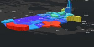
3D map showing population density as state height
Tutorial 7.3: This tutorial teaches you how to make a 3D design. We used a park as a case study for this. We configured our 3D objects to be 3D types, this displays 3D representations of the objects we have marked as points of interest on our map. In the options you can select the a type and then the marker box, which will let you configure the shapes you want to use. The list includes different types of vegetation.
7.4: This tutorial had us using a version of the scene we made in the previous tutorial. This one had us adding in a sky layer, and a few underground layers. For the sky layer we added helicopters, which were configured using size, and then as 3D objects. To change the resolution of the scene you can navigate to the settings tab then resolution and adjust the slider (I could not find this).
7.5: This section has us adding in specific objects, to add a car, go to the POI layer, then click edit, then car, from here you can place a car by clicking on the map, then you can rotate it and move it around.
7.6: To add extra detail to the scene you can click the daylight/weather button which looks like the sun, this allows you to change the time of day that is displayed, you can also enable shadows and have the scene run a day/night cycle. To slice and look inside objects you can use the slice objects button in the scene tools menu. To change the orientation of the slice press control. To get an election profile use the elevation profile tool in the scene tools menu.
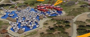
3D design of a park (had a little bit of fun)
I could use this to create a design for a potential green city or food forest. This seems like a very good way to do simple landscape designs.