Ben Buroker
Spring 2023
Geog 192
Dr. Kyrgier
Week 6:
Assign: Read and complete GTKWGIS chapter 7. Create a new blog entry with comments, notes, and questions on these readings. This is: <Your Name> Week 6
- Include a few-sentence description of an application based on ideas from chapter 7, using your own data or the Delaware Data (from Geog 191). This edition of the tutorial includes ideas under “Assignment” (p. 35 in the 5th edition of the tutorial).
Write-up:
The terminology of “web” and “3D” for 3d scenes/maps are important to remember. It is intuitive that another dimension of data will improve the visualization, analysis, and communication of a map. The two types of 3d scenes are photorealistic scenes and cartographic scenes. Photorealistic use photos to create features and cartographic uses 2d thematic mapping techniques to display features which may not be as visual. There are a multitude of ways you can represent the 3d images or data. I think the point cloud maps are cool because they provide some context to the lidar data that I have heard Dr. Rowley talk about quite a bit. It’s cool to see what lidar data would look like when compiled into a 3d map. I got a little lost when they started talking about all the r’s, AR, VR, XR, MR… it’s a lot.
Exercise 7.1:
I couldn’t do 7.1 because this was the description it gave online on how to do it… This is the same problem from earlier in the book; where the instructions didn’t include the ending of the paragraph. I fixed this for future chapters by using the hard copy of the book from the GIS lab, no the ebook.
Exercise 7.2:
I’m having some issues with this exercise because it is asking me to choose “population per square miles” when it is not an option that I have in the drop down menus. I am instead using “population density” whenever I am asked to do this. I feel like it is close to if not the same as pop. per sq mi.
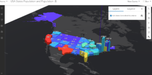
This is my web scene after completing 6.2. The spike in Washington is weird and I don’t know how to address it…
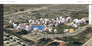
Exercise 7.3:
Making the “fun park” was enjoyable and pretty straightforward. It made me feel like an architect but it was actually really useful to see how you can format a 3d scene to make it look “pretty” or a certain way for a specific layout/project.
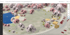
Exercise 7.4:
There is something going on with arc online when formatting the park walls towards the end of exercise 7.4. When you are asked to select the “height field” from a drop down box, there is one option with text and two blank options (pg 258). I believe some of my buildings don’t have walls because of this glitch.
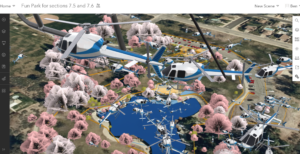
Exercise 7.5:
This section was difficult. I had no trouble adding the car, but for some reason once I tried to add a helicopter my map became overrun by helicopters of various sizes. I only completed all the steps to add two to my map… so I don’t know why there are so many.
Exercise 7.6:
This exercise was cool. It was good to see all the measure tools. It was kind of frustrating trying to navigate the movement controls of the 3d map with my laptop though. It was hard to use my trackpad and the online wifi made the map a little glitchy I think. I would be interested in trying to do this sort of navigation on one of the wired PC’s and with a mouse.
Potential Application:
I can see a 3d scene being used to make a map of a location in Costa Rica from Dr. Rowley’s Bahia Ballena project. I think if we had the basemap data or images we could add in the surrounding “stuff” like trees, buildings, and walls and format/place them in the correct spots. I think a 3d scene like the ones I made above could be a good tool to help people at OWU who haven’t been to Bahia Ballena visualize the town and better understand what is going on. The adding and formatting of the 3d scenes was pretty straightforward, I just don’t know what kind of data you need to begin the process.