Chapter 1: Get Started with Web GIS
This chapter served as a basic introduction to working with 2D maps on ArcGIS Online, as well as making Instant Apps. A lot of the techniques were very similar to those used in the desktop version, like attribute tables, field views, and feature symbology. As someone who is more used to web apps as opposed to desktop (for example, the Google workspace over Microsoft Office apps), I found ArcGIS Online and the Instant Apps site to be a little bit more intuitive than the ArcGIS on desktop, but maybe this is just because I have experience with ArcGIS now. However, I did notice that the web app feels a little cramped with the presence of more menus that use larger text, and I preferred the general layout of the desktop version. Additionally, a few aspects of the Chapter 1 Tutorial did not exactly align with the ArcGIS Online interface, but I didn’t have too much trouble adjusting.
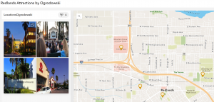
Figure 1: Redlands Attractions Map.
Chapter 2: Smart Mapping and Storytelling with GIS
I’m not sure if this feature was included on ArcGIS Pro, but the Smart Mapping feature discussed in this chapter seems to, at the very least, present difficult mapping methods more clearly. I think it is interesting (and probably helpful) that ArcGIS has its own coding language, Arcade. Learning so many coding languages can be difficult, but I am sure that there will be input menus (like those in ArcGIS Pro) linked to the code to make any necessary “coding” really easy for beginners. Also, the ArcGIS Living Atlas of the World seems like a LIFESAVER. Having a huge database of hosted layers eliminates a lot of initial data collection, which would probably have a tendency to be frustrating and discouraging as an early step in a GIS project. It also emphasizes the science behind GIS and its collaborative nature, which I find cool.
One of the most interesting facets of GIS is the almost psychological nature. In order for maps to be effective, they have to be physically appealing and aesthetically organized. StoryMaps, for example, are best received when they are fast, easy, and fun to use. I find the concept of StoryMaps super clever and effective. The actual maps themselves are just one of multiple important components: according to this chapter, adding a narrative and multimedia contributes to the overall story as well.
In Tutorial 2.2, we make a map of the 50 most populous US cities, which are shown by graduated symbols. It appears that New York City and Los Angeles are the two biggest cities in the US, which is consistent with the data in the Excel spreadsheet. After changing the map to have ratios of population change from 2010 to 2020, it appears that the fastest-growing cities in the US are Seattle, Washington, and Fort Worth, Texas. Thankfully, this chapter wasn’t too difficult, as we used ArcGIS StoryMaps in GEOG 291 as well.
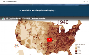
Figure 2: A video on US population growth and change that I added to my StoryMap.
Potential Future Applications:
Similar to the Chapter 1 reading and tutorial, I could make a travel guide for my hometown with must-see or personal favorite places. I could even color-code the legend based on what purpose each location serves. More specifically, I could see myself marking all of the environmental and conservation-based organizations in my area and linking each location to a volunteer position webpage, hopefully encouraging community action or collaboration between organizations in my local area.