Chapter five focuses on how and why to build a private Web GIS as opposed to using ArcGIS online and the public cloud. For security, connection, or functionality reasons, you may want to have a private Web GIS and this can be done through ArcGIS Enterprise. Hybrid Web GIS is also discussed which works for and incorporates both ArcGIS Online and ArcGIS Enterprise. There are many similarities between the two but one thing that stands out is that ArcGIS Enterprise runs on user-managed infrastructures. Organizations can directly run these infrastructures or they can be run by other cloud providers. Connection issues are a big reason for this on-premise GIS work as some organizations may not have connection considering how government or corporate regulations can hinder/disallow the use of the public cloud in any capacity. Hybrid use occurs as organizations want to maintain their operational layers but also use ArcGIS Online components and functionality like basemaps or sharing. Thirdly, organizations need ArcGIS Enterprise in order to publish the results of geoprocessing services. I think it’s important to take away from this that the things we have learned with ArcGIS Online like publishing feature layers, and creating web maps, generally apply to Enterprise with subtle differences and distinctions. The book then discusses ArcGIS Enterprise as a user-managed component of the ESRI spatial cloud. ArcGIS Enterprise supports on-premise and cloud configurations as well as a mixture of the two. ArcGIS Enterprise involves various software components that work together like Portal for ArcGIS (or Enterprise portal) which is basically a geospatial content management system. This content is united and shared throughout an organization by ArcGIS. Portal for ArcGIS provides user types, roles, and privileges like ArcGIS Online. Next, ArcGIS Server has the ability to create and host various types of geospatial web services, as the main component that makes geographic information available to others within an organization and those outside of the organization if wanted. ArcGIS Server has 8 license roles. I’ve read through these but don’t feel the need to comment on each one. ArcGIS Web Adapter is the next software component followed by the final one of ArcGIS Data Store. There are relational data stores for hosted feature layers, tile cache data stores for hosted scene layers, and spatiotemporal data stores for dealing with real time observational data and data analysis for large data sets. The next part of the chapters explains Base ArcGIS Enterprise deployment which is essentially an important setup of ArcGIS Enterprise. There are various requirements for this deployment and they function collaboratively and cohesively. There are also three flexible deployment cases including single-machine deployment, and multi-tiered deployment. The difference here is that components are installed on a single machine whether it be physically or virtually for the former and components are installed separately for the latter. There is finally the highly available deployment scenario. Portal collaboration is essential for organizations. One example is like NYC which has various bureaus, and then another subset of various departments arranged is this hierarchy type of order. Everything can have their own ArcGIS Enterprise or ArcGIS Online organization but in order to share common objectives and so forth curated content must be shared which is done through groups. Distributed collaboration is used for sharing with external Web GIS deployments. This is valuable for working with and sharing content across organizations. Layers, web maps, and web apps are the kinds of content that can be replicated with this distributed collaboration. The most recent evolution and current stage of GIS deployment is distributed Web GIS. Moving on, the specified web layer types that ArcGIS Online and ArcGIS Enterprise can create and host are highlighted with a focus on raster tile, vector tile, map image layers, feature tiles. Rater tile layers deliver maps to client applications as image files. These can take time and a lot of storage to create. The benefits include versatility in terms of application and device use, advanced cartography, and support raster data sources like elevation or imagery. Vector tile layers deliver map data as many grouped vector files. These deliveries are produced in Protocolbuffer Binary Format. Benefits include the capacity to customize map style, labels remain upwards when rotating, adaptability to the resolution of the display devices, and vector tiles are smaller than raster tiles and can be generated more quickly. A notable takeaway here is that vector tiles generally make tiles based on data density. Next there are map image layers which can be drawn by the survey or by using tiles from a cache. When tiles are used, the underlying vector data remains available. With this, map image layers support visualization and spatial or attribute queries. Map image layers were most common in the past but now we have feature layers supporting many features and tile layers supporting fast display and so map image layers have kind of fallen out. The fundamental uses of map image layers are customers who need rendering capabilities non-existent in feature layers or customers that have large data sets in need of server-side rendering rather than the client rendering them locally. Feature tiles of feature services is the following section of the chapter, discussing how feature services can make feature tiles in real time when requested by more advanced and modern ArcGIS client apps. Feature tiles allow web clients to show more features from the service with a quicker load time. Caching is relevant in all of this as a useful technique to improve performance by temporarily storing data, as we have learned whether it be for pre-drawn map tiles or frequently accessed query results. In terms of caching, map image layer racquets have the slowest performance, rats and vector tile requests are faster and can reduce the load on the web server. The visual for this section was helpful for comparing map image layers, raster tile layers, vector tile layers, and feature layers. I should have just looked at this rather than all of the tedious text lol. In terms of publishing strategy when choosing layer types, there are a range of choices to consider when choosing a layer type for data. The format whether it be raster or vector and the temporal component of static or dynamic are the fundamental factors for web layer type allocation. There are web service standards that facilitate the ability for different systems and applications to work together and exchange data across boundaries whether that boundary be geographic location or organizational boundaries. The chapter proceeds to talk about how we can publish web layers using ArcGIS Online and ArcGIS Enterprise web pages or use ArcGIS Pro to do so. The chart of the workflow to share web layers using ArcGIS Pro is helpful to see. In three fundamental steps, the first is to prepare the data using ArcGIS Pro, then author the map in ArcGIS Pro including adding web layers and configuring symbols and other properties, and thrifty, share the web layer. The final part of the chapter provides some context on making data accessible to ArcGIS Enterprise in order for it to serve the web layers whether it be generating a map or tending to queries for example. When sharing web layers here, the data is either copied to the server or referenced by the server. The reference option is better from my understanding.
—
—
Chapter 6 comments on spatiotemporal and real-time GIS data use for dealing with objects and events that move, appear, and change through time. There is a demand for real-time data in coherence with mobile proliferation and in turn there is a need for real-time GIS to perform various functions. Spatiotemporal data comes from a range of sources whether it be manual data entry or generation from simulations models. Mobile proliferation has caused an increase in volunteered geographic information and this has been enhanced through things like GPS improvements and wireless data communication. Spatiotemporal data is grouped in moving (trains), discrete (criminal incidents), stationary, (highway speed) or change (flooded areas) classifications. Real-time GIS deals with current and continuous data, enhancing situational awareness, emergency repose, and decision making by delivering data on the spot and performing analysis at the time of the crime per se (when things happen) The time value of an event can be a point in time or a duration of time like the time a lighting strike occurs or when a wildfire starts and ends. One attribute field for storage purposes for the former and two attribute fields for the latter. There are various terms that are critical for working with spatiotemporal data including time measurement system, time reference system, time representation, and temporal resolution. The term I was least familiar with was temporal resolution which is the time interval at which events are sampled like how a weather station reports temperature in every 15 minute intervals. Smaller temporal intervals result in larger temporal resolution and vice versa. The internet of things (IOT) is basically a massive network connecting things and people. There are two fundamental types of IOT applications including enterprise and consumer IOT. Consumer applications apply to the consumer like connected cars, health, or smart homes whereas enterprise IOT applies to the enterprise at large like smart cities, environmental monitoring, and so forth. Smart homes involve something cool that stood out to me called geofences virtual perimeter for a real-world geographic area, either dynamic or static. Moreover, the relative sensor data of IOT requires context and geolocation does just that and then the GIS transforms the raw data to useful info that can be acted on. Location and geoanalytics work together with onboard sensors. The book gives a nice example of how smart cars must integrate their onboard sensors with the geospatial cloud for routing, legal, and safety purposes. Real-time GIS involves cloud, server, and client-side tech. IOT is everywhere and so this poses a challenge to real-time GIS in terms of volume and velocity of data. In order to combat this challenge, Esri’s geospatial cloud has ArcGIS Velocity and ArcGIS GeoEvent Server. Both are scalable and used for real-time GIS. OInput connectors, processors, and output connectors are provided for taking in real time data, performing analysis, and producing results. In more depth, the three shared fundamental components of ArcGIS Velocity and ArcGIS GeoEvent Server revolve around ingesting, processing, and outputting. Ingestinnn interacts with distinctive data sources and different data formats. Processing processes the real-time data and is able to perform real-time filtering and analysis. Filters include attribute filters for attribute expressions and spatial filters for events based on their spatial relationships with a geofence. Real-time analysis has many strong capabilities like the ability to detect incidents or create a buffer around an earthquake or flood. Outputting involves sending the processed data to whatever destination(s). Sending more formal communication or simple and clear alerts are possible here. All of these components can be configured to trigger further specific alerts or actions. In regards to ArcGIS Velocity, this is relatively new. The main thing is that it is a software-as-a-service (SaaS) platform that runs on ArcGIS Online and is managed by Esri. This requires a subscription not a software license. ArcGIS Velocity introduces three new types of items to ArcGIS including feed items, real-time analytics items, and big data analytic items. Feed items allow users to receive sensor inputs, real time analytic items allow users to perform real-time processing of those inputs, and finally big data analytic items allow users to access and analyze big data repositories that are long time observations and historically stored. A cool and core function of ArcGIS Velocity is the capacity to create feeds to collect real-time streams of data. There are two methods of poll and push that ArcGIS Velocity supports in terms of the delivery of real-time data. Poll is the traditional method where the client polls the server in intervals or whatnot. Push is a newer way to serve data in near real-time using the HTML5 WebSocket protocol in which that protocol is pushed to the web client on the spot by ArcGIS stream services. Stream services can be added to web maps and this is super useful for visualizing real-time data feeds with high data volumes or unexpected data changes. Map viewer has the capacity to show real-time data layers using both pull or push and web apps can be made using only configurable apps like ArcGIS Experience Builder, ArcGIS Dashboards, or custom JavaScript code. The chapter next talks about ArcGIS Dashboards and how this applies to real-time GIS. Essentially these dashboards integrate web maps and other data sources to create comprehensive operational views that serve a similar purpose to say the dashboard of your car. The views update automatically as the associated data changes. I’ve already learned about and worked with ArcGIS Dashboards and so I won’t comment too much for this. A huge application was COVID 19 information sharing by organizations. Arcade is used Dashboards as a data source and for advanced formatting. Next is ArcGIS Mission which is a real-time geospatial communications and situational awareness product. Mission provides a comprehensive picture of the operating environment and assists in the movement and communication of team members whether it be first responders or others. Mission Manager is the relative web app, Mission Responder is the relative mobile app, and Mission Server is an ArcGIS Enterprise server that links manager and responder. Two fundamental benefits are geospatial collaboration and tactical awareness whether it be for disaster relief or law enforcement. Something super cool is the chat tool in Mission that allows for text chats, map sketches, and attachments to be sent. The following section of the chapter is about animating time series data for which the temporal nature of real-time data allows the establishment of the time series. Visualization of the data at each interval fundamental which allows trends and patterns to be visualized over time. Time series data can also be played back. One example of this ability to play back the time series data is replaying the events of an emergency to evaluate the response and make any needed changes. I think this is critical in today’s world. The workflow that illustrates the typical approach to creating web apps that can animate time series data is helpful to see. ArcGIS Pro or ArcGIS Online can be used. Another approach is to publish time-enabled web layers by publishing time-series data to ArcGIS Online or ArcGIS Enterprise. ArcGIS Pro and ArcGIS online have some requirements to do this. A tip is that if we use ArcGIS Pro and open the properties window of a layer and specify the time fields, the result is the enabled time on this layer. This layer can then be shared to ArcGIS Online or ArcGIS Enterprise in order to create a time-enabled web layer. Another approach is to add the time-enabled layer to a web map through which the data can be configured in discrete or cumulative intervals and we can configure the time setting if we want. The final approach is to create a web app from the web map through a time-aware ArcGIS web app template or using ArcGIS Web AppBuilder in which a time slider or time widget is provided for the animation of the data.
—
—
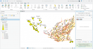
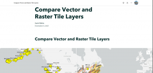
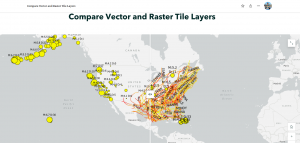
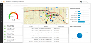
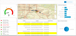
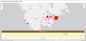
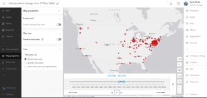
For the chapter 5 tutorial, I was shown how to connect ArcGIS Pro to portals but I was already connected so I skipped this preliminary part. I learned how to publish vector tile and raster tile layers. Lastly, I made a comparison web app to compare the vector and raster tile layers. The focus involved data and a map of the major earthquakes and hurricanes in the United States between the years of 2000 and 2008. The end product was a nice ArcGIS Story that utilized the swipe content block and a side-by-side app. This tutorial was brief. For the chapter 6 tutorial, there were basically two sections, each had a case study associated. In sections 6.1 to 6.4, I created a dashboard app that shows continuous data feeds and photos in near real time. The focus was the city of Redlands, California, and the goal was to assist in response efforts for the city’s local law enforcement/emergency response. The data was provided as web layers for this. I also used Arcade-based formatting here. The end result was super cool and had six total components, an interactive map, a gauge, a table, a list, a pie chart, and a bar chart. For the text part of the tutorial, in sections 6.5 and 6.6, I developed a time-enabled feature layer and a web app that had time animation. The goal of the animation was to display the spatial and temporal patterns simultaneously of US population change over the last 200 years. — I’ve integrated screenshots of my work above. — Both tutorials went smoothly for the most part with some hiccups here and there but I bumped along through it like turbulence.
For an idea from chapter 5, I could formulate an application to display and compare land us, e change through time. With this I would need to publish a raster tile layer like an old or traditional image of the land as well as a vector tile layer, possibly a more modern layer showing up to date boundaries and so forth. Then I could make a comparison web app to compare the vector and rater layers. Turning this into an ArcGIS story at the end would be nice too and more visually appealing. I could then analyze the impact of new development and changes over time. I would employ a comparison widget like a swipe content block and or a side-by-side app. Some patterns that could emerge include loss of forested areas, changes in farmland, urban development and more. I feel like this comparison would be cool to see as in my experience with visualizing landscapes, I often encounter older aerial images. Another idea would be to compare elevation data to a city’s drainage network under the context of flood assessment and vulnerability assessment. This would be valuable for displaying the relationship between drains as critically important infrastructure and the topography of the city/area in terms of elevation. I thought about this as with the proliferation of more intense storms, flooding is becoming more dangerous and frequent. My shore town experiences a lot of flooding and some areas have poor infrastructure like drains. This could assist urban planners and really all stakeholders involved. I did some work on this in my environmental justice class and so I tried to connect those ideas here.
For an idea from chapter 6, I could create an application to show the population change of hammerhead sharks over time. This species in particular along with others like whale sharks have experienced notable population fluctuations historically and so I think it would be interesting to seek out that data for the population and develop a time-enabled feature layer. I would then create a web map and then a web app with a time animation component showing the spatial and temporal trends of hammerhead shark population change over the last 100 years per se. If I wanted to focus on a more recent context and explore the great hammerhead as a critically endangered species and the events that have contributed to this more currently, maybe I could employ a time series spanning the past 50 or 25 years. A smaller time span would allow for patterns to be more visibly exposed I think with subtle changes and specific movements. I would need to make sure the hammerhead population data is in a supported format like a CSV file, shapefile, or file geodatabase. I could also focus this more locally/regionally (like in well-known habitats), or more generally on a global scale. Another idea could revolve around transportation and logistics involving things like fleet tracking, route optimization, incident management, etc. I thought about this because my family business uses a company called Lytx for mapping and visualization, fleet tracking, geofencing, and much more.