Application 1).
For the final project, a cool thing I did pertains to tourism. I made a Web GIS app that introduces the main attractions or points of interest in Philadelphia. I am from Philadelphia and I focus on the top five sights to see. An instant app is the best case I think and most efficient for the user and visually compelling. This is what I did. I think this could be useful for tourists and or visiting parties of any capacity. I thought about this in light of the approaching holiday season in which people do a lot of traveling in general and traveling to see friends and family. Actually, a record of over 81 million Americans are projected to travel for this Thanksgiving. The Philadelphia area is a highly popular destination. While this is related to the economy and an industry at large, I think that it also reflects the daily life implementation and use of Web GIS. The book underscores the versatility of Web GIS in terms of applicability, accessibility, convenience, collaboration, and representativity and feasibility in use. With the increased significance of spatial location and analysis, Web GIS is adding more value perhaps now than ever before. Whether it be through government, business, science, or daily life in this case, Web GIS is considered and applied progressively. In order to do this, I first did some research on the data available at the state and city level. I then did some more detailed searches. Although the topic is deeply contested in terms of what may be the top five places to see in Philly, I am a true Philadelphian and I feel I have the best choices. Essentially, I pulled a subset of the data and crafted an excel spreadsheet containing the data with three fields: Name, caption, and address. I then converted this data to a CSV file. I published a hosted feature layer from a CSV file and added attachments. Next, I added a field to the layer and edited the attributes. I added an ID field to the layer so that I could display the photos in the sequence I want. Then, I formulated a web map through which I added the feature layer in Map Viewer, selected an appropriate base map (the community base map), and configured its style and pop-up. Finally, I transformed my web map into a web app using the Attachment Viewer template.
Here is my app:
https://owugis.maps.arcgis.com/apps/instant/attachmentviewer/index.html?appid=eb759364dc4a4fbda1bf152354a49e71
Application 2).
I have been learning Spanish all my life. I am currently minoring in Spanish. I’ve learned a lot about Hispanic culture and the Spanish speaking community. I’ve spent a lot of time in South Florida and home in the Northeast/Philly area. I’ve noticed more and more Spanish speakers wherever I go. I was curious about the growth of the Spanish speaking population in the United States and whether this growth has been sporadic or consistent. Turns out it’s been the latter. I faced various challenges when working with time-enabled data in GIS. In the end what I did was I used the U.S. Census Bureau which provides the official Hispanic/Latino population data for Metropolitan Statistical Areas (MSAs) only once every ten years through the Decennial Census (1990, 2000, 2010, 2020). I couldn’t efficiently find and use official annual data for the years in between for individual cities/MSAs. I wanted to use a time interval of one count per year on the time slider to show clear patterns and if there is any real change. And so I used Gemini to add to the data using linear interpolation to create annual estimates. For the purpose of the project I thought this would be fine since I am not using this in a professional workspace or to perform real analysis. The result was cool to see a steady increase all around the country. I first had to create the time-enabled feature layer. I made sure that there was a date field in the data. In this process, I published a hosted feature layer, and enabled time on this layer. My data was on an excel spreadsheet and I converted it to a CSV file. I then created a web map and a web app in which I animated the time-series data. I played around with the styling component and the time slider formation. The big S on each point on the map just stands for Spanish! Spanish speakers are indeed becoming more pervasive.
Here is the web app:
https://owugis.maps.arcgis.com/apps/instant/slider/index.html?appid=5ab3c7ec2f054ed490ac5f2921c57ea0
Application 3).
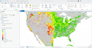
For this one, I was trying to work with vector and raster tile layers. I started out using ArcGIS Pro, gathering my data layers, formatting things with the map, and then publishing the web layer or sharing the map as a web layer using a portal connection. The screen shot I have from ArcGIS Pro is from the data I added that shows drought frequency levels and US Army Corps of Engineers reservoirs. Reservoirs play an important role in mitigating drought in terms of storing excess water during wet periods in order to use that stored source during dry periods They also provide a consistent water supply for agriculture, urban use, and hydropower, and more. The USACE owns and operates over 500 such reservoirs throughout the U.S. I’ve done some research on this federal government organization and previous efforts that have undertaken for example in my shore town community with flooding and flood infrastructure. I noticed a pattern here that drought occurs more frequently in areas where these USACE reservoirs are less pervasive. In the green sections you can notice an abundance and dispersal of these reservoirs that are the dark water bodies portrayed on the map.
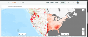
This is an unfinished thing I was doing and for the sake of time I moved on. I wanted to include it here because I did spend time on it but I did run into some issues with ArcGIS Online and the vector and raster tile layers. In the screen shot of ArcGIS Online, this is when I ran into issues and so I just started experimenting. I used layers for Living Atlas to do something similar in showing wildfire point data which is vector data and then drought intensity data which is raster data. The clear pattern that is confirmed by the map is that there are more wildfires where drought intensity is higher. Although droughts may not directly cause wildfires, they contribute to the conditions that create the risk and intensity of wildfires.
Application 4).
I wanted to create a simple thematic web scene and so I played around with things for a while. I was going to create a web scene based on population in some capacity but I had experience with that already and so I focused on something a bit different. I looked into USA counties. I chose to focus on the attribute of area in square miles. The sizes of counties vary throughout the country. These county boundaries are interesting and they were formed by historical and practical factors, like population density, natural geographic features, state law, and more. The polygons on the scene represent the county boundaries and if you zoom in the counties are labeled. The darker colors symbolize counties with greater area in square miles whereas the lighter colors show less area. It was a local scene with a Living Atlas feature layer. This was cool to see not only how many counties there are but their size differentials. This scene allows you to visualize a major historical component that dates back to western expansion and the development of capabilities whether it be tech or infrastructure building. Ultimately the smaller and easily accessible administrative polygons went away that are seen in the Eastern part of the country today. As a result, counties in the West are larger geographically than those in the East, and this is shown via the web scene and the 3D GIS component. I am minoring in politics and government and so it was intriguing to put all of these things together and how for instance the East is more densely populated and therefore counties and even states had to be smaller for reasonable travel and governance. Westward settlement occurred in more unpopulated and remote areas where large areas of land were organized into these political and social boundaries that are counties. In all, knowing county areas can be helpful for planning and resource allocation, understanding the organization of census data, travel logistics, and much more.
Here is the web scene:
Application 5).
For this app, I was doing some park design work with 3D GIS and developing a web scene using feature layers and 3D object symbols but this was taking too long and I didn’t have the right layer. I am still in the process of doing this with particularly the Core Creek Park in PA, one that I am familiar with and have frequented. I wanted to make use of the data I did retrieve and the hosted feature layer I created. This was brought out through a CSV file I made through Excel. I added a field, added attachments, created a web map, and then created an instant app with an attachment viewer template. This was one of my original ideas but I modified it a bit. The web app shows the parks in Bucks County Philadelphia from the department of parks and recreation. Bucks County PA is where I went to high school, a bit north of Philadelphia. I have family that frequent these parks and family that are coming into town for the holidays and so maybe I’ll share this with them.
Here is the web app:
Application 6).
I made a web map to show land use patterns across the United States. I enabled time settings and added a time slider but this is a bit off and I will need to go back in and rework it. I used gemini to acquire some land use data for all 50 U.S. states across the years 1959, 1974, and 2012. These three years were pulled from and approximated based on the U.S. Department of Agriculture’s Economic Research Service (ERS) Major Land Uses (MLU) reports. The values basically come from the real trends and approximate state-level totals, measured in thousands of acres, for those key years. There are some cool patterns that emerge just at first glance. For instance, most of the western portion of the country has a majority of grassland/pasture range land use spread. The middle section of the nation and the midwest is predominantly farmland. And then the eastern portion of the U.S. is dominated by forest cover. The size of the pie chart as the representation of each state is also proportionate to the size of the state. For example, the pie chart over Texas is the largest. Texas is the state with the most amount of total land.
Here is the web map:
ZW