Asp – Week 1

Hi my name is Logan Asp and I am a freshman here at OWU. My current major right now is Data analytics and for this weeks post, I took the quiz for Geog 292, read the syllabus and schedule and also scheuled a meeting with Dr. Krygier.Ā 

ArcGIS can help us map 2D and 3D data spatially. It is also a cloud-based platform that can create apps, web maps and can share geographic information with other people.

I completed the ArcGIS online basics course. Throughout the course the 2 things I learned were the layers that are drawn on top of the basemap are called operational layers and a tile layer is a collection of prerendered images or quick-to-render vectors that can be rapidly.

Under the training section, two other courses that interested me were manage an ArcGIS Online Organizaton and Field Data Collection and Management Using ArcGIS.

Two Applications I found using Google Scholar were:

  1. Using ArcGIS geostatistical analyst
  2. Spatial statistics in ArcGIS

Massaro Week 2


Chapter 1: Something that I think is super interesting about ArcGIS Online is how many people you can connect with on it. Another thing that I think is super interesting is the fact that people are able to view, interact with, edit, and give you suggestions on maps that you have created. Something that we explored in 291 was using a hybrid of online and enterprise GIS. This was helpful because the enterprise was more specific to an individual and more detailed. But online, it is more interactive and widely used to communicate information. Something that I found a little confusing was the apps that you can create. Since I created my own app in the chapter, I was able to understand how it worked, but I’m still confused about how exactly it can be applied to certain things.Ā 

Chapter 2: Overall, I very much enjoyed this chapter. Something that the book keeps mentioning is the use of smart-mapping. This is something that sounds super interesting, and that I would love to explore in the future. Something else that I think will be very useful in the future is the Living Atlas. I worked with this a little bit in 291, but I would like to see how it can be applied to GISOnline. Something that I really enjoyed about this chapter was the fact that we both got to create maps and a way to present them, and the data that they show. I will say that I am not as keen on the arrow symbols that they had us using to display the population growth. From the 3D perspective, the arrows were more useful, but from a 2D perspective, they made the map look a little cluttered and confusing. Additionally, when adding the zoom features for the maps into the sidecar, the arrows got smaller as we zoomed in. I feel like this defeated the whole purpose of zooming in to better display the data. An issue that I ran into when inserting the picture and Wikipedia page for the different states was that the state symbol or flag did not appear within the box. One other thing that annoys me when using the storytelling mode for GISOnline is that the font changes when you change it from a paragraph to a heading. I feel like this makes the project look messy and not as cohesive.Ā 

An application based on the ideas from these two chapters would be a sort of campus tour map. This would use the applications from Chapter 1, where you can add descriptions and images for each of the buildings on campus. Additionally, this could be incorporated into ideas from Chapter 2 by creating a story that shows the history and growth of OWU over time. This could be in terms of an increase in student numbers, students within certain majors, or an increase in buildings since the campus first opened.

Tooill – Week 2

This week in chapters 1 and 2, I created a Web GIS app that introduces the main attractions or points of interest (POIs) in the city of Redlands, California. I also gained more experience creating story maps and learning about the things that they have to offer.

Chapter 1:

  • I created a new item and uploaded the cvs file from the chapter 1 data I downloaded.
  • I learned how to add new layers and added one with the attachments for this chapter.Ā  I then added an ID field to the layer.
  • I also learned how to share layers with the public.
  • I familiarized myself with editing and changing symbols used to identify different map features.
  • I learned how to configure pop ups and attach different contents to them.
  • After creating the web map, I created an instant app using the web map. I remember creating an instant app in GEOG291, but I did not quite remember it and was unfamiliar with how the process worked.
  • I added the desired attachments, changed the basemap layer to more accurately and clearly show surrounding features, and published my app to the public for everyone to view it. I did have some trouble initially creating the instant app because I could not get the attachments to stick. The tutorial instructions threw me for a loop because they were outdated and did not show the exact steps to get to where I needed to be. It took me some extra time, but I finally figured it out well enough to get the attachments placed.
  • The point of this particular application was to show different attractions in the Redlands location, namely the University of Redlands, Esri’s headquarters, Citrus Plaza, and LOOK Cinemas. The instant app shows the location of these places but also includes general information about them as well.

Chapter 2:

  • I downloaded the cvs file for Chapter 2 that includes the following data: Rank, city, state, census 2010 and 2020, estimates for 2012, 2014, 2016, and 2019, median household income for 2019 and 2021, median home value in 2019 and 2021, Wikipedia pages for the cities, and pictures of the cities’ seals or flags.
  • I followed a lot of the same steps that I followed for the tutorial in Chapter 1.
  • I configured more popups with images and then created a story map.
  • Like the apps, I remembered making a story map in GEOG291, but I didn’t entirely remember everything, and I think that this tutorial went much deeper into what you can do with story maps than what we did in GEOG291.
  • In this tutorial, I added maps, media (a video, could add others though), and map actions. The map actions were confusing because the tutorial instructions were outdated for this part. There was no map action option to choose, instead it was media action plus a few more steps. It took me a while, but I was finally able to get map actions created to show Denver and Detroit specifically.
  • Then, I added a side car that allowed me to display a 3D web scene of the population changes. Afte that, I added arrows to show movement relationships between states, specifically between California and Texas, and New York and North Carolina. This part kind of felt not related to the rest of the content, but it was good to learn, nonetheless.
  • I also added swipe blocks that were able to show change over time in populations from the two maps that I added. It showed these changes by allowing me to slide a bar that enlarged and shrunk the maps I was looking at.
  • The story map did not look great initially, but once in preview mode, it actually looked kind of professional and seems to be a great way to display information.

An application that could be made using the information from these chapters and tutorials is a story map that discusses change over time in population of a specific species. Geographic data can be gathered on the current population and mapped out using web GIS. Previous geographic data can be found on the species if they have been well studied before. The story map would include information on the species and an interactive swipe block that can show the two different maps (past and present) to allow viewers to see the change in population number and locations.

Conti Week 1

Hello, my name is Sam Conti (they/them) and I am a senior majoring in Botany with a minor in Theatre. I took the quiz, scheduled my appointment, and poked around the ESRI website a little bit. I completed the ArcGIS Online Basics Course, and I thought it was very interesting how GIS can be used for so many different purposes. Then I used Google Scholar to look more into uses for GIS. In particular I looked up queer online mapping, because this term was new to me.

Duncan- Week 1

Hello, my name is Braidy Duncan, I am a sophomore here at OWU majoring in environmental studies and for this week I scheduled a meeting with Dr. Krygier and took the quiz for Geog 292.

Additionally, all of the other parts of this assignment I did when I was in Geog 291.

When I did the tutorial it was very similar to the one in Geog 291, as it taught you how to zoom in and out, add layers/data to your map, as well as bookmark things to name a few of the similarities. Overall, the tutorial was insightful and allowed me to be confident in going forward with this class.

Datta – Week 1

Hello! I am Kheya Datta and I have a Biology major with a minor in ENVS. I did the Syllabus Quiz and already have a GIS account from last semester. I signed up for the meetings.


ArcGIS allows us to map 2D and 3D overlayed with various features, such as infrastructural plans, scientific data, etc. The online variety allows us to share and collaborate on projects without the hassle of emailing files to each other and for better public maps in the form of webapps.


I completed the Online Basics course


2 applications I’ve found:
– I don’t believe it’s actually public but DelCo Water (my internship place) uses webGIS to map quite a bit of stuff, such as influent points for where they take in water for the reservoirs to inevitably be processed into drinking water

– NOAA also does some mapping of harmful algal blooms, especially in the great lakes region. This is useful if you study algae but also I don’t think the average tourist wants to swim in water that’ll give them cancer (https://coastalscience.noaa.gov/science-areas/habs/hab-monitoring-system/cyanobacteria-algal-bloom-from-satellite-in-western-lake-erie-basin/)

Mulloy Week 1

My name is Gabrielle Mulloy, I’m an Environmental Science and Geography major.

I have taken GEOG 291 and other classes requiring GIS, so I am aware of the basics of what GIS is as well as using Web GIS.

GIS is a tool used to analyze and compute 2d and 3d spatial data. ArcOnline is an entirely online counterpart to ArcGIS Pro. Being online, it’s made much easier to share and publish data and work, with a heavy emphasis on creating web pages and interactable maps, scenes, and apps.

The interactive and sharing aspect of WebGIS seem to be the main appeal of this software rather than analysis like in ArcGIS Pro. It’s very intuitive and simple to make interactive elements. I can see how this can be used to easily create pages that can tell stories or show information in a really unique and valuable way. Sharing spatial information is a really difficult hurdle to overcome in geography, and the way ESRI designed this is genuinely really impressive.Ā 

One of the courses I’m interested in is ArcGIS Online: Performing Analysis. I’m interested to see how analysis differs between ArcGIS pro and online, and I assume Online’s analysis is much quicker and simpler. ArcGIS Pro is very complex and not very user friendly, so I wonder how much time I could save by becoming familiar with ArcOnline analysis.

I’m also interested in the ArcGIS Experience Builder series. I always find it hard to explain geography to others, and so to be able to just write a website that conveys my point with interactive elements and maps would allow me to share so much more information. I’m very passionate about scientific communication, plus I think it would be a great job skill to know how to share scientific information using these tools.

I am well aware of GIS applications, but I found a new one using online GIS.

Theobald, R., Palmer, A., & van de Gevel, S. (2019). Interactive Mapping for Transparent Redistricting. Research in Geographic Education, 21(2), 11-38.

This article is first and foremost about how important geography is in politics, specifically in voting. This article is about how to inform the public about politics and gerrymandering using geospatial information systems. They asked survey participants to do an exercise in GIS to familiarize themselves with geography. While not strictly about Arc Online, it’s very obvious how this article could use Arc Online to tell stories and inform people about geographic and political history.

Ā 

Kozak Week 1

My name is Halle Kozak, I am a senior majoring in Zoology and Botany. I already did 291 the first half of the semester. I read the syllabus and schedule, took the quiz and scheduled the required meetings with Dr. Krygier. In my account I explored my profile and the other tabs. I found out that you can see different posts from community members regarding ArcGIS online, and I saw all of the different settings I can apply to my account.

What is ArcGIS online:

  1. Ā ArcGIS allows you to explore and visualize 2D and 3D data. It also allows you to share personal maps, work collaboratively to create maps, scenes, apps, and notebooks, and access analysis tools to better understand your data.Ā 
  2. Ā One interesting/important point that this webpage includes is how to create a map on ArcGIS online. The steps include choosing a basemap, adding layers, applying styles, configuring popups, and saving the map. In GEOG291 we learned how to do all of this using ArcGIS.Ā 

ArcGIS online basics

This course taught an overview of ArcGIS online. One thing that I learned was that an ArcGIS online organization is a virtual space within the ArcGIS Online cloud that enables an organization to manage content and foster collaboration. Users with organizational access can participate in groups and share work with other members of the organization. I also learned that there are seven types of operational and basemap layers. These include feature, tile, map image, imagery, elevation, scene, and table. Operational and basemap layers are used to classify layers based on their use or how their data is structured.Ā 

Applications

The first application that I chose is from a paper titled ā€œInfluence of landscape heterogeneity on the functional connectivity of Allegheny woodrats (Neotoma magister) in Virginiaā€. The map shows the locations of rock habitats trapped for Allegany woodrats in Virginia.Ā 

Citation: Kanine, J. M., Kierepka, E. M., Castleberry, S. B., Mengak, M. T., Nibbelink, N. P., & Glenn, T. C. (2018). Influence of landscape heterogeneity on the functional connectivity of Allegheny woodrats (Neotoma magister) in Virginia. Conservation Genetics, 19(5), 1259-1268.

The second application I chose is from a paper titled ā€œ Predicting habitat suitability of the critically endangered Be’er Sheva fringe-fingered lizardā€. This map shows the binary habitat suitability using the species distribution model for Acanthodactylus beershebensis.Ā 

Citation: Horesh, S. J., & Ovadia, O. (2024). Predicting habitat suitability of the critically endangered Be’er Sheva fringe‐fingered lizard. Ecology and Evolution, 14(8), e70108.

Tadokoro-Week1

Hey, I’m Haruno Tadokoro and I’m a junior majoring in Environmental Science and minoring in Politics & Governance. I took GEOG 291 in the first module.

This week, I reviewed the course blog, syllabus, and schedule, completed the required readings and training, and took the quiz.Ā 

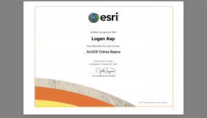
Since I already completed the ArcGIS Online account setup and the ā€œArcGIS Online Basicsā€ training in GEOG 291, I reviewed my account briefly this week and made sure everything still works.

After reading ESRI’s ā€œGet Started: What Is ArcGIS Onlineā€ page, I learned that ArcGIS Online is very convenient because I can access it from my own computer and work anywhere. I also like that publishing and sharing data online reduces the burden on internal systems and makes data management more efficient.

While taking the ESRI Training Course ā€œArcGIS Online Basics,ā€ I found information about basemap layers, operational layers, and 3D scenes.
Basemap layers provide geographic context, like imagery, boundaries, or roads, while operational layers are placed on top and contain the data you can interact with—such as viewing information, editing features, or running analyses.
I also learned that besides creating 2D web maps, ArcGIS Online allows users to build 3D web scenes to better visualize and analyze geographic information in a three-dimensional environment. Both the Map Viewer and Scene Viewer can access a default collection of Esri basemaps.

I’m interested in two other ESRI courses: ArcGIS Pro Fundamentals and ArcGIS Pro: Essential Workflows. They both seem helpful for improving my GIS skills and learning how to use ArcGIS Pro effectively.

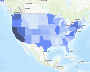
I found an interesting layer in the ArcGIS Living Atlas called ā€œAsian Alone or in Any Combination by Selected Groups.ā€ It shows recent ACS 5-year data about Asian populations by tract, county, and state. I thought it was cool that the layer updates automatically every year and can be used in different ESRI apps like ArcGIS Pro and Story Maps.
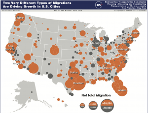
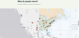
Also, I found a map called ā€œMetro Population Growth and Decline in the United States.ā€ It shows how metro populations across the U.S. are growing or shrinking based on both domestic and international migration.
According to the data from the U.S. Census, large metro areas like Houston, Dallas, and Phoenix are growing fast, while some big cities like New York, Los Angeles, and Miami are losing domestic residents but gaining immigrants. I thought this was a great example of how GIS helps visualize complex population trends.


Becker Week 1

Hello! My name is Bret Becker and I’m a junior here at OWU. I’m a Physics and Environmental Science double major, and I like to sleep a lot.

I took GEOG 291 in the first half of the semester, so I already messed around with my ArcGIS account. While reading through the site, I learned that you could use ArcGIS Online to create apps. I also learned that they could customize the website for a specific course’s desires if wanted.

I learned more about how to find different features available with ArcGIS Online and I also learned more about the levels of sharing and why to choose each one.

One application of ArcOnline I found was to use it to map greenhouse gas emission factors to study them by area.

Another application I found was to use it to map solar panels in the United States.

Solar Infrastructure in the USĀ