Datta – Week 2

CHAPTER 1- The Absolute Basics, And a Brief History

  • WebGIS is cheaper and more user friendly than typical GIS
  • Can be used for all sorts of applications- even daily life.
  • ArcGIS is hosted by amazon (booo. Insert thumbs down here.)
  • COVID had a major boom on ArcGIS usage (and cloud usage in general)
  • The John Hopkins COVID-19 tracker was an ArcGIS project
  • Hosted vs Nonhosted:
    • Hosted data is data stored in the cloud database
    • Nonhosted is data which is stored locally


CHAPTER 2 – Basic info on layers and Pop-ups (and some other stuff)

  • Types of Hosted Layers:
    • Feature Layers
    • Web Feature service layers
    • Tile Layers
    • Vector Tile
    • Vector tile service
    • Scene
    • Image
    • Map Image
  • There are quite a few ways you can style your map, all which best convey different information
  • Pop ups are a way to display further information
  • Arcade allows you to post more info that isnt in an attribute field
  • Living Atlas is a database of datasets which are usable by anyone with an ArcGIS account
  • WebGIS stories is fast and easy to use and make


TUTORIAL:

I did the 2nd Tutorial which goes over how to present population change patterns and such on a story map.

Inderhees- Week 2

Chapter One: 

Web GIS is a modern way of creating, storing, and sharing maps by using the internet instead of keeping everything on a single computer. This allows users in different locations to access the exact same data, tools, and maps at the same time. In the past, only one person could use the information at once, and if data needed to be shared, it had to be downloaded and sent out manually. Any changes required resending the updated version. Now, information is stored in the cloud, so everyone sees the most current version in real time. Web GIS includes many helpful features like layers, map tiles, images, and real-time data that can be added directly to maps. There are many options within these features depending on what is needed for the project. People can open and use these tools on computers, tablets, and even phones, making access much easier and more flexible. Web GIS also allows data to be accessed without distance being a limitation, giving it a global reach. It supports a large number of users, has a lower cost per user, is easier to maintain, and works across many different platforms. Because of these advantages, more businesses, organizations, scientists, and even everyday individuals are using Web GIS to collect and understand data. Cloud computing plays a big role, and its usage grew a lot during COVID-19 when data needed to be updated quickly and viewed by many people. The system also focuses on strong user security. Technology for Web GIS continues to advance, improving from early closed websites to open systems that support two-way communication. Many available apps allow spatial analysis while still sharing similarities like basemaps and layers. Users can also attach extra information to points or locations, helping them better interpret and understand the data they are working with.

Chapter Two:

GIS is about smart mapping and storytelling. This makes the GIS software easier for everyone to use. This chapter focuses on how smart mapping helps people to create clear maps and how things are automatically suggested such as color, symbols, and styles based on the map one is creating. This helps the user to create the map quicker and shows the patterns such as amounts, categories, and the relationships shown without someone having expert skill level in them. This chapter also talks about the different hosted layers which are web feature service, vector tile, tile, tile service, scene, layers, and map image. They also have features such as from existing templets, your own data, or empty. these can be used in many different ways and even at the same time. Once a hosted layer is updated every connected map also updates at the same time. This helps to keep everyone’s data current. Storytelling is also a huge component it allows for combining maps with text, images, and videos which can help to explain a pattern or place and why it matters. This then turns the maps into stories that help people to understand the data and to resonate with the information.  WebGIS makes it very easy to share these maps and the stories that go along with it very easily through the internet and can be viewed through many devices.

Stratton- Week 2

This week I read chapters 1 and 2

Chapter 1-

This chapter was an introduction to Web GIS, including the history and what went into developing web GIS. It discussed the advantages to the use of GIS for web, which include global reach, low cost per user, easy to use, and so much more. I learned the common patterns of GIS which are Mapping and visualization, Data management, Field Mobility, Monitoring , Analytics, Design and Planning, Decision support, Constituent engagement, and sharing and collaboration. I also learned the five main types of content. Data, Layers, Web maps and scenes, tools, and apps. Apps are the “face of Web GIS”, and are offered in bundles such as office and field app bundles, that users can configure and work on their own. The chapter then defines the main user types and the privileges given to each, which include viewers (who can only view items), storytellers (can only create stories and express maps), editors and field workers (who can only view and edit data), creators, GIS professionals, and Insights Analysists (who can edit, create, share content, and do analysis). I then learned about the components of a Web GIS app. Base maps provide context, Operational layers are themed layers for use, and tools go beyond mapping and carry out common tasks like geocoding and routing. It then walks you through tutorial 1 which walked me through Points of Interest in Redlands, California.


Chapter 2-

This chapter introduced me to feature layers. I learned about the different types of hosted layers. Hosted feature layers (which are used to visualize data on top of the base maps), Hosted Web Feature Service (WFS) layers, Hosted tile layers, Hosted vector tile layers, Hosted web map tile service (WMTS) layers, Hosted scene layers, Hosted image layers, and Hosted map image layers. It then details how to publish those layers, and use smart mapping. I learned I could make many different map styles with smart mapping. I really like to heat maps, they look really pretty to me, but you can also make color and size maps, comparing maps, relationship, dot density, predominant, type and size, continuous timelines, vector field. I also learned how to incorporate pop ups into my maps for things like videos and graphs, and attribute values. The chapter then taught me “storytelling” with GIS apps, and exactly what the app should include to make the experience fast, fun, and easy. It’s a simple equation of maps, narrative, and multimedia that creates a story. It then took me through tutorial 2, which worked with US population change data. I really enjoyed this tutorial and working with the map and different layers to create a story.

Wagner Week 2

In chapter 1 I learned about the basic concepts and advantages of Web GIS. The thing that I really love about web GIS is that the content can be shared with so many people around the globe. Web GIS has so many ways for people to collaborate and get a deeper insight into data. I also hadn’t thought about how the government would use web GIS. This chapter also went over the evolution of web GIS which was interesting. I’m excited about the apps in web GIS, especially the storymaps.

For tutorial 1, I created a web GIS app to show the main attractions in Redlands, California. I first created a feature layer from a CSV file and added attachments to it. I then added a field to my layer and edited the attributes. Next I created a web map and configured its style and pop ups. I didn’t struggle too much but GIS always takes me a while. Finally I turned my web map into a web app. 


In chapter 2 I learned about smart mapping and storytelling with GIS through the use of story maps. This chapter focused on hosted feature layers which support vector feature querying, visualization, and editing. A lot of information about smart mapping and styling I already know about thanks to GEOG291. I remember making a story map in that class as well. 

In tutorial 2, I learned how to create an app that presents the spatial patterns of US population change, explore the reasons behind the patterns, and share what I found with the public using a StoryMaps story. I first created a feature layer using geocoding. Then I configured layer style using smart mapping. Next I configured layer pop ups using ArcGIS Arcade. When trying to add an expression I was pretty confused but I guess it worked out. Then I added images and charts, created a story, and worked with swipe blocks and express maps. I really enjoy making storymaps and web GIS makes it pretty easy to do. 


I think it would be fun to make a map using the attachment viewer to show important buildings on campus or attractions in Delaware. It would be helpful for future students to see the locations as well as pictures and captions of different academic/housing buildings around campus. It would also be helpful for students or people to see popular spots in Delaware to visit. 

Bzdafka – Week 5

Pinde Fu Chapter 7: This chapter focuses on web scenes and 3D maps. There are 2 types of scenes, those that are photorealistic which use images to generate textures onto the models. There are also cartographic maps which make maps that are in a 2D plane and make them 3D. The main components of a scene are: 

  • Surfaces: continuous measurements such as elevation 
  • Features: operational layers which are either on, above, or below the surface
  • Textures: which provide context to the map
  • Atmospheric effects: lighting and clouds, and fog

When using web scenes there are a number of layer types you can have. This includes: 

  • 3D object scene layers: used to visualize 3D objects 
  • Building scene layer: Displays buildings/cities 
    • Overview: displays buildings as a single layer 
    • discipline : combines layers into one 
    • Category layer: Represents categories of objects 
    • Filter: Displays selected attributes of buildings 
  • Integrated mesh scene layers: uses drone data to generate 3D scenes
  • Point cloud: displays points in 3D 
  • Voxel scene: Combines spatial and temporal data 

Web scenes support the use of VR, which allows users to go into maps rather than view them from outside with 2D. The 3D and VR can be accessed from many devices along with VR headsets. There is also integration of XR/MR which is where real-world and digital objects are in the same space, this is accomplished through a combination of sensors and technologies that allow for real objects to be read. This makes it possible to collaborate from afar and to work more intuitively with GIS. 

The metaverse is a connection of digital objects, VR, and social connection. This combines realworld and computer generated objects as well as places, which could allow for training, to occur that otherwise would not. This also can allow construction or repair crews to visualize where something is before getting started, such as working on pipes, and other underground objects. 

GIS indoor allows for mapping things that are inside a building. This makes it easier to locate things such as an item in a grocery store, or a room inside a building. An important use case would have been during covid, when GPS was not enough to contact trace individuals, since GPS cannot account for walls, whereas GIS can.  

Tutorial 7.1: This tutorial brings you to this link, which is a premade web scene. It provides you with some instructions on how to navigate it.  

  • To pan use the left click
  • To rotate the orientation use right click 
  • To zoom use the plus and minus keys


Tutorial 7.2: To make a new scene, select the scene at the top of the screen. Then at the top right of the screen select a new scene and the type of scene you would like to make. You can then add layers like normal either locally or from the web. To make a layer 3D you can click on it then change the style to be 3D, to alter the attribute used to generate the 3D layer you can do so at the top of the tab where it says “Choose the main attribute to visualize”. To make it so that height is determined by an attribute change the height setting to attribute driven. To make the labels more intuitive and easier to read toggle on the improve perspective. 

3D map showing population density as state height 

Tutorial 7.3: This tutorial teaches you how to make a 3D design. We used a park as a case study for this. We configured our 3D objects to be 3D types, this displays 3D representations of the objects we have marked as points of interest on our map. In the options you can select the a type and then the marker box, which will let you configure the shapes you want to use. The list includes different types of vegetation. 


7.4: This tutorial had us using a version of the scene we made in the previous tutorial. This one had us adding in a sky layer, and a few underground layers. For the sky layer we added helicopters, which were configured using size, and then as 3D objects. To change the resolution of the scene you can navigate to the settings tab then resolution and adjust the slider (I could not find this). 

7.5: This section has us adding in specific objects, to add a car, go to the POI layer, then click edit, then car, from here you can place a car by clicking on the map, then you can rotate it and move it around. 


7.6: To add extra detail to the scene you can click the daylight/weather button which looks like the sun, this allows you to change the time of day that is displayed, you can also enable shadows and have the scene run a day/night cycle. To slice and look inside objects you can use the slice objects button in the scene tools menu. To change the orientation of the slice press control. To get an election profile use the elevation profile tool in the scene tools menu. 

3D design of a park  (had a little bit of fun)

I could use this to create a design for a potential green city or food forest. This seems like a very good way to do simple landscape designs. 

Buco, Week 2

Chapter 1:

I learned some of the advantages of web gis: global reach, a large number of users, better cross-platform capabilities, and low cost per user—these are only a few of the advantages of web gis. 

I also learned about some of the basic components of a web GIS app. Some of the basic components are basemap layer, operational layers, and tools. These are only a few of the basic components of web GIS applications. 

Lastly, in chapter one I have learned about the technology evolution and trends in Web Gis. Some of the technology evolutions/trends are portal technology, how mobile is becoming the pervasive Web GIS client platform, and how gis has gone from a one-way to two-way information flow. These are some of the ways how GIS has evolved technologically and followed trends. 

Chapter 2:

First, in chapter two, I learned about different types of hosted layers. Some examples of hosted layers are Hosted web feature service layers, Hosted web map tile service layers, and Hosted map image layers. These are only some of the different types of hosted layers you can use in gis Online. 

Next, in chapter two, I learned how ArcGISis a living atlas of the world because it is a huge collection of layers, maps, tools, and apps that were made by Esri and thousands of contributors. 

Lastly, in chapter two I learned how you can use ArcGISto be able to tell stories and the principles of user experience design. The principles are: fast, easy, fun, these principles mean when a user uses web layers, maps and apps. They should be easy to use, fast to use, and fun to use. 

One of the applications based on chapters one and two is using geocoding to create a hosted feature layer from a CSV file. To do this application  can display the ratio of the population from 2005 to 2015 which can be a good indicator of how the population can change over the years. The last thing I did for this application is that I created a sidecar, which allows me to explore the different trends of the population in the different areas in 2D as well as 3D.

Aiden Walz – Week 2

Aiden Walz – Week 2


Chapter 1:

Chapter 1 went over the basics and fundamental ideas of ArcGIS online.

  • WebGIS offers the ability to connect all over the world
  • WebGIS has a larger number of users and a low cost for them
  • Cross-platform capabilities with things like web apps
  • Easy to use and maintain 
  • WebGIS ideal for sharing information and can be used for vast array of applications
  • Mobile devices have become the de facto platform for accessing information online
  • WebGIS has five main types of content: Data published to Web Layers added to Web Maps & Scenes configured and used in Apps
  • Base components of a WebGIS app = Basemaps + Operational Layers + Tools
  • Data sources -> Feature Layers -> App
  • Many templates for layers, and apps
  • Played around with the various tutorials to get a sense of what WebGIS has to offer; First impressions are that WebGIS seems more user friendly than ArcGIS pro
  • Went through how all the various tab settings on the overview tab, and then on map viewer went through all the various tabs
  • Created instant app over the tutorial map


Chapter 2:

Chapter 2 went over the different types of web layers and what they do, and story maps.

  • Hosted feature layers created using CSV files and geocoding
  • Hosted feature layers are the most appropriate for visualizing data on top of basemaps
  • Hosted tile layers support fast map visualization
  • Using your own files on computer, an existing template, or empty feature layer can create a hosted feature layer
  • Smart mapping is a way for users to visually analyze & create high quality maps easily and quickly
  • Various types of smart mapping; like heat maps, symbol color and size, dot density, and many others
  • Smart mapping doesn’t just style your map but also does data analysis for you
  • Pop-ups are windows that show geographic information, lots of users rely on these pop-ups on maps for information
  • Can find lots of content and data on ArcGIS Living Atlas, contains all sorts of data
  • ArcGIS story maps allow for a web based story that combines interactive maps with things like text, video, or even photos
  • Tutorial 2 went over creating feature layer using geocoding, making a smart map based on that layer, creating pop-ups on ArcGIS arcade, and then creating a story around these items

One application idea based on chapters 1 and 2 could involve getting the location data of museums in Ohio, putting them on a feature layer, adding pop-ups with images, and then give a description of each museum along with an overall description of what this interactive map is trying to show you. It would be a great map for people in Ohio wanting to go to a museum and they could check how close one is using this map which would provide more information than something like google maps.

Mulloy Week 2

Chapter 1:
Much of the information covered in this chapter was covered in the readings and activities in the previous week, though much more in-depth. It focuses much more on the computer science of WebGIS, including listing the technologies and coding languages used to make everything possible, the different file types, etc. I had no idea that the biggest corona virus tracker was made in WebGIS, though it makes perfect sense that it would be the case. This book certainly explores the range of WebGIS applications, especially through it’s activities.

This chapter also covers the history of Web GIS, and vaguely how it reflects the history of the web and information sharing. It is very interesting to see how the growth of the internet has caused information to become so easily accessible and sharable. There are groups dedicated to collecting and processing information, but individuals can just as easily contribute to the massive catalogue of knowledge stored digitally, simply from their personal devices.

I completed the chapter 1 activity, creating and publishing a web application that displays attraction locations in Redlands, California, fit with popups with image attachments.


Chapter 2:
This chapter covers web stories and their importance, which is a type of web application like the one in the previous chapter’s exercise. There’s a chart in this chapter with a list of all the different ways to style a map for different purposes. This is important to do in ArcGIS pro, mostly for the user to be able to understand the data they’re working with, but I imagine that it’s significantly more important to do in WebGIS given that it’s likely non-geographers will be viewing the data. It needs to be formatted in a way that is easy and intuitive for people lacking a geographical background to understand. I believe this is also the purpose of their coding language Arcade, which is specially designed for visualization.

I completed the activity, which taught me how to customize pop ups, symbology, charts, and web stories.

Fox – Week 2

This week, I read chapters 1 and 2!

Chapter 1: The beginning of this chapter talks about the multitude of applications WebGIS has. One that really stuck out to me was when the book talked about the global outreach of WebGIS; this is because sharing information is so important, and allowing these maps to be shared globally can have so many different advantages. This chapter also talked about “The Science of Where” and how it has two definitions: one meaning is that GIS is itself a science, as the scientific basis for GIS technology, and the other meaning is that GIS has been used for science as an effective tool for making scientific discoveries. This chapter also talks about the many different groups that can use WebGIS and how each of them could use it, like the Government and just people in their daily lives. This chapter also talks about how WebGIS is opening up a new “gateway” for GIS as it allows for organized, secure, and facilitated access to geographic information products. Also, how GIS servers allow you to create maps and ready-to-use content, such as ArcGIS, which provides tens of thousands of data layers and maps. And finally, how users can search, discover, and use the layers, maps, and apps on desktops, in web browsers, and on mobile devices anywhere, anytime. GIS is an ever evolving field, and by increasing the access people have to GIS programs, more people can familiarize themselves with this amazing application

Chapter 2: The start of this chapter talks about feature layers: the most common type of operational layers. There are a few different types of hosted layers as well. A hosted layer is just the data that has been populated and saved to WedGIS. The types are: hosted feature layers, hosted web service layers, hosted tile layers, hosted vector tile layers, hosted web map tile service layers, hosted scene layers, hosted image layers, and hosted map image layers. Each one of those hosted layers holds different information about your map layers. WebGIS also introduces us to a thing called “Smart Mapping.” Smart mapping enables us to visually analyze, create, and share professional-quality maps easily and quickly with minimal cartographic or software skills. Smart mapping uses intelligent defaults, data-driven visualizations, and innovative workflows. It delivers continuous color ramps and proportional symbols, improved categorical mapping, heat maps, and new ways to use transparency effects to show additional details about your data through a streamlined and updated user interface. Unlike traditional software defaults that are the same every time, smart mapping analyzes your data quickly in many ways, suggesting the right defaults when you add layers and change symbolizing fields. This smart mapping technology can make mapping easier for every user, especially those who did not take GOEG 291 and have to deal with making all those maps from nothing. 

With what was talked about within these 2 chapters, one could map the continuous timeline of buildings on Ohio Wesleyan’s campus. I think that would be a super cool thing to look at and see the addition/destruction of buildings throughout this campus’s history.

Bzdafka – Week 4

Bzdafka Week 4

Pinde fu chapter 5: This chapter is about the difference between ArcOnline and ArcEnterpise. Enterprise uses local data and infrastructure, whereas online uses Esri and online cloud based data and infrastructure. Enterprise keeps things private, which is sometimes desired, it also has certain functions that are not available online. Enterprise uses servers to host different types of layers and data. Using enterprise, it is possible to share information with a sole entity such as different municipalities sharing information with the city, or it can be shared within an organization such that all municipalities can share information with each other and the city so they can collaborate more efficiently. 

Vector layers can be hosted on the web which means that they can be cached. This means that if someone requests to view a map for the first time it could be slow, but when it is viewed subsequent times after it has been cached the load time will be faster. 

Web layers can also be created in Pro, to do so just project your data into web mercator, this helps align your data with common basemaps, remove irrelevant attribute fields, remove unused layers including basemaps, don’t use complex symbols, then copy data to server, select layer type, then publish. 

Tutorial 5.1: To add or connect to a portal in ArcPro open the application, then go to settings, and portals. Here you can use a url to add a portal or sign into a portal that is already active. 

5.2: We took a map that was made in ArcPro, and shared it with a web account. To do this in the map properties enable sharing of unique numeric ID’s, then go to the share ribbon, then web layer, and publish it as a vector tile layer. You can configure the tiling scheme so that it is compatible with other entities, such as google maps, or bing maps. To do this go to configure, liling scheme, then select/input the places you want your layer to be visible. 

5.3: To generate a raster layer do the same process for a tile layer, but select a tile layer instead of a vector tile, then configure it so that level of detail is 0-8. Then make it configure automatically on the server. 

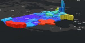
5.4: In this tutorial we compared vector and tile layers by using a storymap to display both layers at the same time. The tutorial has sample layers that are available to use for the display. The swipe insert was used to easily show both types of layers at once. The raster layer is only viewable up to a certain magnification, and it also keeps the text locked in a static position, so if the map is rotated it is hard to read. 

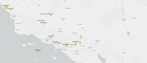
Comparison between vector (on left) and raster (on right). 

If I were to be looking at data within a small area like a county or a city, I would use a vector layer. If I were to map property values for different neighborhoods by size I would want to use a vector layer. 

Pinde fu chapter 6: This chapter focuses on spatiotemporal data. There are different types of date that encompasses movement space and time, these include: 

  • Moving: these are things that move such as vehicles 
  • Discrete: these are events that occur throughout time 
  • Stationary: this includes values that change over time such as a weather station collecting wind speed over time 
  • Change: focuses on how land changes, such as from fire or floods 

Realtime GIS includes data that is continuous and is constantly being updated, such as data from weather sensors or stream gauges. Temporal data can be represented by many units and GIS is flexible with the units that are used and how dates are imputed. This includes the use of different universal “time zones” ; GMT accounts for daylight savings time and UTC does not. Something that is becoming increasingly used is the loT, which is a network of physical objects embedded with sensors that allow for the exchange of data between one another. 

A relatively new product is ArcGIS velocity, which allows for sensors to be connected to maps, this also generates new items that correspond to the sensors. This list includes feed items, which allow for sensor input. There are also items that are used for realtime analysis, as well as items to analyze large amounts of data. When analyzing realtime data, there are two ways to go about acquiring the data: poll which polls the server periodically to acquire data, or to use a push which sends data to a web client that helps with processing the large amount of incoming data. 

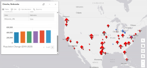
ArcGIS dashboard is a way to integrate web maps with other kinds of data, it can display wind speed, water quality, population density, and other parameters as they change over time. This was likened to how a car’s dashboard displays information such as speed, a fuel gauge, temperature, tire pressure, and gear position. 

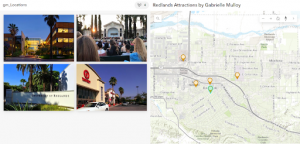
Tutorial 6.1: The web map for the Redlands dashboard hosted by Esri was opened. This map displays emergency dispatch information such as police cars and ambulances, which are polled every 30 seconds. We were able to add a layer into the map that showed live images, taken every 30 seconds. 

6.2: To create a dashboard go to apps, dashboard, and create. To add a map press the plus button then click map. When adding a map there are a few things you can toggle, we displayed a legend, layers, baselayer, and allowed for zooming in and out. To add a gauge (we used emergency incidents) click the plus sign, then the plus in the middle of the screen, then gauge. Here you can configure expressions to display certain fields. You can also change the way the gauge is displayed, we used a meter. To add colors to the gauge, use the guides tab and add guides for different percentages. To add a list (ours displayed the 10 most recent incidents) add a list element, then you can manipulate the maximum number of displayed items, and the fields used. Once you select your fields go to the list tab then use the curly brackets to insert your fields into the line item template. You can also add a title in this tab. 

6.3: To enable certain actions to trigger filters, or map changes, add a category selector by adding an element next to the header. To set actions that will trigger things to happen use the actions tab in the configuration. To make it so that when you click on an item in the table it changes the map, goes to the table, and clicks configuration, then actions, then enables zoom, flash, and filter. 

6.4: It is possible to use advanced formatting (arcade) to alter the colors displayed in the table to show different types of incidents. 

6.5:  This tutorial has us allowing for time to be used in our dashboard. Using the USPop200 that was downloaded from the tutorial, we made it into a hosted feature layer. Then going to the layer from the overview of the map, select the pencil over time, then enable time and specific events on time. 

6.6: To configure the time slider, use the gear button on the slider itself. From here you can alter the amount of years it goes by under the time interval pane, and the speed by which the slider moves under the play rate tab. Then by converting the map to a time slider app we  

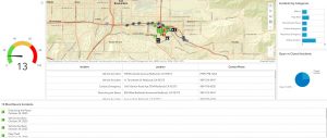
Dashboard made in chapter 6 tutorial 

I could see this being useful to display different types of climate data, such as wind speed, direction, temperature, and other things like that.  It could also be useful for displaying data from a field map, making it interactive and allowing for searches. Â