Week 2 – Aqib Ali

Chapter 1

I was able to create the map using the instructions from the book however I was unable to integrate the app with this map.

Chapter 2 talks about the importance of web layers and the different types of hosted layers it also talks about the different mapping styles like heatmap etc. The chapter later also talks about user expereince and how to best optimize for it.

Becker Week 2

Week 1

Chapter 1

    • First GIS developed in 1960s by Roger Tomlinson
    • Advantages of Web GIS:
      • Global reach
      • Lots of users
      • Low cost per user
      • Cross-platform capabilities
      • Easy to use/maintain
    • Web GIS Applications
      • Mapping and visualization
      • Data management
      • Field mobility
      • Monitoring
      • Analytics
      • Design and planning
      • Decision support
      • Etc.
    • Web GIS can be used in everyday contexts all the way up to governmental contexts
  • Arc GIS Online- software-as-a-service (SaaS) offering of Web GIS hosted on AWS and Microsoft Azure
      • No hardware infrastructure to maintain
  • Arc GIS Enterprise– Web GIS product that organization can acquire and deploy
      • Four basic software components
        • Portal for ArcGIS
        • ArcGIS Server
        • ArcGIS Data Store
        • ArcGIS Web Adapter
    • Web GIS has evolved 
      • From closed websites to open geospatial web services
      • From One-way to two-way information flow
      • Portal technology
      • Cloud GIS
      • More Mobile Web GIS users
      • From 2D to 3D maps (and VR)
      • From static data source to real time and spatiotemporal big data
    • All content items have metadata
    • Types of content items:
      • Data
        • CSV, shapefiles, GPS Exchange Format (GPX), JavaScript Object Notation, photos, imagery, geodatabases
      • Layers
        • Feature layers, tiled layers, vector tiles, map image layers, etc.
      • Tools
        • Perform analytical functions like geocoding, routing, creating PDF files, summarizing data, finding hotspots, and analyzing proximity
      • Web maps and web scenes
        • Map (2D) or scene (3D) comprises one or multiple layers and allow for sophisticated layer configuration
      • Apps
        • Mapcentric programs that can be used on mobile devices, in web browsers, or on desktops
    • Basic components of Web GIS app:
      • Basemaps
      • Operational layers
      • Tools
  • Hosted– web service is based on ArcGIS-managed data
  • Nonhosted- web service connects directly to user-managed data
  • Feature layers posted to ArcGIS Online are always hosted
  • Attachments are an emergingly popular data source
  • Attachment Viewer is an instant app template that allows you to quickly build an app that presents spatial data with an intuitive feature-by-feature viewing experience
  • Other apps allow staff to take pictures in the field and attach them to GIS

One application of the ideas from this chapter could be to label restaurants I’ve visited in my hometown and displaying how I rate them. I would do this in Berea, Ohio and again limit myself to places I have eaten at.


Chapter 2

  • Web layers are building blocks of web apps
  • Most common types of feature layers:
    • Hosted feature layers
    • Hosted Web Feature Service Layers
    • Hosted tile layers
    • Hosted vector tile layers
    • Hosted Web Map Tile Service layers
    • Hosted scene layers
    • Hosted image layers
    • Hosted map image layers
  • Ways to publish hosted feature layers:
    • Create feature layer from own data
    • Create feature layer from existing template
    • Create empty feature layer and define your own fields interactively
  • Smart mapping enables users to visually analyze, create, and share professional-quality maps easily and quickly with minimal cartographic or software skills
  • Examples of smart mapping
    • Heat map
    • Color and size
    • Compare A to B
    • Relationship
    • Dot density
    • Predominant
    • Type and size
    • Continuous timeline
    • Vector field
  • Pop-up windows show geographic information and deliver geographic insight
  • Arcade– portable, lightweight, and secure expression language written for use in ArcGIS to style, label, and add values to layer pop-ups
  • ArcGIS Living Atlas has lots of data for usage
  • Good web layers, maps, and apps are fast, easy, and fun
  • ArcGIS StoryMaps provides a set of web-based story-authoring tools that can combine interactive maps, multimedia content—text, photos, video, audio, and intuitive user experiences—to tell stories about the world
  • Sidecar– special immersive block with a side-by-side reading experience
  • slideshow block- uses horizontal scrolling to emphasize your media
  • map tour block– take a curated set of places and guide your audience through them one point at a time
  • swipe block– interactive experience that allows readers to compare two maps or images
  • timeline block– illustrate a series of chronological events in three layout options: waterfall, single side, and condensed
  • I had issues around halfway through the tutorial that I couldn’t seem to figure out

I could use this to do a spatial pattern tracking map of natural factors in my hometown. I would do it there because there are lots of ways that nature is being incorporated in the city layout.

Aqib Ali – Week1

Hi, my name is Aqib and I am a senior at OWU. For week 1 I met with Prof. Krygier, took the quiz regarding the syllabus and also introduced myself to the ArcGIS using the following article: https://doc.arcgis.com/en/arcgis-online/get-started/what-is-agol.htm. Here are my two takeaways from this article:

  1. I learned about how to use maps and configure them using the settings and different options available in there.
  2. I also learned about the sceneviewer and its features like measuring distances and changing the weather etc.

I also completed the ArcGIS online basics course the certificate to which I have attached:  ArcGIS Online Basics_Certificate_10242025

Key takeaways from the course:

  1. I learned about the about the different layers such as base and operational.
  2. I learned about the ways to add data and acceptable import files.

ArcGIS has been used in various ways for business and economics, the ones I found most interesting were:

  1. ArcGIS was used to  increase retail sales by 150%: https://www.esri.com/en-us/arcgis/products/arcgis-business-analyst/marketsource-case-study.

Image Example 1

2. ArcGIS is used by small and mid sized businesses to figure out the best places for expansion and analyze where target customers live. Source: https://www.esri.com/arcgis-blog/products/business/business/learn-how-arcgis-business-analyst-can-help-small-businesses 

Image Example 2


White Week 2

Chapter 1).

Chapter one highlights how Web GIS is simply the combination of the world wide internet and GIS. The text underscores the versatility of Web GIS in terms of applicability, accessibility, convenience, collaboration, and representativity and feasibility in use. GIS is both a science itself and a mechanism, a tool for science. With the increased significance of spatial location and analysis, Web GIS is adding more value perhaps now than ever before. Whether it be through government, business, daily life, or science Web GIS is considered and applied progressively. The chapter then discusses Esri’s Web GIS capabilities. We have learned and worked with ArcGIS Online a decent amount so I won’t get into details with it. The main idea is the benefit of cloud computing. There has been a trend for organizations to adapt ArcGIS Online and ArcGIS Enterprise. A big benefit of ArcGIS Online I think is the access to ArcGIS Living Atlas of the World. We have worked with this in Geog 291. The chapter proceeds to comment on the evolution of Web GIS from closed to open geospatial web services, from a one-way to a two-way information flow, the recent trend towards mobile pervasiveness, and more. The capabilities of Mobile GIS I read are fascinating to me. Like employing augmented reality to it. Wow. Web GIS has even started to integrate AI! These five main content types of Web GIS are data, layers, web maps and scenes, tools, and apps. This was a bit of a review from Geog 291. The basic components of a Web GIS app are base map layers, operational layers, and tools. Basically, base map layers provide foundational geographic context while the operational layers contain the more particular data on what the map is focused on communicating or analyzing and so forth. The chapter next gets into a discussion of feature layers, a critical component of web services. I learned a lot of feature layers and worked with them previously so I won’t add too much here. However, what I took away from hosted and non-hosted feature layers is that hosted indicates more general public storage/use ran by ESRI for instance whereas non-hosted signifies more private storage/use for example within your organization. There are a range of ways that ArcGIS allows for the creation of web apps. One example is to use desktop tools to convert a shapefile as the data source to a feature layer. Then to create a web map in 2D or a web acne in 3D from the feature layer and finally employing an instant app template. There has also been a positive trend towards adding attachments as data sources. I think this is great because as the text conveys, pictures and videos have great meaning, frequently meaning or value that only pictures or videos can capture by whatever means. The Attachment Viewer template can be used for a multitude of purposes that I mentioned before whether it be daily life or crucial government work. I like that the tutorials are integrated.

Chapter 2). 

Chapter 2 gives an overview of story maps and storytelling with GIS. Web layers are the foundation to web apps and stories are basically a facet of web apps, that is a primary type of web app. ArcGIS Story Maps is the new-generation story app and is the focus of this chapter and our work. The chapter also discusses ArcGIS Living Atlas of the World and how already configured layers can be extracted from this. The chapter opens with an explanation of feature layers, particularly hosted layers that we will be working with. A main point is that hosted layers pertain to vector feature layers. I remember from Geog 291 that this includes things like points, lines, or polygons. The relative data points (coordinate-based) have both location and attributes. There are 8 different types of hosted layers that can be published to the geospatial cloud. There are additionally distinctive ways to create and publish these hosted layers. One way to publish a hosted layer is by creating a feature layer from our own data which I had some experience with in Geog 291 working with the Delaware data and shapefiles. You can also simply use a template that is there or you can create and empty feature layers and go in and manually develop things like fields. Next, the chapter provided me with a refresher of smart mapping. Smart mapping is different from traditional software defaults and processing because smart mapping provides a unique and individualized analysis, creation, and product ready for sharing. Smart mapping also works actively for example as you change or add fields, the internal functioning of smart mapping persists to basically overlay your decision with smart choices to develop the best maps possible. I think this is super awesome. While smart mapping is endlessly useful, you can also manually adjust any changes the system makes.

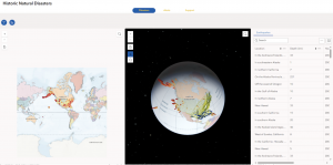
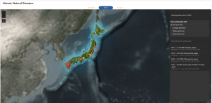
The chapter talks about pop ups and this was a bit of a review as well. What I think is great about pop-ups and the fundamental point here is that they enhance the attributes associated with each feature layer in the map. These pop-ups present geographic info in an interactive way and I think this is critical for applications in the modern era where people almost expect a pop up or expect more information to be given to them as they click on locations or points etc. You can also formulate pop-ups and male them show what you want whether it be simply a picture or even a video with text. ArcGIS Arcade is the following topic of this section. Rather than having to go in and modify data and do tedious work, Arcade is an expression language that acts as a service in ArcGIS to basically configure pop-ups. Arcade allows you to build expressions using fields. The book relates Arcade with the formulas in Excel. Arcade can also evaluate logical statements, even expressions with various statements. The purpose of Arcade is not to write a single-purpose web app built from a template but rather to work with existing expressions that are used for visualization and labeling purposes. Next is an evaluation of ArcGIS Living Atlas of the World. I won’t say too much about this as I learned about it and worked with it previously. Basically it has thousands and thousands of layers stored for it to use. Another core element of this is that data is updated actively and recent data is prioritized especially for live sequences like traffic or natural disasters. A big part of storytelling is tending to today’s clientele who are predominantly technically advanced but at the same time extremely lazy and minimally attentive. There are three keys to facilitate a smooth user experience and these are important to employ when creating web layers, maps, and apps. That is to make things easy, fun, and fast. ArcGIS Story Maps combines interactive maps, user experiences, and multimedia content to tell stories while intuitively integrating the W’s of storytelling to make the narrative strong. The new generation, ArcGIS Story Maps, has a range of advancements from the previous classic ESRI story maps. A bock is an element used to develop the story whether it be a sidecar or a photo. There are also immersive blocks that standout and add more detail/content. The block pallet is the collection of all blocks used to facilitate the interactive component and allows you to select blocks and add them to the story. A sidecar is really cool and allows for vertical-scrolling showing multiple slides and I think this is good for thematic data comparison in an engaging way. You can zoom to points as the narrative moves (slides) along to emphasize things or whatnot. Furthermore, there is a slideshow block which uses horizontal scrolling. This creates a presentation where the block, for example the photo, encompasses the whole screen, creating an enriching visual experience. There is a narrative panel with text that moves along. There is the map tour block which can be used in the guided or explorer mode/layout. With this you can take a specific set of locations or sequence of the data and move through those clusterings/groupings in a narrative format. Then we have swipe blocks and time blocks where the former allows for comparison between two maps or images and the latter shows data in a chronological order for which you can add text for each event. Finally, the chapter concludes with a brief overview of express maps. Express maps are simple and can be created in the story builder. These can be used to efficiently add context to the story. You can actually draw features whether it be a street (a line) or a business district (an area). You can configure pop-ups to further contextualize the features with this. Express maps can be used to simply sketch out what you are envisioning if need be. Arcade was used in this process as well as tools like geocoding and smart mapping. I could add a swipe block to compare the locations of shelters or hospitals to some demographic data. For instance, I could show shelter locations compared to vulnerable low-income populations in order to assist the public with demonstrating resource availability and proximity to their local shelter in the event of this natural disaster.

Tutorial things).

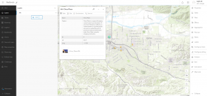
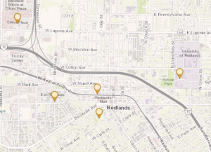
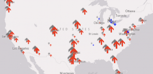
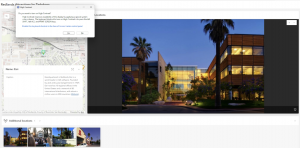
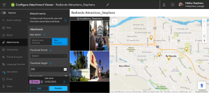
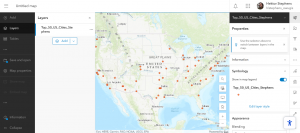
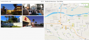
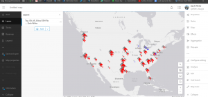
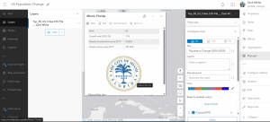
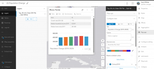
For 1-1 the terminology was a bit off and did not directly line up to what I was actually performing in ArcGIS Online. Particularly there were issues with the attachments. I still smoothly figured it out but just wanted to mention. Essentially, I created a Web GIS app to display the main attractions or as the book explains points of interest (POIs) in the city of Redlands, California. During this process, I first created a base web map in the Map Viewer. The instant app shows the location of these places for efficient visual representation but also includes general information integrated in pop ups and so forth. For chapter 2’s tutorial I created a story and refamiliarized myself with the value of story maps and their capabilities and uses. I created a Web GIS app that shows the spatial patterns of US population change over time, looks into why those changes have occurred, and shares what I discovered/created with the public using ArcGIS Story Maps.

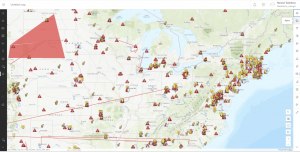
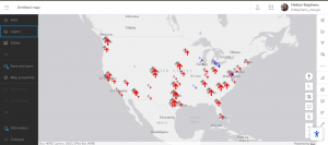
An application I thought up that could incorporate the chapters and their associated tutorials is an instant app on natural disaster related action. I had a class last year called science communication. This reminded me of this class. I would either do an instant app or actually maybe an ArcGIS Dashboard. I like the dashboard idea to convey location-based data and analytics for actively visualizing trends and making real time decisions through real time data, charts, images, and other forms of media/content. I was going to do a story map but I wanted it to be more data driven and functional for this type of serious and reactive situation dealing with a natural disaster, less of a narrative flow type of thing. Something super cool that stood out to be from the chapters was the discussion of ArcGIS Living Atlas of the World. Given the strong hurricane that is currently brewing in the Caribbean sea and down near Jamaica, Tropical Storm Melissa, I’ll focus this application on hurricane management/response. I would aim to intuitively communicate efforts to prepare, how to manage the storm’s impacts, and then real time responses. In doing this, this would support both the public and the federal government with emergency response teams and so forth. The goal would be to communicate scientific information to a representative audience, in a fast, meaningful, easy, and fun way. I would do this by adding real time hosted feature layers, ensuring to find a way to display the hurricane’s forecasted track and progression. This should be possible through ArcGIS Living Atlas of the World. I could also bring in other csv files or shapefiles and publish those as hosted feature layers if needed. I would add a feature layer that has to do with roads whether it be evacuation routes or road closures. I would also consider adding a feature layer of point features including shelters. Shelters are critical infrastructure in times of emergency and natural disaster and so are hospitals. After I added these published layers I would create a web map working with the symbology and styling elements. I would form the web map employing various smart mapping tools like displaying the icons based on a size that reflects their capacity. I would make sure to use smart colors like red for road closures and green for open evacuation routes etc. I would also configure pop-ups to show contextual and fundamental information like the name of the shelter and its phone number and maybe an added attachment image of the shelter for visual reference. Another feature layer pop-up could show the category of the hurricane where it is at, and other weather conditions. Next, I would develop a web app. I would utilize smart mapping for this as well to configure the layer style and so forth. I would use a helpful base map like the community basemap to enhance the operational layers, making sure not to disrupt or diminish those operational feature layers. I would create two versions or just share with the public (everyone) and privately with the municipality/city or emergency response teams. The nice thing is users can access the app on their mobile device or their computer if they prefer.

If I were to just do a story map, I would do this on tracking an endangered species, the sand tiger shark. Through a story map I would be able to focus on more of a narrative layout including text, map(s), and multimedia. Geographic data can be collected on the existing population and then mapped out on web GIS. I would give context on their role in the ecosystem, why they are endangered, and sharks at large. I would bring in already collected GPS data to show movement paths as well as critical habitats that these sharks go through or consistently return to (inhabit).

Tadokoro- Week3

Chapter3

In this tutorial, I used ArcGIS Experience Builder to create a multipage web experience that integrates both 2D and 3D, all without any programming. I added widgets like Section, Map, Image, Text, Table, Filter, Chart, and Menu, and configured their content, styles, actions, and animations.

There were so many widgets that seem really useful in real projects, so I’m glad I got to learn how to use them. This tutorial was quite complex and took a lot of time, but when I finally finished it, I felt so happy seeing a web experience that looked just like the ones you often see online. It was really satisfying to realize I could actually do it myself!

Chapter 4

In this tutorial, I created a smart survey and used Survey123 to collect data. I also created an editable feature layer using feature templates, built a web map with forms, and collected points and lines using Field Maps. On top of that, I created a QuickCapture project and used it in QuickCapture, prepared data for AuGeo, and explored a simple AR experience.

The first part, making the survey form, was really easy and straightforward. But after that, things got pretty challenging. The instructions in the book didn’t always match what I saw in the web GIS interface, which made it take a lot of extra time. I really found myself thinking, “ESRI, please check this and update it!”

Tadokoro – Week2

Chaoter 1

In this tutorial, I published a feature layer using a CSV file, added attachments, created a new attribute field, and entered its values. Then, I added the layer to a web map, configured the style and pop-ups, and built a web app using the Attachment Viewer template. According to the book, this app can be used on smartphones and other devices, which I think is really convenient.

Honestly, when I started this tutorial, I was using a different edition of the book for the first time and felt completely lost. I thought I’d never get it done. But in the end, I managed to complete it, and it feels great to have it working!

Chapter 2

In this tutorial, I created a feature layer using geocoding, styled it with smart mapping, and configured the pop-ups using Arcade. I also added images, links, and charts to the pop-ups. After that, I built an ArcGIS StoryMaps web app, embedding videos, images, web maps, and scenes, and set up sidecar and swipe blocks.

One thing that really surprised me was seeing how small New York’s population was in 2010 compared to now, while Columbus actually had more people in 2020 than I expected.

In tutorial 2-2, there was a part where I was supposed to choose “above and below” as the theme, but when I was doing it, that option wasn’t available, so I just went with “above.”

Gensler – Week 2

Chapter 1: 

  • This Chapter taught me several key benefits and use of WebGIS. I thought that it was really interesting how WebGIS supports users from all over the world and allows them to share and communicate data with one another. The idea that companies and individuals can share this data simultaneously is really cool and a great use of technology. Using this chapter and the given tutorial, I explored WebGIS and the fundamentals of this application. Some of the things I particularly enjoyed reading about were the use of base map and operational layers and many of the tools that go into those layers. Even from just these two layers, a lot of data can be interpreted and analyzed. I also really enjoyed reading about how WebGIS is planning to evolve with growing technology and how this application will change in the future. This makes me interested in how AI will be adapted within GIS and many of the services that WebGIS provides. 


Chapter 2:

  • While reading this chapter and completing the given tutorial, I learned about even more layers that can be used within WebGIS and how they add even more room for potential analysis. This chapter also touched heavily on ArcGIS and how it differs from WebGIS. I enjoyed reflecting back on my time using ArcGIS earlier this semester. I used what I learned in terms of layers in the chapter and applied them within the tutorial for this chapter. This process wasn’t too difficult and I like how the user interface is set up and how user friendly WebGIS is. 

Stephens Week 2

Chapter 1

I’ve always been an “own your files” guy but I like the collaborative aspect of the cloud, and that the public has some access to the services as well. Everything being online makes me worry about security, but although I don’t know the technical stuff very well I think AWS has to be pretty secure considering how many things run on it.

Definitely so far web gis seems to have more features and a simpler layout than desktop, and seems much more simplified for people like me who are significantly more nature and field work aligned than into technology.

Still super excited to mess around with mobile stuff. If it’s not assigned I might on my own anyways. And augmented reality is always interesting. I have to imagine putting geographic layers over your vision would give a whole new perspective on the landscape and the map/scene. We didn’t get to do a whole lot with scenes in 291 so doing those more online will be sweet

A lot of this was gone over in the online esri tutorials. I found myself skimming through a bit that already  made sense to me, either from there or 291.

I thought the first tutorial was easy and fun to do. Configuring the pop ups was a bit of a struggle, because as much as I tried I couldn’t get the picture to upload for ESRI. the link to the powerpoint did show up in the pop up caption, at least. These kinds of stories are an exciting way to show images by location and in my opinion, makes geographical information palatable to the general public. I guess that’s the whole point of GIS isn’t it!

After this I didn’t realize we didn’t have to do the assignment at the end, and I skipped ahead to chapter 2 a bit to try and figure out how to do it. I decided to just map out a few of my favorite metro parks and actually started making a CSV file with their locations. I ended up asking Krygier before getting further and decided to save time and use that as a bit of a starter idea? It would get significantly more complicated than just parks and popup images like I was planning, in that case.

Chapter 2

Smart mapping sounds really interesting and seems like it would help with some of the confusion I had with desktop GIS, particularly things like making aure all the data is cleaned and lined up. Well, I can’t imagine it can compensate for sloppy nasty data but it seems like it would help make it clear *where* the slop is.

Arcade makes no sense to me, I had to look over the book a few times to see that it’s just a way of doing math. Because I can do that, but generally I see anything that looks like code and my brain shuts off.

The Living Atlas sounds fun to look through. The concept of having premade layers to combine and tell your own story sounds like a good way to be creative with less busy work. I think there’s a lot of potential for artistic expression and flow in this program, and I’m wondering what kind of interactive forest cover, tree type, hydrology, who even knows layers for my metro parks app. Finally I’m glad to be doing stories more because I didn’t really parse that in 291.

In the second tutorial, I found the way the CSV file seamlessly fit into the data appealing. I’m glad I did the tutorial before working more on my other assignment, because I would not have realized that you still have to kind of plug the data in, at least with the addresses. Anyways, it all showed up, but I had significant trouble with such a small thing: even with all the panes closed I could not get the map to the exact right extent to show all the cities with their names. Like I said, just a small thing that made me mad. I don’t know if the program has set zoom distances or if I just have butter fingers. In the map, at the end of 2.2, I just hit “zoom to layer” and accepted that viewers would just have to click on some cities to see the names.

Also kind of an aside but if I was making this tutorial I wouldn’t want the shadows. I thought they were ugly and distracted from the actual information being displayed.

On to arcade, it was bad. I struggled to find globals until I realized it was actually the profile variables menu. Eventually, I got it, and configured the pop ups.

On to the story, I struggled to find the right scene and web map because I was searching in the wrong search bar! It’s the top top one. Then starting out the story was ok but I couldn’t find the add map action button anywhere, no matter where I looked. I tried messing around with the map tour but that was something else. The text in the menu is weirdly light so I could barely see it! So, I moved on. I added the scene, and then, the express map and last image. So, the story is mostly complete.

I guess my idea, based on what I started in chapter 1, could definitely involve metro parks! I could make a map of them and make popups with pictures of things to see there, as well as data about things like trail difficulty, wildlife, or distributions of trees or wildflowers. Maybe I could make an easy visual guide for which parks to go to to see which plants or wildlife?

Baer – Week 2

Chapter 1
Chapter one was pretty fundamental. it goes over the basics and core concepts of Web GIS. it points out well how GIS isn’t just for Geography nerdz (yes with a z). GIS is really an application the can go toward any proffesion. The apps were also fun to search around for.

Chapter 2
Chapter two was a lot more specific as it went over the feature layers. it also brought together the idea of storymaps. I am a huge fan of story maps because it’s (in my opinion) the best way to get “non-science” citizens connected with the scientific community.

Overall between the two chapters it have been interesting. I think I still perfer using ArcPro for most work, however I can see that WebGIS is better and more applicable at times. I am excited to see the other ways it can be used in the upcoming weeks. And I am excited to see if it changes my prefence of software.