Fox – Week 3

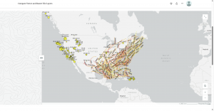
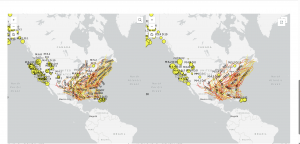
Chapter 3: This chapter really shows how easy WebGIS is compared to the desktop version (in my opinion). WebGIS allows us to create our own web experiences using flexible layouts, content, and widgets that interact with both 2D and 3D data. We can start with templates for mobile-adaptive apps, modify template layouts for a custom design on different screen sizes, or even build apps from scratch. The ability to do those things adds to the availability of this application and how easily one can understand it. When using these applications, you follow a little pattern on how to complete the maps. It goes: pick a template or start from scratch, pick a theme, add your data, add and move around your widgets, refine your layout, and finally save and share your maps! A widget is a JavaScript and HTML component that encapsulates a set of focused functions. Experience Builder provides two types of widgets: basic and layout. Basic widgets can perform as app tools. Basic widgets include map, legend, layers, query, filter, edit, chart, elevation profile, survey, and more. Layout widgets help organize widgets on your pages or windows. Layout widgets include section, column, row, fixed panel, sidebar, and more. One important thing about widgets is that you need to pay attention to your version of ARCGIS because the ArcGIS Online edition doesn’t allow custom widgets; the Portal for ArcGIS edition allows the deployment and use of custom widgets; the developer edition allows the creation, deployment, and use of custom widgets. Overall, just be aware of your GIS and the different things you can do with it

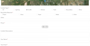
Chapter 4: This chapter talks about mobile GIS and how beneficial that is. I think that offering a mobile version is amazing as it increases the availability of ArcGIS, giving more people the opportunity to learn it. However, there are a few disadvantages to mobile GIS; the small size of mobile devices imposes limitations on speed, memory size, battery power, bandwidth and network connections, screen size, and keyboard size. As an “owner” of a hosted feature layer, you’re also able to be an editor tracker. Editor tracking is the ability to track who has changed the data of a feature layer and when the change was made. Editor tracking can help create more accountability and quality control over the edited data. This is, if you choose to enable it on your layers. A feature layer can contain a feature template, which you can define in ArcGIS Desktop or Map Viewer in ArcGIS Online. A feature template defines the types of data items that users can add to a layer. A template ensures data integrity and makes editing easier for your users. There are also 3 different approaches that can be taken with mobile GIS: browser-based, native-based, and hybrid-based. ArcGIS provides a suite of apps for field operations as well, including ArcGIS Field Maps, ArcGIS Survey123, ArcGIS QuickCapture, ArcGIS Navigator, ArcGIS Companion, ArcGIS Earth, ArcGIS Mission Responder, and ArcGIS Indoors mobile viewer. 

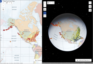
One application of what was talked about in these 2 chapters would be the ability to create a map of tornado locations in Ohio over the past 5 years to see if there is a recurring pattern within those locations.

Tooill – Week 4

Chapter 5-

This chapter was pretty short and focused on creating vector and raster tile layers. Vector tile layers store geographic data as points as points, lines, and polygons. They represent the geometry and attributes of features and are more flexible and efficient. They are best used for interactive maps. Raster tile layers are image tiles. They show small portions of a map. They are used for mapping consistent geography that isn’t expected to change very quickly, such as static basemaps.

  • The tutorial walked me through how to add and publish a portal, but my portal was already set up, so I did not have to do that.
  • I downloaded the data for this chapter onto my computer and then added a vector layer to a new project that I created from the data I downloaded.
  • To be honest, I’m not really sure how I added the vector layer. I went through all of the directions and did as the tutorial said, but there was never a specific step that said I was adding a vector layer. Then, all of a sudden, I was configuring vector tiles and analyzing and publishing my vector layer.
  • Next, I created a raster layer. The steps to creating a raster layer were very similar, and again I’m not really sure where the actual raster layer was created. I think it was maybe just already created from the data I downloaded for the chapter and all I had to do was add it.
  • After I created both the vector and raster layers, I compared them by using a slider/swipe on story maps.
  • A practical application for this chapter would be evaluating wildfire risk. Raster layers would include consistent information, such as vegetation and elevation, while vector layers would include data on things like buildings and boundaries.

Chapter 6-

In this chapter, I created a dashboard web app for the city of Redlands, California, to coordinate response efforts for the city’s medical, police, and fire departments.  This web map displays the most recent incident details, monitors real-time locations (with minimal lag is the idea), and allows users to filter incidents by the type that they are.

  • To start this tutorial, I searched for Redlands Dashboard Map owner:gtkwebgis5 and opened the web map in map viewer. Then, I added a temporal layer of sample data.
  • This temporal layer added live cameras by the California Department of Transportation that shows near-real-time highway photos in the pop-ups.
  • I shared this web map with everyone and then I created a dashboard web app with the map that I had just created in the previous steps.
  • I added lots of elements to the map, including a gauge, chart, table, list, and map.
  • The gauge is responsible for displaying how many open incidents there are, with green representing not many open incidents, yellow representing many open incidents, and red showing too many open incidents.
  • The list element lists the open incidents as they occur.
  • The chart is responsible for representing the ratio of open to closed incidents.
  • The table includes information about incidents, such as the location and contact information.
  • Finally, the map just shows geographic data on where the incidents are occurring.
  • The tutorial then tried to have me configure actions and targets, but I struggled with getting these to work because not all of the expressions were working like they were supposed to even though I was copying and pasting them directly into the expression box to make sure that I didn’t type them in wrong.
  • A practical application from this chapter would include creating a dashboard web app that monitors environmental features such as air and water quality or weather.

Buco, Week 3

Chapter 3

In chapter 3 I learned about the basic components like pages and windows.

I also learned about how basic widgets are widgets that can preform as app tools and how layout widgets are the containers can help organize widgets on the panes and windows.

Lastly I learned about using experience builder to create web experiences like select them, adding source date, adding and configuring widgets, etc.

Chapter 4

In chapter 4 I learned about mobile gis: Concepts and advantages like mobility, location awareness, ease if data collection, near real time information, etc.

Next I learned about the mobile gis is built on some on some of these mobile devices. Some examples of this tech is mobile devices like smartphones. tablets, etc. There are also Mobile operation systems like Microsoft windows, iOS, and android. Lastly there is wireless communication technology like blue tooth, Wi-Fi, cellular network and satellite internet. These are only some of the devices that can be used for mobile gis.

Lastly I learned about is rapid data collection. Like Quick Capture which is specifically designed for field teams that need to collect data from moving vehicles like a truck, car, helicopter, off road vehicle.


During my application I created a simple line feature layer, created attribute fields, created domains, enabled editing, enabled attachments, and created feature templates. During this process of creating and enabling these sections most of it was not to hard to figure out but some of the buttons I had click were hard to find so it took me some time to find those. But overall I enjoyed working on this application.

Patel – Week 3

Under Construction (I will be Comming back to this to see if this is the assignment)


Chapters 3 and 4 of Getting to Know Web GIS expand on the practical tools and workflows that bring Web GIS to life. Chapter 3 introduces the concept of web layers the building blocks of online maps and explains how different types such as feature, tile, and imagery layers are published, styled, and shared. It emphasizes how cloud based platforms like ArcGIS Online simplify data publishing so users can focus on visualization and analysis rather than software management. The chapter also explores how web maps serve as the foundation for web apps, dashboards, and story maps, showing how dynamic mapping can communicate ideas more effectively than static displays. Chapter 4 dives deeper into smart mapping, discussing how symbology, classification, and pop-ups can enhance spatial storytelling by turning raw data into intuitive, meaningful visuals. It also highlights tools for analysis such as spatial queries, buffering, and heat maps that allow users to uncover trends and relationships hidden in spatial data.

Application idea: Using my own GPS data, I could design an ArcGIS Experience Builder app that displays my walking routes over time, with widgets that show the total distance covered, elevation changes, and areas visited most often. Pop-ups could include date and weather details for each route, creating an interactive story of my weekly movement patterns. This project would connect what I’ve learned from Chapters 1-4 by combining map publishing, smart visualization, and app creation.

Thompson – Week 2

Chapter 1 – 

  • First thing is obviously going in and making sure you have a login for the wordpress and arcgis which was already done if you were in Geog 291. 
  • Get a good feel of ArcGis and the different tools
  • Go through and download the necessary files and put them into a folder 
  • Add the necessary data to your ArcGIS 
  • Make a webmap with different layers and symbology
  • Add feature layers like configure pop ups
  • Adjust any settings and learn how to share with others

The goal of chapter 1 was to get a better understanding of WebGIS and how to use it, go through and use the different components (mapping, data, apps, and more), learn more about the different WebGIS apps and just follow the instructions to create your own webmap and know how to share it with others. 

Chapter 2 – 

  • Map data using geocoding (such as CSV data)
  • Use the map viewer to edit your data – includes different attributes and adding/removing feature layers
  • Play around with the symbology of the different layers – can change the symbols and colors
  • Configure the pop ups for each layer – choose what will be shown on the webmap
  • Create the webmap and adjust any settings necessary

The main goals of chapter 2 are to work with ArcGIS using different things like geocoding, feature layers, and more, use symbology to characterize your layers, make your map more interactive with pop ups, add images and charts if needed, and add layers to create your webmap that can then be used to create a web app. 

Tooill – Week 3

Chapter 3 –

In chapter 3, I learned how to create a public web experience to display data, specifically earthquakes and hurricanes. I listed data in tables that allows users to select records and filter maps. Using this data, I was able to display earthquake summaries in a chart and popups, which I then organized to allow users to filter features based on attribute fields. I also learned how to customize widgets.

  • First, I created a new experience builder with a blank canvas.
  • I entered the sample chapter 3 disaster data onto the blank canvas. This data created a 2-D map.
  • On the experience builder, I created widgets by dragging them from the panel of widgets. Then, I customized the size of the widgets to better fit the screen and incorporate other widgets.
  • Along with the 2-D data, I also added 3-D data following the same steps and adding widgets. With one of the widgets on this layer, I added an image widget that I uploaded from my computer.
  • I learned how to make animations so that switching slides in the presentation is more fun!
  • I learned how to configure map message actions, which allowed me to automate responses to specific events within the application.
  • With text widgets, I was able to add lots of different content and information about the earthquakes and hurricanes that happened in the different locations included with the data set.
  • I added chart and table widgets to display information on the web experience.
  • I was able to add multiple pages to the web experience I created, allowing me to have a home page and different content pages.
  • Last, I shared my web experience with the public after previewing it.
  • I think that most of the instructions for this tutorial worked or at least were easy to figure out if they weren’t correct.

Chapter 4-

In chapter 4, I learned about 4 different applications. I learned how to make surveys, use field maps, Quick Capture, and AuGeo. I really liked learning how to use Survey123. However, I was having a hard time with this chapter tutorial because a good portion of the tutorial was inaccurate and I could not get things to work. It was only a couple of steps, but it created a cascade that made it impossible to do following instructions because a previous step did not work. I was not a huge fan of having to download a couple of extra apps onto my phone just to use it for a few steps of the tutorial, especially when some of the instructions were inaccurate.

  • This chapter started off with logging into Survey123 associated with ArcGIS Online.
  • I created a new survey using the prompt from the book: A university wants its students, staff, and the public to report nonemergency incidents on campus. With this prompt, I was able to create questions that coincide with different incidents that may occur on campus, including AC, lighting, graffiti, etc.
  • On this application, I was able to add questions pertaining to description of the incident, as well as contact information.
  • Learning about Field Maps is helpful, but I wish that the steps on the tutorial would have been up to date with the program because I got stuck and couldn’t do much with it. I got stuck at street cracks and guardrail issues, which inhibited me from being able to do things with that layer later on.
  • An application that could be created using the information I just learned about Survey123, Field Maps, Quick Capture, and AuGeo could be one that collects data on the best places on and off campus to study or on different species of plants found along hiking trails.

Dylan Patel – Week 2

Chapters 1 and 2 of Getting to Know Web GIS introduce the foundations of what makes Web GIS such a powerful evolution of traditional geographic information systems. Chapter 1 focuses on how Web GIS moves mapping and analysis into the online environment, allowing for greater accessibility, interactivity, and collaboration. Instead of being limited to desktop software, users can now create, share, and analyze spatial data through browsers and mobile apps. This shift transforms GIS from a specialized tool used by experts into a connected platform that supports teamwork, decision-making, and public engagement. Chapter 2 explores the structure of GIS data, including the differences between vector and raster formats, how feature layers are organized, and why coordinate systems and map projections are crucial for accuracy. Understanding how data aligns spatially ensures that maps are not only visually appealing but also meaningful for analysis.

Timi Week 2

Timi  Week 2

This week, I went on ArcGIS Online and searched for Grand Canyon National Park. I used the Imagery basemap to look around the area without any borders or boundaries, i searched for the best viewpoints which are mather point and Yavapai point and I also explore the area and dug around to see where the Colorado river came from which passed through the Grand canyon. I zoomed in and out, moved around the map, and tried different tools to see how the platform works. It was interesting to see how much information the imagery basemap shows and how smooth the navigation is. If I were to make an application, I’d want to create a map showing famous landmarks and natural parks across the U.S., and even far across the world where users could click on each location to learn quick facts or see satellite images.

Dondero – Week 2

Chapter 1:

  • One method to create a new feature layer is by importing it into ArcGIS Online
  • In your map, you have the options to add layers and tables, change the basemap used, as well as create legends and charts that correspond to your map
  • You can also search for and import layers from the ArcGIS database, as well as from living atlas, with the option to change visual characteristics such as transparency, layer style and symbology
  • You can share the maps with others within your organization, or publish the map so that anyone can access it.
  • You can create story maps that guide the user through your map, with images, videos and other media, similar to a presentation but spatially.

Chapter 2:

  • ArcGIS Online has a large variety of templates available, each suitable for different projects such as 3D scenes or collecting and categorizing data.
  • Each WebGIS app is formed from 3 components, the basemap, the operational layers and the additional tools specific to that project.
  • Living Atlas is an Esri hosted collection of maps, databases and apps that are available for you to add and use within your own apps and maps
  • Arcade lets you use expressions to manipulate data that you already have, instead of needing to change the underlying data


One idea I had for a potential application use would be mapping rail lines within Ohio, and cross referencing them with major industry locations, such as steel mills and coal mines.

Below is my attempt at making a map similar to that idea, which has Ohio’s rail lines, as well as markers delineating historical locations throughout the state (Both Layers I found in Living Atlas)